How designing for different web browsers is like throwing a dinner party

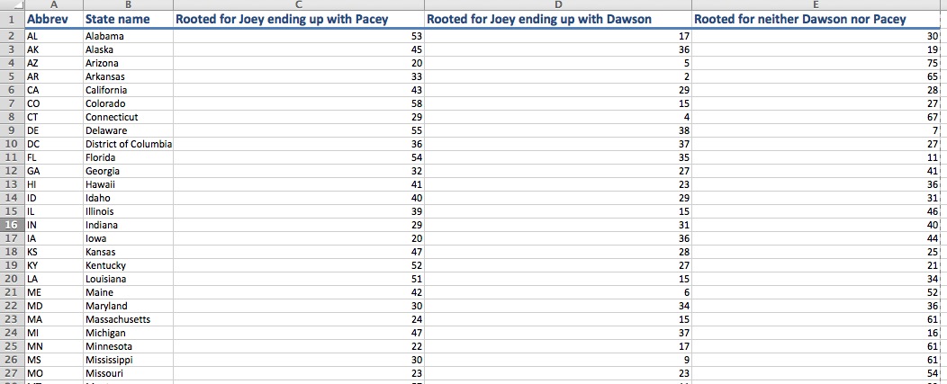
Designing web sites and interactives for different browsers is like planning a dinner party for widely different guests. None of whom has RSVPd. You don’t know who could show up, so you have to be prepared that they all could.

The most fickle is Internet Explorer, which is like that guy who was really popular in high school but hasn’t really done a whole lot since then. He invited himself to your party after hearing about it from someone else. He’s nice and well-intentioned, but planning for him is a pain in the ass.

Depending on the version, Internet Explorer can’t handle SVG, and when it can, it needs a lot of special help if you want to animate the SVG. This is the equivalent of a party guest who doesn’t always drink booze, but when he does, it’s Budweiser from a can and he’s hammered by the the third beer.

Beyond that, Internet Explorer can be finicky about aspects of CSS that other browsers can handle without any problem. Like break points in media queries. This is to say that this Budweiser-drinking party guest is also lactose-intolerant, but sometimes drinks milk anyway and then complains about it. He doesn’t eat red meat or chicken, but does eat turkey. He’s allergic to nuts, gluten, oats, soy, baby carrots, cherry tomatoes, white onions, food products made in July, and pickles cut the long way. He can’t eat black beans because they give him horrible gas.

Some versions of Internet Explorer can’t even recognize borders applied in CSS, which is the equivalent of this party guest saying, “Bee tee dubs, I’m allergic to water.”

You can’t just uninvite him, either, because he’s still popular among many circles and you can’t risk the fallout that could come from cutting him off. His retired family members no longer work, but they could still show up and wreak havoc at your party.

He might not show up, but just in case he does, you want to have something he can have. Maybe a jar of gluten-free air.

Much more agreeable is Safari, your bubbly coworker in her mid-20s. Just as Safari shows up in every Mac product, this party guest shows up at every party you have, usually 10 minutes early. Safari handles CSS much better than IE, which is to say that you don’t have to worry about this guest not eating any of your tapas. I’ve noticed in some of my projects that CSS break points look a little rougher in Safari, which is to say that if you ask this party guest to pick up chips on the way, she might just get the store brand chips unless you specify the brand you want.

Where Safari can have issues is the css for animated SVGs. This can sometimes cause Safari to flip out, much in the same way that certain hard liquors will send your bubbly party guest into a blackout drunken stupor where you have to confiscate her phone so that she doesn’t keep texting the guy she met on Tinder.

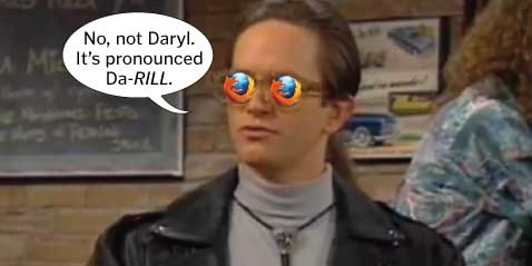
Firefox is much more capable and reliable than Internet Explorer and probably Safari, but that doesn’t mean it’s not without its quirks. Firefox is that friend you invite to the party because you like him even though he can be kind of a snobby, pedantic smartass. Firefox can handle SVG with aplomb, but I’ve had to use an if/else statement to distinguish whether the user has Firefox, and thus whether to apply different JavaScript. This is like having to make a separate booze run because your contrarian friend insists on drinking a more expensive “specialty” vodka that you can only get at certain liquor stores. He uses terms like “craft cocktails,” and if that didn’t make you roll your eyes, his blog about craft cocktail trends as a symbol of populism in the west will shoot your eyeballs from your skull.

These criticisms so far stem from SVG, but there are more generic irritations with Firefox. There are times I’ve had to add “float:left” to the CSS because Firefox has pushed divs with a 100% width all the way to the right off the screen. This is a quirk that even IE didn’t have. This is the equivalent of asking your friend to pick up ice on the way to the party.

“Can you grab ice? The bodega by my house sells pink bags in seven and 20 pounds. We just need one seven-pound bag. Thanks!”

And then from the store, your friend calls and says, “I can’t find anything like what you’re talking about. All I see are light magenta bags of ice that weigh 6.95 pounds and 19.95 pounds. What should I do?”

“Right now, I wish an actual Firefox, like a fox made of fire, would come and eat your face, you pedantic nerf herder.”

In the grand scheme of things, having to add “float:left” or Firefox-specific JavaScript isn’t a deal-breaker. But those things can make designing web packages annoying, particularly because Firefox is so capable otherwise. This is why Firefox’s quirks can make it more annoying than IE. Internet Explorer, with its myriad food allergies and other quirks, is so demanding that you’ll never be lulled into thinking that you don’t have to attend to it. Firefox’s quirks feel like that party guest who throws a tantrum while the host administers CPR to Internet Explorer because he accidentally had water with an ice cube.

But the browser that gets you through this soirée is Google Chrome. Testing iterations of your responsive interactive graphic on Chrome is like having your BFF at your side for this chaotic gathering of misfit toys. Chrome gets you. Chrome knows you inside and out. And that’s not just because Chrome is synced with your Google accounts and thus literally knows everything about you.

Chrome will call you on the way to your dinner party and ask you if you need her to pick anything up at the store. Unlike the other guests, Chrome doesn’t need any more instruction than “ice” or “chips.” Chrome will get it for you and even get you a six-pack of your favorite beer, because Chrome could hear in your voice that you were a little stressed.

Chrome’s got your back.

Chrome can handle SVG with ease, whether it’s static, animated with SMIL, whatever. This is like having a BFF that’s not picky about beer, wine, or liquor. You could even have bottom shelf vodka that stings like rubbing alcohol and your bestie wouldn’t care.

“What y’all drinkin’ on?”
“Burnett’s.”
“Awesome. Gimme some.”

Now, only every once in a while, Chrome will stall on a page and give you an “Aw snap” fail page. But if you refresh it or try it in another tab, it’s dependable again. That’s the equivalent of calling your bestie and saying, “Hey, you wanna get drinks tonight?”

“I would, but it was a long day, I’m just getting home and I have to be up early tomorrow. But what are you up to tomorrow night? I’m gonna make a casserole and binge-watch the last few episodes of Scandal, drinking Olivia Pope-sized glasses of wine. Wanna join?”

“I’m totes there.”

There are certainly other guests beyond these four, but they aren’t as noticeable at the party. Opera is your friend’s friend who your friend invited at the last minute. You like this guy and think that if you lived in the same city, you’d hang out more. And there are certainly many more Linux web browsers out there. These could be the party guests who came because they were walking by your place, heard the music and knocked on your door. You didn’t prep for them, but they seem cool and you don’t mind if they come in for a bit.

As long as they don’t have weird food allergies.

How to use Mr. Map Generator, a map tool for journalists

In a recent blog post about journalists using technology to make their lives and jobs easier, I mentioned that I created templates in Illustrator of the maps we use the most. I saved those as SVGs and then turned those SVGs into HTML. The heavy lifting was writing code for a map generator that would allow me to copy and paste spreadsheet data to color-code the maps for me. It took some time, but it paid off. It creates responsive maps that I can easily pluck onto the website, but I can also print-to-PDF those suckers and have the basis for the print version. People who have made vector maps will know that the “old way” of having to select each state/county individually to color-code it was a pain. And fraught with the possibility of introducing error.

Mr. Map Generator has maps of the US, Massachusetts and Boston. For this post, I’ll explain how to use the US map generator, though the concepts will be almost the same for the other map generators.

GETTING STARTED

1. We’ll start with a spreadsheet. I usually use a Google Spreadsheet or an Excel Spreadsheet. In our fake spreadsheet, we will pretend it’s a spreadsheet about the “Dawson’s Creek” finale, showing the percentage of people in each state who rooted for Joey to end up with Pacey, Dawson, or neither. Obviously, these are made-up numbers, because most people will agree that Joey should have ended up with Pacey. But for the sake of this exercise, we will pretend.

Format your data with state postal codes in the first column, state names in the second column, and data in however many columns you want, starting with the third column. You can download a zip for the responsive files here or if you just want to make a print map, download the Excel template here. Neither the postal codes or state names need to be in any order.

2. On the page of the US map generator, paste your data in the field that says, “Paste your data in this field.”

3. After pasting your data, click on the button that says, “Click here to select your data set.”

4. After you’ve done that, you’ll get a button that shows you the columns from your spreadsheet. In this scenario, as we’ve created a fake spreadsheet, our options are “Rooted for Joey ending up with Pacey,” “Rooted for Joey ending up with Dawson,” and “Rooted for neither Dawson nor Pacey.” For the sake of this exercise, I’ve clicked on those who “Rooted for Joey ending up with Dawson.” Which, of course, was not how it ended.

5. Step 5 allows you to select your color from the options of red, blue, a gold/yellow, green, and purple. Step 6 allows you to decide whether you want the map to have 2, 3, 4 or 5 colors, or to be a chloropleth where the smallest value is the lightest shade and the largest value gets the darkest shade.

6. In our case, we’ve opted to have four shades of red. The generator is designed to calculate your smallest value and your largest value, and then calculate the ranges in between those two values. I strongly suggest not leaving those values as is, for a variety of reasons:

  • Outliers that skew the ranges
  • Ranges that aren’t intuitive (6.1-11.6, 11.6-17.1, etc.)

7. Once you have selected your color and ranges, you can click a button to preview your map. Do that.

Here’s what your map will look like:

8. You’ll then have the option to generate your code. It will appear in a text box.

9. To make a web version, download these files if you didn’t already do so in the first step. Copy the code in the box above and paste it inside the file called code.js. Then open the HTML in a browser. You don’t have to edit or change any of the other files. When you upload it to your server space, you’ll need four files:

  • code.js
  • map.css
  • US-map.htm
  • US-responsive.js

10. You’ll need to add a key/legend on your own. If you inspect element on this page, you can copy the HTML you’ll need and can plunk it into US-map.htm before uploading it.

11. To use this to make a vector print map, right click and select “Print.”

12. In the print dialog box, select “Save as PDF.” I usually have it only save page 2 of the PDF, rather than saving the entire file.

13. I then open that PDF in Illustrator. Using the white arrow, I select everything I want to delete. I delete until all is left is the shapes of the states.

14. Once I’ve deleted the extra parts from the PDF, such as text characters, I have only the map left. I then plug that into a Globe template file. I’ve done enough of these that I have a starter file with the state labels in place.

If you see yourself making a lot of these, having an Illustrator template with a layer of labels is not a bad idea.

<b>RELATED:</b> How to make your own Mr. Map Generator with your own SVG

“Should journalists learn code?” Well, what exactly do you mean by “code”?

There have been many blog posts and articles that pose what has become a divisive question: Should journalists learn code?

There’s a lot of passion in the comment sections on these posts, but I’ve wondered if we’re all on the same page as to what the question means.

“Should journalists learn code?”

What do we mean by “code”? Do we mean HTML and CSS, which are markup languages? Or do we mean languages such as JavaScript and jQuery? Or do we mean Ruby? Python? C++? Journalists who don’t know what they don’t know might be tempted to lump everything together, but they’re not all the same.

What do we mean by “learn”? Do we mean learn everything until we are masters? Do we mean learn enough to be proficient? Do we mean that we should learn some of the basic concepts so we can follow conversations with our colleagues about projects?

Does this mean everyone should learn the same skills? Should reporters, editors, developers, photographers and graphic artists all learn the same programs and languages? Should they all be proficient at an expert level?

“Should journalists learn code?” will mean different things to different journalists, and the anxiety that question brings with it also brings valid concerns. Many journalists equate that question with completely changing their job. Some could think of it in terms of web galleries and managing assets on a web site. Some have told me they think of code as high-level computer programming and thus think of it as losing any aspect of reporting or editing in their jobs to instead solely write code. Others have not-unfounded worries that some newsrooms could farm out more work to fewer people. In other words, they muse, if journalists have to take on more work, and even different kinds of work, how can they do any of it effectively?

These are the concerns of many journalists, and thus we have been asking the wrong question all this time. There’s a better question to ask than “Should journalists learn code?”

The better question to ask is, “How can journalists use technology to be better at their jobs and to make their jobs easier?” A follow-up question can be, “How can markup and/or coding languages help journalists be better at their jobs and to make their jobs easier?”

These two questions are intentionally open-ended, and hopefully have a much more positive spin to them. It doesn’t imply changing your job or having to learn MIT-level technology. “Technology” doesn’t have to necessarily mean “code.” Any journalist who’s used Excel or Google Refine has used technology to make his or her job easier.

This question does not have any one right, binary answer, because each journalist will need different technologies for different reasons based on what his or her job is. As a person who makes interactive graphics, it behooves me to stay on top of the best practices for jQuery and JavaScript. But I don’t expect our metro columnists to feel the same need to master jQuery and JavaScript. They might scrape data, clean up spreadsheets or use coding languages with their reporting, because that can make their job easier.

“Should journalists learn code?” makes people defensive. They get their guards up and lose track of the ways they can mine data and use it to make their projects richer.

Here are examples of how I’ve integrated technology into my workflow to make things easier for me:

*When making bar charts in Illustrator, I never manually type the data values for the bars. I copy the chart, and modify that copy so that the text of the values appear. I ungroup that chart and voila, I have labels without me having to risk typing a typo.

*We tend to make a lot of color-coded maps, so I created templates in Illustrator of the maps we use the most: US, Massachusetts towns, Boston neighborhoods, etc. I saved those as SVGs and then turned those SVGs into HTML. That was just a few clicks and typing of lines. The heavy lifting was writing code for a map generator that would allow me to copy and paste spreadsheet data to color-code the maps for me. It took some time, but it paid off. It creates responsive maps that I can easily pluck onto the website, but I can also print-to-PDF those suckers and have the basis for the print version. People who have made vector maps will know that the “old way” of having to select each state/county individually to color-code it was a pain the ass. And fraught with the possibility of introducing error.

*When working on web projects, I almost always use spreadsheets. Lately I’ve used Google spreadsheets so that reporters and editors can make changes. I then use Mr. Data Converter to turn that spreadsheet into a JSON and then write the JavaScript/jQuery that will cycle through that data and write out HTML for me. I do that rather than having to copy and paste things, because it’s ultimately easier and because copying and pasting things into divs leaves the possibility of pasting in the wrong place.

You might sense a theme in those three examples: All three of them are processes I’ve adopted so as to minimize or eliminate errors. Cutting down on errors is good for us, our bosses, our readers and our sources. It’s good for everyone. Using technology to help me do that was worth any of the effort I put into it. It also taught me skills that allowed me to help colleagues in ways I hadn’t been able before.

The web is to our culture now what water is to a fish. If we ignore the basics of how the web works, we do so at our own peril. The more tools we have in our toolbox, the more our projects will benefit. A reporter who pores over public records could do well to understand how to scrape data from web sites. That same reporter could benefit from knowing how to clean up data, either through Excel or Google Refine.

Given the choice between two equally talented writers, I would bet news organizations want people who can do more with the web, not less with it. It’s going to be hard to find a journalism job posting that doesn’t want someone who has at least a basic understanding of general web concepts. No, that does not mean that reporters will need mastery understanding of HTML, CSS and JavaScript to get a job. But if the reporter is going to be working with designers and developers who will take that reporter’s story and turn it into a web presentation, shouldn’t the reporter at least have a broad understanding of what those people do? The reporter doesn’t need to know how to do those other jobs, but should at least know some of the challenges, including that the way a web page looks on a desktop is not necessarily how it looks on a mobile phone.

Reporters are good at researching the processes and terminologies of the organizations they cover, whether it’s a basketball team or a school board. A good tech reporter doesn’t have to be able to build the technology he’s covering, but he at least should be able to know enough to follow along when talking to sources and then be able to explain the important parts to readers. We should have that same mindset in our newsrooms. A reporter and a developer working on a big web project together will have different roles on that project, but they should at least communicate what they need from each other and how they can help each other most effectively.

How it appeared in the newspaper vs. online: Movie psychopaths

In today’s Ideas section of The Sunday Globe, Boston Globe Graphics Editor (and my boss) Chiqui Esteban put together a graphic examining psychopaths from the movies. The graphic accompanies a Q&A with psychiatry professor Samuel Leistedt, who watched 400 movies, identified 126 psychopathic characters, sorted them into four broad clinical categories, and released his findings last month.
Click the image below to see a larger version.

As people would walk by our desks and comment on how cool the graphic was shaping up to be, we would tell them, “Just wait till you see how this plays online.

The print graphic was able to include images of just some of the characters, but for the BostonGlobe.com version, we had images for each of the 126 characters in Leistedt’s report. Online, Chiqui created a sortable datable where users could sort between type, gender and primary/secondary. Additionally, he added a slider, allowing users to isolate the time frames.


Additionally, I added a link to a PDF of today’s Ideas page so that users how the piece ran in print. In my gay marriage project for BostonGlobe.com, I’ve been including PDFs of Boston Globe front pages as a way of playing up BostonGlobe.com’s archiving potential. When possible, I’ve tried to include links to past projects, whether those links are to other web projects or PDFs of newspaper pages.

This web version of the psychopaths graphic benefitted from Chiqui’s knowledge from past projects. He has done lots of good web graphics making use of sortable databases that show or hide an array of variables:

As you can see, the web version has a different feel to it from the print version. But that’s OK. That’s going to be true for most graphics that have both print and web components, because of a few variables:

  • The print versions are constrained by whether the page is color or not. The web version, of course, can appear in a golconda of colors. In this case, the use of colors allowed us to color-code the four types of psychopaths that Leistedt included in his survey. In a quick glance, you can see the variety.
  • The total print version can be seen at once. But on the web, the interactive can’t be seen all at once, as the user will scroll and/or click to see more.
  • Whether you’re reading the newspaper in downtown Boston or Newton or all the way out in Maine, you’ll see the graphic at the same size on a page that has the same dimensions. The web version, of course, varies based on the size of your screen.
  • The print reader can’t sort, click, show or hide any of the information presented to him/her. But the user of the interactive graphic can have all of those options.
  • Because you can see photos with all 126 characters, the user can get a more complex view of the variety of psychopathy in the movies.
  • The option to not sort is just as important as the option to sort. This list includes quite a disparate list, ranging from Don Corleone to Chucky to Patrick Bateman to Thelma and Louise to Bonnie and Clyde. That covers a lot of ground, and I think we’re doing a service to the readers by giving them the options to see it all at once while also giving them the options to only see the subcategories. In print, we’d have to make that decision for them. But if they’re on a desktop or a mobile device, they can decide for themselves with their mouse or their finger.

This ran in The Sunday Globe Ideas section, which reports on ideas, people, books, and trends that would be of interest to intellectuals. It covers lots of ground, and has allowed us to do lots of great graphics. One of my favorite graphics for Ideas was a chart I did showing how Harry Potter and other fantasy characters used Joseph Campbell’s hero myth archetypes.

Go check out Chiqui’s graphic here. Check out Chiqui’s portfolio here.

INFOGRAPHIC: ‘Golden Girls’ to ‘Desperate Housewives’

Sunday’s series finale of “Desperate Housewives” provided me and my colleagues at The Boston Globe the opportunity to create a graphic showing how the show fits in with other TV shows with female foursomes. The concept was simple: “Desperate Housewives” is going away, but the archetypes that defined each character has been around on TV for a while, at least since “The Golden Girls.” And seems to continue with the new show, “Girls.”

Here’s the chart that ran on Sunday’s Arts section of The Boston Globe. Click for a larger view.

Boston Globe chart comparing Desperate Housewives, Golden Girls, Sex And The City, Hot In Cleveland, Living Single, Designing Women, Girls


Click on the links to the BostonGlobe.com version and the Boston.com version.

––––––

HOW IT CAME TOGETHER

I had a professor who taught me several important things, but two things are important for this graphic:

  1. Anything can inspire an information graphic, whether it be a press release or a musing you have at a coffee shop.
  2. The characters in “Sex And The City” are perfect counterparts to the characters in “Golden Girls.”

In the years that have followed, I realized he was right. First, anything can lend itself to a graphic. I have several graphics in my portfolio that started out as conversations. I blogged last summer about a chart using the archetypes described in Joseph Campbell’s “The Hero With a Thousand Faces” to compare characters from the Harry Potter series, “Star Wars” and other franchises. It was a great blending of some of my favorite things: academic-minded critiques, pop culture and infographics.

Just as that graphic started with me talking about how Harry Potter was similar to other movies, this “Desperate Housewives” chart started with me talking with friends. I repeated my professor’s statement that the “Sex And The City” characters were very similar to the “Golden Girls” characters. When I’d tell this to people, they’d instantly see that Samantha was Blanche and that Charlotte was Rose. But what about Carrie? Was she Dorothy or Sophia? There were compelling arguments that she was Dorothy and Miranda was Sophia, but just as many people said Carrie was Sophia and Miranda was Dorothy.

Around this same time, “Desperate Housewives” premiered on ABC. I immediately watched, because it had not one but TWO “Melrose Place” alums: Marcia Cross and Doug Savant. I was hooked on this show that seemed equally inspired by “Knots Landing” drama, John Waters’ campiness and “Twin Peaks”-style darkness.

As it became apparent that this would be the last season, I came up with several graphic possibilities for the end of “Desperate Housewives.” The idea of viewing the show in a broader context seemed most appealing, because I knew that something too focused on the show wouldn’t get any play. I began to wonder how the ladies of Wisteria Lane fit in with “Golden Girls” and “Sex And The City.”

I floated the idea to a few people to test their interest. The debates were pretty good, and I realized I had a winner on my hands. I didn’t know if it would be something that the Boston Globe wanted, so I initially pitched it to Boston.com. I ended up getting several e-mails that indeed this could have a home in print and online.

FITTING IT ALL IN

The more I talked with editors, it was apparent that we could use several shows in this graphic. “Designing Women” had a similar formula, as did Betty White’s new show, “Hot In Cleveland.” “Girlfriends” and “Living Single” seemed to line up with this, as did “Noah’s Arc,” which was about four gay black men in Los Angeles. But if used shows about men, would we also use “Entourage”? It could become very unwieldy.

The solution was to run six in print. We cut “Hot In Cleveland” from the print version and instead used “Girls” as the modern show. But we kept “Hot In Cleveland” for the web versions. Michael Brodeur took my original text and punched it up, giving it some flair and humor. I had never seen “Girls,” so he helped identify which categories fit which characters.

I created two web versions, because this would live on both BostonGlobe.com and Boston.com. The sites have different palettes and styles, of course, but there’s another hitch. I had to design the BostonGlobe.com version responsively, meaning that I had to make sure it could be viewed (and readable!) on any browser, on any platform, on any screen, at any size.

You saw the chart at the top of the page. How can that be read on a mobile device?

Here’s how one of the TV shows would appear on the iPhone’s portrait view of the BostonGlobe.com version:


And here’s how a show would look in the iPhone’s landscape view, or on some tablets:

On larger screens, it appeared the way it did in print: as a full grid.
Click on the links to the BostonGlobe.com version and the Boston.com version.

Behind the Missouri School of Journalism’s Project 573

This week, the Missouri School of Journalism launched Project 573, a multi-disciplined, multimedia reporting project put together by 12 seniors representing the School of Journalism’s six sequences: broadcast, convergence, magazine, photojournalism, print and strategic communication.

They decided to report on the recession of the last few years and how it’s affected American life. The result is “The American Response,” which will be updated throughout the next few months. When it launched Monday, it already had photo galleries, videos, narratives and infographics. There’s even an interactive game.

Project 573 (so named for the area code) was put together by 12 seniors, overseen by two faculty advisers, Reuben Stern and Jacqui Banaszynski. I had both Reuben and Jacqui when I attended Mizzou’s J-school. It’s because of Reuben that I took my first infographics class and chose this path.

The project was conceived by Evan Bush and Adam Falk. I was impressed by the project, especially when you realize that the Kirk and Spock of the project were seniors who had all sorts of other things going on. I remember my capstone semester in college, and I barely could function well enough to remember to eat or get gas in the car, let alone run a project like this one. So, I wanted to get their perspectives. Evan took some time to answer my questions, the answers to which are below.

—————

How did you guys come up with Project 573?

The project was kind of a weird moment of serendipity. Adam [Falk] and I are roommates and we spend a lot of time on “shop talk” around the house. But the project was actually fleshed out in an excited text message/ Gchat conversation. Adam was at a journalism conference, and I texted him something like, “We need to make a documentary.” Just an off-the-cuff idea I’d had. Adam quickly reminded me that the J-school probably wouldn’t let us take a year off to shoot a documentary and that a collaboration with students of other interest areas would be much more interesting.

In New York, the conference Adam attended was about the future of journalism education. I think the wheels started turning for him there; he came back jazzed on journalism and couldn’t shut up about the conference.

So we took a step back, and the day he came back, hashed out the guts of our plan in a G-Chat conversation while Adam was at work and I was in class.

I had a lunch date with a couple of other students and Dean Mills. I just jumped in and said I’d been kicking around a crazy idea–that we could bring all the sequences at the J-school together for a big happy journalism mess. Dean had been at the New York conference with Adam, so they were sort of familiar with each other.

I told him we would like to meet with him. He agreed for the next week, and then the planning began.

—————

How did you pitch this? How was it received?

Adam and I went to Dean’s office just bubbling with excitement and energy. We took about an hour to get ready for school that day–like we were going to a senior prom or something. We practiced a basic elevator speech at home and tried not to get too excited.

When we walked in, we made small talk for a few minutes and we didn’t get halfway through the pitch before he jumped in with basic questions. We’d expected this thing to be a fight and we’d have to have a lot of ammo.

After a couple of easy questions, he said something to the effect of, “Sounds great, let’s take the next step.”

We kind of looked at each other like, “Uh…is that a yes…and if so…let’s figure out a couple of next steps.”

It kind of felt like he’d already made up his mind before we’d even stepped foot in his office.

We’ve had a lot of feelings like that in Dean’s office. We’ll get geared up for a big pitch to him and then walk into his office and he’s already excited and ready to support us however he can.

—————

How did the other 10 seniors get involved with Project 573?

The hardest pitches we’ve made were to students, although pretty much everyone we talked to was interested right away. We contacted students individually based on our experiences with them in classes and seeing people’s work out there. We asked professors for recommendations. We came up a one-sheet pitch to give people.

Adam and I met with them individually, gave them a basic elevator speech, answered questions and let them take a few days to decide. Pretty much everyone we contacted was interested right away and it usually became a logistics question–how the heck are we going to get everybody Capstone credit in an established system.

It took a lot of work to make sure everyone could fit into a schedule and graduate on time.

—————

How did you divvy up the workload among the group?

It was a process. We didn’t know what we were doing as managers right away and weren’t comfortable taking complete ownership over a group project. We thought it was going to be really important to get everyone on board with the idea and then go from there. For the first few weeks, we had really vague discussions about what we as a group wanted the project to be.

Everyone was really interested in a truly collaborative process, but it became clear that at some level they needed someone to drive the boat. Adam and I decided to be co-editors with the group’s support and take that role so people would feel comfortable with a structure.

After that, things became more collaborative and everyone started to feel more comfortable. We all brainstormed an organizational structure where we divvied out administrative workload. We decided that everyone would be reporting, editing and either designing or helping conceptualize design.

I’d read a bit about Google’s 20% model. Basically, Googlers get to use 20% of their time however they choose as long as it fits within the mission of Google. We put that in place right before winter break and people have taken ownership of some supplementary things we call “pet projects.” For example, all of our bio videos were produced by Alex Rozier, who chose working on them as his pet project.

—————

How long had you been working on this before you went live?

We spent one semester in a one-hour class conceptualizing, planning, pre-reporting and designing a website. But any true reporting and web development began the last week of January when we put our noses to the grindstone and began going out into the community and working on stories.

—————

What kind of hurdles did you experience when working on this?

Woof. What a question.

First off, Adam and I had little to no experience in management. But we were confident (read: stupid) enough to give it a shot. Learning on the fly when 10 people are expecting results from you has its ups and downs. We have learned more about group dynamics, how to get people excited, how to lead meetings, and how to execute an idea more than any Business 4000 class could ever teach you. We were fortunate enough to recruit patient and forgiving people that liked us (or pretended to at least) enough to stick it out when we didn’t know what the heck we were doing.

Kind of along those lines, getting people on board with this thing was tough. Our class in the Fall met for one hour each week at 8 a.m. No amount of coffee was going to get everybody pumped about Project 573 consistently each class session at that time. We worked really hard at making sure everyone was involved in all the big decisions and that they began to feel ownership of this project. We had to transfer ownership from the two of us, to everyone else. By the end of the Fall semester, we’d begun to feel really confident about the way the group was starting to gel and take initiative. At the end of the semester, we had a 4-hour meeting outside of class on a Saturday. Best decision we made. Everything kind of culminated and we came together as a group. That was the moment we knew everyone was on board and ready to get out there and report.

Settling on a topic took about 8 weeks. To get everyone on board, we needed something universal, and something every reporter could get behind. So we spent a lot of time talking about what we valued in journalism. In the end, our group decided that we wanted to focus our reporting on people and universal themes.

We wanted to report on something that we would have an advantage covering in Missouri, but that would resonate on a national level. So we settled on telling the story of the economy in the heartland.

Equipment was a challenge. We wanted to shoot video on DSLRs–Nikon D7000s–because we felt like we could get more camera for the J-school’s buck. And we definitely did, but we didn’t know the equipment.

Adam, myself, Andrew Feiler and Dan Brenner came up with an equipment list that basically amounted to endless Googling of photography and videography blogs. The equipment we’re using took a lot of time to put together and is unlike anything the J-school currently has. It’s amazing stuff, but it has quirks no one at Mizzou really knows how to fix.

—————

What was easier than you expected?

Convincing the dean. Finding a developer. We found a guy to develop our site for free because he needed a portfolio piece. He is an absolute animal and stayed up for about 3 days finishing our site recently. He gets the web, understands journalism, and has been a pleasure to work with. All for free. Could we have stumbled into a better deal? Public Service Announcement: Josh Smith. Hire him yesterday.

—————

What surprises came up that you weren’t expecting?

We asked Jacqui Banaszynski to guest lecture for our class. She’s a Pullitzer-prize winning journalist who coaches writing at Mizzou. She came into Project 573 and gave a quick chat that had everyone’s jaws touching their desks. A month and a half later, she agreed to help with story coaching. Basically, she helps our reporters conceptualize stories and brainstorm how to tell them. And she suggests ways to improve stories as they come along.

—————

You blogged and Tweeted with this project way before Project 573’s March 14 launch date. How did this help you lay the groundwork and get interest in the community?

Community engagement is something we thought was incredibly important to start with. It’s something we didn’t know enough about and kind of did a lot of trial and error to get figured out. We have an amazing strategic communications student, Campbell Massie, working on the project. The three of us have talked a lot about improving engagement. It’s a new area for all of us, and we’ve been experimenting with it. Having an online presence was very important to us, but it was hard to justify that without content. We started a blog and started pushing that out as a way to engage with people, find an audience and get connected with social media.

—————

When putting this project together, from whom, where or what did you draw inspiration?

First, we looked at top student multimedia projects that we thought had similar ideas to us. We wanted a mark set that we could shoot for. Not to pigeonhole us as student journalists, but with full class schedules and the limitations of a college life, we wanted to set expectations that were attainable, yet of the highest quality. We drew inspiration from University of North Carolina’s Powering a Nation and the Soul of Athens project at the University of Ohio. We sought out some of the students who had worked on those projects and had gone onto professional careers in multimedia and chatted with them about what to expect.

After that, it’s a mixed bag of things we thought were awesome journalism. NPR’s Planet Money helped us understand broad economic concepts. The New York Times has some fantastic multimedia work in One in 8 Million and a variety of other projects. Little video blogs like Californiaisaplace were great examples of storytelling and compelling shooting.

Inspiration came from anywhere and everywhere. It just had to have a core that focused on dynamic, well-reported storytelling.

—————

What plans are there for this project to continue after you all graduate and move on with your careers?

We don’t have anything hard and fast lined up, but a big part of this project has been trying to find juniors to take the mantle over. One of our group member’s pet projects is to recruit new, talented students to take ownership of Project 573 and take it from here. We have a handful of people that have shown interest and expect to have more interested following the launch.

A lot of the professors in the J-school think this project is important and some have expressed interest in helping that continue. Entrepreneurship and innovation are becoming hot words at Mizzou right now, and we hope this will open the floodgates for plenty more projects with bold goals and students at the helm.

—————

If you’re hiring this spring, consider these students. Seriously. Be sure to check out the “Meet The Team” bios on each person. Their candid videos about the future of journalism shows their excitement for trial and error. These students have some interesting ideas and don’t seem to be afraid of the possibilities. That’s pretty refreshing, and inspiring.

“Jen Aniston sex tape” and 7 viral video traits

If you clicked on any of the “Jen Aniston sex tape” links hoping to see Aniston having sex, then you did exactly what they wanted you to do.

“They” being Smart Water, who hired Jennifer Aniston to make a commercial for the company’s bottled water. The video is not a sex tape at all, unless you’re Ozzie and Harriet and can be aroused by hair and lipstick. No, this video was a spoof on viral videos — and an attempt to create a viral video.

I spent last week looking up what makes a viral video, hoping to pin down what made these things work. The guys behind this ad seem to know how to make a viral video. What resulted was a video that included references to general trends and specific viral videos. Some of the references might have been too specific for casual web users, though meme-savvy people will get it.

So, I give you the breakdown of this viral video from the perspective of a guy who trolls the Internetz, but who has never made a viral video. My only research — besides looking up “how videos go viral” and “how to make a viral video” — has been tracking lots of videos and memes.

If I’ve learned anything, it’s this: The Internet is a scary place. So, let’s go.

——

1. REFERENCES TO OTHER VIRAL VIDEOS

Of course this video references past viral videos; that’s what makes it a parody. The whole video references trends, but I could count three specific videos referenced:

The “Numa Numa” video has been referenced before in a Geico commercial in which the zealous lip-syncing guy with glasses was shown with the Geico gecko. Funny or Die parodied the “David After Dentist” video with “Bieber After the Dentist.” That “David After Dentist” video was mashed up with the Christian Bale tirade video, and it was hilarious.

——

2. CELEBRITIES

Would this Smart Water ad have been as funny without a celebrity? I don’t think so. The “David After Dentist” video inspired several parodies, but it was the Justin Bieber parody that went viral. The James Vandermemes video earlier this year worked because it featured a celebrity making fun of himself.

——

3. KIDS

People love kids on the Internet. They don’t have to be cute or even well-behaved. Precocious kids, it seems, get lots of page views.

This kid in the Jennifer Aniston Smart Water video is especially precocious, lip-syncing to Far East Movement and responding with sass to Aniston’s questions. It was scripted, of course, but came off as real, which is another thing that can help videos go viral.

——

4. AUTHENTICITY

The little kid might have been one of the only authentic things in this commercial, but at least we knew it was scripted from the beginning. Some of my favorite viral videos have that “Holy shit, is this real?” quality to them. And they feature people who aren’t afraid to do something silly (hence, “Numa Numa.”)

Newscasts with weird characters or mistakes are especially good for authenticity. Antoine Dodson became a meme after he was featured in a newscast about his sister being assaulted. I don’t think they’ve caught the perp, but Antoine Dodson has inspired several parodies (many including Dodson himself). The subsequent Antoine Dodson videos have not been funny, in my opinion, because he’s too aware that he’s trying to get your attention and make you laugh.

Other newscast videos that went viral:

A low-quality video that looks like it was shot on a webcam or camcorder can still go viral if it’s authentic, funny and worth watching through the end. Tay Zonday’s video for “Chocolate Rain” went viral, and many didn’t know why. It was a repetitive song with no chorus and was not sophisticated in its production value. But the guy was earnest and you couldn’t help but like him. The “Numa Numa” guy was very authentic, which is why his original video was better than his Geico ad.

——

5. ANIMALS

If I’ve learned anything from I Can Has Cheezburger?, it’s that animals will get views. It doesn’t matter what kind of animal: it could be a cat, dog, bird, ferret or something else.

The only animal that wouldn’t go viral would probably be a dead animal. Fortunate for Jennifer Aniston, the folks at Smart Water went with live animals.

——

6. VIOLENCE

Search for “kick to the nuts” on YouTube and you’ll find a bunch of videos. Most notable is this one, if for no other reason than the quote at 1:12: “No cup, no nothin’, bro, just straight up nuts.”

——

7. SEX

This video takes advantage of several of Jennifer Aniston’s assets — her humor, her timing, her recognition — but also takes advantage of her good looks. There really is no sex in this video — the Herbal Essences commercials were steamier.

But if you add “sex tape” to anything, you’ll get views. Even if it’s on YouTube and people know they won’t get to see nudity. Even if it’s on my blog and they know it won’t be an actual “sex tape,” they’ll still click on it. You did, and so will others.

RELATED: My favorite videos of 2011 so far

My favorite videos of 2011 so far

In conjunction with my musings on the “Jen Aniston sex tape” and seven traits of viral videos, I present my favorite videos to surface in 2011. Four of them have gotten at least a million page views apiece, and the fifth could eventually get that many views. The sixth one, though, will probably remain a cult favorite.

——

1. ATLANTA WEATHER REPORT

Megan McGlover is not a weather lady or even a reporter, per se. She’s a woman with her blog and videos — and she’s hilarious.

——

2. VOLKSWAGON COMMERCIAL: THE FORCE

This Super Bowl commercial actually appeared online a few days before the game. It was a wise move, because it generated a lot of hype. Thus, I think this is the most memorable commercial from this year’s Super Bowl.

——

3. 5-YEAR-OLD NEEDS JOB BEFORE GETTING MARRIED

There’s another video where this girl explains why Seinfeld is a better comedian than she is. She laments that he can write great jokes, and she can’t. In this video, though, she explains that she’s going to be independent before getting married.

——

4. ZACH WAHLS SPEAKS ABOUT FAMILY

In an address before Iowa legislators, 19-year-old Zach Wahls describes his life growing up raised by gay parents. His candor and passion make you want to give him a hug.

——

5. SASSY GAY FRIEND: GREAT EXPECTATIONS

The Second City Network has produced a handful videos showing how women from literature would have fared had they had a sassy gay friend. This newest one is one of the best. It’s already had more than 100,000 views in its first week.

——

6. LCD SOUNDSYSTEM, “DANCE YRSELF CLEAN”

The video is nine minutes long, keeps the same pace throughout and is for a band that has cult status but not mainstream recognition, per se. Thus, this video won’t be viral in the way that these other videos have been and will continue to be. But it features Muppets rocking out and getting drunk on the beaches of Brighton in England, so it’s got that going for it.

Snakes on a train!

A funny thing happened on the way to the office on Thursday. A woman announced she had lost her snake, causing unrest among fellow passengers and slight delay on the red line.

You might have read Eric Moskowitz’s brief about it on Metro Desk. Or Moskowitz’s story in Friday’s paper, in which you-know-who was quoted. Or, you might have read the first-person account.

Yes, this was a popular story on Thursday. That says a lot, considering what else went on that day:

  • Governor Deval Patrick was inaugurated for a second term
  • Ellen Weiss stepped down as the top news executive at National Public Radio
  • Former Massachusetts state Senator Dianne Wilkerson was sentenced to 3 1/2 years in prison for taking $23,500 in bribes

And yet, the phantom snake slithered its way into the news cycle.

Of course, I still could see a snake on a train sometime:

The T does not expressly prohibit snakes. Guide dogs and other service animals are allowed at all hours, while nonservice pets are allowed only during off-peak hours. Dogs should be well behaved and properly leashed, while small domestic animals must be carried in lap-size containers and kept out of the way of exits, according to T policy.

Good to know.

——————–

UPDATE

This story continued. Melissa, who lost her snake, put an ad on Craigslist (which has since expired). In an interview with WCVB-TV, Melissa shared pictures of Penelope, the missing snake.

Joel Abrams of Boston.com put together a dramatization of the event, using Xtranormal, a text-to-movie site.

Most of the dialogue comes direct quotes of Melissa, either from Eric’s story, my account or the Craigslist ad.

Two possible futures for copy desks

Nick Jungman, Knight Visiting Editor in the Columbia Missourian newsroom and a visiting assistant professor in the Missouri School of Journalism, recently wrote of a new direction for the Missourian’s copy desk. In a nutshell, most of the newsroom’s copy desk now has no involvement with the print product, focusing instead on the website.

Jungman writes:

Instead, they’d become “interactive copy editors.” They would focus on getting stories to our website quickly and accurately, on finding ways to increase reader engagement with our work online, and on making sure the website is always putting its best possible foot forward. The work of a copy editor would be just beginning when an article published.

A small team of editors and designers, working separately, would manage all the details of the print edition, from story selection to final proofing, piggybacking as much as possible on the work of the interactive copy desk.

Among the interactive copy editors’ responsibilities:

Interactive copy editors are in charge of our social networks. They regularly use Twitter and Facebook. But we can be more creative and proactive in soliciting reader input for potential stories, rather than just the ones we’ve already posted.

Interactive copy editors also monitor the comment boards at the end of every article. They take down comments that violate our policies, and they jump in when the conversation demands a Missourian response. We think copy editors could do more in mediating conflicts among commenters and soliciting comments on stories that ought to be sparking them but aren’t.

I attended the Missouri School of Journalism, and also worked on the Missourian’s copy desk eight years ago, so I am especially interested in this project. I’d be interested in seeing how newsrooms would attempt this model.

Meanwhile, another recent story highlights a possibility for the future of copy desks:

The Winston-Salem Journal has eliminated 17 full-time positions and one part-time copy editor position as part of its transition to a consolidated editing center, in which the paper’s design, copy editing and headline writing are being done in Tampa, Fla., and Richmond, Va.

One of the 17 employees is moving to the Richmond editing center, and one has moved to a position in another department at the Journal. The other copy editors and designers, who left the Journal last week, received a severance package. A graphic artist and an assigning editor also were laid off in a separate cost-cutting move.

Of course, this was not a surprise. In April, Media General Inc., who owns the Journal, announced  that it would transition to “editing centers” by the end of 2010.