How Kansas area newspapers covered Turner Gill’s firing as KU football coach

On Sunday afternoon, acting KU athletic director Sheahon Zenger fired Turner Gill as football coach. Gill had been at the University of Kansas for two years.

This move comes after Saturday’s Border War loss to Missouri, which you can read about on the blog here. The Jayhawks, once a dominant force in Big 12 football, have had a string of losses in the last two seasons. And by “string of losses,” I mean, they’ve only won one Big 12 game.

I saw this firing coming, even before kickoff on Saturday. But hey, at least he’s not the Kansas coach who said, “The majority of Kansas fans don’t give a flip about playing Missouri.” Not that I’m bitter.

Here’s a round-up of newspaper front pages from Newseum.

————

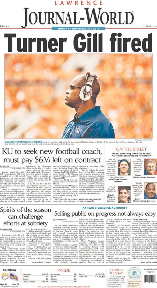
THE LAWRENCE JOURNAL-WORLD
Lawrence, Kan.

To read Matt Tait’s story, go here.

————

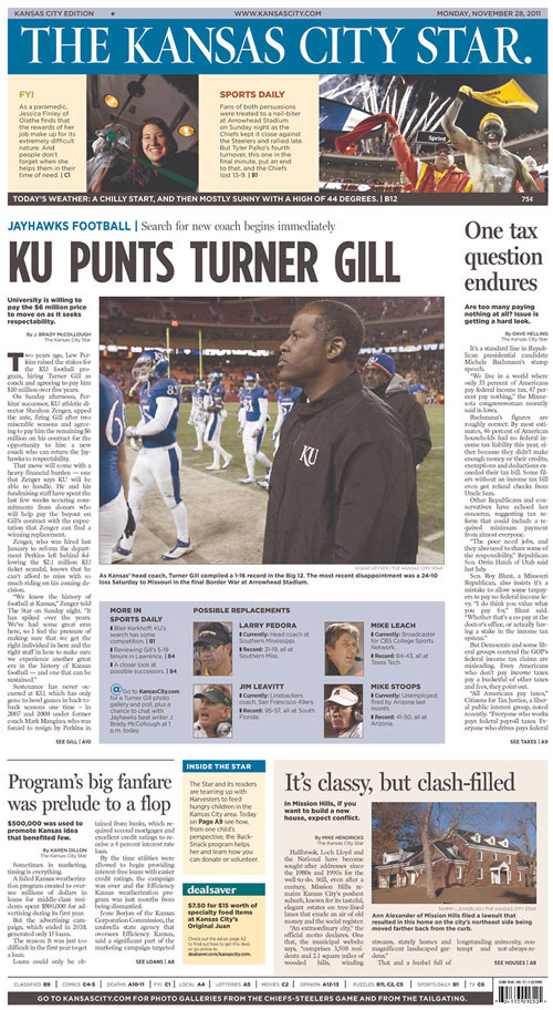
THE KANSAS CITY STAR
Kansas City, Mo.

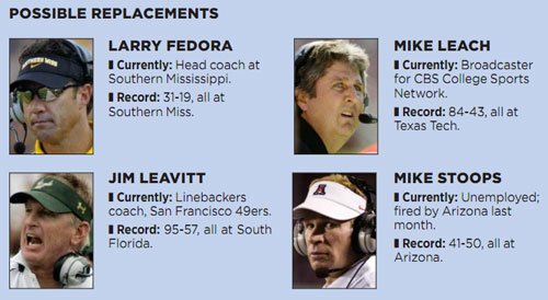
At the bottom of that package is an info box about potential replacements for Turner Gill:

————

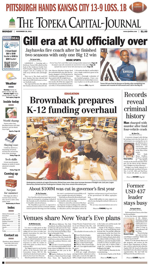
THE TOPEKA CAPITAL-JOURNAL
Topeka, Kan.

The subhed gets at a point that the others didn’t: Gill only had one Big 12 win in two seasons. One. It was against Colorado in 2010.

————

STRIPPED SKYBOXES

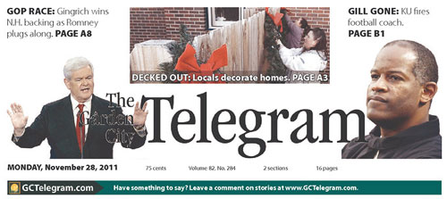
Several Kansas papers stripped the story in skyboxes. Hutchinson gave the all the skybox space to the story, whereas Wichita and Garden City split the space among a few stories.


THE HUTCHINSON NEWS
Hutchinson, Kan.

————

THE WICHITA EAGLE
Wichita, Kan.

————

THE GARDEN CITY TELEGRAM
Garden City, Kan.

————

Overall, I was surprised that it was not a bigger story, though this was no surprise. This season has been appalling, especially when you consider that these guys were once considered pretty good. For the fans, this can — and should — be good news.

Ya know, if you give a flip about playing Kansas.

RELATED
Coverage of Missouri/Kansas Border War and Mizzou’s SEC move


Coverage of Missouri/Kansas Border War and Mizzou’s SEC move

College Football just finished its annual Rivalry Week, that great week when college sports fans most resemble WWF fans in their rabid hatred for the other guy, whomever the other guy might be.

For Missouri and Kansas fans, this rivalry goes way back and runs deep. The University of Missouri first played the University of Kansas in 1891, making it the second oldest rivalry in college football, and the oldest west of the Mississippi River.

The Associated Press wrote a few weeks ago:

The rancor is understandable. The rivalry predates college sports to a time when pro-slavery forces in Missouri battled free-state Kansans 150 years ago. Missouri fans have been known to invoke William Quantrill, a Confederate guerrilla leader whose Civil War assault on Lawrence in 1863 killed nearly 200 civilians and burned down most of the town. The series was officially known as the Border War before it was changed to Border Showdown several years ago when the country was fighting in two wars.

The Quantrill thing is serious. There are T-shirts featuring depictions of that massacre:

Courtesy of CollegeFootballResource.com

So, you see why the word “rancor” was aptly used in the AP article, right?

This year’s game, which was the 120th meeting of the two teams, took on even more importance after the University of Missouri announced it was leaving the Big 12 to join the SEC, effective July of 2012. Coaches and officials at the University of Kansas have said Kansas will not play Missouri out of conference. KU basketball coach Bill Self even said, “The majority of Kansas fans don’t give a flip about playing Missouri.”

So, I was kind of surprised to find minimal references to the Border War game when perusing Newseum in the last week. I wasn’t expecting big centerpieces, as it’s had to contend with Thanksgiving, Black Friday, the Super Committee and other news, but I was expecting at least a skybox here or there.

Today’s front pages didn’t have as much Border War coverage as I would have expected.

————

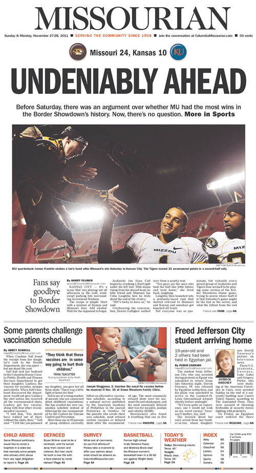
THE COLUMBIA MISSOURIAN
Columbia, Mo.

The deck explains that “UNDENIABLY AHEAD” headline:

Before Saturday, there was an argument over whether MU had the most wins in the Border Showdown’s history. Now, there’s no question.

Which is a polite way of saying what many Mizzou fans have been saying with their middle fingers for years.

————

THE LAWRENCE JOURNAL-WORLD
Lawrence, Kan.

The Jayhawks’ hometown paper played the game up top in bigger-than-normal skybox with the nameplate.

That subhed says it pretty well: “Jayhawks blow early lead in last Big 12 game against Tigers.” As a buddy said at The Boston ‘Zou watch party, “When did Kansas become the ’85 Bears?”

————

THE ST. JOSEPH NEWS-PRESS
St. Joseph, Mo.

The St. Joseph paper doesn’t mention yesterday’s game, but instead has a piece describing fan reaction to Mizzou’s move the SEC.

Most interesting, though, is the info box giving “A little history”:

The University of Missouri was a founding member of the league that would someday become the Big 8 and later the Big 12 Conference. Kansas, Nebraska and Washington University in St. Louis formed the Missouri Valley Intercollegiate Athletic Association in 1907. Teams were added, and teams left in the next few years including the exit of Washington University. A league recognizable as the Big 8 formed in 1958 and the MVIAA officially changed its name the following year. Four Texas schools were added in 1996 to form the Big 12. With Nebraska recently leaving the league and Missouri leaving after this year, the only original member of the Big 12 will be Kansas.

There was a lot in there that I didn’t know.

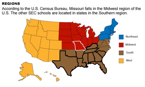
When the announcement was made, one of the Columbia papers covered the hell out of it, especially in graphics…

————

THE COLUMBIA MISSOURIAN
Columbia, Mo.

The Missourian had several graphics about the move to the SEC, including some maps by Rachel Rice explaining how Missouri fits into the new conference. She touched upon something many of us have been saying: “But we’re not in the South!”

To see the rest of Rachel’s maps of Missouri’s new role in the SEC, go here. To see how Missouri stacks up academically against the SEC schools, go here.

I’ll be interested to see more coverage once we’re actually playing in the SEC, without Texas.

And without Kansas.

RELATED
How Kansas area newspapers covered Turner Gill’s firing as KU football coach

11 tips for journalists who want their own website

As more journalists are putting their portfolios online and creating their own websites, more of my friends are asking for advice on how to do it. I am in no ways an Obi-Wan at this, having launched my website only last year, but in the 17ish months I’ve had this site, I’ve gotten some good advice. And I’ve figured out that some things work better than others. I can’t say I can help you with your “brand”, but I can help you with your site.

1. You don’t have to limit yourself to 3 to 5 clips
You can include the link in your cover letter, explaining that you’ve attached some of your best clips but that more are available at your website. Thus, if someone’s coming to your website, he or she wants to see more of your work. You can show the breadth and diversity of your work in a way that 3 to 5 clips won’t always do. It might even help to break them up into categories. Mine are divided by infographics, illustrations, interactives and miscellaneous. Reporters might want to break them up into categories, whether it be enterprise and non-enterprise, types of beat, etc.

2. Include background stories about your clips
A friend of mine said he included a “clip guide” with his clips when applying to a major newspaper. It included information you couldn’t tell just by looking at the clip: the brainstorming behind the concept, the time frame, the deadlines, etc. He was told that the clip guide was very helpful, as it gave insight into his working process.

At SND STL, speaker Jen Lee Reeves said, “We all do a lot of really good work, but we don’t talk about it. But we should.”

3. Optimize your copy
I’ve written about this before, but it bears repeating. If you write your text in a way that’s friendly to search engine, you stand a better chance of getting picked up in search results. As my SEO-minded friend explained on the blog last time:

The basic principle is super straightforward: if you have a specific phrase that appears prominently and multiple times in the copy on a page of your site, your site is more likely to come up in the search results for that specific phrase. For instance, ‘info graphics artist,’ ‘info graphics designer,’ ‘Jacksonville illustrator’ and ‘news graphic design’ may all be appropriate for your list. More generic phrases like ‘info graphics artist’ will put you up against more competition, and while they may improve your ranking for those phrases, they may never get you close to the top of the list. As you get more specific, ‘Jacksonville illustrator,’ for example, you’ll be up against fewer sites and can make it closer to the top of the list.

It might seem challenging, but a web producer friend of mine said, “If you’re writing the who, what, when, where, why and how of the story, then you’ll have the important search terms already in there.”

4. Include the names of everyone who worked on the project
There are a few reasons for this practice. It’s good karma to not snub someone and take credit for work they did. They might remember that you gave them credit, but they will also remember if you don’t give them credit. And, in terms of search engine optimization, if someone’s searching for that person’s name, your site can appear in the results. I’ve gotten page views because people searched for co-workers. Florida Times-Union reporter Jeff Brumley’s name nets me a lot of page views.

5. Link to other people’s sites and blogs
Again, it’s good karma, but it’s also good SEO. The search engines look not only at your words, but who links to you and to whom you link. Look at the column to the right of this text. There are some good folks in there.

6. Start a blog!
Again, I’ve written about this before, but it bears repeating. Chances are you won’t be adding new content to your portfolio every day or even every week. Writing a blog helps you generate more content that can appear in search engines, even if you’re just writing once a week or so. Write about trends in the industry or use the blog to write longer pieces about how one of your clips came to be. Ever read this guy’s blog? Of course you have. Charles Apple’s blog has become a portfolio piece in and of itself. Not just for Charles Apple himself, but for all the people he’s written about over the years.

7. Share your blog and portfolio links on every site you can
Use Facebook, Twitter, Digg, Reddit, Google+, StumbleUpon, Pinterest and beyond. You’ll reach some people on one site that you won’t reach on another site. By going to where the different audiences are, you can try to hit as many eyeballs as possible.

8. Use the same avatar everywhere
I have Jen Lee Reeves to thank for this advice. It hadn’t occurred to me, but it makes sense: if I want people to recognize me, I should give them the same thing to recognize everywhere I have a web presence, right?
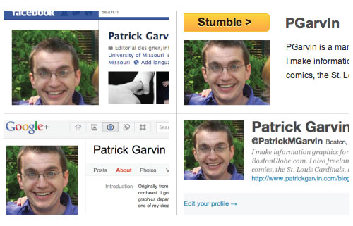
If you’ve got a public account with a social media site and you’re using that account to promote your site and your work, then it behooves you to use one consistent image.

9. Pay attention to metrics and other feedback
Whether you’re using Google Analytics or some other service, see what on your site is getting the most page views. Where are people spending the most time on your site? What topics garner the most views? The most “likes”?

10. Consider your site’s mobile functions… and limitations
Look into whether the sites you use to build your portfolio have mobile-friendly versions. If you code your own site (which I did for the non-blog aspects of my site), then be mindful of how it will look on smaller devices. (Note: coming in 2012, a responsive patrickgarvin.com). If you’re not coding your own site, look into the mobile versions of sites using that same service (WordPress, etc.)

11. Let your site become a portfolio piece in and of itself
I created my website as a home for the clips of which I am most proud, but found I was proud of the site. I worked through kinks with HTML and CSS, and continue to learn more because of what I’ve done with the site. I’ve found that I’ve learned things that I can apply to my job at The Globe. Some of the responsive interactives I’ve worked on in the last few months have been easier because I had played around with code on my personal site.

Any other tips you have for journalists who want their own sites? Comment below.

RELATED
Do we have “brands”? Or just reputations for our work?
Do we have “brands”? Or just reputations for our work?

A question I’ve struggled with recently is whether journalists have “brands.” I’ve heard that term a lot in the last year, at conferences and on websites, and I’m not always sure what to make of it.

I used to cringe when hearing that term. To me, it was a gimmicky word for marketers and advertisers that had no place in the sacred world of journalism. I, and other journalists like me, drew a distinction: Disney, Wal-Mart and Fox have brands, but we were just people. We were people who worked hard and wanted to be known for doing our particular jobs well, but we were just people.

But Joe Grimm, the guy who became known for the Jobs Page and “Ask The Recruiter,” changed the way I viewed the word “brand.” A few months ago at SND STL, he lectured a session called, “Building Your Digital Brand.” His overall message that was that your “brand,” if we call it that, is what you’re known for, and not some image that you manufacture.

If I and other journalists seem sensitive about the term, it’s because we’ve felt under scrutiny for wanting to promote our work. A few months ago, Gene Weingarten of The Washington Post wrote a column about journalists and brands.

Weingarten wrote the column as a letter to a reader named Leslie, who chose Weingarten as the subject of her journalism school graduate thesis. Weingarten writes:

The best way to build a brand is to take a three-foot length of malleable iron and get one end red-hot. Then, apply it vigorously to the buttocks of the instructor who gave you this question. You want a nice, meaty sizzle.
These are financially troubled times for our profession, Leslie — times that test our character — and it is disheartening to learn that journalism schools are responding to this challenge by urging their students to market themselves like Cheez Doodles.

And later, when talking about modern journalists…

Now, the first goal seems to be self-promotion — the fame part, the “brand.” That’s because we know that, in this frenetic fight for eyeballs at all costs, the attribute that is most rewarded is screeching ubiquity, not talent. It is why Snooki — who is quite possibly literally a moron — has a best-selling book. It is why the media superstars of today are no longer people such as Bob Woodward, who break big stories, but people like Bill O’Reilly, who yell about them.

Yikes. That column made me never want to use the word ever again. But Weingarten’s missive also kind of confused me, because I didn’t think it was bad for journalists to share their work. It gets shared in thousands of newspapers a day, so why is it so bad to group it together in one spot on the Internet? When I need ideas and inspiration, I love looking at other journalists’ portfolios. To me, having your work in one spot to share with other journalists (and potential future employers) was a good thing. Certainly not worthy of the hot poker.

Maybe it’s the word “brand” that bothered him. Because it certainly bothered me. But if Joe Grimm and other journalists are just using the word to represent your skills and work for which you’re known, then is there less fuss? Grimm even pointed out that Weingarten himself has made a name or “brand” (gasp!) for himself and that’s why he’s so valuable to The Washington Post. When you read Weingarten, you know what you’re getting and you probably read it (or don’t) because you know what you’re getting.

And it’s occurred to me that’s been true about several journalists I’ve admired over the years:

  • Mike Royko
  • Lewis Grizzard
  • Brian McGrory
  • Bill McClellan

I like all those guys, but not because of the mystique behind the name, but because I like the work they do.

Which was exactly Joe Grimm’s point:
“You don’t try to brand yourself. The thing that does it is the work. And it has to be real and authentic.”

Think of it this way. Let’s say you’re looking for a graphics person who can also illustrate. You’ll start listing the names whom you know can do what you want, and then you start comparing those people’s portfolios to narrow it down. Then, you’re no longer talking about names, but rather the work and skills that defines those names.

Knowing what you’re good at doing is important as news organizations struggle to stay afloat and rethink their strategies. Grimm says:

“It’s not enough to be good. You have to be good in a remarkable way…
…You need to be good, and you need to be good in a remarkable way, and it has to be a valuable way.”

And why does Grimm suggest this? So that you can do more good work. When I think of it that way, and don’t use the b-word at all, I think I get it.

RELATED
11 tips for journalists who want their own website

4 reasons why Adobe Flash was not a waste of our time

Last week, Adobe Systems announced it would stop making Flash technology for mobile devices and would instead focus on HTML5.

Flash’s end has been predicted for the last few years now, as it is not supported on the iPhone or the iPad. Flash runs on other mobile devices, but Apple products are the Marcia Brady of their kind. If Apple rejects you, you’re kinda sorta screwed.

4 reasons why Adobe Flash was not a waste of our time

For many graphic artists who joined newsrooms before the big push for “interactive graphics,” Flash was the first program we used to make web graphics with rollovers. We struggled with the differences between frames and keyframes. We learned that changing a movie clip changed every instance of the movie clip. We cheered when we figured those things out, and then were challenged when we transitioned from ActionScript 2.0 to 3.0.

Don’t take that as a complaint. Journalists pride themselves on being problem-solvers whose job is learning new things. With interactive graphics, there was (and still is) always something to learn. Flash, to me, embodies how a lot of people in newsrooms feel: no matter how fast you try to catch up, there’s always something newer to learn.

Earlier this year, I got to attend SND STL. While there, I met a lot of graphic artists who felt frustrated by Flash’s imminent obsolescence. One guy put it best: “I feel like I spent the last three years trying to learn this program, and now that I’m somewhat proficient, it’s useless. I feel like I wasted my time.”

But I don’t think he wasted his time. Here are a few reasons why:

  1. It was a decent gateway for people who had never coded before. Flash allowed you to create things the way you were used to creating them in Illustrator. Using ActionScript, you could make those objects do things. ActionScript won’t work in HTML or JavaScript, but the general concept is the same: you have code that dictates what the package looks like and how the user will interact with it. ActionScript and JavaScript are not the same but they have similar structures. You can’t waltz from one into the other, per se, but knowing one could help you grasp some of the basic concepts.
  2. It forced some people to learn HTML and CSS. When you finished your Flash file, you had to export it as a SWF. To put that on a web page, you still needed to write code that said, “Hey, show this Flash file.” If you had never used HTML before, having to embed your Flash movies might have been your introduction to basic CSS and HTML.
  3. You proved you could adapt. Remember when we all had to switch from FreeHand to Illustrator? Or ActionScript 2.0 to 3.0? There were quirks and growing pains, and you might have complained that you shouldn’t have to learn this stuff. But you did it. So what if Flash is no longer used by many organizations. The take-away is that you have proven that you are willing to invest time to learn whatever the new technologies are. Spin it that way, and your Flash knowledge makes you look like a hard worker who can try new things, rather than some dinosaur.
  4. Understanding the philosophy behind what makes a good interactive graphic is just as important as knowing the specific technology. Page designers who made good pages in Quark figured out how to make good pages in InDesign. The fundamentals of page design didn’t change when we switched from Quark to InDesign. The fundamentals of good information graphics didn’t change when FreeHand was replaced in newsrooms by Illustrator.

The Nieman Journalism Lab had a good piece about how Adobe’s abandonment of Flash will affect the news organizations who used it. If you haven’t seen it, please do.

And then start on your HTML5 tutorials. There are interactive graphics to be made.