How to get a hand-drawn look in your infographics

Several years ago, a colleague taught me a trick that gives you the appearance of hand-drawn detail in infographics: you take your vector graphic, draw some shadows and then touch it up in Photoshop. It’s a trick that gives your work a sense of elegance, even if you don’t consider yourself artistic. And it’s a trick that I used for an information graphic that ran in this Sunday’s Boston Globe as part of the “Living Longer, Living Better” section.

Start with a basic vector version of your image and print it at a larger scale than you expect it to run in print. Some say to print it at 125 percent of the final size, and others say 175 percent. The point is, print it at a size larger than it actually is. Assistant graphics editor Javier Zarracina said that 175 percent is probably the maximum size, as you don’t want it to have to shrink it so much that the pencil details blend together into a dark blur.

Next, use a pencil to add shadows and depth to the image. The pencil work doesn’t have to be too clean or detailed, because its imperfections will be minimized in the later version. Javier said that it helps to not be as careful as you would be with a normal drawing.

Here’s my initial drawing of a knee replacement:
Patrick Garvin and Boston Globe infographic using hand-drawn images
Hip replacement:
Patrick Garvin and Boston Globe infographic using hand-drawn images
Once you’ve finished adding the pencil, scan the image. Scale it to the size it will be when printed. The scratchy pencil work, when scaled down, looks a lot more detailed and precise than it did on paper. In Photoshop, adjust the contrast and shadows if needed.

In Illustrator or Photoshop, add the color. I usually add a slight Gaussian blur to give it that imperfect hand-painted look. It helps if the color is not uniformly distributed but instead darker or lighter in some spots. For this knee and hip replacements graphic, I used some dark blue at a light opacity to strengthen the shadows and add shadows in spots I had missed. In the hopes of increasing the sense of contrast, I added white in areas that seemed too dark. I got those suggestions from Javier, which I think helped.


Patrick Garvin and Boston Globe infographic using hand-drawn images


Patrick Garvin and Boston Globe infographic using hand-drawn images


Lastly, replace the vector placeholders in your infographic with the colored images. And voila! You have a hand-drawn graphic!


Patrick Garvin and Boston Globe infographic using hand-drawn images


I like this style for medical graphics and diagrams of the body. Even when I don’t use a hand-drawn look, I’m still a fan of creating an image at a larger size than you intend to run it in order to condense the detail. The results are subtle, but it gives the effect of shadows.

A few things really help when working on a project like this:

  • If you can have most (or all) of the text edited before drawing the images, it saves you from having to move stuff around later. Furthermore…
  • Make sure you, the reporter and editor(s) are all on the same page in terms of how many steps you want to include.
  • If you’re sending the graphic to a source to double-check it for accuracy, you might find that he or she wants you to add or remove steps. It’s easier to make those changes if you haven’t yet scanned the image yet.
To see the version of the graphic that ran on Boston.com, go here.
To read Rob Weisman’s story about knee and hip replacements on Boston.com, go here.
To see the entire “Living Longer, Living Better” section on Boston.com, go here.


To see the version of the graphic that ran on BostonGlobe.com, go here.
To read Rob Weisman’s story about knee and hip replacements on BostonGlobe.com, go here.
To see the entire “Living Longer, Living Better” section on BostonGlobe.com, go here.

Coverage of the final Border War basketball game between Missouri and Kansas

Yesterday was a historic day for fans of Missouri and Kansas, as the two universities’ men’s basketball teams faced off in what is ostensibly the last of their meetups in the historic Border War rivalry. Mizzou is leaving the Big 12 Conference and will play with the SEC next season. Coaches and officials at the University of Kansas have said Kansas will not play Missouri out of conference. KU basketball coach Bill Self even said, “The majority of Kansas fans don’t give a flip about playing Missouri.”

When the teams played their last football game against each other in November, Mizzou won the game and the distinction of winning most of the football games between the two teams.


————

THE LAWRENCE JOURNAL-WORLD
Lawrence, Kan.

The University of Kansas’ hometown paper stripped a photo of victorious fans celebrating the “grand finale” of the “epic border battle.” Not that these fans “give a flip.”

————

THE HUTCHINSON NEWS
Hutchinson, Kan.

————

THE TOPEKA CAPITAL-JOURNAL
Topeka, Kan.

Here’s a close-up of that photo:

So, Bill Self, when you say that Kansas fans “don’t give a flip” about playing Mizzou, what fans are you talking about? These guys seem to give pretty much of a flip.

As they should. Their team was behind and then Mizzou blew a 19-point lead. That’s flip-worthy.

————

THE KANSAS CITY STAR
Kansas City, Mo.

This was pretty fitting play for the Kansas City Star, the biggest daily newspaper between Lawrence and Columbia.

It pains me to see that photo of smiling Jayhawks celebrating. But that’s a great photo, showing a majority of beakers… giving a flip.

————

THE COLUMBIA MISSOURIAN
Columbia, Mo.

What a heartbreaking photo by Andrew Mitchell of The Missourian, showing Missouri guard Michael Dixon on the court after the game. With the Jayhawk mascot in the background, even.

————

THE COLUMBIA DAILY TRIBUNE
Columbia, Mo.

The other daily paper in Columbia picked a slightly less heartbreaking photo, though the disappointment is still apparent.

————

THE ST. JOSEPH NEWS-PRESS
St. Joseph, Mo.

The News-Press does a good job picking above-the-nameplate photos. They used a variation of the Dixon scene. This photo shows more of the Jayhawk mascot than the Missourian photo, but it makes sense: St. Joe is a lot closer to Lawrence than it is to Columbia, so News-Press readers aren’t necessarily reading this outcome as heartbreak.

————

As a Missouri native and Mizzou alum, I can’t overstate how big this rivalry is. Games against KU were as important to Mizzou sports as the “Battlestar Galactica” episodes when you found out the identity of another Cylon. To Mizzou fans, Kansas was the rival among rivals. Kansas is the Cavil among the other Cylons. If the Big 12 were “The X-Files,” Kansas was Cancer Man among the Syndicate, foiling Mizzou’s Mulder and Scully. Watching Mizzou beat KU was like watching the trailer scene in “Kill Bill” when Darryl Hannah gets what she has coming.

I could come up with dozens more pop culture references, but you get the point: This was a big deal, about which we gave a huge flip.

As you can see, I’m pretty hacked off about that Bill Self comment. A friend of mine who used to cover the rivalry for a radio station put it pretty aptly: “He can say that, but I sure don’t ever see Kansas fans making ‘Muck Febraska’ T-shirts.”

Touche.

Jessie-Lynne Kerr Day, a year later

The Jacksonville Association of Fire Fighters have posted a photo on Facebook that’s being heavily re-shared:

It was year ago today that Jacksonville Mayor John Peyton declared Feb. 22 as Jessie-Lynne Kerr Day, honoring the reporter who worked at the Florida Times-Union for 47 years. Peyton’s declaration was part of a surprise event at the Times-Union to honor Jessie-Lynne’s career. The City Council designated a section of Riverside Avenue as Jessie-Lynne Kerr Parkway, stretching from the Times-Union to Forest Street.

Jessie-Lynne Kerr with John Peyton. Photo by Don Burk.

Two months later, on April 28, Jessie-Lynne died of complications from lung cancer. It was two days after her 73rd birthday, or as she would have said, two days into her 74th year.

Jessie-Lynne was a character that fewer newsrooms have now: that curmudgeonly institution of knowledge who had been at the paper longer than many of her colleagues have been alive. She called herself by two nicknames: “Mama Kerr” and “tough old broad.” Depending on the circumstances of your meeting, she could come across as either, or both.

If someone mispronounced Duval County or added more than one L to Philips Highway, we would hear about it. She kept a dictionary on the shelf above her desk, and it came out whenever the word “Caribbean” was used. She’d read the guide on how to say it correctly, though I think she’d read it enough that she had it memorized. But the dictionary gave her authority and proved her point.

But ultimately, she was Mama Kerr, bringing in cookies for birthdays, serving dinner at her son’s fire station, leading newsroom tours. And when the chips were down, she was there.

She was a face of the Times-Union, having been there since March 9, 1964. It was one of her proudest anniversaries.

From a Jacksonville standpoint, she did effect some change. Her story saved the Treaty Oak, effectively leading to the establishment of Treaty Oak Park. She convinced editors to cover a parade for Olympic gold medalist Bob Hayes, which she thought was the first time an African-American appeared on the front page of the Times-Union without committing a crime.

In the later years, she chronicled her cancer, and in doing so, talked about her alcoholism, her divorce and the suicide of her oldest son. She received several letters throughout her cancer treatment, asking when she’d publish her next update in the paper. Even people who didn’t subscribe to the paper would ask me how she was doing.

For the Times-Union newsroom, Jessie-Lynne was a needed icon because she was a fighter. We saw friends and colleagues take buyouts, or worse, get laid off. We saw even larger cuts at other papers, and many of us feared our journalism careers were going to end prematurely. We had thrown ourselves far from home and our biological families, and so we had to rely on each other.

I spent four and a half years of my formative 20s at the Times-Union. In addition to the “what does it all mean” phase of the mid-to-late 20s, I lost loved ones, experienced family health scares and other big life experiences that tend to scare the shit out of you the first time you experience them. Having my friends at The Times-Union to support me meant the world to me, and while I didn’t ever see Jessie-Lynne outside of work, she was still a part of that fabric.

I needed that “tough old broad.” I needed her to give me a hug at times, and to tell me to suck it up at other times. I needed her cookies, and yes, I needed her corrections on pronunciations.

Just don’t tell her I said so.

Florida Times-Union piece brings change — before it runs

A Florida Times-Union investigation of Jacksonville Transportation Authority bus drivers led to three employees losing their jobs and four bus drivers being suspended. Three of those drivers have been reinstated, though they could still face some punishment.

Newspaper investigations into public agencies result in firings and changes, but in this case, the moves happened in the week before the piece was even published.

Transportation reporter Larry Hannan wrote in Sunday’s piece:

JTA Executive Director Michael Blaylock said he was unaware of the background problems until the Times-Union investigation began. He promised major changes.

“I have to accept full responsibility for this,” Blaylock said. “And the [JTA] board expects me to fix it.”

What there is to fix: The Times-Union investigation found there were JTA drivers who were cited for driving with suspended licenses while continuing to drive buses. Additionally, 258 of 330 drivers had a total of 1,276 criminal and driving violations, including domestic battery, child abuse, driving without a valid license and writing bad checks.

The newspaper’s investigation began after a passenger was run over and killed downtown by a JTA bus in October.

Here’s how the story was played in this past Sunday’s Times-Union. Click for a larger view.


Larry Hannan and Florida Times-Union investigation of Jacksonville Transportation Authority bus drivers


On the inside:


Larry Hannan and Florida Times-Union investigation of Jacksonville Transportation Authority bus drivers

The main Jedi behind this investigation is Larry Hannan, the Florida Times-Union’s transportation reporter. He previously worked at News-Herald in Ohio and the Naples Daily News in Florida.

On Tim Wakefield, oldest active player in Red Sox history

On Friday, Boston Red Sox pitcher Tim Wakefield announced he’s retiring after 19 seasons in the major leagues, 17 of which were with the Red Sox.

Wakefield got his 200th career win this past season. Of those 200 wins, 186 were with the Red Sox. Sports Jedi Luke Knox put together this chart showing Wakefield’s wins and how he stacks up with other Sox players.

Boston Red Sox graphic about Tim Wakefield

Indeed, among Red Sox pitchers, he’s high on many leader lists, right up there with Cy Young and Roger Clemens.

There’s another distinction that Wakefield earned in the 2011 season: he became the oldest active player in the history of the Boston Red Sox, including the time when the team was called the Boston Americans in the early 1900s. On Tuesday, May 10, 2011, Tim Wakefield was 44 years, 281 days old, a day older than Deacon McGuire was when he played final game for the team in 1908.

It seems like a nitpicky distinction, but it’s one I will remember, because it was the topic of one of my first enterprise graphics at The Boston Globe. Click for a larger view.

Boston Red Sox graphic about Tim Wakefield

When I first got to the Globe in November 2010, I knew I wanted to learn more Flash. And I knew I wanted a project about the Red Sox. And I know that for both, the man to talk to was Daigo Fujiwara, who knew Flash and Red Sox baseball very well. He has his own baseball sites and even hosts a Red Sox podcast.

In talking with him, I mentioned Jamie Moyer, whom I had just seen mentioned in an article as being the oldest player in major league baseball in the 2010 season. A few years behind him in age was Boston Red Sox pitcher Tim Wakefield. I went home and did some research on Baseball-Reference.com, and found that there had been other Sox players who played at the age of 44. But a comparison of birthdays showed that none of them had been as far into 44 as Tim Wakefield. Some time into the upcoming 2011 season, Tim Wakefield would become the oldest Red Sox player in the history of the team.

I told my boss that this might be a fun project to work on in my down time at work when I didn’t have any other pressing projects. That is, if he thought people would be interested. “Almost anything Sox-related gots lets of traction in this town. People will definitely be interested.”

So, using Baseball-Reference.com, I created a spreadsheet. I noted the youngest and oldest player of each season, dating back to the days when the team was The Americans. Additionally, Baseball-Reference determines the average age of every player on the team, so I included that as well. It was a tedious task, going through each page for each season, looking through their rosters. But a pretty cool data table was shaping up.

When finished, I plugged the data into Illustrator’s graph tool, showing the youngest, oldest and average ages per season. The nut graph was that there were no noticeable trends. Carl Yastrzemski played for a bit when he was 44, but was a younger 44.

Throughout the winter of 2011, when I had no more dailies or short-term projects on my plate, I would turn to this project, and how we would present it online. Using the Actionscript from projects I had worked on with Daigo, I created a template for what the Flash version would be. I turned the Excel spreadsheet into an XML file that fed into the Flash file. While the print version had been a static version of the chart, the Flash version would allow the user to roll over each year and see the oldest and youngest players. My boss, David Schutz, suggested I include photos of each player. The aforementioned Luke Knox directed me to some old Red Sox press guides, which is where I found the bulk of the photos.

So, by the end of April, this thing had come together in bits and pieces over a period of several months. On Tuesday, May 10, the day that Wakefield became the oldest active Red Sox player, we ran the graphic in the sports section of The Boston Globe, and this interactive went live on Boston.com.

To this day, it’s one of my favorite things I have ever done, especially at The Globe. Of course, by the time Tim Wakefield was the age I am now, he had already won 56 games in the majors.

Not bad. Indeed, not bad.

Florida Times-Union, Jacksonville.com Valentine’s project

I’m always interested to see how the online version of a project ties in with the print version. Particularly when the online version includes more than the print version, or includes things that you couldn’t put in the paper (like, video and audio).

My friends and former colleagues at The Florida Times-Union recently launched a series online and in print, called (extra)ordinary Love. The description from the main page:

Love is an emotion that propels, from the moment you know you’ve found it through the trials you endure to sustain it. Whether romantic, platonic or familial, there is extraordinary power in ordinary love.

Three stories ran in the paper, starting this past Sunday with a story about Jaguars lineman Terrance “Pot Roast” Knighton:

I never knew his nickname was “Pot Roast,” but now I want that moniker, too. Here’s the page from Monday:

Tuesday:

I’m told these pages were designed by Jennifer Bradford.

Each day featured promos to the web package, which included three additional stories, with pictures and audio:

In addition to Jennifer Bradford on page design, this project had reporting and videos by Kate Howard and Tracy Jones; photography by Bruce Lipsky, Kelly Jordan and Bob mack; and web design by Derek Hembd, whom I put on par with MacGyver in being able to figure things out.

The design for both print and the web is clean, and the packages have the unifying package sig while being distinct from each other.

I always love being able to show what my friends and former colleagues have been working on in Jacksonville. Good work, friends.

“Aysel’s Arrow”: The challenges of book cover design

Every once in a while, I get to do a book cover for a friend who has a fun book project. Last year, my friend and former colleague Topher Sanders approached me about a women’s literature project he was working on with his friend Elizabeth Román. “Aysel’s Arrow,” which was released today, focuses on a Latina whose new relationship forces her to deal with issues with her family and her past. Get it on Amazon here. To read a Q-and-A with Topher and Elizabeth, go here.

When Topher and I began discussing the project, he had some ideas based on themes in the novel:

  • Aysel is a Latina, so picking imagery familiar to her culture might tie the cover to the story. Mexican Lotería cards have a specific style to them: colorful and yet simple.
  • Anime also plays a huge role in the novel, as it is at an anime event that Aysel meets Courtney, her main love interest. Topher and I mused as if there was a way to involve anime in the cover.
  • But it was this Flickr photo that informed my earliest drafts. Simply called “milk,” this image shows a woman. Is she emerging? Is she drowning? Is she simply just there, neither drowning nor emerging? Elizabth, Topher and I each had our own takes on this woman. “That’s the beauty of art,” Topher said. “Everybody can see their own thing.”

So, with “milk” and anime on my mind, here were my first two versions:

Aysel's Arrow

Aysel's Arrow

I was just sort of experimenting, with some ideas as jumping-off points. I kinda wanted to just throw a bunch of ideas out there, and then see how they land. These seemed like they matched the themes somewhat: the Lotería typefaces, the hint of an Anime character emerging (or hiding?) in the smokey, foggy texture.

But it didn’t really feel complete, so the second version included the ripped texture. This was where I got a little artsy-fartsy: Those ripped edges don’t match up if you try to line them up. There’s a missing piece needed to make them one whole piece. It reflects the literal losses she’s experienced, but also the abstract losses she might not be able to identify.

Or so I thought. Still, I wasn’t sold.

I started thinking of some of my favorite book covers. I thought of Chip Kidd and some other well known book designers, but my mind kept going back to the simple covers for Carl Hiaasen’s novels. With that in mind, I went more toward the Lotería theme, focusing on archery, an important hobby for Aysel.

Aysel's Arrow

Aysel's Arrow

This was pretty simple, and much more straightforward. The texture adds some grittiness, but it’s still pretty plain. You don’t see whether she’s aimed, whether she misses or whether she hits the bull’s eye. You don’t see the arrows, either. You just see the target, sitting there.

It had some influence from the Lotería cards, but the simple, singular illustration in the middle with bright colors was my way of emulating the covers for Carl Hiaasen’s novels.

Additionally, the colors seemed to work well with Aysel’s story. She’s tough, so primary colors seemed more appropriate than pastels or the muted browns I used in the earlier cover. The blurry fog of the earlier cover worked well to show what was beneath the surface, but this straight cover introduces you to the feel of the novel a lot faster, I felt.

I sent Topher and Elizabeth the four versions, and they were receptive to them all. But it was the simple archery-themed one that won them over. We tweaked the text and made some elements a little bigger.

Here’s how the final version turned out:

Aysel's Arrow

One of the things I had begun to miss about illustrating for newspapers was the challenge of finding concepts that match abstract topics. When designing a cover for the weekend arts and entertainment tab, you have to illustrate a variety of things in one defined space. This project scratched that itch, but also gave me a new challenge: matching an emotional tone of a character and writing style.

Additionally, it was fun to collaborate with Topher again, especially on a project so different for both of us.

To read a Q-and-A with Topher and Elizabeth, go here.

To get the book on Amazon, go here.

To check out the Facebook page, go here.

Topher Sanders and Elizabeth Román on “Aysel’s Arrow”

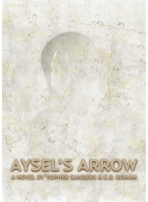
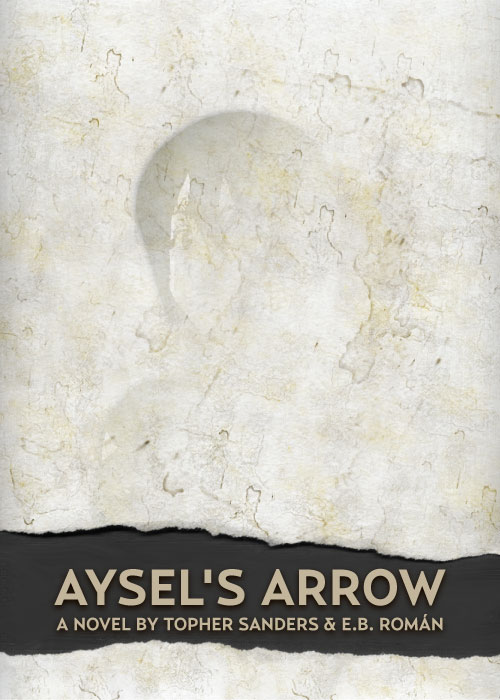
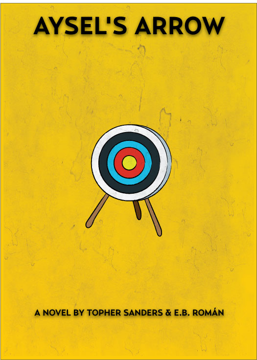
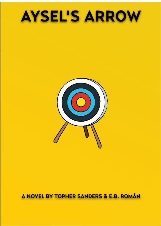
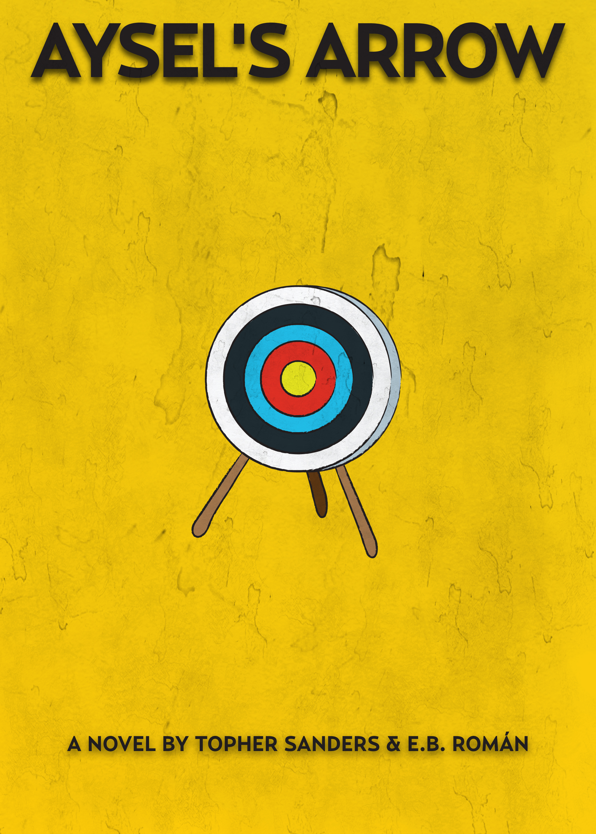
My friend and former colleague Topher Sanders and his friend Elizabeth Román have written a book, “Aysel’s Arrow,” which is released today. The book is women’s literature, and focuses on a Latina whose new relationship forces her to deal with issues with her family and her past. Get it on Amazon here.

Topher asked me to design the book’s cover. To read more about that, go here.

Elizabeth’s work has been published in “Working with Student Writers: Essays on Tutoring and Teaching, Second Edition.” Additionally, she was a reporter with
the New York Times Company. She currently works and lives in Washington, D.C.

Topher is an award-winning reporter whose beat work has been recognized by editor associations in New York and Florida. His freelance work has appeared in Essence, Black Enterprise and Newsweek magazines and Washington Post Company subsidiary TheRoot.com. He is currently a reporter with The Florida Times-Union in Jacksonville, where I had the pleasure of working with him.

I asked Topher and Elizabeth some questions, which they graciously answered.

How did the idea of the book come about?

Topher: We were talking one day about both of us having aspirations to write a book. And we were looking at some of the books that were already on the shelf and saying to each other “we could do that.” With me being black and Elizabeth being Latina, we knew we wanted to write about people of color. But we also didn’t want to write about black and brown folks in the circumstances typically drawn out in books or movies — thugs, down and out, annoyingly successful or magical. Honestly we were just tired of the trite stereotypes, so we wanted a lead character that felt different to us, a protagonist with more texture. So we sought to write something that made us proud in that regard.

Elizabeth: We started by dumping all of the things we liked about people we knew, or had met, or could imagine into a creative pot. We are both big readers – so our next step was to narrow down ideas to ones that we longed to see expressed in popular fiction. Right away emerged a female protagonist who was a tough Latina with strong family ties. Then we built around her a world filled mainly with people of color. It was important that our characters were relate-able, universal, but also reflected an authentic cultural voice. The storyline itself emerged slowly as we tried on different scenarios. What I’m most proud of about this book was that it was an entirely creative process. We started many late-night conversations with, “What if” as we developed each moment and each character out of thin air. A heavy amount of research followed, of course, including trekking through Chicago neighborhoods and learning about archery.

What writers or novels inspire or at least inform the way you wrote the book?

Elizabeth: Michele Serros is my hero. She wrote “How to Be A Chicana Role Model” along with the “Honey Blonde Chicaseres.” She was the first Chicana writer I’d read that wasn’t afraid to be funny. It was also clear she wasn’t trying to be Sandra Cisneros or do the magic-realism thing of Laura Esquivel. Serros spoke to the first or second generation Chicanas who bleached their hair, listened to hip-hop, and ate chicharones during their community college classes. Her work inspired us to write this novel with the same fearlessness, eschewing stereotypical ideas about what a Latina or a black man in the U.S. likes to do, who they love, or how they end up.

Topher: In addition to Michele, for me it’s Junot Diaz. Mr. Diaz is that dude. I am in no way putting “Aysel’s Arrow” in the same ballpark as “The Brief Wondrous Life of Oscar Wao,” but it’s Diaz’s work that totally pushed me to continue developing, smoothing and carving out Aysel’s world, family and struggles. My wife absolutely got tired of me talking about Diaz. His characters are so “neighborhood,” and by that I meaning real and tangible — I know someone like Oscar and his sister and everybody knows Oscar’s mom. But those characters are crafted in a way that propels them out of their usual landscape and pushes the envelope on their experience. We want to be able to do that with our characters. So Aysel is the first of many attempts to extend the experience of characters of color.

How did the idea of co-writing come about, instead of having one writer?

Elizabeth: We were talking about our mutual aspiration to complete a novel and the frustration with being able to get started. Since at the time we were both professional journalists who were used to writing under a deadline, we thought that perhaps by joining forces we could accomplish our goal, together, in a shorter time frame.

Elizabeth Román and Topher Sanders

What were the challenges of having two writers?

Elizabeth: Our schedules was the hardest part of this project. Most of our collaborations occurred during 5 a.m. phone calls before we had to be at work, or late in the evening after returning from long shifts. Even still, we found that our paying gigs, family, and other unforeseen life events, sometimes clashed directly with our best laid plans. There were months when we couldn’t get into sync. Fortunately, however, we never lost the faith at the same time. When one of us was on empty, the other was right there with a full can of gas.

What were the strengths of having two writers?

Topher: Being able to push each other. When one of us got discouraged or distracted, the other would be like “yo, you want to do this or not?” We’re really close, so that helped a lot. I’m not sure two people could do this if they weren’t close and candid with each other. We didn’t worry about offended each other when one person had to critique the other’s writing. Our willingness to hear each out and be flexible were key factors enabling us to finish the novel and get the best out of each other.

Elizabeth: We also both have high standards. Our honesty and directness were huge assets during this process because we didn’t let each other off the hook with the writing. If something was crap, told each other without taking it personally. And we kept revising and revising until we were both satisfied.

What inspired the anime festival where Aysel meets Courtney?

Elizabeth: We are both are sci-fi nerds (though Topher doesn’t admit to being a nerd. He is, though). People are often surprised about that; no one thinks a Latina could be a die-hard “Star Trek” or anime fan. So we started there – then thought we’d add another layer of surprise to their meeting. When we were researching the book in Chicago, there were a lot of ideas we had to scrap because they couldn’t conceivably be true. But we were happy to uncover the Portage Theater. The place is massive – over a thousand seats, a grand lobby, balcony, stage, you name it. Even with a good crowd in there a person (or persons) could go unnoticed when the lights were out.

Throughout all the variations of the cover, what qualities did you find most important when picking the cover to represent this novel?

Topher: We wanted something that captured the intrigue of the book and our lead character’s passion for archery or lack of direction. The different covers you did accomplished all of that, but also gives potential readers that “head-tilt” reaction or curiosity.

Elizabeth: We both loved that you used the Mexican Loteria game as inspiration for the colors, font and illustration. We wanted something simple – yet something that still was able to convey humor and drama. That’s not easy to do.


For more on the cover, go here.

What was the publishing process like?

Topher: It’s tough out there in publishing and we learned that first hand. We went the query route for about eight months and then did some face-to-face meetings at some conferences but ultimately decided we needed to control our own destiny. One of my favorite Kanye West lyrics comes to mind: “Don’t let nobody with the power to sign, ever tell you you ain’t got the power to rhyme.” You can find that testimony with so many talented artists, musicians, athletes and even in your own family. With the help of some awesome industry professionals, we pushed forward with a plan that put us in charge.

Elizabeth: We wanted to get a quality product in front of as many readers as possible, as quickly as possible. For us, that meant hiring a top-notch professional editor and writer, Jennifer Miller – who also has a new novel, “The Year of the Gadfly,” releasing this year. We handled all the little details of the publishing and promoting process. And at this point, we have a lot of confidence that people will feel that they got a good value for $2.99 when they download and enjoy reading our book.

What would you say you’ve learned since beginning “Aysel’s Arrow”?

Topher: I’ve learned so much, but mostly the project helped me to develop the confidence that I can actually tell a story over 80,000 words. That is so empowering, it takes the fear away and makes my time in front of the computer comfortable and relaxing. I’m not just typing away to type, I’m working to a real end and the knowledge of that is something I really needed, because I’d like to write for a living.

Elizabeth: Everything. Really, I was completely naive coming into this project on how to actually do it. There are no shortcuts. It’s a tiresome, tedious, heartbreaking process. But despite the difficulties I am eager to start another project, now, armed with knowledge and empowered by the completion of this first novel. I also feel blessed to be able to share this moment with my best friend.

Topher: Aww. Me too.

To buy the book on Amazon, go here.

To check out the Facebook page, go here.

To learn more about the cover, go here.