
Several years ago, a colleague taught me a trick that gives you the appearance of hand-drawn detail in infographics: you take your vector graphic, draw some shadows and then touch it up in Photoshop. It’s a trick that gives your work a sense of elegance, even if you don’t consider yourself artistic. And it’s a trick that I used for an information graphic that ran in this Sunday’s Boston Globe as part of the “Living Longer, Living Better” section.
Start with a basic vector version of your image and print it at a larger scale than you expect it to run in print. Some say to print it at 125 percent of the final size, and others say 175 percent. The point is, print it at a size larger than it actually is. Assistant graphics editor Javier Zarracina said that 175 percent is probably the maximum size, as you don’t want it to have to shrink it so much that the pencil details blend together into a dark blur.
Next, use a pencil to add shadows and depth to the image. The pencil work doesn’t have to be too clean or detailed, because its imperfections will be minimized in the later version. Javier said that it helps to not be as careful as you would be with a normal drawing.
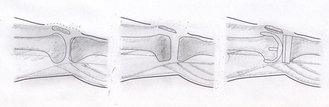
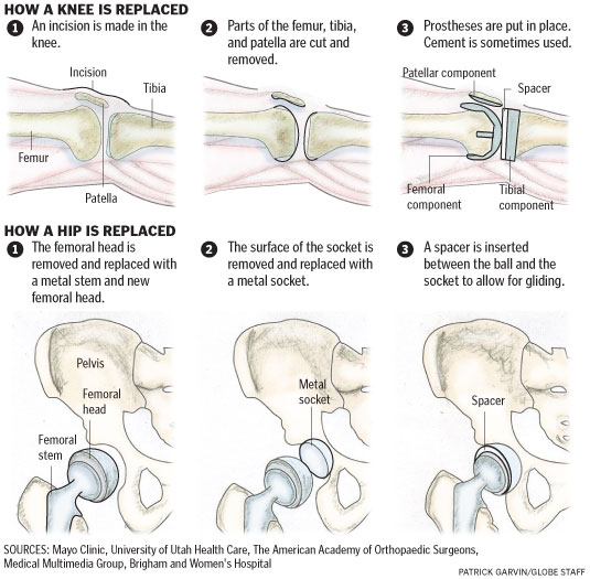
Here’s my initial drawing of a knee replacement:
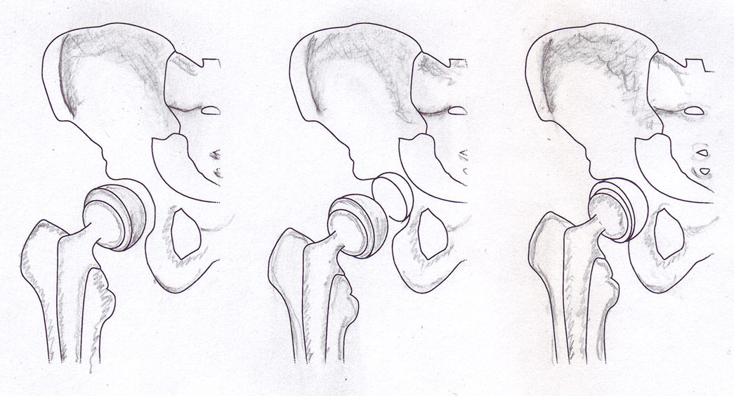
Hip replacement:
Once you’ve finished adding the pencil, scan the image. Scale it to the size it will be when printed. The scratchy pencil work, when scaled down, looks a lot more detailed and precise than it did on paper. In Photoshop, adjust the contrast and shadows if needed.
In Illustrator or Photoshop, add the color. I usually add a slight Gaussian blur to give it that imperfect hand-painted look. It helps if the color is not uniformly distributed but instead darker or lighter in some spots. For this knee and hip replacements graphic, I used some dark blue at a light opacity to strengthen the shadows and add shadows in spots I had missed. In the hopes of increasing the sense of contrast, I added white in areas that seemed too dark. I got those suggestions from Javier, which I think helped.
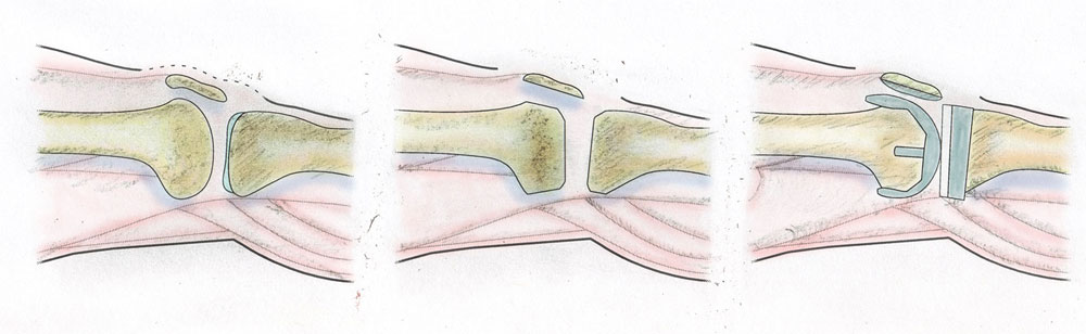
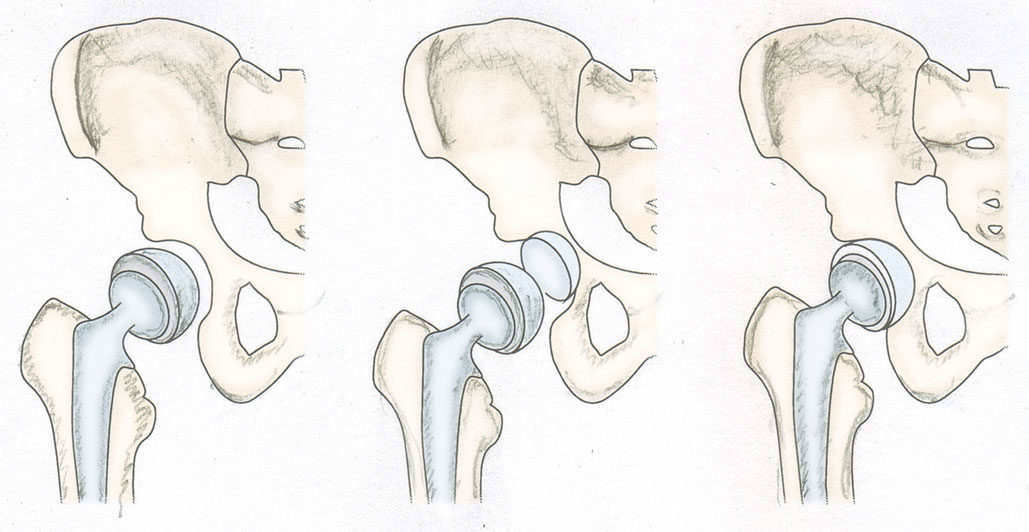
Lastly, replace the vector placeholders in your infographic with the colored images. And voila! You have a hand-drawn graphic!
I like this style for medical graphics and diagrams of the body. Even when I don’t use a hand-drawn look, I’m still a fan of creating an image at a larger size than you intend to run it in order to condense the detail. The results are subtle, but it gives the effect of shadows.
A few things really help when working on a project like this:
- If you can have most (or all) of the text edited before drawing the images, it saves you from having to move stuff around later. Furthermore…
- Make sure you, the reporter and editor(s) are all on the same page in terms of how many steps you want to include.
- If you’re sending the graphic to a source to double-check it for accuracy, you might find that he or she wants you to add or remove steps. It’s easier to make those changes if you haven’t yet scanned the image yet.