This past week, the graphic artists and page designers at the Boston Globe did some great work to explain what happened at the Boston Marathon and during the manhunt. I was out of town for much of the week, so I only worked on a few graphics. The great graphic work from the Globe this past week was a huge effort by colleagues James Abundis, David Butler, Robert S. Davis, Chiqui Esteban, Kevin Golden, graphics director Javier Zarracina and assistant managing editor Dan Zedek.
Here are some of the graphics produced this past week. To see larger versions, click on any images.
——
Graphics director Javier Zarracina put together this map Monday, the day of the bombings, for Tuesday’s paper. This is not pointed due north, but rather due southwest, for perspective.
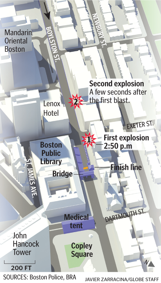
——
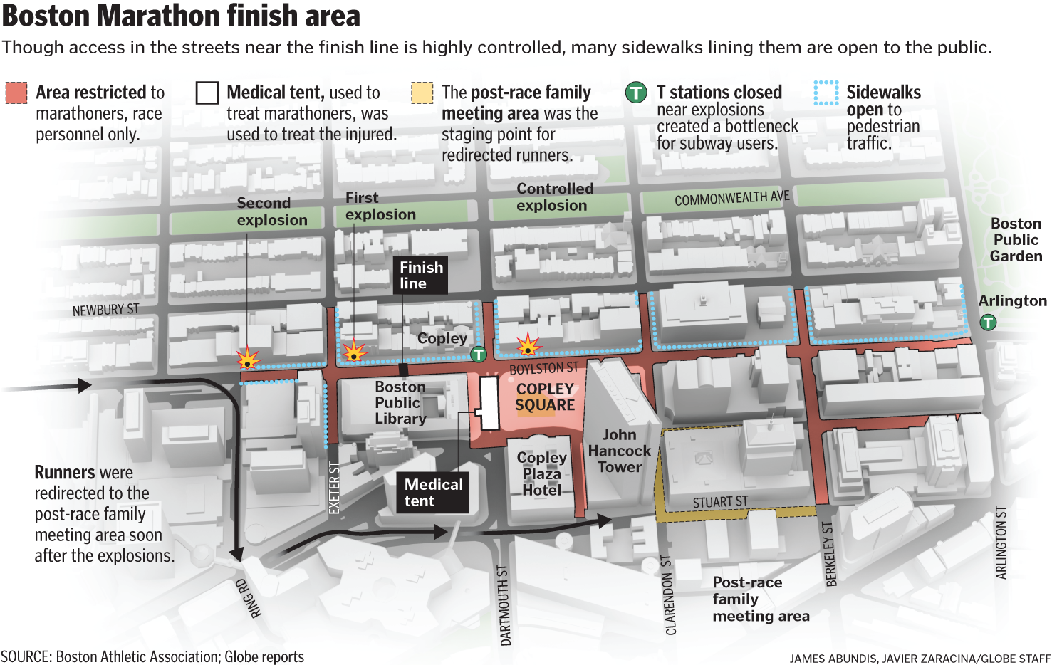
Here’s a slightly zoomed-out view of the finish area, showing a little more detail.
——
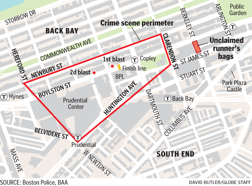
Here’s the area that was treated as a crime scene the days after the blast:
——
For Sunday’s paper, we ran vignettes of people who had been at and near the finish line when the bombs went off. The map shows where they were, and what happened to them after the explosions. This was part of a special “Terror at the Marathon” section designed by Robert S. Davis.
There were several reporters on this, as the gang byline at the bottom shows. It took some coordination to plot who was where, and then to triple-check all of it. David Filipov and Steve Wilmsen served as the main point persons on this, and were key to producing this map.
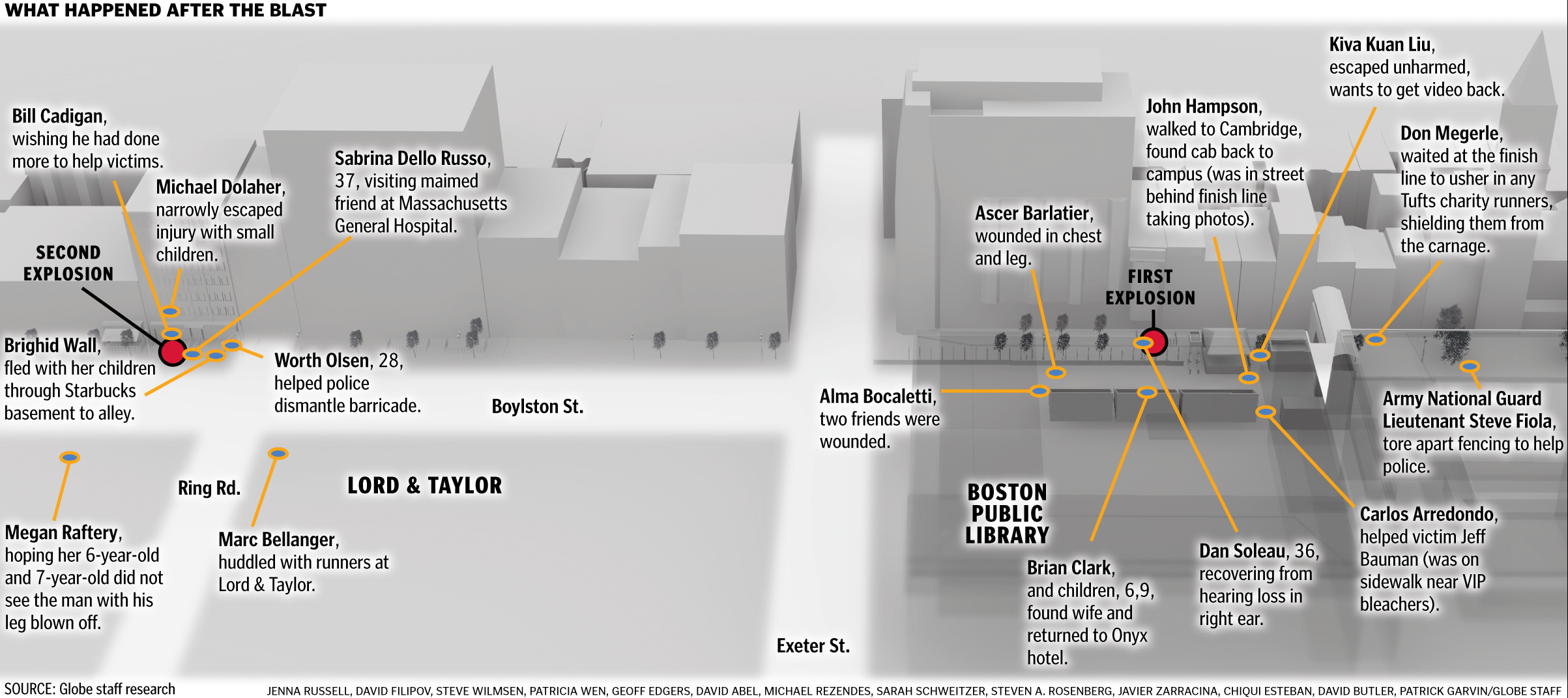
To read the story, click here.
To see Chiqui Esteban’s interactive graphic of this map, click here.
——
For Wednesday’s paper, James Abundis put together this in-depth look inside the medical tent that was turned into a functional triage unit. Click on the image to see more. Lots of detail in this graphic.
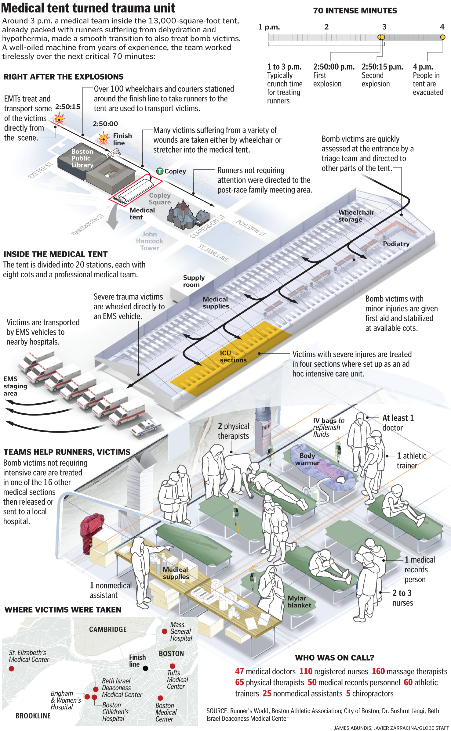
To read the story, click here.
——
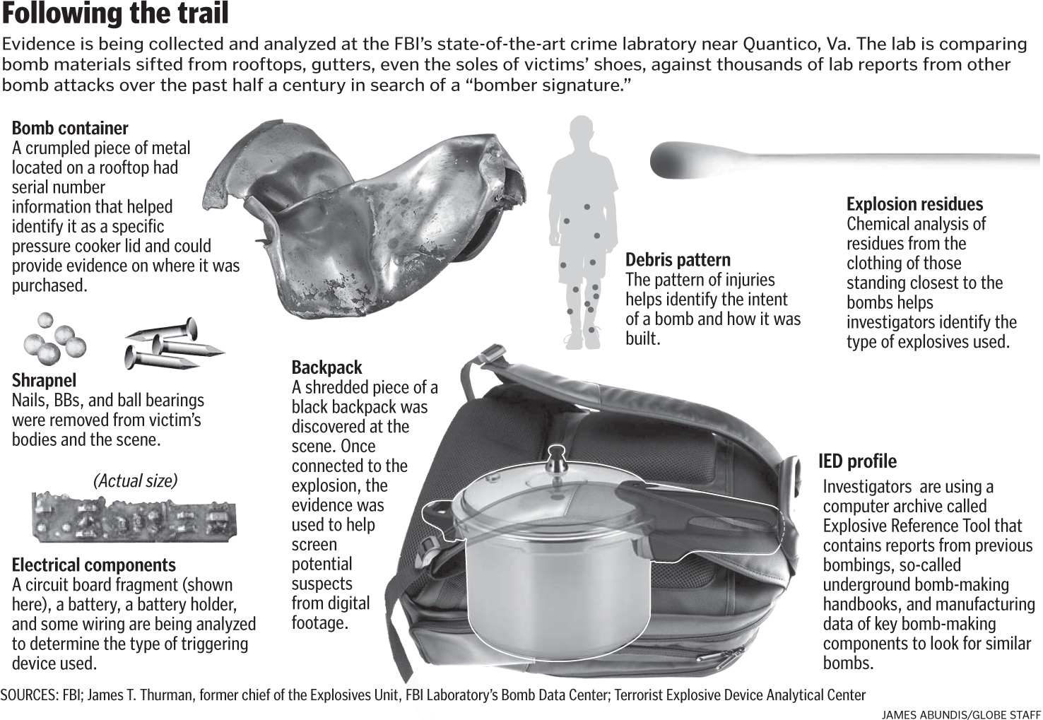
As more detail about the actual bombs emerged, James Abundis put together this graphic.
——
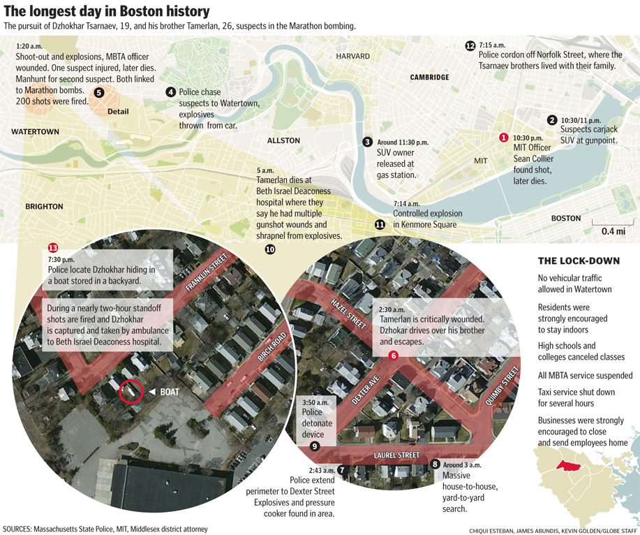
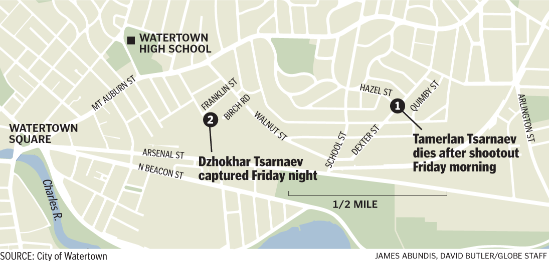
How the manhunt unfolded Friday:
——
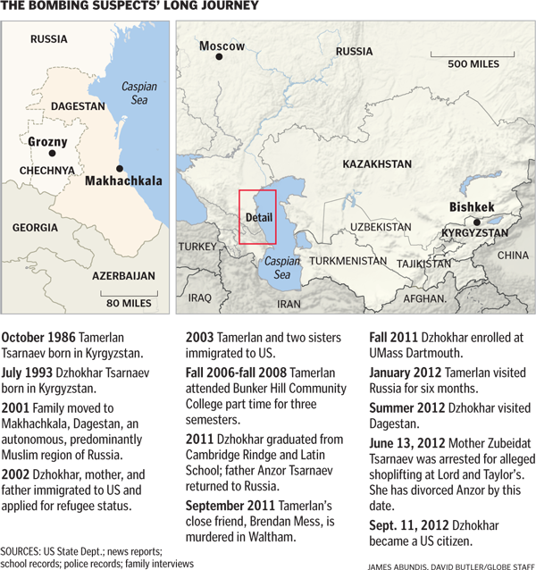
As details emerged about the Tsarnaev brothers, attention turned to their journey from Kyrgyzstan to Cambridge.
Again, it must be said that the great graphic work from the Globe this past week was a huge effort by colleagues James Abundis, David Butler, Robert S. Davis, Chiqui Esteban, Kevin Golden, graphics director Javier Zarracina and assistant managing editor Dan Zedek.