I Can Haz Page Views? You Want A Blog

Social Media Guide posted an interesting link this morning: “34 Reasons To Start A Blog.” It’s a pretty good list, and many of those reasons factored in my decision to start this very blog.

When I created my online portfolio, I asked an SEO-minded friend how to get page views for my site. (“SEO,” for the n00bs and unititiated, being “search engine optimization”). I could pay Google oodles to be one of the sponsored results at the top of the page, but that would not be fun, he warned.

“The owners of those sites paid Google directly for you to see those listings. They maybe didn’t pay too much to get that link high on the page, but if you click on that link, Google may […] them over for more than a dollar just for that click. And if you don’t buy anything on their site or click on one of their sponsor ads or something, you and Google make them look and feel like real assholes… Based on the type of website this is, the types of visitors you’re trying to attract and my assumption that you don’t want to pay through the ass to get your numbers to creep up, free SEO tactics are probably what you’re most interested in.”

And? Those free SEO tactics?

  1. Start a blog. “It doesn’t have to be a strictly graphics blog, but it should mostly be about you and your career and design and whathaveyou. Also things that you think are interesting and cool. You want to do this because search engines reward sites that are updated more frequently, so just a couple short blog posts per week will help. A post could be just a heading, a couple sentences, a link and a picture, and that will go toward boosting SEO. Putting links in blog posts, and really anywhere else on your site, will also help. Search engines like sites with lots of external links.”
  2. Get people to link their site to yours. “It’s up to you how you want to arrange for this to happen and whose sites you’d like to have linked back to yours. Search engines also like sites that have lots of links going TO them, so this gives everyone an incentive to ‘link swap,’ or agree to link to one another’s site in an even exchange.”
  3. Optimize your copy. “The basic principle is super straightforward: if you have a specific phrase that appears prominently and multiple times in the copy on a page of your site, your site is more likely to come up in the search results for that specific phrase. For instance, ‘info graphics artist,’ ‘info graphics designer,’ ‘Jacksonville illustrator’ and ‘news graphic design’ may all be appropriate for your list. More generic phrases like ‘info graphics artist’ will put you up against more competition, and while they may improve your ranking for those phrases, they may never get you close to the top of the list. As you get more specific, ‘Jacksonville illustrator,’ for example, you’ll be up against fewer sites and can make it closer to the top of the list. If you need help coming up with search term ideas based on your basic keywords, use the free Google Adwords Keyword Suggestion Tool.”
  4. Work those phrases into copy on your site in a way that comes across as natural. “It matters where they appear; search engines can tell heading text apart from body text, and they weigh it more heavily. All text that is emphasized in terms of font size and placement on the page is weighted to some degree. For each given page, I would recommend choosing just one or two selected search terms. Try to find a way to work one or both phrases into the title bar at the top of the browser window, and pick one phrase to put in the heading over the body text on that page. Then use one or both phrases about two times each per 300 words of body text, as a general rule of thumb. Be sure to list both terms in the meta tags and site description. Capitalization and punctuation won’t affect the phrases in terms of their effectiveness in optimization, but any other editing will, like inserting additional words within a phrase, changing spelling, etc.”

Another friend who’s much more web savvy than me offers this morsel for journalists wanting to blog:

“It’s one thing to have a nicely designed portfolio site that features your work, but a competitive job a recruiter also wants to see that you are involved in the cutting edge issues of your industry and demonstrating that you have ideas, and that other people care what you think and are commenting on it. In other words, I don’t just want to see your clips. I want to see you thinking critically about other people’s work and leading a conversation with other key players in your industry.”

From that Social Media Guide link, I found another blog-related read: Why Start a Blog and 25 Tips to Make it Work.

Enjoy, and get to blogging.

August 30: In case you missed it…

In case you missed these graphics, interactives and overall awesome goodies in the last few week:

“Star Wars Uncut”

Andrew DeVigal posted something awesome on Twitter this weekend: A scene from “Star Wars” reshot by fans, in which every 15 seconds is shot by a different group of fans. The scene is part of Star Wars Uncut, which includes just about every scene from “A New Hope” shot in segments lasting 15 segments. Some people used toys, others used dogs and others used their kids. And even others used stranger things. Quite enjoyable.

—-

Albert Pujols’ road to 400 home runs [stltoday.com]

Albert Pujols, in his 10th season, has reached the 400 home run milestone by age 30. Only Stan Musial has more as a Cardinal. In this look at Albert’s regular-season career home runs, you can sort the home runs by season, stadium, team and batting conditions. By Erica Smith and Brian Williamson.

—-

Muppets Name Etymology [College Humor]

Not sure if it’s because of GraphJam or I Love Charts, but I’m seeing all sorts of Venn diagrams lately. And this one is one of the best.

Comigraphic: How social media makes your birthday awesome

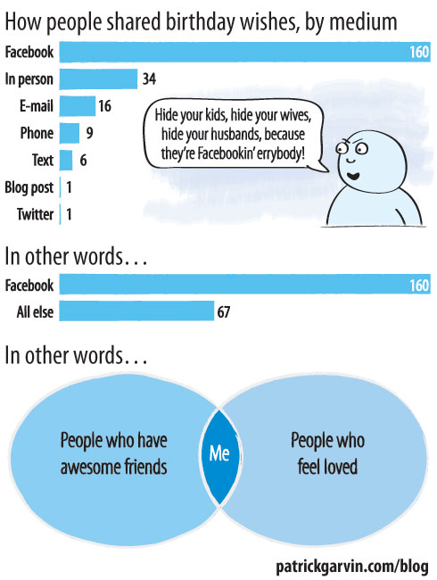
A few weeks ago, one of the newsroom interns tallied the number of people who had wished him a happy birthday, breaking it down by medium. He had gotten phone calls, Tweets and e-mails, but the largest number of well wishes came from Facebook.

With that in mind, I kept a chart on my birthday last week to see if that trend would hold true for me. It did, and probably holds true for you, too. I have some theories as to why this is: Facebook reminds you of upcoming birthdays, and tells you when your friends have written on the walls of mutual friends for their birthdays. Regardless of why, it was much appreciated.

August 22: In case you missed it…

I’ve been on vacation in Boston for the last few days, so I’m sure I’ve missed some goodies the last few days. That being said, here are a few goodies I did NOT miss, nor should you…

In case you missed these graphics and interactives in the last few days:

Support for Same-Sex Marriage, State by State [New York Times]

Graphic showing select states and their residents’ views on same-sex marriage now versus the mid ’90s. Goes along with…

—-

Support for Same-Sex Marriage interactive [New York Times]

This interactive lets you examine each state’s support (or non-support) for same-sex marriage back to 1994. From Week In Review.

—-

Ax Handle Saturday, 1960: A day of defiance in black and white [Florida Times-Union]

Deirdre Conner’s thorough look back at a  day 50 years ago in Jacksonville when black youth, attempting to sit down at a whites-only lunch counter, were accosted by an angry mob wielding ax handles. Graphic artist, colleague and good friend of mine Kyle Bentle worked with Deirdre to recreate Jacksonville’s downtown circa 1960 and show the timeline of events. Kyle’s work is always thorough, and pieces like this reiterate his attention to detail.

—-

Crackdown on Indecency [Detroit Free Press via I Love Charts]

It’s a crime to wear saggy pants in Flint, Mich., so to show you the various warnings and fines you could get, Moses Harris of the Detroit Free Press put together this graphic. In the years I’ve been making graphics, I’ve never been able to draw a buttocks. Not for a graphic explicitly about the buttocks, that is.

—-

Kyle Bentle’s Portfolio/Website [KyleBentle.com]

As I mentioned earlier, Kyle Bentle is a colleague and good friend of mine. He’s been working on his portfolio for a while now, and has recently gone live. It showcases his talent, but my favorite part is…

…this placeholder he had on his site for a while. I was worried it would go away when he launched the site, but THANK GOD it stayed up there. Take a look and enjoy the site.

August 8: In case you missed it…

In case you missed these graphics and interactives in the last few days:

States that allow same-sex marriage vs. States that allow marriage between first cousins [I Love Charts]

Charles Blow tweeted this yesterday. It is, as you might guess from the title, a look at the states allowing same-sex marriage compared to the states allowing marriage between first cousins.

—-

Back to the Future timelines [Sean Mort, via FlowingData]

This chart breaks down the timelines from the “Back To The Future” trilogy. Compared to this, the various “Lost” timelines were totally followable.

—-

The Brett Favre Retirement Curve [Slate]

Dubbed “an interactive visualization of the quarterback’s annual off-season waffling,” this chart is a fever chart of sorts showing his waffling between “comeback,” “not sure” and “retirement.” And, the colors match those of the teams for which he’s played.

—-

Missouri’s sexually transmitted disease rates [stltoday.com]

The topic might not be pretty, but that’s why this chart is all the more important. It allows you to search by county, zip code, year and STD. My home county, St. Louis, has consistently ranked among the nation’s worst for at least two of the diseases, chlamydia and gonorrhea. This was put together by Brian Williamson, who consistently does great graphics databases. See this, like, now.

—-

Got some stuff we missed? Send ’em our way.