Hot enough to fry an egg? Bake cookies? News outlets try

The heat wave of the past few days has led many in news organizations to ponder just how hot it has been. Hot enough to fry an egg? Hot enough to bake cookies?

They’ve tried these experiments, with varying results.

———

STLtoday.com/St. Louis Post-Dispatch

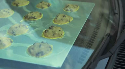
Erica Smith shared a video by Huy Mach in which they tried to bake cookies in Erica’s car.

To watch the fun video and learn whether they were edible, go here. Music by Kevin McLeod.

———

indystar.com/Indianapolis Star

Online Editor Amy Bartner and Columnist Erika Smith went outside to fry an egg. The first surface they tried?

The hood of a car. They ended up testing other surfaces, too. To see their video, go here.

———

lancasteronline.com/Intelligencer Journal/Lancaster New Era

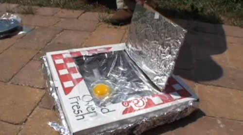
In Lancaster, Pa., the experiments were carried out by the staff at Lancaster Science Factory. In one experiment, they used a frying pan covered in Saran Wrap to keep the egg white from evaporating.

A second experiment used a pizza box lined with foil.

To see how these worked, go here.

———

EastBayRI.com/East Bay Newspapers

East Bay Newspapers in Rhode Island tried with a skillet and again with foil.

To see how those experiments turned out, go here.

———

I ate my fair share of eggs this weekend, but I cooked them inside. And they were delicious.

Any other examples I missed? Send ’em my way.

Harry Potter, Star Wars, Joseph Campbell and the hero myth

I wanted to share with you a chart from the Ideas section of this Sunday’s Boston Globe. Using the archetypes described in Joseph Campbell’s “The Hero With a Thousand Faces,” the chart compares characters from the Harry Potter series, “Star Wars,” “The Matrix,” “Lord Of The Rings” and… “Finding Nemo.”

Click for a larger view.
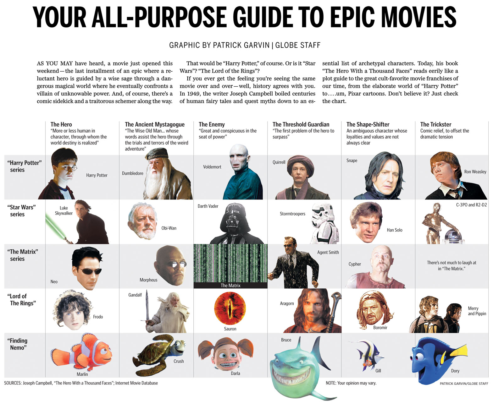
Boston Globe chart comparing Harry Potter, Star Wars, The Matrix, Lord of the Rings and Finding Nemo using Joseph Campbell hero archetypes

HOW IT CAME TOGETHER

I’ve long kept a graphics notebook in which I jot down and scribble ideas as they occur to me. I’m currently on the fifth notebook.

In the summer of 2007, I caught up with the world and finally began reading the Harry Potter books. I started a month or so before the final book was released. Thus, I got to start with the first book and read the entire series without pausing in between books. The day I finished the seventh book, my mind was racing with ideas. Once such idea:
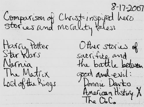
I jotted whatever came to my mind, knowing I could edit it later. I had long seen the similarities in other sci-fi and fantasy movies, as I had some teachers in high school who riffed on those concepts in class. The idea sat in the notebook for almost four years. (Note to those who know me: check the date on the top of the notebook entry.)

Flash forward to this current summer, four years and one newspaper after I first read the Harry Potter books and had the idea. Colleague Ryan Huddle was working on his great Harry Potter treatment, which you can read about on Charles Apple’s blog. Dan Zedek, AME for Design, asked if I might have any ideas for “The Deathly Hallows,” as he had seen what I had done for the last Indiana Jones movie. I told him about the aforementioned notebook submission, and added that we didn’t have to focus solely on Biblical characters. We could open it up to the hero archetypes explored by Joseph Campbell, who literally wrote the book on the topic.

The next day, Dan told me he had run the idea by Steve Heuser of the Ideas section. Steve had thought the idea had potential and wanted me to rough up some notes to use as a jumping-off point. I consulted assistant graphics editor Javier Zarracina, who was a wealth of ideas. We looked up the hero myth structure, which can be very simple or complicated, depending on who’s dissecting Joseph Campbell’s books and lectures. Additionally, I am especially indebted to Mike O’Brien and Rob Bergman from DeSmet Jesuit High School in St. Louis, as they gave me tons of ideas and sites to consult.

Working with Steve and Javier, I tightened the focus to the archetypes and left out the comparisons of plot. I used Harry Potter, “Star Wars,” “Lord of the Rings” and “The Matrix,” but decided to leave off the Narnia movies. For one, I had only seen the first movie, which hadn’t had the same mass appeal as the others on the list. Steve suggested we try to find a movie that used the same archetypes but that deviated from the serious sci-fi/fantasy realm. I suggested “Finding Nemo,” and he laughed so hard that I knew we had a winner.

I originally structured the chart in a rather traditional, straightforward way. Steve suggested I use the whole width of the page, and Javier suggested I cut out some of the photos using silhouettes. Lisa Tuite and Wanda Joseph-Rollins of The Boston Globe library both helped pull photos to use. Dan helped me vary the cutouts so that they seemed more dynamic. We tweaked and tweaked, and I liked each version more than the previous versions. The graphic ended up on Boston.com by Friday afternoon.

ABOUT THE MOVIES WE DIDN’T USE

There were a ton of movies we could have used, because there are a ton of movies that use these archetypes. Besides the Narnia films, both the “Batman” series and “The Princess Bride” were suggested, as were several westerns and Akira Kurosawa films. Many non-fantasy films were suggested, too. These were all great suggestions, and I thank all of you whom I e-mailed for advice.

Ultimately, Steve, Javier, Dan and I kept the list limited to big movies and series from the past 10 years or so. We could have easily done a full-page chart with more than a dozen films and still not even scratch the surface of the films who’ve used these archetypes. The whole point of this chart is that these tropes are ubiquitous.

In addition to the films we chose (or didn’t choose), readers might take issue with the specific characters we chose for the categories. Within the newsroom, we had lots of differing opinions. Ultimately, I think this shows we came up with a great idea that will have people talking. A “talker,” if you will. Or a “Hey, Martha.”

Working on this chart appealed to several of my geek loves: “Star Wars,” philosophy, Harry Potter and infographics. Dan frequently likes to tease me for my references to “Star Wars” and “Harry Potter.” If only I could have referenced Scrabble, “The X-Files,” “Battlestar Galactica” and “Melrose Place,” the Pat Garvin interests could have all been referenced.

Next time.

Del Taco, a flying saucer and a nostalgia for a past St. Louis

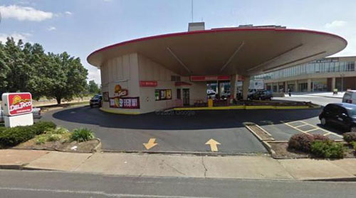
There’s a big kerfluffle in my hometown of St. Louis this week. A UFO-looking building, which until midnight was home to a Del Taco franchise, was presumably going to be demolished. The property’s owner didn’t think anyone would take the property and keep the building intact. The Board of Aldermen voted Wednesday on a bill that would provide tax abatement for whomever developed the property, and on Thursday, the bill’s sponsor added a provision to the bill that would force the demolition to go before the city’s Preservation Board. Still, the preservationists are skeptical that the building will be preserved.

It might be hard to understand the fervor for the building. Certainly there’s no fervor for the business within the building. The Del Taco franchise didn’t make much money. In December 2009, the independent operator who had been subleasing the building filed for bankruptcy. I would think that the people who cared about the Del Taco would have shown up by now. But in the weeks since the building’s possible demolition was announced, there have been Facebook pages, a petition and blogging campaigns to save the late-’60s era building.

Why? What’s so special about this building? I’ve had to ask myself that question a few times this week.

When I first heard that the flying saucer building on South Grand could be torn down, I felt a pang of nostalgia. It reminded me of when I was a kid, and I felt that was reason enough to save it. After some thought, I realized I had never even gone through the drive-thru there, let alone inside. I had been to the other Del Taco, but not the one in the flying saucer building. Thus, my only memories of it were seeing it as I drove into the cities from the suburbs.

But I had this righteousness that they shouldn’t tear down such a historic building. Of course, until I started reading about the building, I had no idea it had been built in the 1960s as a gas station. I had attached a sense of nostalgia to a place I only saw from a car. Why was this place so important? I didn’t even grow up in the city. I grew up in the county. And I haven’t lived there since 2000.

So, why am I and other kids from the suburbs suddenly following this on Facebook, with a sense of nostalgia for a building we hadn’t thought of in years? There are a few reasons at play, and only a few have to do with the building itself.

Photo by Laura Miller/Riverfront Times

Photo by Laura Miller/Riverfront Times

For starters, it is a cool building. It looks like a flying saucer, and is a testament to some of the interesting architecture that’s harder to find in St. Louis these days. Past has shown that interesting buildings don’t get replaced with interesting buildings. The Parkmoor was torn down for a Walgreen’s, the Arena was torn down for an office park. Historic architecture has been replaced with things that no longer distinguish the neighborhoods. You could have a Walgreen’s in Wentzville or an office park in Chesterfield, but you won’t find a flying saucer there.

St. Louis is a city with a fragile ego. The city as a whole is still smarting over the fact that InBev bought Anheuser Busch, which is one of several big companies that are no longer headquartered in St. Louis. There are people there who remember the days when St. Louis thought of itself in the same leagues as New York and Chicago. St. Louis had several major companies. St. Louis had four sports teams. St. Louis had a thriving downtown. That’s in the past, but it hurts, even for people who were born long after the city’s heyday. The inferiority complex has been passed down to generations. Quite simply, St. Louis is a Jan Brady — the overlooked middle sister — smarting over how it used to be Marcia, the pretty older sister who commanded attention.

In a column from July 2009 about “Meet Me In St. Louis,” St. Louis Post-Dispatch columnist Bill McClellan captured some of this feeling pretty well:

Back when the country was founded, the successful people had no reason to leave the East Coast. The less successful pushed west. This clump of unsuccessful people reached St. Louis. The adventurous ones pushed on. The slackers stayed here. Much later, we built the Gateway Arch to honor the people who had the gumption to keep going. We are the only city in the world that has a memorial to honor those who left.

So this whole thing about leaving and not leaving is in our DNA.

This underlying zeitgeist is important in understanding things in St. Louis. Nothing exists in a vacuum, and these old wounds surface at the oddest times. The guilt over not doing enough to improve the city. The guilt over leaving the city altogether. The guilt of riding someone else’s nostalgia for a building I never even entered.

So, this isn’t really about a Del Taco. Or a flying saucer. It’s about a symbol.