Does an infographic need to be “memorable” to be good? That might depend on how you define “infographic”

After reading coverage recent study about what makes charts memorable, I was convinced that there is a fundamental divide not only on what constitutes an information graphic, but also on what graphics are meant to do.

I have spent almost 10 years of my life making information graphics. I have moved to another state to take an infographics job not once, but three times. I do not consider maps, charts or diagrams to be a passing fad. Thus, I have a vested interest in how information graphics are received and perceived. I’ll see links on news sites for and “INFOGRAPHIC,” only to find that what I’ve actually clicked on is an image of icons, big numbers, some photos and flashy colors. Friends who have worked for great news agencies have shared recent freelance stories of clients choosing big numbers of multiple colors over data, charts and diagrams. Rather, in my estimation, they are rejecting actual infographics for something else, and they’re calling that “something else” an infographic.

Thus, it was with this sense of frustration that I read a bout a recent study in which people were shown multiple visualizations of data and asked which ones were most memorable. Examples with photos, logos, icons and colors were more memorable than basic charts or pie graphs. Does this serve as validation for the dressed-up web images we see billed as “infographics” on Tumblr, Pinterest and elsewhere these days?

Fortunately, no. Doctoral student Michelle Borkin of Harvard’s School of Engineering and Applied Sciences, who helped conduct the study, said “Icons, images, and human-recognizable objects will instantly make [a visualization] more memorable… But there’s this very careful caveat — and this is me speaking as a viz design person: make sure they’re helping your reader understand the main point of your data.”

I’m glad Borkin made that last point. If you remember a graphic’s presentation but you don’t remember the graphic’s content, is that really a success? I’ve seen pie charts made with actual pies, showing data from Thanksgiving studies. Or so I think. I remember the chart, but I have no memory of what it was trying to tell me.

When discussing this with colleagues at work, I said that while I do not remember all the specific articles I read on Sept. 12, 2001, I do remember the information in those articles. And I think the information and story itself is much more important than the vessel that brought you that information and story, whether the vessel was an article or an information graphic. When you’re showing a declining crime rate, what do you want the reader to ultimately remember: the trend in crime, or that you used a 75% Periwinkle 2-point stroke on the fever chart over two columns? As long as they remember that they saw the chart, and the information within, then I’m happy.

Sometimes, a graphic will require more images and colors than a simple stock chart. But I’d reiterate that decisions made in making infographics should be made because the chart requires it and it helps communicate your ultimate point. If we are adding elements just to “dress it up” or to “make it pretty,” we’re losing focus of the goal of an information graphic. Like a good news article, a good information graphic should convey information clearly in a way that does not confuse the reader. If we end up making decisions about infographics not based on the content, the graphic suffers.

There is a tendency for photos and graphics to be referred to as the page’s “art.” If the lead art falls through, the other photos and graphics on the page sometimes have to change to make up for it. On the idea of information graphics as art, Charles Blow of The New York Times once famously said: “I would like to make a distinction between information graphics and art in terms of their missions. Art need serve no purpose but to express the vision of the artist. On the other hand, the highest purpose of an information graphic is to clearly express the relationships among data. That said, if someone should call a chart art because of its beauty or message, that person would get no argument from me.”

If the live “Sound of Music” was recast with famous quarterbacks

The live version of “The Sound of Music” got a lot of press, tweets and Facebooks. I didn’t watch the broadcast, but I couldn’t help inferring that musical theatre fans thought of this event the way football fans view a BCS bowl game. Thus, I decided to parse the reviews, tweets and posts about this Carrie Underwood version of “The Sound of Music” and match the actors with well-known quarterbacks.

Carrie Underwood was apparently Tim Tebow, plucky and earnest but not universally accepted as “ready for the big time.” If you dislike Tebow, use Blaine Gabbert in this comparison instead. Like Carrie Underwood, Tebow and Gabbert are talented but not showing the desired results because they’re not in roles suitable for their abilities and background. Of course, both Gabbert and Tebow — like Underwood — have naysayers that pan them as just no good.


Stephen Moyer in “True Blood” is Johnny Manziel’s 2012 A&M season: amazing, beloved, worthy of accolades. Stephen Moyer in “The Sound of Music” is Manziel’s 2013 A&M season: not as strong, and certainly not better than his predecessors, but not horrible. He’s in spots, and not commanding or confident, but certainly not abysmal, either.

Tony winners Audra McDonald as the Mother Abbess and Laura Benanti as the Baroness would be Joe Montana and/or Tom Brady: established heavyweights whose awards and years of experience as winners have shown they have the chops. Brady might be hated, but remember, those nuns and the Baroness were kind of bitchy.

The rest of the cast of the live broadcast of “The Sound of Music” was less discussed, partially because so much attention was spent talking about Underwood’s perceived weaknesses or the impressive performances by Benanti and McDonald. With that perspective in mind, the collective cast could be seen as middle-of-the-pack South Carolina quarterback Connor Shaw: decent, but not so bad or so good that he merits a lengthy discussion.

But given the circumstances, all of these players, both on the field and on the stage, are doing the best they can do. And way better than I could do as a singer. Or as a quarterback. Or as a singing quarterback.

How BostonGlobe.com’s gay marriage interactive graphic came to be

Today is the first day that Hawaii allows same-sex marriage. The state was the 16th to approve allowing gay marriage, and becomes the 15th to begin performing them. Illinois’ state legislature approved same-sex marriage a few days before Hawaii, but that law won’t go into effect until summer of 2014.

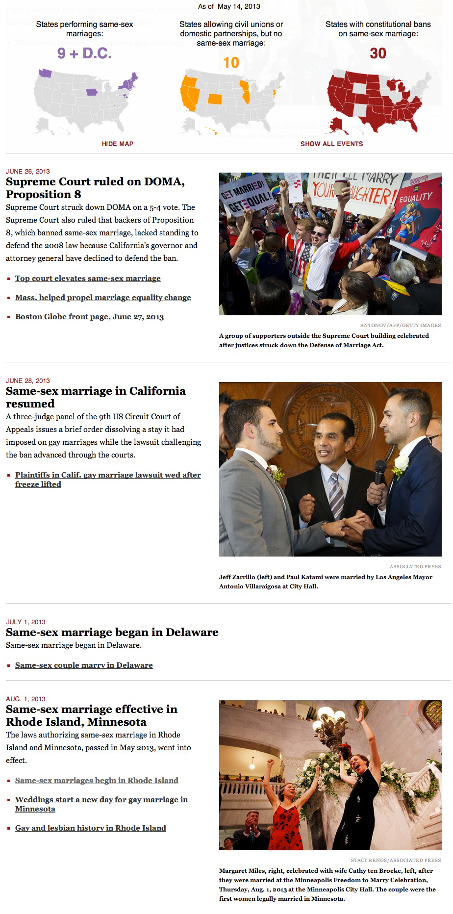
For the last four months, I have been editing and updating this BostonGlobe.com interactive graphic about the history of same-sex marriage in the United States. In short, there’s a sticky navigation that stays with you when you scroll through the timeline, show maps and tallies that change as states allow gay marriage, ban gay marriage or allow civil unions or domestic partnerships. The timeline includes links to archived stories, copies of bills and statutes, and PDFs of past Globe front pages.

The landscape as of 1996:

As of the 2004 election:

As of today, when Hawaii becomes the 15th state to allow same-sex marriage:

This sticky bar is just part of the graphic, of course, as the timeline is what triggers the changes in colors.


—————————


HOW THIS STARTED

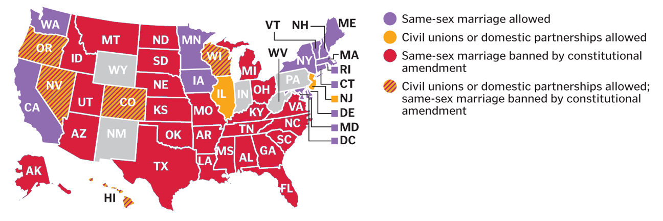
I conceived this project right after the Supreme Court ruled on Proposition 8 and the Defense of Marriage Act. In the days that followed, we had many stories about what impact these rulings could bring. These stories usually included maps that more or less looked like this:

Those maps can be tricky to read, because they cram five different types of states into one map:
*States allowing gay marriage
*States allowing civil unions or domestic partnerships, but not gay marriage
*States banning gay marriage by constitutional amendment
*States banning gay marriage by constitutional amendment, but allowing civil unions or domestic partnerships
*The default states, not identified, which have no constitutional reference to gay marriage

These maps are helpful to glean the overall splintering of the issue, and can be used to parse out laws state by state, but are still busier than need be. I wanted was something easier to read, and after talking with Boston Globe AME for Design Dan Zedek, I decided three separate maps would work best. But even then, I thought the map alone didn’t show how much the map has changed over time.

To truly get at the heart of the story, I thought, we needed three interactive maps that changed over time.

It was late June and I set myself an August 1 deadline. I picked that date because that’s when Rhode Island and Minnesota would begin performing same-sex marriages.

So, I set to work on a variety of tasks:
*Researching gay marriage laws and milestones, both on national and state-by-state levels
*Compiling links of past stories on the milestones, both to add to the timeline and to CQ the dates I had found
*Compiling photos from those events
*Building the framework for this responsive graphic using jQuery, JavaScript and CSS
*Testing it to see where it broke
*Refining, revising, refining and more revising

As I revised this, former Boston Globe Graphics Director Javier Zarracina was very helpful in giving me advice on tweaking the design. He was also very accommodating in giving me the time to work on this project.

—————————


HOW THIS EVOLVED

I reached the August 1 deadline.

For the Metro section of the paper that day, Boston Globe Assistant Design Director for News Robert S. Davis conceived a tease graphic that could anchor the page and promote the online graphic:

Once I launched this on August 1, I would update this whenever new developments occurred. The summer and fall of 2013 saw a bunch new developments, of course, as federal agencies and state agencies began changing policies to be inclusive of married same-sex couples. I ended up having more than 100 events on the timeline. Thus, per the suggestion of Robert Davis, I divided the news stories into “key events” and “other.” The page now loads with only the key events, but the sticky nav with the maps includes a link to click that shows all the events.

This project has spawned the most unwieldy-looking Excel file I’ve ever used:

I mean, just looking at that gives me a headache.


—————————


HOW THIS TECHNICALLY WORKS

Using Shan Carter’s great resource, Mr. Data Converter, I turned that beast of an Excel file into a JSON file. The jQuery reads that and appends a main div on the page with a div for each event, including nested divs for the headline, the text, the photos, the captions and the links.

The maps are SVG, taken from a template that Chiqui Esteban created for our department. When the timeline is scrolled through, the color and tally changes are triggered by div IDs when those IDs are near the top of the screen.


—————————


HOW I FIND STORIES FOR THE TIMELINE

The obvious ones — “Illinois to approve gay marriage,” for example — present themselves. The less obvious ones come from the AP wire, Google searches and a great app that has been invaluable in this process.

Zite functions like Google News in that you can have personalized categories for your news feed. Furthermore, it lets you give a story a “thumbs up” or “thumbs down,” like Pandora.

I check Zite throughout the day, particularly on its feed for “Same-sex marriage.” It often has things that are on my radar, but it has also allowed me to find stories that I wouldn’t have known were coming.

Gay news blogs have also been invaluable. I never source a gay news blog, but I will often follow their links to news sources that I can source: The Associated Press and other newspapers. In the same vein, Twitter has also been a good way to find stories. The #gaymarriage hashtag brings up a lot of opinions, but it has helped me find stories in other states.


—————————


WHAT’S NEXT
What’s next is that I’ll keep updating this as gay marriage news continues to happen. Naturally, you’ll need to check BostonGlobe.com to see the updates.