How to make an SVG animation, from Illustrator to HTML

Last week, I discovered Rob Levin‘s podcast, “SVG Immersion: The Anything and Everything SVG Podcast.” On one of the episodes, Rob talked to front-end developer Petr Tichy about SVG animation, as Petr had created this really cool animated Christmas card using SVG. Just click on it and it watch it.

Cool, eh?

Inspired by Rob and Petr, I Googled how to create SVG animations myself. After looking at some examples and a few tutorials, I decided to attempt my own. This SVG animation was the result of my efforts. It was easier than I expected, and I think SVG animation is a tool my colleagues and I will be able to use for many interactive projects.

Below, I’ve written a tutorial of how I put the animation together. It’s a rather long explanation, but I wanted to document it in depth. I used the starter files from Mr. Map Generator to help build this animation and thus the tutorial will read similarly to the one I wrote for that.

To create this responsive SVG animation, I used Adobe Illustrator and a text editor. If you’re following along, I’m going to assume you are familiar with Illustrator and only a little familiarity with basic HTML. For the most part, this requires a lot of copying and pasting. You need not have any SVG experience, and I’ve written this as if the reader has never used SVG.

This was my first time using SVG animation, so I am not an expert by any means. Rather, I am writing this from a perspective to say, “Hey, look how easy this was for a newbie!”

Let’s get started. Here is a zip file of four files:

  • ocean.ai
  • starter.htm
  • svg.css
  • responsive.js

When you’ve downloaded the zip, open up the Illustrator file called ocean.ai.
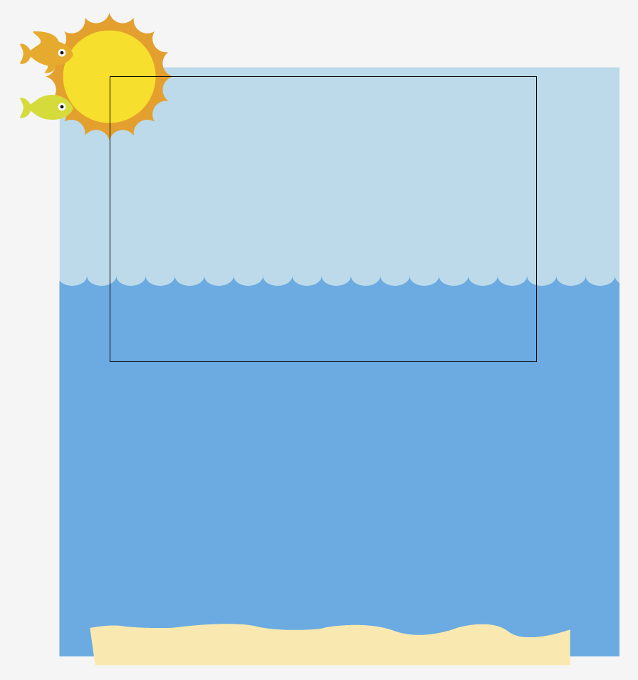
You’ll see that there are elements hanging off the artboard. Our artboard is 600px wide and 400px tall. But when animating SVG, you can make your artboard whatever width or height you want.

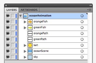
Each section of the ocean scene has its own layer in the Illustrator file. Furthermore, each layer has a name describing the content of said layer: greenFish, orangeFish, etc. These names are one word, with no spaces or breaks. This is important.

Our layers are:

  • orangeFish, the orange fish
  • greenFish, the green fish
  • orangePath, the path the orange path will swim along
  • greenPath, the path the green path will swim along
  • sun
  • oceanScene, which is the water and the sand
  • sky

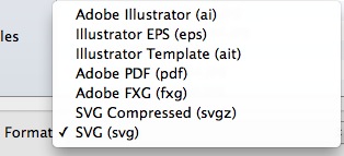
Save the Illustrator file as an SVG. It’s easy to do in the “Save As” settings.
Illustrator will give a pop-up and you can leave it be.
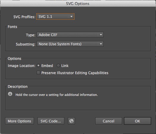
Once you’ve saved the file as an SVG in Illustrator, open the SVG in a text editor. Programs like Notepad or TextEdit are free with your computer. They are perfectly functional, but I use TextWrangler, which you can download for free. It color-codes tags in HTML and makes it easier to organize what you’re writing. Sublime and other editors are fine, too.

When you open the file in a text editor, it could look rather daunting if you’ve never looked at SVGs in text editors. Looks like a lot of gibberish, right?
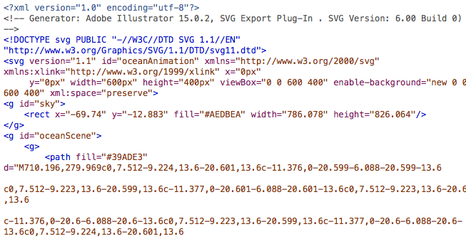
And yet while it looks foreign at first, certain things will look familiar. Just as p tags and div tags need opening tags and closing tags, so do g tags. In SVGs, g tags are group tags. Another way to think of g tags is to think of them like div tags for SVGs. Like div tags, g tags can have classes and IDs.

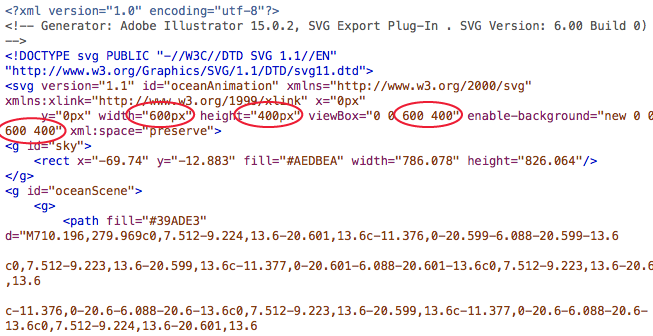
Look at the line that says “viewbox.”

Look at the part that says viewbox=”0 0 600 400.” That 600 means the box for your SVG is 600 pixels wide and 400 means it is 400 pixels tall. We’re going to eventually delete that part, but before we do, write down those two numbers somewhere or copy them into another file.
Write them down yet? Ya sure? OK, good.

In your text editor, highlight everything from the first line until the space just before the first g tag.

Got it highlighted? Good. Now delete that.

At the bottom of the document, highlight everything after the last closing g tag. And then hit delete.

Now select all that’s in the document and copy it. We’re ready to add it to our HTML file: starter.htm.

Look for the part that says, “HIGHLIGHT THIS AND PASTE YOUR SVG OVER IT!” Highlight that part, and well, do what it says: Delete it, and paste your SVG that you’ve cut and pasted.

In starter.htm, that is going to be on line 30.
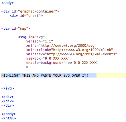
OK, now that you’ve pasted that, look for the areas that say “viewBox” and “enable-background.” Particularly, notice that they each include a line that says “0 0 XXX XXX.”

This is why I told you to write your width and height down. Or paste it somewhere. Because now you need it.

Paste over “XXX XXX” with your actual width and height. In our case with our file, we had a width of 600 and a height of 400, so we changed “0 0 XXX XXX” to “0 0 600 400″ in our file.

Open up responsive.js. The top three lines of the file will look like this:

Change the XX to reflect the appropriate value. Our exercise had a width of 600 and a height of 400.

Save the JS file and close it. You’re done with it.

At this point of the process, if you were to open up starter.htm in a browser, you’d get a static, non-moving image.

Now we are ready to start animating!

In your text editor, in starter.htm, find the g tag for sun.

Most of that code is for the orange part on the outside. The circle tag is for the middle circle of the sun.

The code that will do the animating will look like this:

<animateTransform attributeType=”xml”
attributeName=”transform”
type=”rotate”
from=”0″ to=”360″
begin=”0″ dur=”10s”
repeatCount=”indefinite” />

What that does is rotate the sun from 0 degrees to 360 degrees, beginning 0 seconds into the animation. The “dur” refers to the duration, which we have as 10 seconds. Where it says, “repeatCount,” we’ve left a value of “indefinite,” meaning we want it to repeat indefinitely. We will paste that just before the closing g tag. That will make our sun rotate.

Test it in the browser, and it should work!

Now we want to add code that will have the sun float up after 2 seconds. That could will look like this:

<animateTransform
attributeType=”XML”
attributeName=”transform”
type=”translate”
from=”0,0″ to=”0,-400″
begin=”2s” dur=”2″
fill=”freeze”/>

This will move the sun from an X,Y coordinate of 0,0 to 0,-400, 2 seconds in and over a period of 2 seconds. In other words, want it to move up 400 pixels over 2 seconds. We will paste that in the sun group, just after where we posted the rotating code: before the closing g tag.

Test it in the browser, and it should work. Except now we see that when the sun starts moving up, it has stopped rotating. We want it to keep rotating, though, as it moves up.

What we need to do is to add <g> tag between <g id=”sun”> and the first <path> tag. Then we add </g> tag before the second <animateTransform> tag.

That keeps the rotating animation going while moving the whole sun upward.

Now we want to add code that will have the water and sand float up after 2 seconds. That could will look exactly the same as the code we just added to the sun:

<animateTransform
attributeType=”XML”
attributeName=”transform”
type=”translate”
from=”0,0″ to=”0,-400″
begin=”2s” dur=”2″
fill=”freeze”/>

We add it to the code for “oceanScene,” which contains both the water and the sand. We add just before the final g tag:
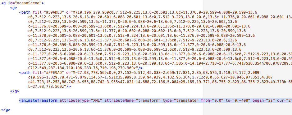
This will move “oceanScene” from an X,Y coordinate of 0,0 to 0,-400, 2 seconds in and over a period of 2 seconds.

Test it in the browser, and it should work!

Now when we look at the page in the browser, we should see the sun rotate, and then after two seconds, the sun, water and sand move up. That gives the appearance that we’ve panned down to the bottom of the sea.

Now, all we need to do is add the animation that makes our fish swim!

So, in the Illustrator file are two paths that we’ve put on layers: orangePath and greenPath. They both have no fill and no stroke.
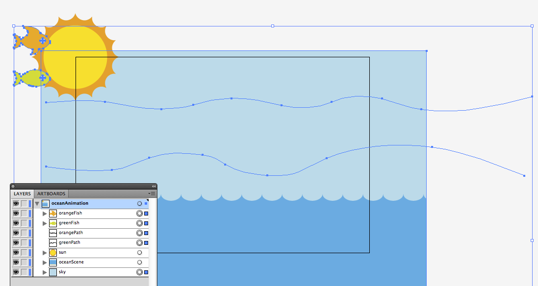
Here’s how they look in code:
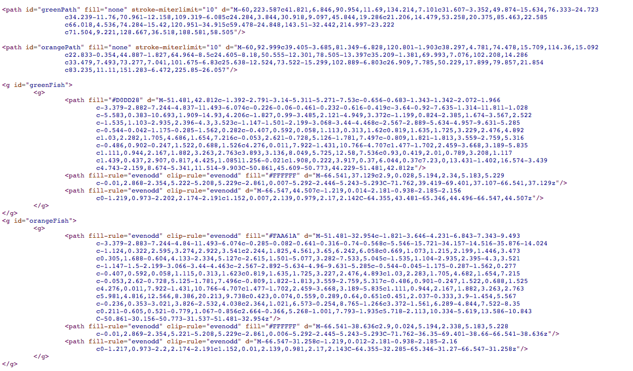
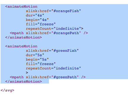
We want the orange fish to move along orangePath. We want it to begin at 4 seconds, and take 4 seconds to complete. We want that to repeat indefinitely. Here’s the code that would do that:

<animateMotion
xlink:href=”#orangeFish”
dur=”4s”
begin=”4s”
fill=”freeze”
repeatCount=”indefinite”>
<mpath xlink:href=”#orangePath” />
</animateMotion>

We want almost identical code for the green fish. We want the green fish to move along greenPath. But we want it to start a second after the orange fish, and have the green fish swim a little slower. So with this tag, we want it to begin at 5 seconds, and take 5 seconds to complete. We want that to repeat indefinitely. Here’s the code that would do that:

<animateMotion
xlink:href=”#greenFish”
dur=”5s”
begin=”5s”
fill=”freeze”
repeatCount=”indefinite”>
<mpath xlink:href=”#greenPath” />
</animateMotion>

Now we just need to add that code to our file, starter.htm. In the past examples, we have been adding tags inside g tags. These animateMotion tags, though, will be placed outside of any g tags. These will be pasted before the closing svg tag.
And that, friends, is how to animate an SVG.

I found that I had to adjust my Illustrator file and resave it to SVG a few times to get the positions just right. The first few times, I had my fish too low, then too high, just a hair too right, etc. Having to toggle between Illustrator and a text editor was cumbersome, and that’s a complaint I’ve heard on a few different SVG podcasts.

When I made this, I got a lot of the code from examples I Googled. This example from CSS-Tricks was especially helpful, as it was where I got the code for how to animate something on a specific path.

There’s a lot more, of course, but that page has a great overview to get started.

How it appeared in the newspaper vs. online: Movie psychopaths

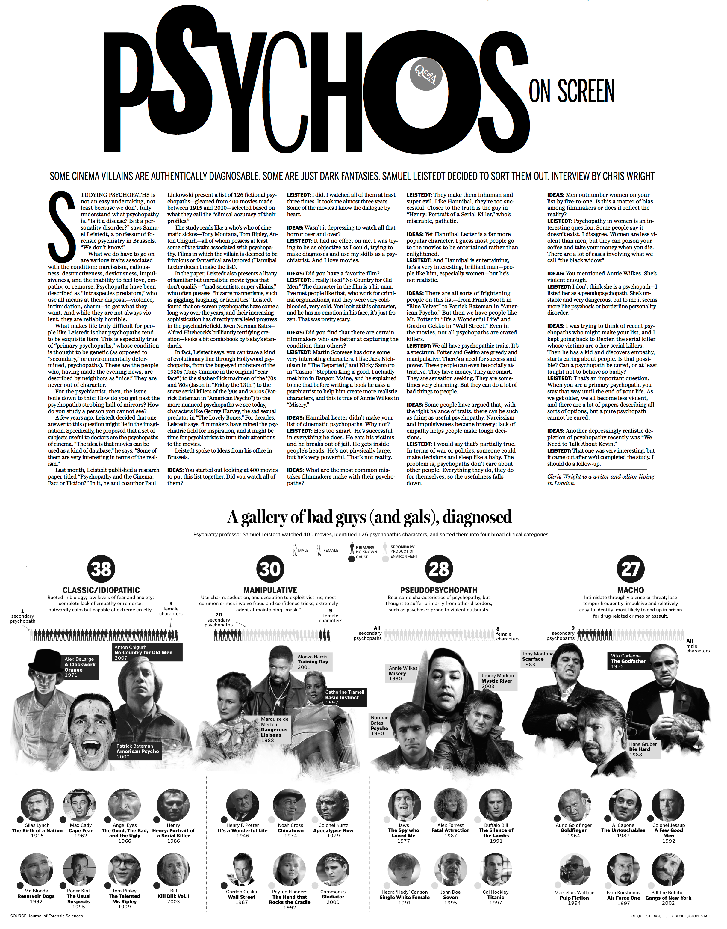
In today’s Ideas section of The Sunday Globe, Boston Globe Graphics Editor (and my boss) Chiqui Esteban put together a graphic examining psychopaths from the movies. The graphic accompanies a Q&A with psychiatry professor Samuel Leistedt, who watched 400 movies, identified 126 psychopathic characters, sorted them into four broad clinical categories, and released his findings last month.
Click the image below to see a larger version.

As people would walk by our desks and comment on how cool the graphic was shaping up to be, we would tell them, “Just wait till you see how this plays online.

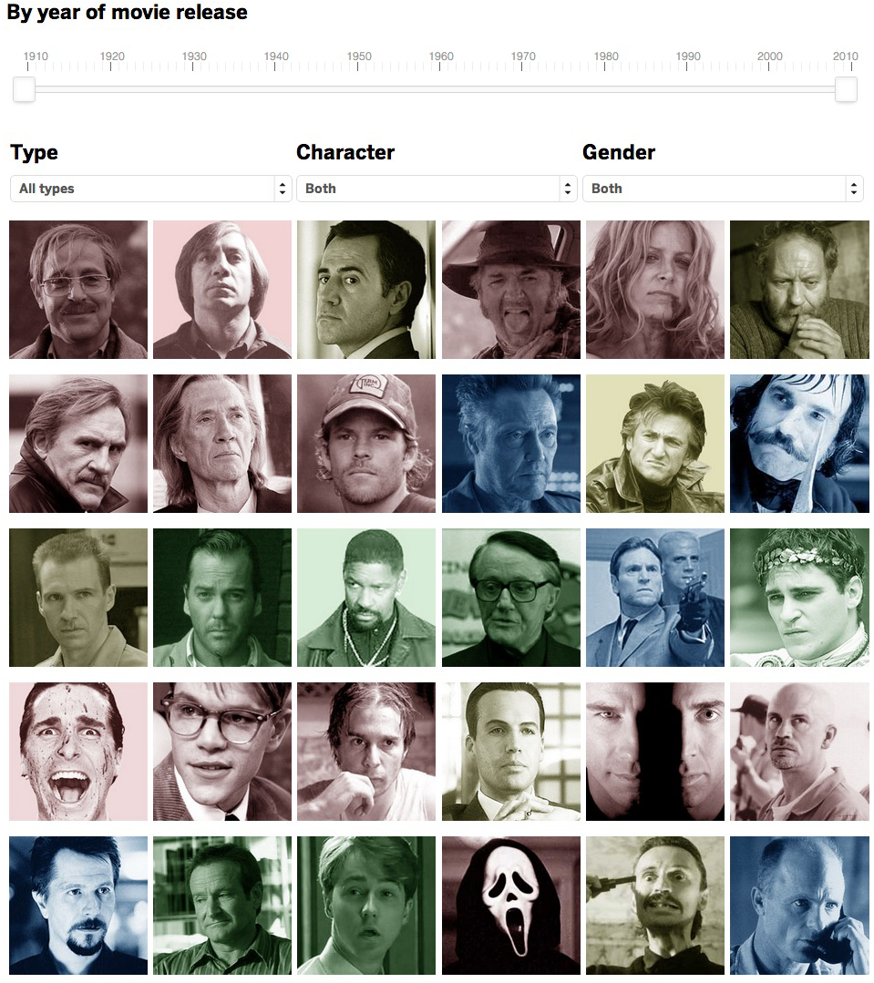
The print graphic was able to include images of just some of the characters, but for the BostonGlobe.com version, we had images for each of the 126 characters in Leistedt’s report. Online, Chiqui created a sortable datable where users could sort between type, gender and primary/secondary. Additionally, he added a slider, allowing users to isolate the time frames.


Additionally, I added a link to a PDF of today’s Ideas page so that users how the piece ran in print. In my gay marriage project for BostonGlobe.com, I’ve been including PDFs of Boston Globe front pages as a way of playing up BostonGlobe.com’s archiving potential. When possible, I’ve tried to include links to past projects, whether those links are to other web projects or PDFs of newspaper pages.

This web version of the psychopaths graphic benefitted from Chiqui’s knowledge from past projects. He has done lots of good web graphics making use of sortable databases that show or hide an array of variables:

As you can see, the web version has a different feel to it from the print version. But that’s OK. That’s going to be true for most graphics that have both print and web components, because of a few variables:

  • The print versions are constrained by whether the page is color or not. The web version, of course, can appear in a golconda of colors. In this case, the use of colors allowed us to color-code the four types of psychopaths that Leistedt included in his survey. In a quick glance, you can see the variety.
  • The total print version can be seen at once. But on the web, the interactive can’t be seen all at once, as the user will scroll and/or click to see more.
  • Whether you’re reading the newspaper in downtown Boston or Newton or all the way out in Maine, you’ll see the graphic at the same size on a page that has the same dimensions. The web version, of course, varies based on the size of your screen.
  • The print reader can’t sort, click, show or hide any of the information presented to him/her. But the user of the interactive graphic can have all of those options.
  • Because you can see photos with all 126 characters, the user can get a more complex view of the variety of psychopathy in the movies.
  • The option to not sort is just as important as the option to sort. This list includes quite a disparate list, ranging from Don Corleone to Chucky to Patrick Bateman to Thelma and Louise to Bonnie and Clyde. That covers a lot of ground, and I think we’re doing a service to the readers by giving them the options to see it all at once while also giving them the options to only see the subcategories. In print, we’d have to make that decision for them. But if they’re on a desktop or a mobile device, they can decide for themselves with their mouse or their finger.

This ran in The Sunday Globe Ideas section, which reports on ideas, people, books, and trends that would be of interest to intellectuals. It covers lots of ground, and has allowed us to do lots of great graphics. One of my favorite graphics for Ideas was a chart I did showing how Harry Potter and other fantasy characters used Joseph Campbell’s hero myth archetypes.

Go check out Chiqui’s graphic here. Check out Chiqui’s portfolio here.

How BostonGlobe.com’s gay marriage interactive graphic came to be

Today is the first day that Hawaii allows same-sex marriage. The state was the 16th to approve allowing gay marriage, and becomes the 15th to begin performing them. Illinois’ state legislature approved same-sex marriage a few days before Hawaii, but that law won’t go into effect until summer of 2014.

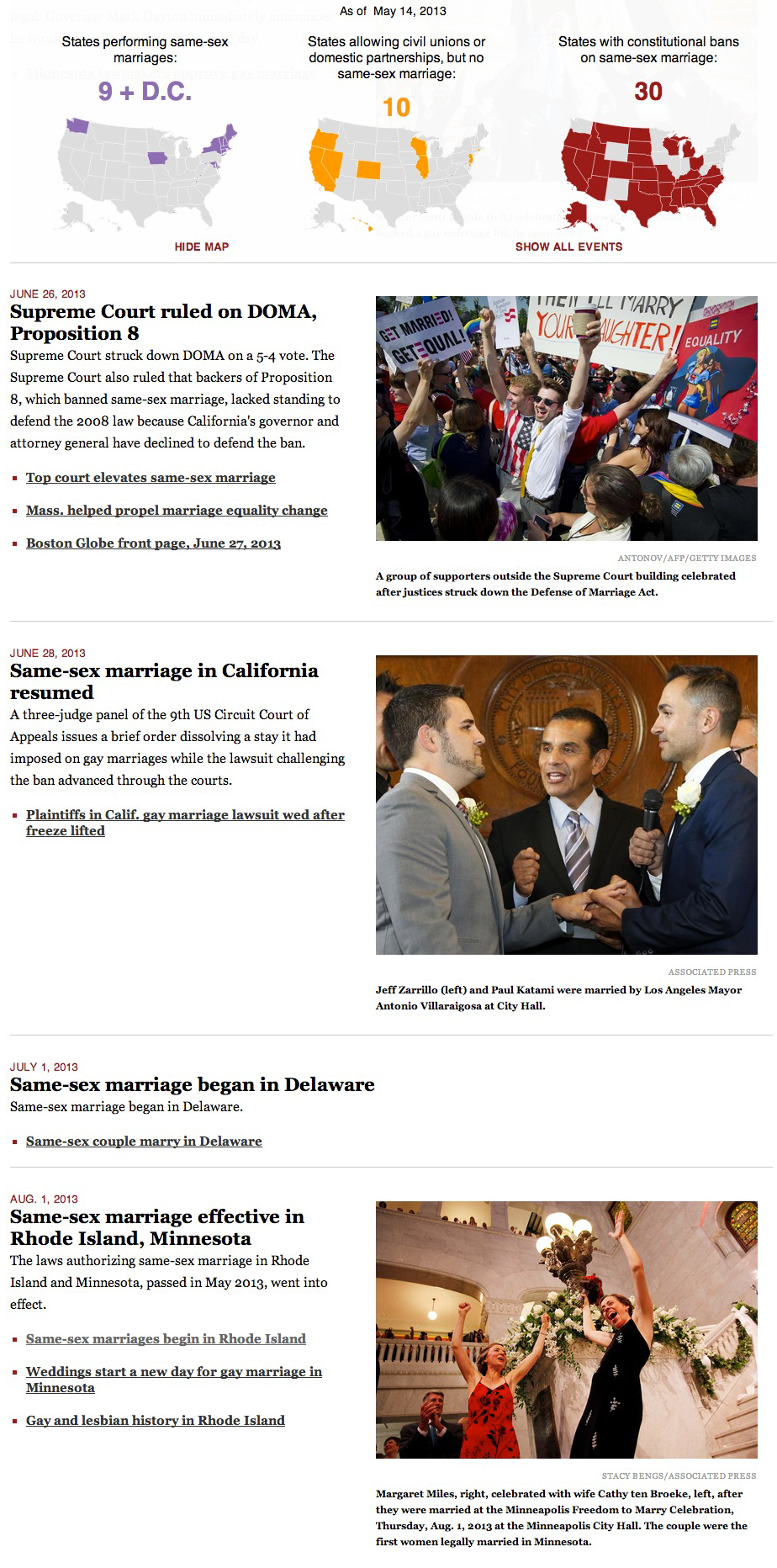
For the last four months, I have been editing and updating this BostonGlobe.com interactive graphic about the history of same-sex marriage in the United States. In short, there’s a sticky navigation that stays with you when you scroll through the timeline, show maps and tallies that change as states allow gay marriage, ban gay marriage or allow civil unions or domestic partnerships. The timeline includes links to archived stories, copies of bills and statutes, and PDFs of past Globe front pages.

The landscape as of 1996:

As of the 2004 election:

As of today, when Hawaii becomes the 15th state to allow same-sex marriage:

This sticky bar is just part of the graphic, of course, as the timeline is what triggers the changes in colors.


—————————


HOW THIS STARTED

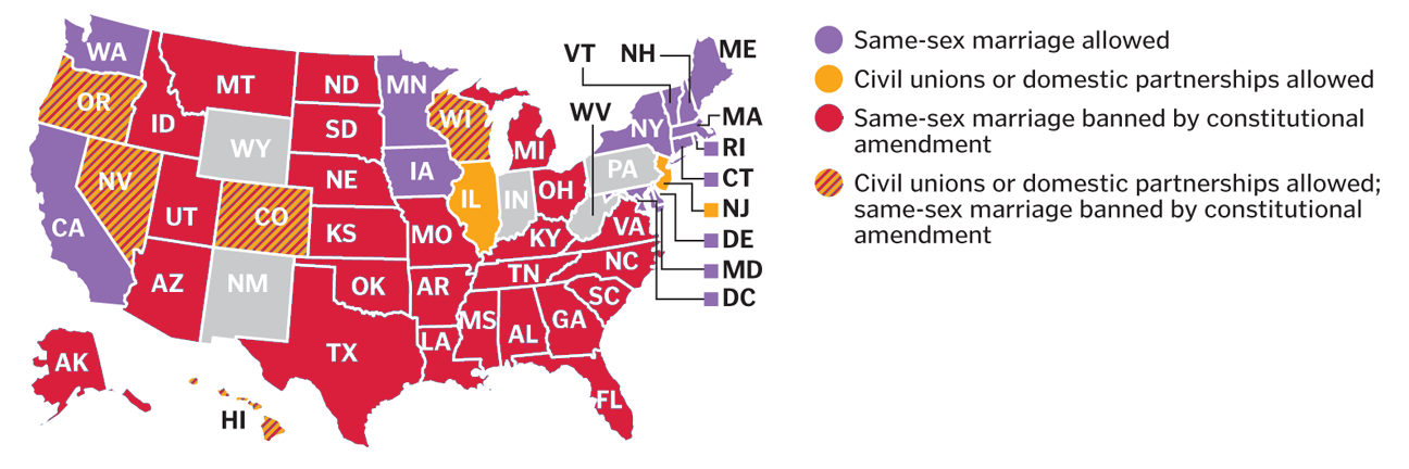
I conceived this project right after the Supreme Court ruled on Proposition 8 and the Defense of Marriage Act. In the days that followed, we had many stories about what impact these rulings could bring. These stories usually included maps that more or less looked like this:

Those maps can be tricky to read, because they cram five different types of states into one map:
*States allowing gay marriage
*States allowing civil unions or domestic partnerships, but not gay marriage
*States banning gay marriage by constitutional amendment
*States banning gay marriage by constitutional amendment, but allowing civil unions or domestic partnerships
*The default states, not identified, which have no constitutional reference to gay marriage

These maps are helpful to glean the overall splintering of the issue, and can be used to parse out laws state by state, but are still busier than need be. I wanted was something easier to read, and after talking with Boston Globe AME for Design Dan Zedek, I decided three separate maps would work best. But even then, I thought the map alone didn’t show how much the map has changed over time.

To truly get at the heart of the story, I thought, we needed three interactive maps that changed over time.

It was late June and I set myself an August 1 deadline. I picked that date because that’s when Rhode Island and Minnesota would begin performing same-sex marriages.

So, I set to work on a variety of tasks:
*Researching gay marriage laws and milestones, both on national and state-by-state levels
*Compiling links of past stories on the milestones, both to add to the timeline and to CQ the dates I had found
*Compiling photos from those events
*Building the framework for this responsive graphic using jQuery, JavaScript and CSS
*Testing it to see where it broke
*Refining, revising, refining and more revising

As I revised this, former Boston Globe Graphics Director Javier Zarracina was very helpful in giving me advice on tweaking the design. He was also very accommodating in giving me the time to work on this project.

—————————


HOW THIS EVOLVED

I reached the August 1 deadline.

For the Metro section of the paper that day, Boston Globe Assistant Design Director for News Robert S. Davis conceived a tease graphic that could anchor the page and promote the online graphic:

Once I launched this on August 1, I would update this whenever new developments occurred. The summer and fall of 2013 saw a bunch new developments, of course, as federal agencies and state agencies began changing policies to be inclusive of married same-sex couples. I ended up having more than 100 events on the timeline. Thus, per the suggestion of Robert Davis, I divided the news stories into “key events” and “other.” The page now loads with only the key events, but the sticky nav with the maps includes a link to click that shows all the events.

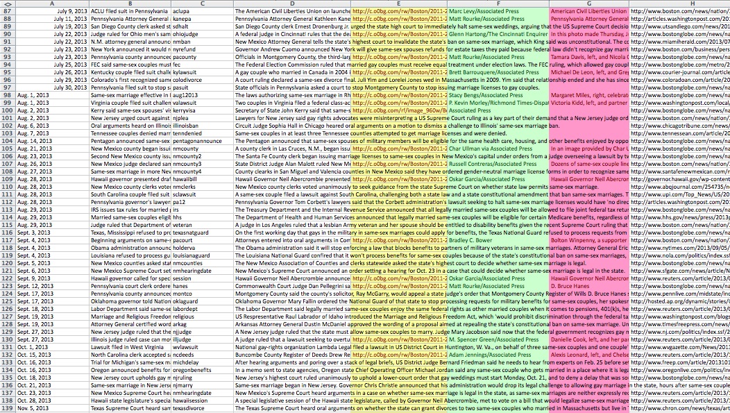
This project has spawned the most unwieldy-looking Excel file I’ve ever used:

I mean, just looking at that gives me a headache.


—————————


HOW THIS TECHNICALLY WORKS

Using Shan Carter’s great resource, Mr. Data Converter, I turned that beast of an Excel file into a JSON file. The jQuery reads that and appends a main div on the page with a div for each event, including nested divs for the headline, the text, the photos, the captions and the links.

The maps are SVG, taken from a template that Chiqui Esteban created for our department. When the timeline is scrolled through, the color and tally changes are triggered by div IDs when those IDs are near the top of the screen.


—————————


HOW I FIND STORIES FOR THE TIMELINE

The obvious ones — “Illinois to approve gay marriage,” for example — present themselves. The less obvious ones come from the AP wire, Google searches and a great app that has been invaluable in this process.

Zite functions like Google News in that you can have personalized categories for your news feed. Furthermore, it lets you give a story a “thumbs up” or “thumbs down,” like Pandora.

I check Zite throughout the day, particularly on its feed for “Same-sex marriage.” It often has things that are on my radar, but it has also allowed me to find stories that I wouldn’t have known were coming.

Gay news blogs have also been invaluable. I never source a gay news blog, but I will often follow their links to news sources that I can source: The Associated Press and other newspapers. In the same vein, Twitter has also been a good way to find stories. The #gaymarriage hashtag brings up a lot of opinions, but it has helped me find stories in other states.


—————————


WHAT’S NEXT
What’s next is that I’ll keep updating this as gay marriage news continues to happen. Naturally, you’ll need to check BostonGlobe.com to see the updates.