How spreadsheets can make journalists’ jobs easier and projects better

In a recent blog post about journalists using technology to make their lives and jobs easier, I mentioned that one of the ways I’ve made my job easier and more efficient has been to rely heavily on spreadsheets. I use spreadsheets to make color-coded maps, to update my gay marriage map/timeline, to help reporters and editors update projects on their own, and to easily organize my own interactive projects. I even use spreadsheets when making simple charts in Illustrator. Not just for the data, but adding the labels.

When we think of spreadsheets, it’s easy for us to think of them in terms of numbers: daily history of the Dow, changes in gas prices, budgets from fiscal year to fiscal year.

These are fine uses for spreadsheets, as we know, but we can use them for so much more than numbers and charts. We can, and should, be using them to help organize and execute a variety of alternative story forms, and not just things we know will visually be presented as grids. Some examples:
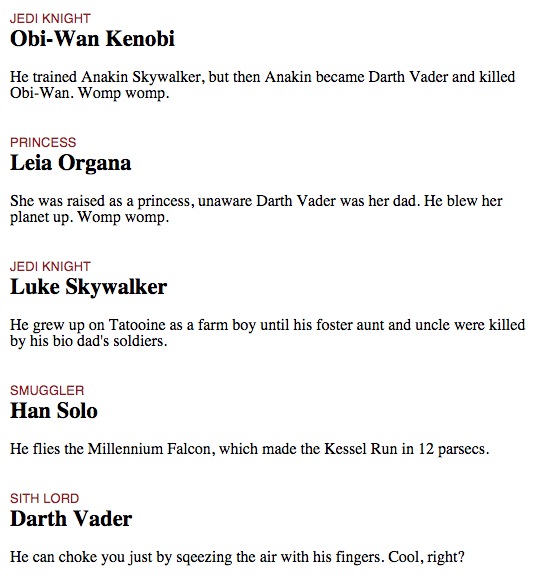
  • Series of bio boxes
  • Q&As
  • Timelines
  • Photo galleries
  • Map locations and associated text blocks
  • Step-by-step process explainers

And those are just some of the examples.

There are several reasons to use spreadsheets:

  • Shared Google spreadsheets mean that everyone can collaborate and edit a spreadsheet, rather than having to walk over to someone and dictate a change (or having to be the guy to whom all those changes are dictated).
  • This eliminates people making fixes by just sending body copy in an e-mail. If you send an e-mail, you don’t know if the manager of the spreadsheet has gotten around to updating it. But if you can go in there yourself, you know the change has been made.
  • By keeping the content in one Google spreadsheet doc that you can share on the cloud, you eliminate having multiple files that could confuse everyone. You know which file to use, because there’s only one, rather than ones called “version2,” “version2NEW,” “version2USETHIS.”
  • If everyone can see what’s on the spreadsheet from the beginning, it opens up communication and can potentially prevent problems later.
  • Having a spreadsheet means that whomever is working on the digital presentation can easily turn the data into a JSON that JavaScript and jQuery can use to write the HTML for you. If you have a spreadsheet with 20 rows of data about school board members, it’s a lot easier to write the script to write those div tags and image tags once rather than having to copy and paste the code 20 times. Copying, pasting, and deleting can be dicey, as you might delete div tags or forget to change the content of a p tag.

You might sense a theme in these reasons: Not only do they make things easier, they minimize or eliminate the introduction of errors. Cutting down on errors is good for us, our bosses, our readers and our sources. It’s good for everyone. Using spreadsheets to help me do that is worth any of the effort I put into it.

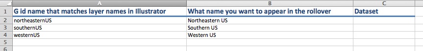
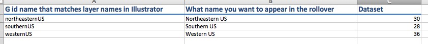
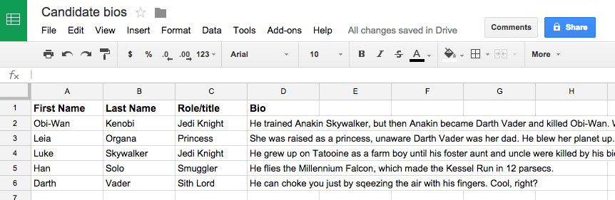
A colleague asked me for a primer on how I use Google spreadsheets, and I thought I’d share it here. For the sake of this exercise, we will assume we are creating a spreadsheet of bios on candidates of some kind.

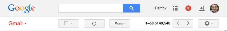
For many people, the top of their Gmail inbox looks like this:

Click on the three-by-three square toward the right side of the top:

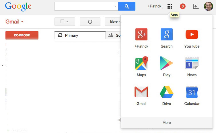
You’ll see multiple icons. Click on the one that says “Drive.”

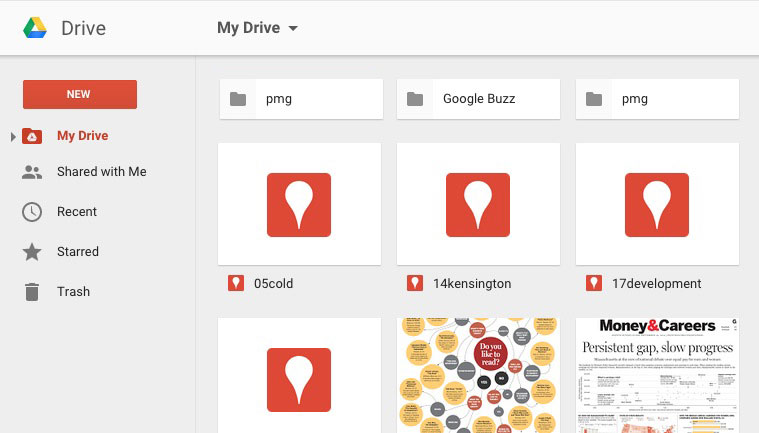
You’ll be taken to a screen that should look like this:

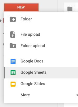
On the left side, click on the big red button that says “NEW” and select “Google Sheets.”

You will then be taken to a new page: your blank spreadsheet.

To rename it, click on the part at the top that says “Untitled spreadsheet.” You’ll get a pop-up that looks like this:

In your spreadsheet, you can now fill in the columns as you please.

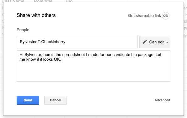
To share the spreadsheet with reporters, editors, designers, web producers and other collaborators, click on the blue share button at the top right.

In that share window, you’ll get the option to type in email addresses and decide what level of access you want to share. You can allow them to just view the spreadsheet, or you can allow them to fully edit it.

Once the spreadsheet is edited, the real fun begins. This is where producers, graphic artists, developers or whoever can use the spreadsheet to make the magic happen. The following steps are not going to directly affect reporters or editors, but they are cool steps that show just how awesome and powerful these spreadsheets can be for journalists.

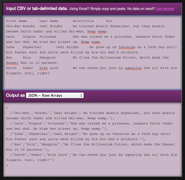
Select all the data in your spreadsheet and copy it:

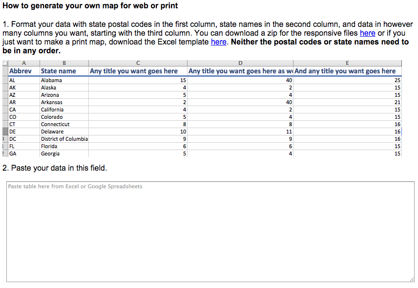
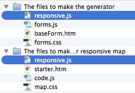
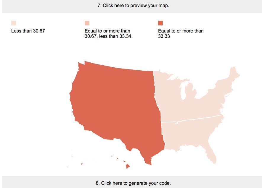
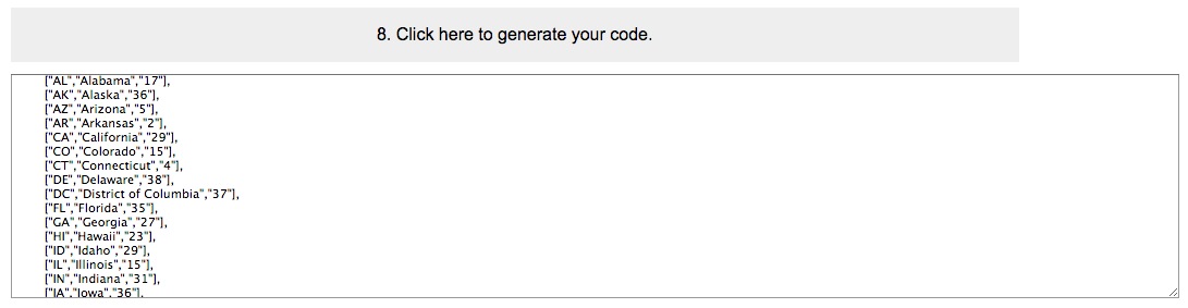
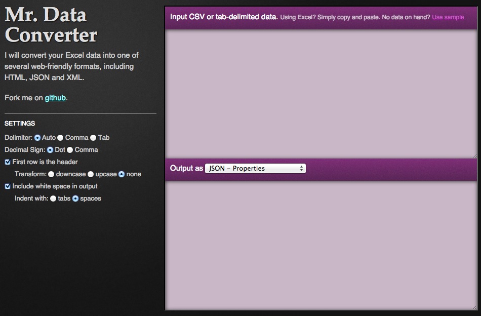
Go to Shan Carter’s Mr. Data Converter, a resource I use almost daily and the reason why Mr. Map Generator is named what it is.

Carter’s tool is fantastic: it converts your Excel or Google spreadsheet data into one of several web-friendly formats, including HTML, JSON and XML. You paste your data in the top box and it spits out your format in the bottom box.

For our example, we want the format to be JSON, in row arrays:

We then copy our JSON from the bottom box and add it our JS file. Using a combination of JavaScript and jQuery that cycles through a for loop, we append div tags to our document using elements from the JSON.

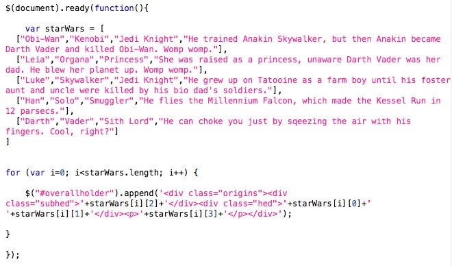
The HTML itself is only one line:

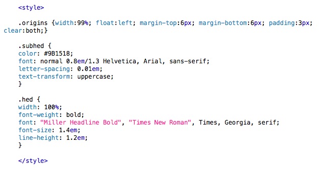
And the CSS is not complex, either:

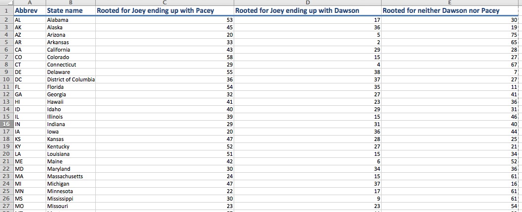
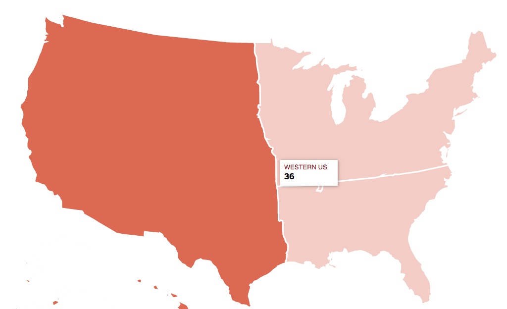
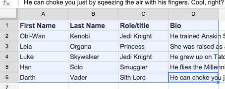
Thus, we’ve been able to turn a spreadsheet that looks like this…

Into a digital presentation that looks like this:

It’s a rather simple process, in which all the players who need to edit the text can do so at once. By turning the spreadsheet into a JSON and having jQuery/JavaScript write the HTML elements for you, it makes editing easier. In the past, the designer, developer or producer handling the web project would be peppered with changes and edits from reporters and editors. This makes it way easier for everyone: just make the change you need in the spreadsheet, alert the the designer, developer or producer to update the JSON and that’s about it. There are ways to have the Google spreadsheet directly hooked up to your code, but depending on your newsroom’s setup, that could require some server access that not everyone has.

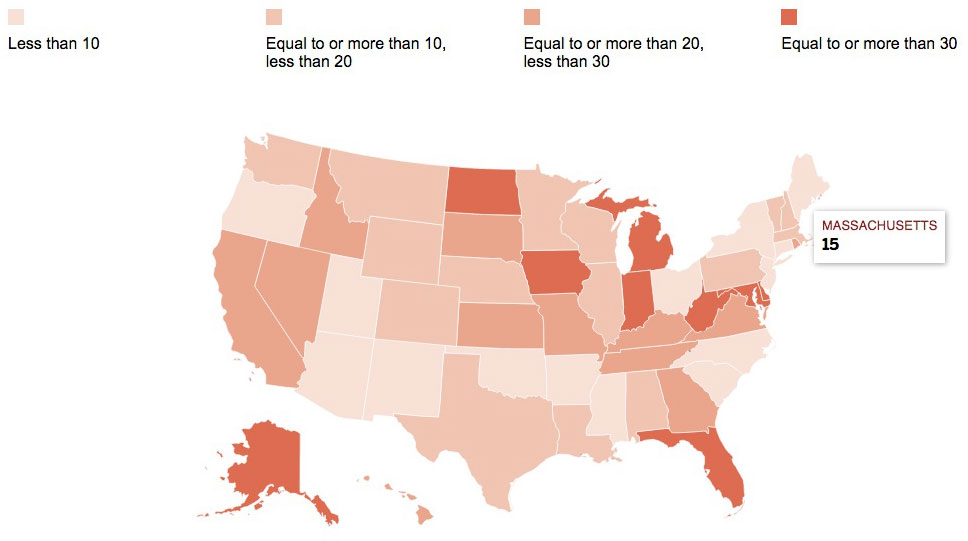
Earlier this year, Boston Globe reporter James Pindell wrote about the activists whose endorsements are key to Republicans in the New Hampshire primary. Data and multimedia editor Laura Amico, James and I used a spreadsheet to keep tabs on all of these people: their names, hometowns, current jobs, endorsements for 2016, 2012 and so forth.

I then used that spreadsheet to create our endorsement tracker. I wrote code that goes through the JSON, tallies how many people have endorsed whom, adds those up, and includes those numbers on the labels and buttons referring to the candidates. It also calculates how many fields in the spreadsheet are blank, meaning the person hasn’t endorsed anyone yet. The code does all the math for us. As more people endorse more candidates, we just update the spreadsheet, update the JSON and then re-upload it.

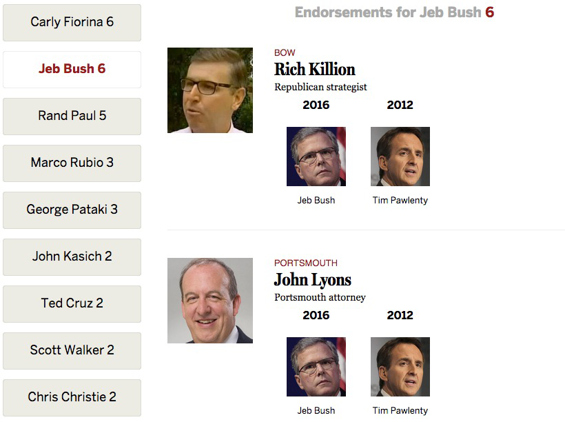
That’s it. No having to get out our calculators to add up how many have endorsed a candidate. No having to go into the HTML and look for the labels for each candidate. No having to go into div tags and no worrying that we are deleting a tag on accident. Just the JSON, and the code then automatically updates all the numbers and rewrites the HTML.

Another spreadsheet project that I worked on with Laura Amico was a primer on all the people in the case of Aaron Hernandez, the former Patriots player on trial for murder. Metro Editor Anica Butler, Laura and I formatted the sheet, adding links to stories about the various individuals connected to the case.

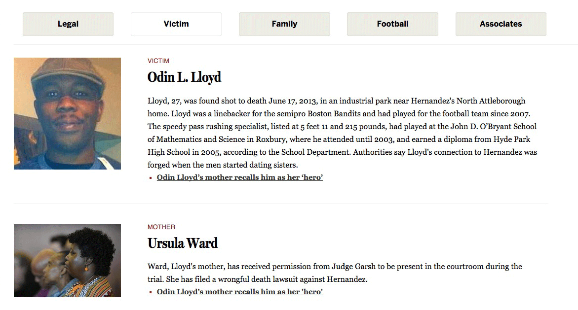
I then wrote code that would sort through the spreadsheet-turned-JSON and put the bios of these people in the proper categories: victims, family, legal, and so forth. Thus, if the editors decided to move anyone to another category or add/remove someone altogether, I didn’t have to change anything or move anything other than re-pasting the JSON in the file. That’s it.

Even quizzes can benefit from the content being organized in spreadsheet. Last year, The Boston Globe’s deputy editorial page editor, Dante Ramos, wrote a profile of each of the five tech hubs in the Boston area. For BostonGlobe.com, we thought it could be fun to present a quiz allowing users to find out which of those tech hubs suited their personality. The quiz relied on JavaScript, jQuery, an extensive JSON file and a whole lot of if/then statements. That JSON file was made from a spreadsheet that allowed many members of the editorial staff to read over the quiz questions and edit as they went along.

The most ambitious project I’ve used a spreadsheet for, though, is something a project I blogged about in late 2013..

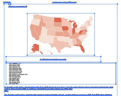
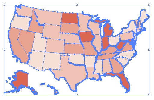
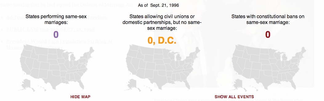
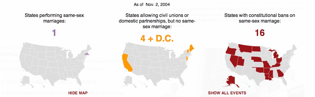
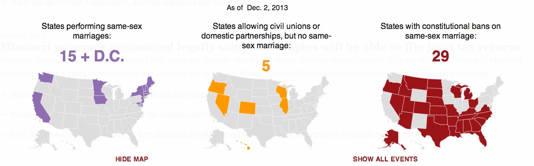
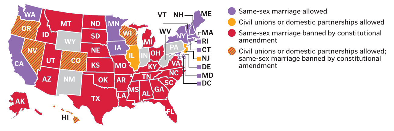
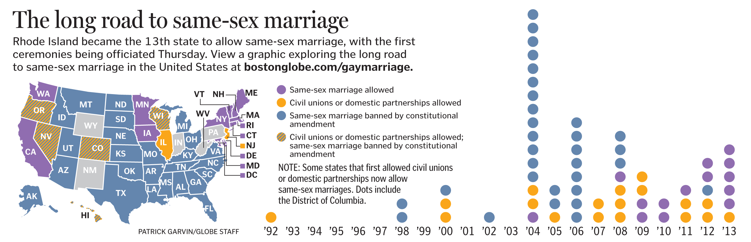
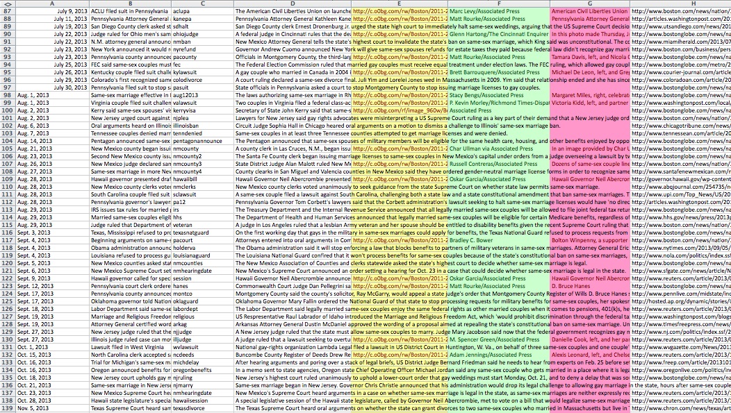
For the last year and a half, I have been editing and updating this BostonGlobe.com interactive graphic about the history of same-sex marriage in the United States. There’s a sticky navigation that stays with you when you scroll through the timeline, shows maps and tallies that change as states allow gay marriage, ban gay marriage or allow civil unions or domestic partnerships. The timeline includes links to archived stories, copies of bills and statutes, and PDFs of past Globe front pages.

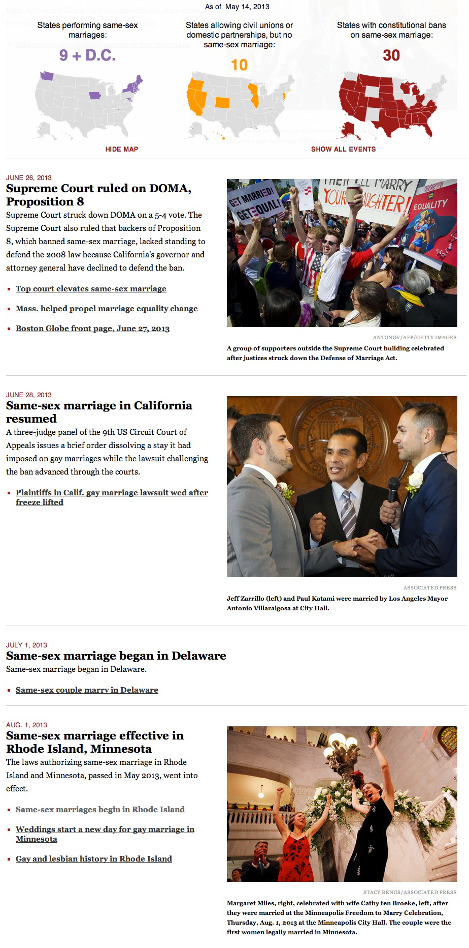
Each blurb on the timeline has its own row in a spreadsheet that has more than 700 rows:

Every time there is a new update or development, I use Shan Carter’s aforementioned great resource, Mr. Data Converter, to turn that spreadsheet into a JSON file. The jQuery reads that and appends a main div on the page with a div for each event, including nested divs for the headline, the text, the photos, the captions and the links.

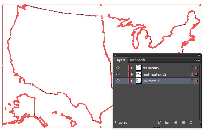
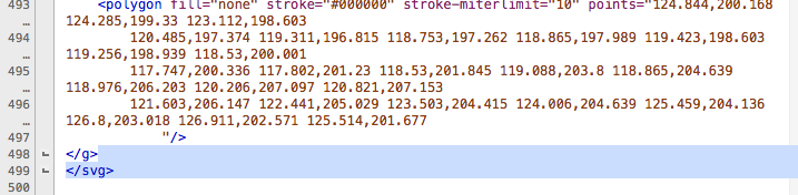
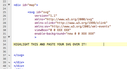
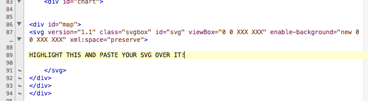
The maps are SVG, taken from a template that former graphics director Chiqui Esteban created for our department. When the timeline is scrolled through, the color and tally changes are triggered by div IDs when those IDs are near the top of the screen. What the tally and colors should be are dictated by values in the JSON that was created from the spreadsheet.

Read more about that project here.

As you can see, these spreadsheets help in a variety of projects. Shan Carter’s Mr. Data Converter especially incentivizes the use of spreadsheets. Reporters and editors need not know about JavaScript or JSONs or any of the terminology. They need not know how the sausage is made to appreciate that these spreadsheets make it easier for them to edit projects and that it makes it super easier for graphic artists, developers, web producers and anyone else creating web projects.

How to make your own Mr. Map Generator with your own SVG

A few days ago, I wrote about a responsive mapping tool I created called Mr. Map Generator and explained how to use it. Charles Apple blogged about the reasons behind why I created the tool. In the days since, people have reached out to ask me how they could make similar generators for their own cities, states, countries, and so forth.

The aim of this post is to walk you through the process of how to do that, starting with an Illustrator AI file and ending with testing it to make sure it works. It might seem like a tedious process, but it will be worth it in the end when you can easily generate maps rather quickly.

Here is a zip file that includes all you’ll need:

  • An Excel file for your data
  • An Illustrator file I’ve created for this exercise
  • A folder called “The files to make the generator”
  • A folder called “The files to make your responsive map”

Open up the Illustrator file called mapGen.ai. In this example, I’ve put together a map that divides the US into three regions: the west, the southeast and the northeast. This was an arbitrary selection of just grabbing states and making a path with the pathfinder tool. Meaning that… No, I don’t think the northeast extends down to the midwest. It’s simply relative to the other shapes, as it is the most northern and eastern of those shapes.

Each section of the map has its own layer in the Illustrator file. Furthermore, each layer has a name describing the content of said layer: southernUS, northeasternUS, westernUS. These names are one word, with no spaces or breaks. This is important.

To be safe, I select everything in the layer and then use the pathfinder tool to combine those elements to make a compound path. You can also go to the objects menu, select compound path and then select make.

Save the Illustrator file as an SVG. It’s easy to do in the “Save as” settings.

Illustrator will give a pop-up and you can leave it be.

Once you’ve saved the file as an SVG in Illustrator, open it in a text editor. Programs like Notepad or TextEdit are free with your computer. They are perfectly functional, but I use TextWrangler, which you can download for free. It color-codes tags in HTML and makes it easier to organize what you’re writing.

When you open the file in a text editor, it could look rather daunting if you’ve never looked at SVGs in text editors. Looks like a lot of gibberish, right?

And yet while it looks foreign at first, certain things will look familiar. Just as p tags and div tags need opening tags and closing tags, so do g tags. For the sake of this exercise, let’s think of g tags as like div tags for SVGs.

Look on one of the earlier lines in the code, probably around line 6.

You see that, right? Of course you do: one of the g tags has an ID of “southernUS.” It has that ID because that’s the name of one of the layers from the Illustrator file. Whatever those layers are called will be the same names used as the IDs for the corresponding g tags. That’s why it’s important to name them something easier to distinguish from each other than just using “Layer 1,” “Layer 2” and “Layer 3.”

Look just above that line to line 5, particularly the part that says “viewBox.”

Look at the part that says viewbox=”0 0 337.5 212.5.” That 337.5 means the box for your SVG is 337.5 pixels wide and 212.5 means it is 212.5 pixels tall. We’re going to eventually delete that part, but before we do, write down those two numbers somewhere or copy them into another file.

Write them down yet? Ya sure? OK, good.

In your text editor, highlight everything from the first line until the space just before the first g tag.

Got it highlighted? Good. Now delete that.

At the bottom of the document, highlight everything after the last closing g tag. And then hit delete.

Now we just have to clean up the file a bit.

In my original file, the shapes had a black stroke and a white fill. We want to get rid of that. Do a find-and-replace search for fill=”#FFFFFF” and replace it with nothing.

Next, do a find-and-replace search for stroke=”#000000″ and replace it with nothing

The last find-and-replace search is to find all the g tags that include an id. Our file will have three.

By adding class=”state,” we are assigning a class to our three g tags. That class is defined in the CSS files already downloaded.

Now select all that’s in the document and copy it. We’re ready to add it to our two different HTML files.

We have two files: baseForm.htm and starter.htm. The first one, baseForm, is the template for the page where you actually paste your data, click the buttons, decide your colors, preview your map, etc.

The other file, starter.htm, is the blank file that will become your map that you post.

In both files, look for the part that says, “HIGHLIGHT THIS AND PASTE YOUR SVG OVER IT!” Highlight that part, and well, do what it says: Delete it, and paste your SVG that you’ve cut and pasted.

In starter.htm, that is going to be on line 34.

In baseForm.htm, that is going to be on line 89.

While you’re in those files, notice the parts that say “viewBox” and “enable-background.” Particularly, notice that they each include a line that says “0 0 XXX XXX.”

This is why I told you to write your width and height down. Or paste it somewhere. Because now you need it.

Paste over “XXX XXX” with your actual width and height. So if your SVG had a width of 300 and a height of 400, “0 0 XXX XXX” should become “0 0 300 400.” In our case with our files, we had a width of 337.5 and a height of 212.5, so we changed “0 0 XXX XXX” to “0 0 337.5 212.5” in our files.

Save the two HTML files, close them, and go back to the two folders. In both folders, there will be a JS file called responsive.js. Open both of those.

The top three lines of each one will look like this:

In both files called responsive.js, change the XX to reflect the appropriate value. Our exercise, with our three regions of the US, had a width of 337.5 and a height of 212.5.

Save the JS files and close them. The only thing left now is to format your spreadsheet.

In the zip file you downloaded, open the Excel spreadsheet called data. It should be blank and look like this:

We have three columns: “G id name that matches layer names in Illustrator,” “What name you want to appear in the rollover,” and “Dataset.”

We’ll use an example from the previous blog post about how to use Mr. Map Generator. Here is a screen grab we had of state-by-state data about the “Dawson’s Creek” finale, showing the percentage of people in each state who rooted for Joey to end up with Pacey, Dawson, or neither.

Notice that the first column is the US postal codes, the second is the name of those states, and columns three through five are actual numbers.

The postal codes match the names of the g tags in the SVG. So, the row with MA in the first column corresponds to Massachusetts, and the g in the SVG has an id of MA. For this to work, the text in the first column has to match the g tags in the SVG files.

In our Illustrator file, we gave the layers these names: southernUS, northeasternUS, westernUS. Thus, our g tags have the ids of southernUS, northeasternUS, and westernUS. Thus, we have to use those in our first column in our Excel spreadsheet.

The second column is where we type whatever we want to see when the user rolls over the shape. That can be whatever you want.

And the third, fourth, fifth, sixth, seventh, and forever onward columns can be, well, the actual data.

So now you’re ready to test out your generator!

Copy your data from your spreadsheet, and in baseForm.htm, paste it to try it out.

If it doesn’t work at first, refresh it once or twice. If it still doesn’t work, check console.log to see if any errors appear.

If it does work, copy the code from step 8 and then paste it in code.js.

It might seem like a tedious process, but it will be worth it in the end when you can easily generate maps rather quickly.

How to use Mr. Map Generator, a map tool for journalists

In a recent blog post about journalists using technology to make their lives and jobs easier, I mentioned that I created templates in Illustrator of the maps we use the most. I saved those as SVGs and then turned those SVGs into HTML. The heavy lifting was writing code for a map generator that would allow me to copy and paste spreadsheet data to color-code the maps for me. It took some time, but it paid off. It creates responsive maps that I can easily pluck onto the website, but I can also print-to-PDF those suckers and have the basis for the print version. People who have made vector maps will know that the “old way” of having to select each state/county individually to color-code it was a pain. And fraught with the possibility of introducing error.

Mr. Map Generator has maps of the US, Massachusetts and Boston. For this post, I’ll explain how to use the US map generator, though the concepts will be almost the same for the other map generators.

GETTING STARTED

1. We’ll start with a spreadsheet. I usually use a Google Spreadsheet or an Excel Spreadsheet. In our fake spreadsheet, we will pretend it’s a spreadsheet about the “Dawson’s Creek” finale, showing the percentage of people in each state who rooted for Joey to end up with Pacey, Dawson, or neither. Obviously, these are made-up numbers, because most people will agree that Joey should have ended up with Pacey. But for the sake of this exercise, we will pretend.

Format your data with state postal codes in the first column, state names in the second column, and data in however many columns you want, starting with the third column. You can download a zip for the responsive files here or if you just want to make a print map, download the Excel template here. Neither the postal codes or state names need to be in any order.

2. On the page of the US map generator, paste your data in the field that says, “Paste your data in this field.”

3. After pasting your data, click on the button that says, “Click here to select your data set.”

4. After you’ve done that, you’ll get a button that shows you the columns from your spreadsheet. In this scenario, as we’ve created a fake spreadsheet, our options are “Rooted for Joey ending up with Pacey,” “Rooted for Joey ending up with Dawson,” and “Rooted for neither Dawson nor Pacey.” For the sake of this exercise, I’ve clicked on those who “Rooted for Joey ending up with Dawson.” Which, of course, was not how it ended.

5. Step 5 allows you to select your color from the options of red, blue, a gold/yellow, green, and purple. Step 6 allows you to decide whether you want the map to have 2, 3, 4 or 5 colors, or to be a chloropleth where the smallest value is the lightest shade and the largest value gets the darkest shade.

6. In our case, we’ve opted to have four shades of red. The generator is designed to calculate your smallest value and your largest value, and then calculate the ranges in between those two values. I strongly suggest not leaving those values as is, for a variety of reasons:

  • Outliers that skew the ranges
  • Ranges that aren’t intuitive (6.1-11.6, 11.6-17.1, etc.)

7. Once you have selected your color and ranges, you can click a button to preview your map. Do that.

Here’s what your map will look like:

8. You’ll then have the option to generate your code. It will appear in a text box.

9. To make a web version, download these files if you didn’t already do so in the first step. Copy the code in the box above and paste it inside the file called code.js. Then open the HTML in a browser. You don’t have to edit or change any of the other files. When you upload it to your server space, you’ll need four files:

  • code.js
  • map.css
  • US-map.htm
  • US-responsive.js

10. You’ll need to add a key/legend on your own. If you inspect element on this page, you can copy the HTML you’ll need and can plunk it into US-map.htm before uploading it.

11. To use this to make a vector print map, right click and select “Print.”

12. In the print dialog box, select “Save as PDF.” I usually have it only save page 2 of the PDF, rather than saving the entire file.

13. I then open that PDF in Illustrator. Using the white arrow, I select everything I want to delete. I delete until all is left is the shapes of the states.

14. Once I’ve deleted the extra parts from the PDF, such as text characters, I have only the map left. I then plug that into a Globe template file. I’ve done enough of these that I have a starter file with the state labels in place.

If you see yourself making a lot of these, having an Illustrator template with a layer of labels is not a bad idea.

<b>RELATED:</b> How to make your own Mr. Map Generator with your own SVG

“Should journalists learn code?” Well, what exactly do you mean by “code”?

There have been many blog posts and articles that pose what has become a divisive question: Should journalists learn code?

There’s a lot of passion in the comment sections on these posts, but I’ve wondered if we’re all on the same page as to what the question means.

“Should journalists learn code?”

What do we mean by “code”? Do we mean HTML and CSS, which are markup languages? Or do we mean languages such as JavaScript and jQuery? Or do we mean Ruby? Python? C++? Journalists who don’t know what they don’t know might be tempted to lump everything together, but they’re not all the same.

What do we mean by “learn”? Do we mean learn everything until we are masters? Do we mean learn enough to be proficient? Do we mean that we should learn some of the basic concepts so we can follow conversations with our colleagues about projects?

Does this mean everyone should learn the same skills? Should reporters, editors, developers, photographers and graphic artists all learn the same programs and languages? Should they all be proficient at an expert level?

“Should journalists learn code?” will mean different things to different journalists, and the anxiety that question brings with it also brings valid concerns. Many journalists equate that question with completely changing their job. Some could think of it in terms of web galleries and managing assets on a web site. Some have told me they think of code as high-level computer programming and thus think of it as losing any aspect of reporting or editing in their jobs to instead solely write code. Others have not-unfounded worries that some newsrooms could farm out more work to fewer people. In other words, they muse, if journalists have to take on more work, and even different kinds of work, how can they do any of it effectively?

These are the concerns of many journalists, and thus we have been asking the wrong question all this time. There’s a better question to ask than “Should journalists learn code?”

The better question to ask is, “How can journalists use technology to be better at their jobs and to make their jobs easier?” A follow-up question can be, “How can markup and/or coding languages help journalists be better at their jobs and to make their jobs easier?”

These two questions are intentionally open-ended, and hopefully have a much more positive spin to them. It doesn’t imply changing your job or having to learn MIT-level technology. “Technology” doesn’t have to necessarily mean “code.” Any journalist who’s used Excel or Google Refine has used technology to make his or her job easier.

This question does not have any one right, binary answer, because each journalist will need different technologies for different reasons based on what his or her job is. As a person who makes interactive graphics, it behooves me to stay on top of the best practices for jQuery and JavaScript. But I don’t expect our metro columnists to feel the same need to master jQuery and JavaScript. They might scrape data, clean up spreadsheets or use coding languages with their reporting, because that can make their job easier.

“Should journalists learn code?” makes people defensive. They get their guards up and lose track of the ways they can mine data and use it to make their projects richer.

Here are examples of how I’ve integrated technology into my workflow to make things easier for me:

*When making bar charts in Illustrator, I never manually type the data values for the bars. I copy the chart, and modify that copy so that the text of the values appear. I ungroup that chart and voila, I have labels without me having to risk typing a typo.

*We tend to make a lot of color-coded maps, so I created templates in Illustrator of the maps we use the most: US, Massachusetts towns, Boston neighborhoods, etc. I saved those as SVGs and then turned those SVGs into HTML. That was just a few clicks and typing of lines. The heavy lifting was writing code for a map generator that would allow me to copy and paste spreadsheet data to color-code the maps for me. It took some time, but it paid off. It creates responsive maps that I can easily pluck onto the website, but I can also print-to-PDF those suckers and have the basis for the print version. People who have made vector maps will know that the “old way” of having to select each state/county individually to color-code it was a pain the ass. And fraught with the possibility of introducing error.

*When working on web projects, I almost always use spreadsheets. Lately I’ve used Google spreadsheets so that reporters and editors can make changes. I then use Mr. Data Converter to turn that spreadsheet into a JSON and then write the JavaScript/jQuery that will cycle through that data and write out HTML for me. I do that rather than having to copy and paste things, because it’s ultimately easier and because copying and pasting things into divs leaves the possibility of pasting in the wrong place.

You might sense a theme in those three examples: All three of them are processes I’ve adopted so as to minimize or eliminate errors. Cutting down on errors is good for us, our bosses, our readers and our sources. It’s good for everyone. Using technology to help me do that was worth any of the effort I put into it. It also taught me skills that allowed me to help colleagues in ways I hadn’t been able before.

The web is to our culture now what water is to a fish. If we ignore the basics of how the web works, we do so at our own peril. The more tools we have in our toolbox, the more our projects will benefit. A reporter who pores over public records could do well to understand how to scrape data from web sites. That same reporter could benefit from knowing how to clean up data, either through Excel or Google Refine.

Given the choice between two equally talented writers, I would bet news organizations want people who can do more with the web, not less with it. It’s going to be hard to find a journalism job posting that doesn’t want someone who has at least a basic understanding of general web concepts. No, that does not mean that reporters will need mastery understanding of HTML, CSS and JavaScript to get a job. But if the reporter is going to be working with designers and developers who will take that reporter’s story and turn it into a web presentation, shouldn’t the reporter at least have a broad understanding of what those people do? The reporter doesn’t need to know how to do those other jobs, but should at least know some of the challenges, including that the way a web page looks on a desktop is not necessarily how it looks on a mobile phone.

Reporters are good at researching the processes and terminologies of the organizations they cover, whether it’s a basketball team or a school board. A good tech reporter doesn’t have to be able to build the technology he’s covering, but he at least should be able to know enough to follow along when talking to sources and then be able to explain the important parts to readers. We should have that same mindset in our newsrooms. A reporter and a developer working on a big web project together will have different roles on that project, but they should at least communicate what they need from each other and how they can help each other most effectively.

How it appeared in the newspaper vs. online: Movie psychopaths

In today’s Ideas section of The Sunday Globe, Boston Globe Graphics Editor (and my boss) Chiqui Esteban put together a graphic examining psychopaths from the movies. The graphic accompanies a Q&A with psychiatry professor Samuel Leistedt, who watched 400 movies, identified 126 psychopathic characters, sorted them into four broad clinical categories, and released his findings last month.
Click the image below to see a larger version.

As people would walk by our desks and comment on how cool the graphic was shaping up to be, we would tell them, “Just wait till you see how this plays online.

The print graphic was able to include images of just some of the characters, but for the BostonGlobe.com version, we had images for each of the 126 characters in Leistedt’s report. Online, Chiqui created a sortable datable where users could sort between type, gender and primary/secondary. Additionally, he added a slider, allowing users to isolate the time frames.


Additionally, I added a link to a PDF of today’s Ideas page so that users how the piece ran in print. In my gay marriage project for BostonGlobe.com, I’ve been including PDFs of Boston Globe front pages as a way of playing up BostonGlobe.com’s archiving potential. When possible, I’ve tried to include links to past projects, whether those links are to other web projects or PDFs of newspaper pages.

This web version of the psychopaths graphic benefitted from Chiqui’s knowledge from past projects. He has done lots of good web graphics making use of sortable databases that show or hide an array of variables:

As you can see, the web version has a different feel to it from the print version. But that’s OK. That’s going to be true for most graphics that have both print and web components, because of a few variables:

  • The print versions are constrained by whether the page is color or not. The web version, of course, can appear in a golconda of colors. In this case, the use of colors allowed us to color-code the four types of psychopaths that Leistedt included in his survey. In a quick glance, you can see the variety.
  • The total print version can be seen at once. But on the web, the interactive can’t be seen all at once, as the user will scroll and/or click to see more.
  • Whether you’re reading the newspaper in downtown Boston or Newton or all the way out in Maine, you’ll see the graphic at the same size on a page that has the same dimensions. The web version, of course, varies based on the size of your screen.
  • The print reader can’t sort, click, show or hide any of the information presented to him/her. But the user of the interactive graphic can have all of those options.
  • Because you can see photos with all 126 characters, the user can get a more complex view of the variety of psychopathy in the movies.
  • The option to not sort is just as important as the option to sort. This list includes quite a disparate list, ranging from Don Corleone to Chucky to Patrick Bateman to Thelma and Louise to Bonnie and Clyde. That covers a lot of ground, and I think we’re doing a service to the readers by giving them the options to see it all at once while also giving them the options to only see the subcategories. In print, we’d have to make that decision for them. But if they’re on a desktop or a mobile device, they can decide for themselves with their mouse or their finger.

This ran in The Sunday Globe Ideas section, which reports on ideas, people, books, and trends that would be of interest to intellectuals. It covers lots of ground, and has allowed us to do lots of great graphics. One of my favorite graphics for Ideas was a chart I did showing how Harry Potter and other fantasy characters used Joseph Campbell’s hero myth archetypes.

Go check out Chiqui’s graphic here. Check out Chiqui’s portfolio here.

Does an infographic need to be “memorable” to be good? That might depend on how you define “infographic”

After reading coverage recent study about what makes charts memorable, I was convinced that there is a fundamental divide not only on what constitutes an information graphic, but also on what graphics are meant to do.

I have spent almost 10 years of my life making information graphics. I have moved to another state to take an infographics job not once, but three times. I do not consider maps, charts or diagrams to be a passing fad. Thus, I have a vested interest in how information graphics are received and perceived. I’ll see links on news sites for and “INFOGRAPHIC,” only to find that what I’ve actually clicked on is an image of icons, big numbers, some photos and flashy colors. Friends who have worked for great news agencies have shared recent freelance stories of clients choosing big numbers of multiple colors over data, charts and diagrams. Rather, in my estimation, they are rejecting actual infographics for something else, and they’re calling that “something else” an infographic.

Thus, it was with this sense of frustration that I read a bout a recent study in which people were shown multiple visualizations of data and asked which ones were most memorable. Examples with photos, logos, icons and colors were more memorable than basic charts or pie graphs. Does this serve as validation for the dressed-up web images we see billed as “infographics” on Tumblr, Pinterest and elsewhere these days?

Fortunately, no. Doctoral student Michelle Borkin of Harvard’s School of Engineering and Applied Sciences, who helped conduct the study, said “Icons, images, and human-recognizable objects will instantly make [a visualization] more memorable… But there’s this very careful caveat — and this is me speaking as a viz design person: make sure they’re helping your reader understand the main point of your data.”

I’m glad Borkin made that last point. If you remember a graphic’s presentation but you don’t remember the graphic’s content, is that really a success? I’ve seen pie charts made with actual pies, showing data from Thanksgiving studies. Or so I think. I remember the chart, but I have no memory of what it was trying to tell me.

When discussing this with colleagues at work, I said that while I do not remember all the specific articles I read on Sept. 12, 2001, I do remember the information in those articles. And I think the information and story itself is much more important than the vessel that brought you that information and story, whether the vessel was an article or an information graphic. When you’re showing a declining crime rate, what do you want the reader to ultimately remember: the trend in crime, or that you used a 75% Periwinkle 2-point stroke on the fever chart over two columns? As long as they remember that they saw the chart, and the information within, then I’m happy.

Sometimes, a graphic will require more images and colors than a simple stock chart. But I’d reiterate that decisions made in making infographics should be made because the chart requires it and it helps communicate your ultimate point. If we are adding elements just to “dress it up” or to “make it pretty,” we’re losing focus of the goal of an information graphic. Like a good news article, a good information graphic should convey information clearly in a way that does not confuse the reader. If we end up making decisions about infographics not based on the content, the graphic suffers.

There is a tendency for photos and graphics to be referred to as the page’s “art.” If the lead art falls through, the other photos and graphics on the page sometimes have to change to make up for it. On the idea of information graphics as art, Charles Blow of The New York Times once famously said: “I would like to make a distinction between information graphics and art in terms of their missions. Art need serve no purpose but to express the vision of the artist. On the other hand, the highest purpose of an information graphic is to clearly express the relationships among data. That said, if someone should call a chart art because of its beauty or message, that person would get no argument from me.”

How BostonGlobe.com’s gay marriage interactive graphic came to be

Today is the first day that Hawaii allows same-sex marriage. The state was the 16th to approve allowing gay marriage, and becomes the 15th to begin performing them. Illinois’ state legislature approved same-sex marriage a few days before Hawaii, but that law won’t go into effect until summer of 2014.

For the last four months, I have been editing and updating this BostonGlobe.com interactive graphic about the history of same-sex marriage in the United States. In short, there’s a sticky navigation that stays with you when you scroll through the timeline, show maps and tallies that change as states allow gay marriage, ban gay marriage or allow civil unions or domestic partnerships. The timeline includes links to archived stories, copies of bills and statutes, and PDFs of past Globe front pages.

The landscape as of 1996:

As of the 2004 election:

As of today, when Hawaii becomes the 15th state to allow same-sex marriage:

This sticky bar is just part of the graphic, of course, as the timeline is what triggers the changes in colors.


—————————


HOW THIS STARTED

I conceived this project right after the Supreme Court ruled on Proposition 8 and the Defense of Marriage Act. In the days that followed, we had many stories about what impact these rulings could bring. These stories usually included maps that more or less looked like this:

Those maps can be tricky to read, because they cram five different types of states into one map:
*States allowing gay marriage
*States allowing civil unions or domestic partnerships, but not gay marriage
*States banning gay marriage by constitutional amendment
*States banning gay marriage by constitutional amendment, but allowing civil unions or domestic partnerships
*The default states, not identified, which have no constitutional reference to gay marriage

These maps are helpful to glean the overall splintering of the issue, and can be used to parse out laws state by state, but are still busier than need be. I wanted was something easier to read, and after talking with Boston Globe AME for Design Dan Zedek, I decided three separate maps would work best. But even then, I thought the map alone didn’t show how much the map has changed over time.

To truly get at the heart of the story, I thought, we needed three interactive maps that changed over time.

It was late June and I set myself an August 1 deadline. I picked that date because that’s when Rhode Island and Minnesota would begin performing same-sex marriages.

So, I set to work on a variety of tasks:
*Researching gay marriage laws and milestones, both on national and state-by-state levels
*Compiling links of past stories on the milestones, both to add to the timeline and to CQ the dates I had found
*Compiling photos from those events
*Building the framework for this responsive graphic using jQuery, JavaScript and CSS
*Testing it to see where it broke
*Refining, revising, refining and more revising

As I revised this, former Boston Globe Graphics Director Javier Zarracina was very helpful in giving me advice on tweaking the design. He was also very accommodating in giving me the time to work on this project.

—————————


HOW THIS EVOLVED

I reached the August 1 deadline.

For the Metro section of the paper that day, Boston Globe Assistant Design Director for News Robert S. Davis conceived a tease graphic that could anchor the page and promote the online graphic:

Once I launched this on August 1, I would update this whenever new developments occurred. The summer and fall of 2013 saw a bunch new developments, of course, as federal agencies and state agencies began changing policies to be inclusive of married same-sex couples. I ended up having more than 100 events on the timeline. Thus, per the suggestion of Robert Davis, I divided the news stories into “key events” and “other.” The page now loads with only the key events, but the sticky nav with the maps includes a link to click that shows all the events.

This project has spawned the most unwieldy-looking Excel file I’ve ever used:

I mean, just looking at that gives me a headache.


—————————


HOW THIS TECHNICALLY WORKS

Using Shan Carter’s great resource, Mr. Data Converter, I turned that beast of an Excel file into a JSON file. The jQuery reads that and appends a main div on the page with a div for each event, including nested divs for the headline, the text, the photos, the captions and the links.

The maps are SVG, taken from a template that Chiqui Esteban created for our department. When the timeline is scrolled through, the color and tally changes are triggered by div IDs when those IDs are near the top of the screen.


—————————


HOW I FIND STORIES FOR THE TIMELINE

The obvious ones — “Illinois to approve gay marriage,” for example — present themselves. The less obvious ones come from the AP wire, Google searches and a great app that has been invaluable in this process.

Zite functions like Google News in that you can have personalized categories for your news feed. Furthermore, it lets you give a story a “thumbs up” or “thumbs down,” like Pandora.

I check Zite throughout the day, particularly on its feed for “Same-sex marriage.” It often has things that are on my radar, but it has also allowed me to find stories that I wouldn’t have known were coming.

Gay news blogs have also been invaluable. I never source a gay news blog, but I will often follow their links to news sources that I can source: The Associated Press and other newspapers. In the same vein, Twitter has also been a good way to find stories. The #gaymarriage hashtag brings up a lot of opinions, but it has helped me find stories in other states.


—————————


WHAT’S NEXT
What’s next is that I’ll keep updating this as gay marriage news continues to happen. Naturally, you’ll need to check BostonGlobe.com to see the updates.

Pi Alley, responsive design and 140 years of The Boston Globe

One hundred and forty years ago today, on March 4, 1872, The Boston Daily Globe published its first edition.

A lot has changed since that first issue: For starters, the word “Daily” has dropped from the name.

In looking back on the paper’s history and how the newspaper industry has changed, I’m reminded of one of my parts of Boston: Pi Alley. Particularly, I’m reminded of how it supposedly got its name from typesetters.

There are a few stories. According to the web site for the Pi Alley Garage:

As downtown Boston evolved from a residential to commercial area by the end of the 19th century, the name of this alley evolved from the names of local landowners to one more descriptive of the area. Many small restaurants set up shop in the alley to serve the area’s workers. A staple in many of these places was meat pies, often ordered by colorful names such as “Cat Pie” earning the alley the name “Pie Alley.”

In the days that Washington Street was home to most of the city’s newspaper printing plants, many of the printers and typesetters frequented a tavern in the alley called the “Bell in the Hand” In their haste to get refreshments, newspapermen would often drop pocketfuls of mixed up, loose type (called “pi” in the printing business) on the ground, leading to the name “Pi Alley.” Today, the alley continues the tradition of small businesses serving the people who work in the area, as well as the many tourists and visitors.

There is a sign in Pi Alley that repeats those stories almost verbatim. I took a picture one night as photographic proof for a friend who dismissed the newspaper connection as bullshit.

The newspaper is no longer downtown and thus no longer near Pi Alley, but I think of the Globe every time I walk through that neighborhood. Not that I don’t think of the Globe anyway; it’s what brought me to Boston.

It’s a news organization of which I am proud to be a part. I could list 140 reasons why, but that would read like a sloppy love letter written by some infatuated teenager. Indeed, I am infatuated with the Globe, and there are many reasons. The newspaper’s Pulitzer-winning coverage of abuse in the Catholic church was instrumental in exposing abuse in parishes across the country. When I first got here, I would pass some of the reporters who worked on those projects and feel like the freshman walking by Johnny Football Hero, although those reporters were much nicer than Johnny Football Hero.

Late last year, the paper launched BostonGlobe.com, a subscriber-only site. It is responsive, meaning it resizes based on the user’s browser and platform. This responsive design sidesteps the need for individual apps for each device. Whether you’re on an iPhone, a Kindle, a P.O.S. with Internet Explorer or even R2-D2, you can read BostonGlobe.com.

Even if you’re in Pi Alley.

————

To download the first front page, click here.

To see a gallery of Globe pages, click here.

To read Louis M. Lyons’ piece that marked the centennial in 1972, click here.

Coverage of the final Border War basketball game between Missouri and Kansas

Yesterday was a historic day for fans of Missouri and Kansas, as the two universities’ men’s basketball teams faced off in what is ostensibly the last of their meetups in the historic Border War rivalry. Mizzou is leaving the Big 12 Conference and will play with the SEC next season. Coaches and officials at the University of Kansas have said Kansas will not play Missouri out of conference. KU basketball coach Bill Self even said, “The majority of Kansas fans don’t give a flip about playing Missouri.”

When the teams played their last football game against each other in November, Mizzou won the game and the distinction of winning most of the football games between the two teams.


————

THE LAWRENCE JOURNAL-WORLD
Lawrence, Kan.

The University of Kansas’ hometown paper stripped a photo of victorious fans celebrating the “grand finale” of the “epic border battle.” Not that these fans “give a flip.”

————

THE HUTCHINSON NEWS
Hutchinson, Kan.

————

THE TOPEKA CAPITAL-JOURNAL
Topeka, Kan.

Here’s a close-up of that photo:

So, Bill Self, when you say that Kansas fans “don’t give a flip” about playing Mizzou, what fans are you talking about? These guys seem to give pretty much of a flip.

As they should. Their team was behind and then Mizzou blew a 19-point lead. That’s flip-worthy.

————

THE KANSAS CITY STAR
Kansas City, Mo.

This was pretty fitting play for the Kansas City Star, the biggest daily newspaper between Lawrence and Columbia.

It pains me to see that photo of smiling Jayhawks celebrating. But that’s a great photo, showing a majority of beakers… giving a flip.

————

THE COLUMBIA MISSOURIAN
Columbia, Mo.

What a heartbreaking photo by Andrew Mitchell of The Missourian, showing Missouri guard Michael Dixon on the court after the game. With the Jayhawk mascot in the background, even.

————

THE COLUMBIA DAILY TRIBUNE
Columbia, Mo.

The other daily paper in Columbia picked a slightly less heartbreaking photo, though the disappointment is still apparent.

————

THE ST. JOSEPH NEWS-PRESS
St. Joseph, Mo.

The News-Press does a good job picking above-the-nameplate photos. They used a variation of the Dixon scene. This photo shows more of the Jayhawk mascot than the Missourian photo, but it makes sense: St. Joe is a lot closer to Lawrence than it is to Columbia, so News-Press readers aren’t necessarily reading this outcome as heartbreak.

————

As a Missouri native and Mizzou alum, I can’t overstate how big this rivalry is. Games against KU were as important to Mizzou sports as the “Battlestar Galactica” episodes when you found out the identity of another Cylon. To Mizzou fans, Kansas was the rival among rivals. Kansas is the Cavil among the other Cylons. If the Big 12 were “The X-Files,” Kansas was Cancer Man among the Syndicate, foiling Mizzou’s Mulder and Scully. Watching Mizzou beat KU was like watching the trailer scene in “Kill Bill” when Darryl Hannah gets what she has coming.

I could come up with dozens more pop culture references, but you get the point: This was a big deal, about which we gave a huge flip.

As you can see, I’m pretty hacked off about that Bill Self comment. A friend of mine who used to cover the rivalry for a radio station put it pretty aptly: “He can say that, but I sure don’t ever see Kansas fans making ‘Muck Febraska’ T-shirts.”

Touche.

Florida Times-Union piece brings change — before it runs

A Florida Times-Union investigation of Jacksonville Transportation Authority bus drivers led to three employees losing their jobs and four bus drivers being suspended. Three of those drivers have been reinstated, though they could still face some punishment.

Newspaper investigations into public agencies result in firings and changes, but in this case, the moves happened in the week before the piece was even published.

Transportation reporter Larry Hannan wrote in Sunday’s piece:

JTA Executive Director Michael Blaylock said he was unaware of the background problems until the Times-Union investigation began. He promised major changes.

“I have to accept full responsibility for this,” Blaylock said. “And the [JTA] board expects me to fix it.”

What there is to fix: The Times-Union investigation found there were JTA drivers who were cited for driving with suspended licenses while continuing to drive buses. Additionally, 258 of 330 drivers had a total of 1,276 criminal and driving violations, including domestic battery, child abuse, driving without a valid license and writing bad checks.

The newspaper’s investigation began after a passenger was run over and killed downtown by a JTA bus in October.

Here’s how the story was played in this past Sunday’s Times-Union. Click for a larger view.


Larry Hannan and Florida Times-Union investigation of Jacksonville Transportation Authority bus drivers


On the inside:


Larry Hannan and Florida Times-Union investigation of Jacksonville Transportation Authority bus drivers

The main Jedi behind this investigation is Larry Hannan, the Florida Times-Union’s transportation reporter. He previously worked at News-Herald in Ohio and the Naples Daily News in Florida.