
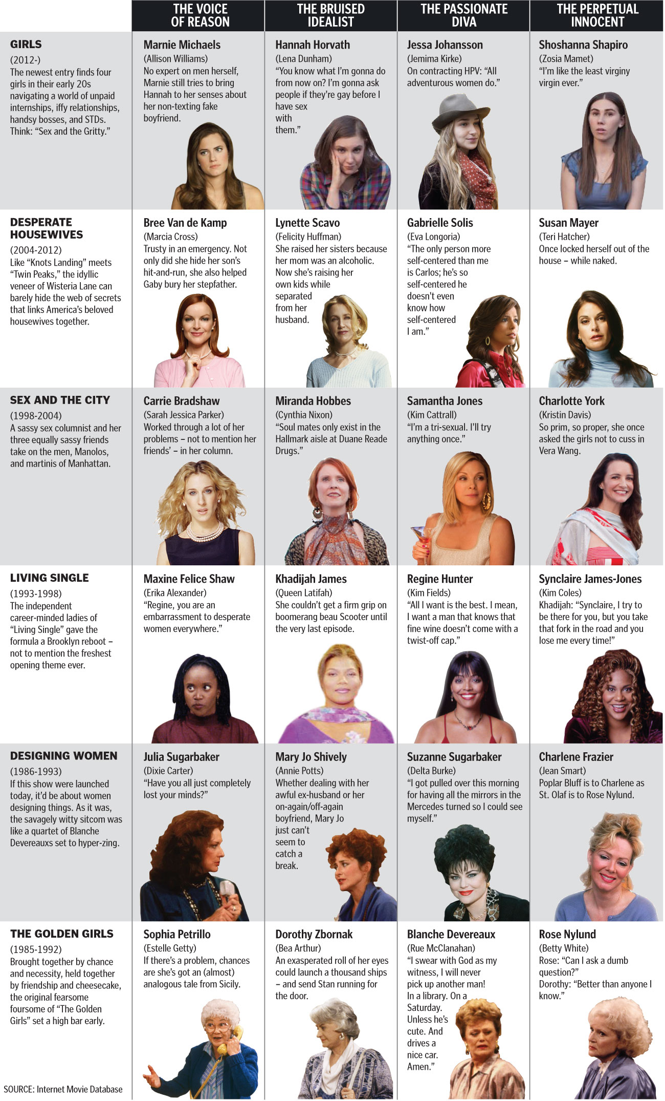
Sunday’s series finale of “Desperate Housewives” provided me and my colleagues at The Boston Globe the opportunity to create a graphic showing how the show fits in with other TV shows with female foursomes. The concept was simple: “Desperate Housewives” is going away, but the archetypes that defined each character has been around on TV for a while, at least since “The Golden Girls.” And seems to continue with the new show, “Girls.”
Here’s the chart that ran on Sunday’s Arts section of The Boston Globe. Click for a larger view.
Click on the links to the BostonGlobe.com version and the Boston.com version.
––––––
HOW IT CAME TOGETHER
I had a professor who taught me several important things, but two things are important for this graphic:
- Anything can inspire an information graphic, whether it be a press release or a musing you have at a coffee shop.
- The characters in “Sex And The City” are perfect counterparts to the characters in “Golden Girls.”
In the years that have followed, I realized he was right. First, anything can lend itself to a graphic. I have several graphics in my portfolio that started out as conversations. I blogged last summer about a chart using the archetypes described in Joseph Campbell’s “The Hero With a Thousand Faces” to compare characters from the Harry Potter series, “Star Wars” and other franchises. It was a great blending of some of my favorite things: academic-minded critiques, pop culture and infographics.
Just as that graphic started with me talking about how Harry Potter was similar to other movies, this “Desperate Housewives” chart started with me talking with friends. I repeated my professor’s statement that the “Sex And The City” characters were very similar to the “Golden Girls” characters. When I’d tell this to people, they’d instantly see that Samantha was Blanche and that Charlotte was Rose. But what about Carrie? Was she Dorothy or Sophia? There were compelling arguments that she was Dorothy and Miranda was Sophia, but just as many people said Carrie was Sophia and Miranda was Dorothy.
Around this same time, “Desperate Housewives” premiered on ABC. I immediately watched, because it had not one but TWO “Melrose Place” alums: Marcia Cross and Doug Savant. I was hooked on this show that seemed equally inspired by “Knots Landing” drama, John Waters’ campiness and “Twin Peaks”-style darkness.
As it became apparent that this would be the last season, I came up with several graphic possibilities for the end of “Desperate Housewives.” The idea of viewing the show in a broader context seemed most appealing, because I knew that something too focused on the show wouldn’t get any play. I began to wonder how the ladies of Wisteria Lane fit in with “Golden Girls” and “Sex And The City.”
I floated the idea to a few people to test their interest. The debates were pretty good, and I realized I had a winner on my hands. I didn’t know if it would be something that the Boston Globe wanted, so I initially pitched it to Boston.com. I ended up getting several e-mails that indeed this could have a home in print and online.
FITTING IT ALL IN
The more I talked with editors, it was apparent that we could use several shows in this graphic. “Designing Women” had a similar formula, as did Betty White’s new show, “Hot In Cleveland.” “Girlfriends” and “Living Single” seemed to line up with this, as did “Noah’s Arc,” which was about four gay black men in Los Angeles. But if used shows about men, would we also use “Entourage”? It could become very unwieldy.
The solution was to run six in print. We cut “Hot In Cleveland” from the print version and instead used “Girls” as the modern show. But we kept “Hot In Cleveland” for the web versions. Michael Brodeur took my original text and punched it up, giving it some flair and humor. I had never seen “Girls,” so he helped identify which categories fit which characters.
I created two web versions, because this would live on both BostonGlobe.com and Boston.com. The sites have different palettes and styles, of course, but there’s another hitch. I had to design the BostonGlobe.com version responsively, meaning that I had to make sure it could be viewed (and readable!) on any browser, on any platform, on any screen, at any size.
You saw the chart at the top of the page. How can that be read on a mobile device?
Here’s how one of the TV shows would appear on the iPhone’s portrait view of the BostonGlobe.com version:

And here’s how a show would look in the iPhone’s landscape view, or on some tablets:
