How it appeared in the newspaper vs. online: Movie psychopaths

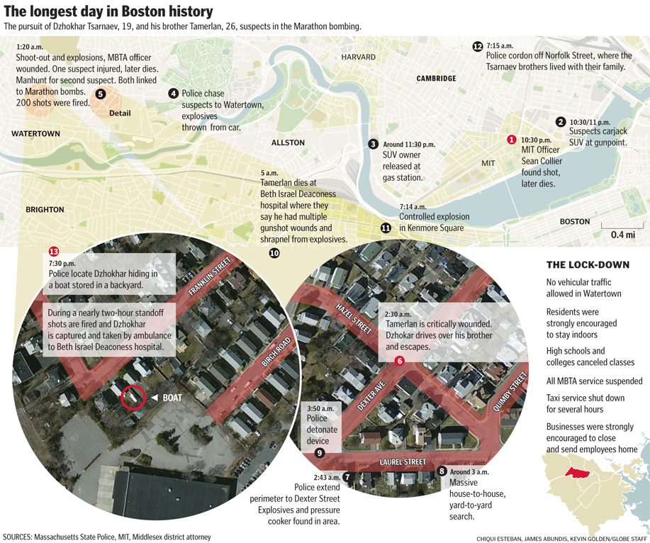
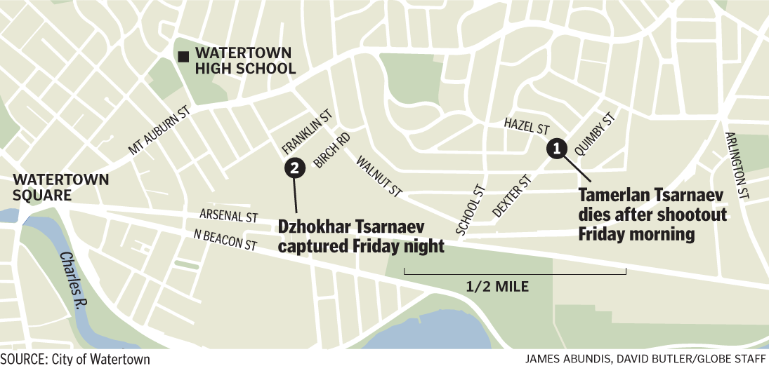
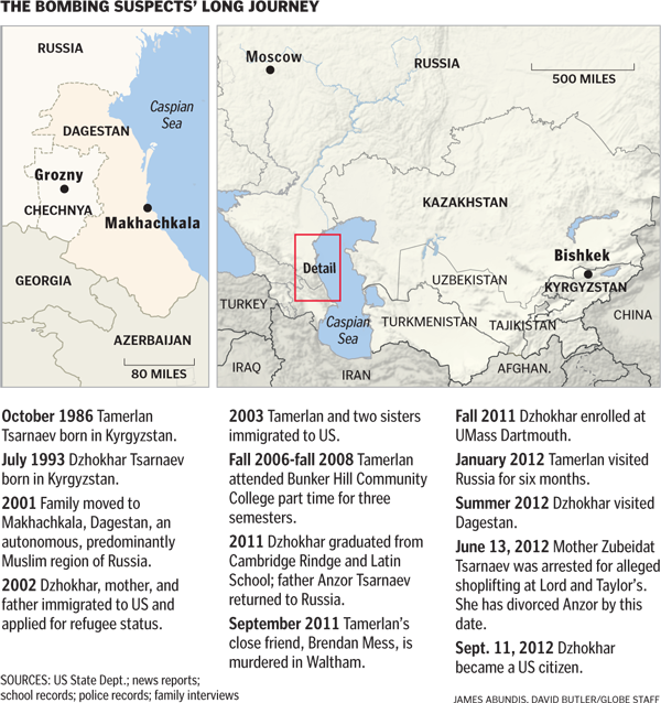
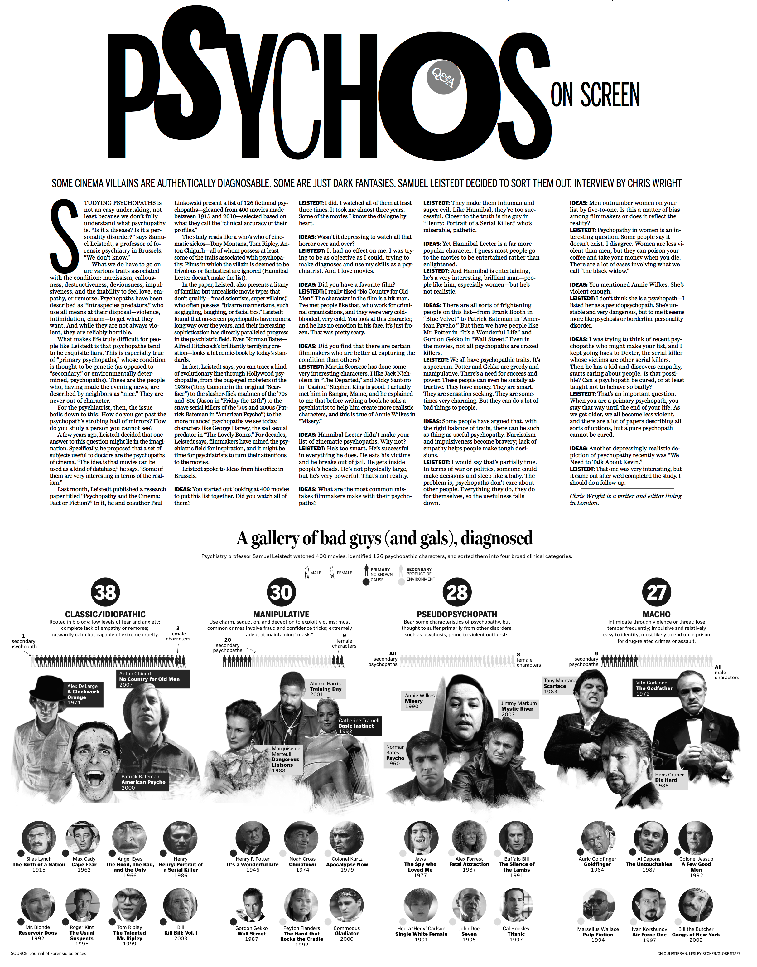
In today’s Ideas section of The Sunday Globe, Boston Globe Graphics Editor (and my boss) Chiqui Esteban put together a graphic examining psychopaths from the movies. The graphic accompanies a Q&A with psychiatry professor Samuel Leistedt, who watched 400 movies, identified 126 psychopathic characters, sorted them into four broad clinical categories, and released his findings last month.
Click the image below to see a larger version.

As people would walk by our desks and comment on how cool the graphic was shaping up to be, we would tell them, “Just wait till you see how this plays online.

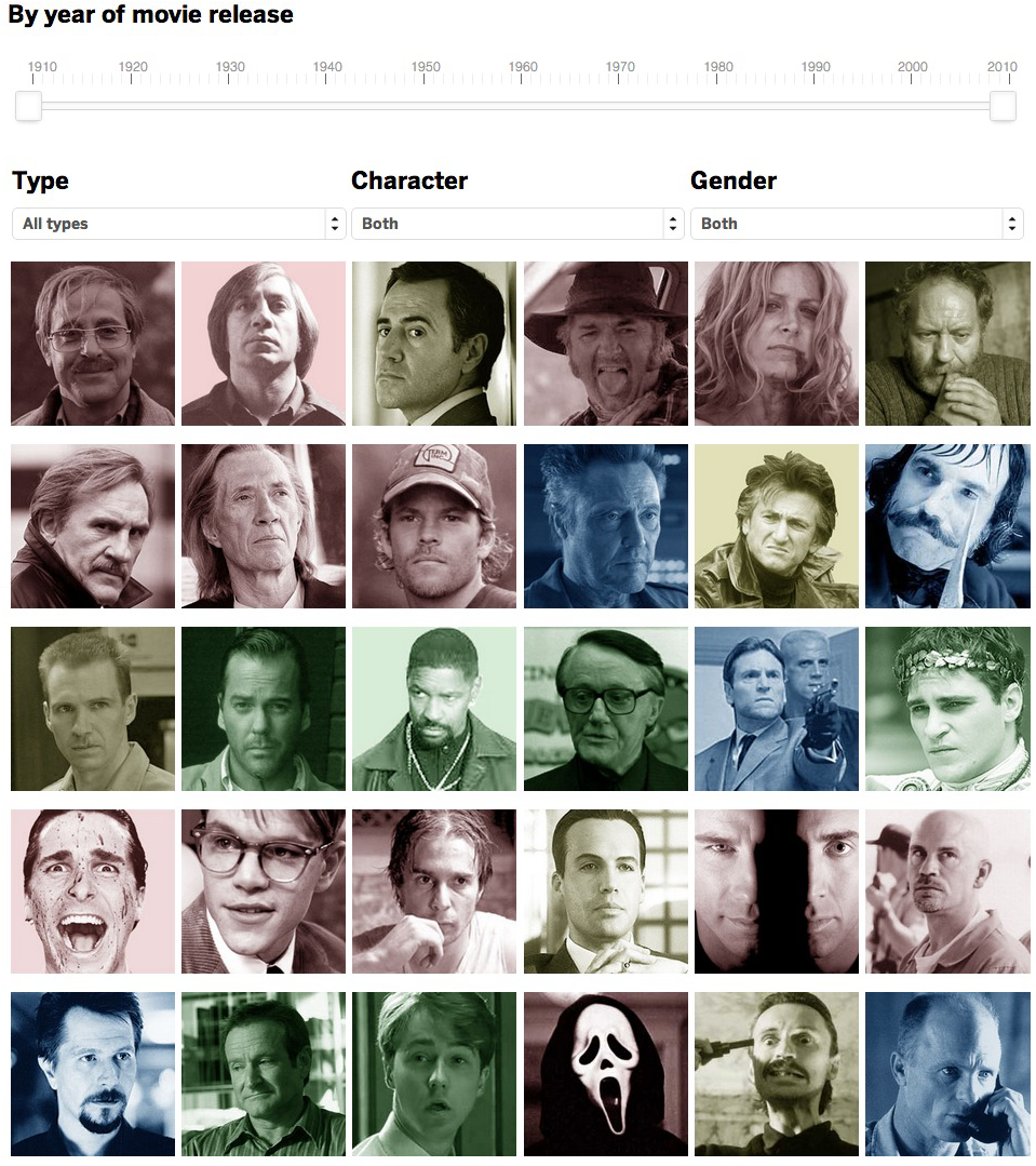
The print graphic was able to include images of just some of the characters, but for the BostonGlobe.com version, we had images for each of the 126 characters in Leistedt’s report. Online, Chiqui created a sortable datable where users could sort between type, gender and primary/secondary. Additionally, he added a slider, allowing users to isolate the time frames.


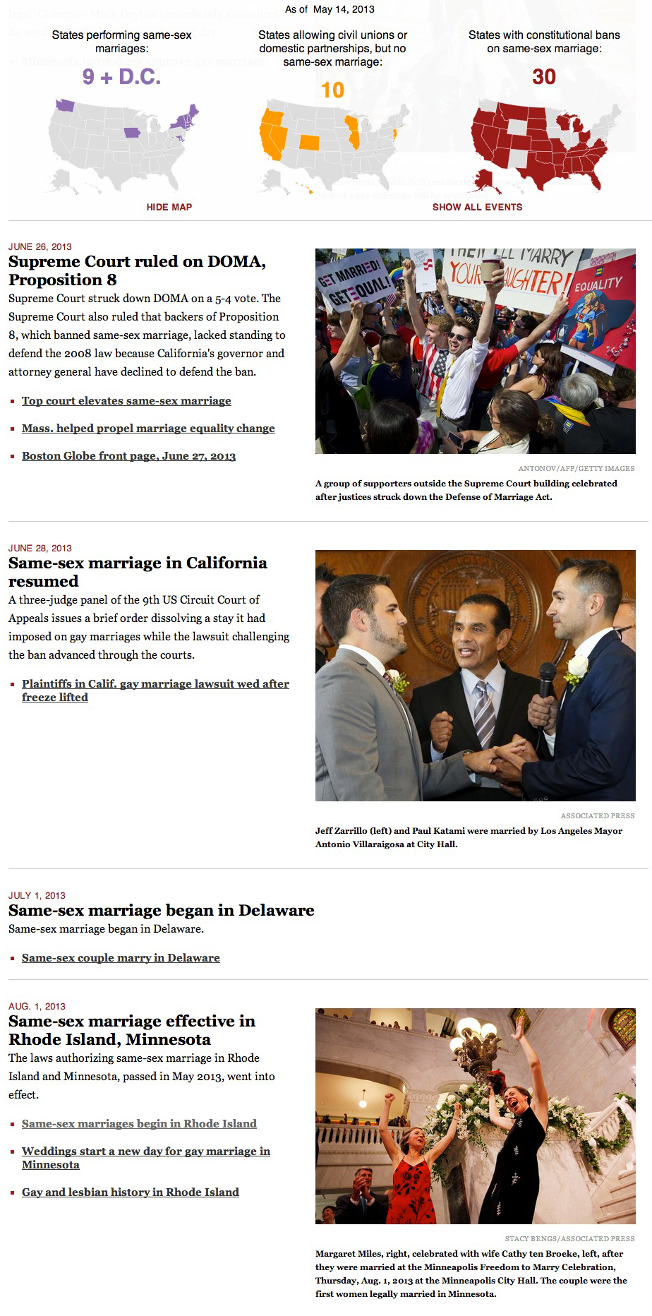
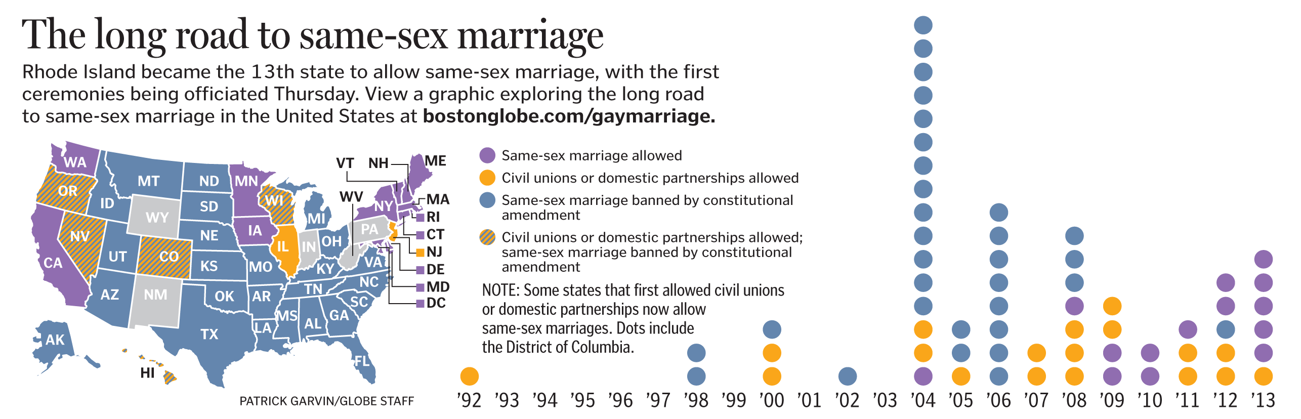
Additionally, I added a link to a PDF of today’s Ideas page so that users how the piece ran in print. In my gay marriage project for BostonGlobe.com, I’ve been including PDFs of Boston Globe front pages as a way of playing up BostonGlobe.com’s archiving potential. When possible, I’ve tried to include links to past projects, whether those links are to other web projects or PDFs of newspaper pages.

This web version of the psychopaths graphic benefitted from Chiqui’s knowledge from past projects. He has done lots of good web graphics making use of sortable databases that show or hide an array of variables:

As you can see, the web version has a different feel to it from the print version. But that’s OK. That’s going to be true for most graphics that have both print and web components, because of a few variables:

  • The print versions are constrained by whether the page is color or not. The web version, of course, can appear in a golconda of colors. In this case, the use of colors allowed us to color-code the four types of psychopaths that Leistedt included in his survey. In a quick glance, you can see the variety.
  • The total print version can be seen at once. But on the web, the interactive can’t be seen all at once, as the user will scroll and/or click to see more.
  • Whether you’re reading the newspaper in downtown Boston or Newton or all the way out in Maine, you’ll see the graphic at the same size on a page that has the same dimensions. The web version, of course, varies based on the size of your screen.
  • The print reader can’t sort, click, show or hide any of the information presented to him/her. But the user of the interactive graphic can have all of those options.
  • Because you can see photos with all 126 characters, the user can get a more complex view of the variety of psychopathy in the movies.
  • The option to not sort is just as important as the option to sort. This list includes quite a disparate list, ranging from Don Corleone to Chucky to Patrick Bateman to Thelma and Louise to Bonnie and Clyde. That covers a lot of ground, and I think we’re doing a service to the readers by giving them the options to see it all at once while also giving them the options to only see the subcategories. In print, we’d have to make that decision for them. But if they’re on a desktop or a mobile device, they can decide for themselves with their mouse or their finger.

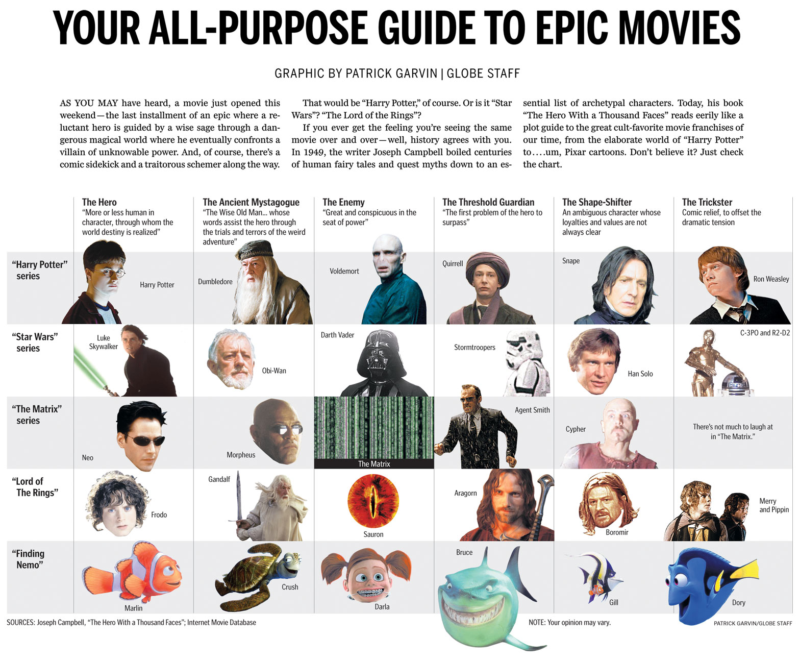
This ran in The Sunday Globe Ideas section, which reports on ideas, people, books, and trends that would be of interest to intellectuals. It covers lots of ground, and has allowed us to do lots of great graphics. One of my favorite graphics for Ideas was a chart I did showing how Harry Potter and other fantasy characters used Joseph Campbell’s hero myth archetypes.

Go check out Chiqui’s graphic here. Check out Chiqui’s portfolio here.

How BostonGlobe.com’s gay marriage interactive graphic came to be

Today is the first day that Hawaii allows same-sex marriage. The state was the 16th to approve allowing gay marriage, and becomes the 15th to begin performing them. Illinois’ state legislature approved same-sex marriage a few days before Hawaii, but that law won’t go into effect until summer of 2014.

For the last four months, I have been editing and updating this BostonGlobe.com interactive graphic about the history of same-sex marriage in the United States. In short, there’s a sticky navigation that stays with you when you scroll through the timeline, show maps and tallies that change as states allow gay marriage, ban gay marriage or allow civil unions or domestic partnerships. The timeline includes links to archived stories, copies of bills and statutes, and PDFs of past Globe front pages.

The landscape as of 1996:

As of the 2004 election:

As of today, when Hawaii becomes the 15th state to allow same-sex marriage:

This sticky bar is just part of the graphic, of course, as the timeline is what triggers the changes in colors.


—————————


HOW THIS STARTED

I conceived this project right after the Supreme Court ruled on Proposition 8 and the Defense of Marriage Act. In the days that followed, we had many stories about what impact these rulings could bring. These stories usually included maps that more or less looked like this:

Those maps can be tricky to read, because they cram five different types of states into one map:
*States allowing gay marriage
*States allowing civil unions or domestic partnerships, but not gay marriage
*States banning gay marriage by constitutional amendment
*States banning gay marriage by constitutional amendment, but allowing civil unions or domestic partnerships
*The default states, not identified, which have no constitutional reference to gay marriage

These maps are helpful to glean the overall splintering of the issue, and can be used to parse out laws state by state, but are still busier than need be. I wanted was something easier to read, and after talking with Boston Globe AME for Design Dan Zedek, I decided three separate maps would work best. But even then, I thought the map alone didn’t show how much the map has changed over time.

To truly get at the heart of the story, I thought, we needed three interactive maps that changed over time.

It was late June and I set myself an August 1 deadline. I picked that date because that’s when Rhode Island and Minnesota would begin performing same-sex marriages.

So, I set to work on a variety of tasks:
*Researching gay marriage laws and milestones, both on national and state-by-state levels
*Compiling links of past stories on the milestones, both to add to the timeline and to CQ the dates I had found
*Compiling photos from those events
*Building the framework for this responsive graphic using jQuery, JavaScript and CSS
*Testing it to see where it broke
*Refining, revising, refining and more revising

As I revised this, former Boston Globe Graphics Director Javier Zarracina was very helpful in giving me advice on tweaking the design. He was also very accommodating in giving me the time to work on this project.

—————————


HOW THIS EVOLVED

I reached the August 1 deadline.

For the Metro section of the paper that day, Boston Globe Assistant Design Director for News Robert S. Davis conceived a tease graphic that could anchor the page and promote the online graphic:

Once I launched this on August 1, I would update this whenever new developments occurred. The summer and fall of 2013 saw a bunch new developments, of course, as federal agencies and state agencies began changing policies to be inclusive of married same-sex couples. I ended up having more than 100 events on the timeline. Thus, per the suggestion of Robert Davis, I divided the news stories into “key events” and “other.” The page now loads with only the key events, but the sticky nav with the maps includes a link to click that shows all the events.

This project has spawned the most unwieldy-looking Excel file I’ve ever used:

I mean, just looking at that gives me a headache.


—————————


HOW THIS TECHNICALLY WORKS

Using Shan Carter’s great resource, Mr. Data Converter, I turned that beast of an Excel file into a JSON file. The jQuery reads that and appends a main div on the page with a div for each event, including nested divs for the headline, the text, the photos, the captions and the links.

The maps are SVG, taken from a template that Chiqui Esteban created for our department. When the timeline is scrolled through, the color and tally changes are triggered by div IDs when those IDs are near the top of the screen.


—————————


HOW I FIND STORIES FOR THE TIMELINE

The obvious ones — “Illinois to approve gay marriage,” for example — present themselves. The less obvious ones come from the AP wire, Google searches and a great app that has been invaluable in this process.

Zite functions like Google News in that you can have personalized categories for your news feed. Furthermore, it lets you give a story a “thumbs up” or “thumbs down,” like Pandora.

I check Zite throughout the day, particularly on its feed for “Same-sex marriage.” It often has things that are on my radar, but it has also allowed me to find stories that I wouldn’t have known were coming.

Gay news blogs have also been invaluable. I never source a gay news blog, but I will often follow their links to news sources that I can source: The Associated Press and other newspapers. In the same vein, Twitter has also been a good way to find stories. The #gaymarriage hashtag brings up a lot of opinions, but it has helped me find stories in other states.


—————————


WHAT’S NEXT
What’s next is that I’ll keep updating this as gay marriage news continues to happen. Naturally, you’ll need to check BostonGlobe.com to see the updates.

A look at the Boston Globe’s Boston Marathon bombing infographics

This past week, the graphic artists and page designers at the Boston Globe did some great work to explain what happened at the Boston Marathon and during the manhunt. I was out of town for much of the week, so I only worked on a few graphics. The great graphic work from the Globe this past week was a huge effort by colleagues James Abundis, David Butler, Robert S. Davis, Chiqui Esteban, Kevin Golden, graphics director Javier Zarracina and assistant managing editor Dan Zedek.

Here are some of the graphics produced this past week. To see larger versions, click on any images.

——

Graphics director Javier Zarracina put together this map Monday, the day of the bombings, for Tuesday’s paper. This is not pointed due north, but rather due southwest, for perspective.

Boston Globe graphics after Boston Marathon bombings

——

Here’s a slightly zoomed-out view of the finish area, showing a little more detail.


Boston Globe graphics after Boston Marathon bombings

——

Here’s the area that was treated as a crime scene the days after the blast:

Boston Globe graphics after Boston Marathon bombings

——

For Sunday’s paper, we ran vignettes of people who had been at and near the finish line when the bombs went off. The map shows where they were, and what happened to them after the explosions. This was part of a special “Terror at the Marathon” section designed by Robert S. Davis.

There were several reporters on this, as the gang byline at the bottom shows. It took some coordination to plot who was where, and then to triple-check all of it. David Filipov and Steve Wilmsen served as the main point persons on this, and were key to producing this map.


Boston Globe graphics after Boston Marathon bombings


To read the story, click here.

To see Chiqui Esteban’s interactive graphic of this map, click here.

——

For Wednesday’s paper, James Abundis put together this in-depth look inside the medical tent that was turned into a functional triage unit. Click on the image to see more. Lots of detail in this graphic.

Boston Globe graphics after Boston Marathon bombings

To read the story, click here.

——

As more detail about the actual bombs emerged, James Abundis put together this graphic.

Boston Globe graphics after Boston Marathon bombings

——

How the manhunt unfolded Friday:

Boston Globe graphics after Boston Marathon bombings


Boston Globe graphics after Boston Marathon bombings

——

As details emerged about the Tsarnaev brothers, attention turned to their journey from Kyrgyzstan to Cambridge.

Boston Globe graphics after Boston Marathon bombings

——

Again, it must be said that the great graphic work from the Globe this past week was a huge effort by colleagues James Abundis, David Butler, Robert S. Davis, Chiqui Esteban, Kevin Golden, graphics director Javier Zarracina and assistant managing editor Dan Zedek.


INFOGRAPHIC: ‘Golden Girls’ to ‘Desperate Housewives’

Sunday’s series finale of “Desperate Housewives” provided me and my colleagues at The Boston Globe the opportunity to create a graphic showing how the show fits in with other TV shows with female foursomes. The concept was simple: “Desperate Housewives” is going away, but the archetypes that defined each character has been around on TV for a while, at least since “The Golden Girls.” And seems to continue with the new show, “Girls.”

Here’s the chart that ran on Sunday’s Arts section of The Boston Globe. Click for a larger view.

Boston Globe chart comparing Desperate Housewives, Golden Girls, Sex And The City, Hot In Cleveland, Living Single, Designing Women, Girls


Click on the links to the BostonGlobe.com version and the Boston.com version.

––––––

HOW IT CAME TOGETHER

I had a professor who taught me several important things, but two things are important for this graphic:

  1. Anything can inspire an information graphic, whether it be a press release or a musing you have at a coffee shop.
  2. The characters in “Sex And The City” are perfect counterparts to the characters in “Golden Girls.”

In the years that have followed, I realized he was right. First, anything can lend itself to a graphic. I have several graphics in my portfolio that started out as conversations. I blogged last summer about a chart using the archetypes described in Joseph Campbell’s “The Hero With a Thousand Faces” to compare characters from the Harry Potter series, “Star Wars” and other franchises. It was a great blending of some of my favorite things: academic-minded critiques, pop culture and infographics.

Just as that graphic started with me talking about how Harry Potter was similar to other movies, this “Desperate Housewives” chart started with me talking with friends. I repeated my professor’s statement that the “Sex And The City” characters were very similar to the “Golden Girls” characters. When I’d tell this to people, they’d instantly see that Samantha was Blanche and that Charlotte was Rose. But what about Carrie? Was she Dorothy or Sophia? There were compelling arguments that she was Dorothy and Miranda was Sophia, but just as many people said Carrie was Sophia and Miranda was Dorothy.

Around this same time, “Desperate Housewives” premiered on ABC. I immediately watched, because it had not one but TWO “Melrose Place” alums: Marcia Cross and Doug Savant. I was hooked on this show that seemed equally inspired by “Knots Landing” drama, John Waters’ campiness and “Twin Peaks”-style darkness.

As it became apparent that this would be the last season, I came up with several graphic possibilities for the end of “Desperate Housewives.” The idea of viewing the show in a broader context seemed most appealing, because I knew that something too focused on the show wouldn’t get any play. I began to wonder how the ladies of Wisteria Lane fit in with “Golden Girls” and “Sex And The City.”

I floated the idea to a few people to test their interest. The debates were pretty good, and I realized I had a winner on my hands. I didn’t know if it would be something that the Boston Globe wanted, so I initially pitched it to Boston.com. I ended up getting several e-mails that indeed this could have a home in print and online.

FITTING IT ALL IN

The more I talked with editors, it was apparent that we could use several shows in this graphic. “Designing Women” had a similar formula, as did Betty White’s new show, “Hot In Cleveland.” “Girlfriends” and “Living Single” seemed to line up with this, as did “Noah’s Arc,” which was about four gay black men in Los Angeles. But if used shows about men, would we also use “Entourage”? It could become very unwieldy.

The solution was to run six in print. We cut “Hot In Cleveland” from the print version and instead used “Girls” as the modern show. But we kept “Hot In Cleveland” for the web versions. Michael Brodeur took my original text and punched it up, giving it some flair and humor. I had never seen “Girls,” so he helped identify which categories fit which characters.

I created two web versions, because this would live on both BostonGlobe.com and Boston.com. The sites have different palettes and styles, of course, but there’s another hitch. I had to design the BostonGlobe.com version responsively, meaning that I had to make sure it could be viewed (and readable!) on any browser, on any platform, on any screen, at any size.

You saw the chart at the top of the page. How can that be read on a mobile device?

Here’s how one of the TV shows would appear on the iPhone’s portrait view of the BostonGlobe.com version:


And here’s how a show would look in the iPhone’s landscape view, or on some tablets:

On larger screens, it appeared the way it did in print: as a full grid.
Click on the links to the BostonGlobe.com version and the Boston.com version.

Pi Alley, responsive design and 140 years of The Boston Globe

One hundred and forty years ago today, on March 4, 1872, The Boston Daily Globe published its first edition.

A lot has changed since that first issue: For starters, the word “Daily” has dropped from the name.

In looking back on the paper’s history and how the newspaper industry has changed, I’m reminded of one of my parts of Boston: Pi Alley. Particularly, I’m reminded of how it supposedly got its name from typesetters.

There are a few stories. According to the web site for the Pi Alley Garage:

As downtown Boston evolved from a residential to commercial area by the end of the 19th century, the name of this alley evolved from the names of local landowners to one more descriptive of the area. Many small restaurants set up shop in the alley to serve the area’s workers. A staple in many of these places was meat pies, often ordered by colorful names such as “Cat Pie” earning the alley the name “Pie Alley.”

In the days that Washington Street was home to most of the city’s newspaper printing plants, many of the printers and typesetters frequented a tavern in the alley called the “Bell in the Hand” In their haste to get refreshments, newspapermen would often drop pocketfuls of mixed up, loose type (called “pi” in the printing business) on the ground, leading to the name “Pi Alley.” Today, the alley continues the tradition of small businesses serving the people who work in the area, as well as the many tourists and visitors.

There is a sign in Pi Alley that repeats those stories almost verbatim. I took a picture one night as photographic proof for a friend who dismissed the newspaper connection as bullshit.

The newspaper is no longer downtown and thus no longer near Pi Alley, but I think of the Globe every time I walk through that neighborhood. Not that I don’t think of the Globe anyway; it’s what brought me to Boston.

It’s a news organization of which I am proud to be a part. I could list 140 reasons why, but that would read like a sloppy love letter written by some infatuated teenager. Indeed, I am infatuated with the Globe, and there are many reasons. The newspaper’s Pulitzer-winning coverage of abuse in the Catholic church was instrumental in exposing abuse in parishes across the country. When I first got here, I would pass some of the reporters who worked on those projects and feel like the freshman walking by Johnny Football Hero, although those reporters were much nicer than Johnny Football Hero.

Late last year, the paper launched BostonGlobe.com, a subscriber-only site. It is responsive, meaning it resizes based on the user’s browser and platform. This responsive design sidesteps the need for individual apps for each device. Whether you’re on an iPhone, a Kindle, a P.O.S. with Internet Explorer or even R2-D2, you can read BostonGlobe.com.

Even if you’re in Pi Alley.

————

To download the first front page, click here.

To see a gallery of Globe pages, click here.

To read Louis M. Lyons’ piece that marked the centennial in 1972, click here.

How to get a hand-drawn look in your infographics

Several years ago, a colleague taught me a trick that gives you the appearance of hand-drawn detail in infographics: you take your vector graphic, draw some shadows and then touch it up in Photoshop. It’s a trick that gives your work a sense of elegance, even if you don’t consider yourself artistic. And it’s a trick that I used for an information graphic that ran in this Sunday’s Boston Globe as part of the “Living Longer, Living Better” section.

Start with a basic vector version of your image and print it at a larger scale than you expect it to run in print. Some say to print it at 125 percent of the final size, and others say 175 percent. The point is, print it at a size larger than it actually is. Assistant graphics editor Javier Zarracina said that 175 percent is probably the maximum size, as you don’t want it to have to shrink it so much that the pencil details blend together into a dark blur.

Next, use a pencil to add shadows and depth to the image. The pencil work doesn’t have to be too clean or detailed, because its imperfections will be minimized in the later version. Javier said that it helps to not be as careful as you would be with a normal drawing.

Here’s my initial drawing of a knee replacement:
Patrick Garvin and Boston Globe infographic using hand-drawn images
Hip replacement:
Patrick Garvin and Boston Globe infographic using hand-drawn images
Once you’ve finished adding the pencil, scan the image. Scale it to the size it will be when printed. The scratchy pencil work, when scaled down, looks a lot more detailed and precise than it did on paper. In Photoshop, adjust the contrast and shadows if needed.

In Illustrator or Photoshop, add the color. I usually add a slight Gaussian blur to give it that imperfect hand-painted look. It helps if the color is not uniformly distributed but instead darker or lighter in some spots. For this knee and hip replacements graphic, I used some dark blue at a light opacity to strengthen the shadows and add shadows in spots I had missed. In the hopes of increasing the sense of contrast, I added white in areas that seemed too dark. I got those suggestions from Javier, which I think helped.


Patrick Garvin and Boston Globe infographic using hand-drawn images


Patrick Garvin and Boston Globe infographic using hand-drawn images


Lastly, replace the vector placeholders in your infographic with the colored images. And voila! You have a hand-drawn graphic!


Patrick Garvin and Boston Globe infographic using hand-drawn images


I like this style for medical graphics and diagrams of the body. Even when I don’t use a hand-drawn look, I’m still a fan of creating an image at a larger size than you intend to run it in order to condense the detail. The results are subtle, but it gives the effect of shadows.

A few things really help when working on a project like this:

  • If you can have most (or all) of the text edited before drawing the images, it saves you from having to move stuff around later. Furthermore…
  • Make sure you, the reporter and editor(s) are all on the same page in terms of how many steps you want to include.
  • If you’re sending the graphic to a source to double-check it for accuracy, you might find that he or she wants you to add or remove steps. It’s easier to make those changes if you haven’t yet scanned the image yet.
To see the version of the graphic that ran on Boston.com, go here.
To read Rob Weisman’s story about knee and hip replacements on Boston.com, go here.
To see the entire “Living Longer, Living Better” section on Boston.com, go here.


To see the version of the graphic that ran on BostonGlobe.com, go here.
To read Rob Weisman’s story about knee and hip replacements on BostonGlobe.com, go here.
To see the entire “Living Longer, Living Better” section on BostonGlobe.com, go here.

On Tim Wakefield, oldest active player in Red Sox history

On Friday, Boston Red Sox pitcher Tim Wakefield announced he’s retiring after 19 seasons in the major leagues, 17 of which were with the Red Sox.

Wakefield got his 200th career win this past season. Of those 200 wins, 186 were with the Red Sox. Sports Jedi Luke Knox put together this chart showing Wakefield’s wins and how he stacks up with other Sox players.

Boston Red Sox graphic about Tim Wakefield

Indeed, among Red Sox pitchers, he’s high on many leader lists, right up there with Cy Young and Roger Clemens.

There’s another distinction that Wakefield earned in the 2011 season: he became the oldest active player in the history of the Boston Red Sox, including the time when the team was called the Boston Americans in the early 1900s. On Tuesday, May 10, 2011, Tim Wakefield was 44 years, 281 days old, a day older than Deacon McGuire was when he played final game for the team in 1908.

It seems like a nitpicky distinction, but it’s one I will remember, because it was the topic of one of my first enterprise graphics at The Boston Globe. Click for a larger view.

Boston Red Sox graphic about Tim Wakefield

When I first got to the Globe in November 2010, I knew I wanted to learn more Flash. And I knew I wanted a project about the Red Sox. And I know that for both, the man to talk to was Daigo Fujiwara, who knew Flash and Red Sox baseball very well. He has his own baseball sites and even hosts a Red Sox podcast.

In talking with him, I mentioned Jamie Moyer, whom I had just seen mentioned in an article as being the oldest player in major league baseball in the 2010 season. A few years behind him in age was Boston Red Sox pitcher Tim Wakefield. I went home and did some research on Baseball-Reference.com, and found that there had been other Sox players who played at the age of 44. But a comparison of birthdays showed that none of them had been as far into 44 as Tim Wakefield. Some time into the upcoming 2011 season, Tim Wakefield would become the oldest Red Sox player in the history of the team.

I told my boss that this might be a fun project to work on in my down time at work when I didn’t have any other pressing projects. That is, if he thought people would be interested. “Almost anything Sox-related gots lets of traction in this town. People will definitely be interested.”

So, using Baseball-Reference.com, I created a spreadsheet. I noted the youngest and oldest player of each season, dating back to the days when the team was The Americans. Additionally, Baseball-Reference determines the average age of every player on the team, so I included that as well. It was a tedious task, going through each page for each season, looking through their rosters. But a pretty cool data table was shaping up.

When finished, I plugged the data into Illustrator’s graph tool, showing the youngest, oldest and average ages per season. The nut graph was that there were no noticeable trends. Carl Yastrzemski played for a bit when he was 44, but was a younger 44.

Throughout the winter of 2011, when I had no more dailies or short-term projects on my plate, I would turn to this project, and how we would present it online. Using the Actionscript from projects I had worked on with Daigo, I created a template for what the Flash version would be. I turned the Excel spreadsheet into an XML file that fed into the Flash file. While the print version had been a static version of the chart, the Flash version would allow the user to roll over each year and see the oldest and youngest players. My boss, David Schutz, suggested I include photos of each player. The aforementioned Luke Knox directed me to some old Red Sox press guides, which is where I found the bulk of the photos.

So, by the end of April, this thing had come together in bits and pieces over a period of several months. On Tuesday, May 10, the day that Wakefield became the oldest active Red Sox player, we ran the graphic in the sports section of The Boston Globe, and this interactive went live on Boston.com.

To this day, it’s one of my favorite things I have ever done, especially at The Globe. Of course, by the time Tim Wakefield was the age I am now, he had already won 56 games in the majors.

Not bad. Indeed, not bad.

Harry Potter, Star Wars, Joseph Campbell and the hero myth

I wanted to share with you a chart from the Ideas section of this Sunday’s Boston Globe. Using the archetypes described in Joseph Campbell’s “The Hero With a Thousand Faces,” the chart compares characters from the Harry Potter series, “Star Wars,” “The Matrix,” “Lord Of The Rings” and… “Finding Nemo.”

Click for a larger view.

Boston Globe chart comparing Harry Potter, Star Wars, The Matrix, Lord of the Rings and Finding Nemo using Joseph Campbell hero archetypes

HOW IT CAME TOGETHER

I’ve long kept a graphics notebook in which I jot down and scribble ideas as they occur to me. I’m currently on the fifth notebook.

In the summer of 2007, I caught up with the world and finally began reading the Harry Potter books. I started a month or so before the final book was released. Thus, I got to start with the first book and read the entire series without pausing in between books. The day I finished the seventh book, my mind was racing with ideas. Once such idea:

I jotted whatever came to my mind, knowing I could edit it later. I had long seen the similarities in other sci-fi and fantasy movies, as I had some teachers in high school who riffed on those concepts in class. The idea sat in the notebook for almost four years. (Note to those who know me: check the date on the top of the notebook entry.)

Flash forward to this current summer, four years and one newspaper after I first read the Harry Potter books and had the idea. Colleague Ryan Huddle was working on his great Harry Potter treatment, which you can read about on Charles Apple’s blog. Dan Zedek, AME for Design, asked if I might have any ideas for “The Deathly Hallows,” as he had seen what I had done for the last Indiana Jones movie. I told him about the aforementioned notebook submission, and added that we didn’t have to focus solely on Biblical characters. We could open it up to the hero archetypes explored by Joseph Campbell, who literally wrote the book on the topic.

The next day, Dan told me he had run the idea by Steve Heuser of the Ideas section. Steve had thought the idea had potential and wanted me to rough up some notes to use as a jumping-off point. I consulted assistant graphics editor Javier Zarracina, who was a wealth of ideas. We looked up the hero myth structure, which can be very simple or complicated, depending on who’s dissecting Joseph Campbell’s books and lectures. Additionally, I am especially indebted to Mike O’Brien and Rob Bergman from DeSmet Jesuit High School in St. Louis, as they gave me tons of ideas and sites to consult.

Working with Steve and Javier, I tightened the focus to the archetypes and left out the comparisons of plot. I used Harry Potter, “Star Wars,” “Lord of the Rings” and “The Matrix,” but decided to leave off the Narnia movies. For one, I had only seen the first movie, which hadn’t had the same mass appeal as the others on the list. Steve suggested we try to find a movie that used the same archetypes but that deviated from the serious sci-fi/fantasy realm. I suggested “Finding Nemo,” and he laughed so hard that I knew we had a winner.

I originally structured the chart in a rather traditional, straightforward way. Steve suggested I use the whole width of the page, and Javier suggested I cut out some of the photos using silhouettes. Lisa Tuite and Wanda Joseph-Rollins of The Boston Globe library both helped pull photos to use. Dan helped me vary the cutouts so that they seemed more dynamic. We tweaked and tweaked, and I liked each version more than the previous versions. The graphic ended up on Boston.com by Friday afternoon.

ABOUT THE MOVIES WE DIDN’T USE

There were a ton of movies we could have used, because there are a ton of movies that use these archetypes. Besides the Narnia films, both the “Batman” series and “The Princess Bride” were suggested, as were several westerns and Akira Kurosawa films. Many non-fantasy films were suggested, too. These were all great suggestions, and I thank all of you whom I e-mailed for advice.

Ultimately, Steve, Javier, Dan and I kept the list limited to big movies and series from the past 10 years or so. We could have easily done a full-page chart with more than a dozen films and still not even scratch the surface of the films who’ve used these archetypes. The whole point of this chart is that these tropes are ubiquitous.

In addition to the films we chose (or didn’t choose), readers might take issue with the specific characters we chose for the categories. Within the newsroom, we had lots of differing opinions. Ultimately, I think this shows we came up with a great idea that will have people talking. A “talker,” if you will. Or a “Hey, Martha.”

Working on this chart appealed to several of my geek loves: “Star Wars,” philosophy, Harry Potter and infographics. Dan frequently likes to tease me for my references to “Star Wars” and “Harry Potter.” If only I could have referenced Scrabble, “The X-Files,” “Battlestar Galactica” and “Melrose Place,” the Pat Garvin interests could have all been referenced.

Next time.

How The Boston Globe/Boston.com covered the tornadoes

The Boston Globe and Boston.com have done a great job covering Wednesday night’s tornadoes in Western and Central Massachusetts. I’ve included the last three days’ front pages, as well as some inside pages, photos and graphics. To see all of the Boston Globe/Boston.com coverage, go here.

———

THURSDAY, JUNE 2

The inside page:

The top photo is by Matthew Cavanaugh, for the Boston Globe:

We used NOAA’s updates to put together this map of reported touchdowns and deaths:

Javier Zarracina quickly put together this explainer on the anatomy of a tornado:

To read the main bar (gang byline of Travis Andersen, Eric Moskowitz, Martin Finucane, Glen Johnson, Bryan Marquard, and David Abel), go here.

To read Carolyn Y. Johnson’s story on how tornadoes form, go here.

To see Tom Giratikanon’s map of the history of tornadoes in Massachusetts, go here.

———

FRIDAY, JUNE 3

We had several inside pages, including this color photo page:

Which included this great photo by David L. Ryan:

Elsewhere inside was this great map by James Abundis with reporter Brian Ballou. It shows the varying damage of houses on Pennsylvania Avenue in Springfield.

To read Ballou’s story, go here.

With updates from the National Weather Service, we were able to show which cities had warnings, and more reported touchdowns:

Javier Zarracina put together an explainer showing how the National Guard and FEMA were deployed to coordinate the search and rescue operations:

To read Brian MacQuarrie’s story, go here.

———

SATURDAY, JUNE 4

The photo up top is by John Tlumacki:

To read Stephanie Ebbert’s story, go here.

To read Brian MacQuarrie’s story, go here.

To see all of the Boston Globe/Boston.com coverage, go here.