4 reasons why Adobe Flash was not a waste of our time

Last week, Adobe Systems announced it would stop making Flash technology for mobile devices and would instead focus on HTML5.

Flash’s end has been predicted for the last few years now, as it is not supported on the iPhone or the iPad. Flash runs on other mobile devices, but Apple products are the Marcia Brady of their kind. If Apple rejects you, you’re kinda sorta screwed.

4 reasons why Adobe Flash was not a waste of our time

For many graphic artists who joined newsrooms before the big push for “interactive graphics,” Flash was the first program we used to make web graphics with rollovers. We struggled with the differences between frames and keyframes. We learned that changing a movie clip changed every instance of the movie clip. We cheered when we figured those things out, and then were challenged when we transitioned from ActionScript 2.0 to 3.0.

Don’t take that as a complaint. Journalists pride themselves on being problem-solvers whose job is learning new things. With interactive graphics, there was (and still is) always something to learn. Flash, to me, embodies how a lot of people in newsrooms feel: no matter how fast you try to catch up, there’s always something newer to learn.

Earlier this year, I got to attend SND STL. While there, I met a lot of graphic artists who felt frustrated by Flash’s imminent obsolescence. One guy put it best: “I feel like I spent the last three years trying to learn this program, and now that I’m somewhat proficient, it’s useless. I feel like I wasted my time.”

But I don’t think he wasted his time. Here are a few reasons why:

  1. It was a decent gateway for people who had never coded before. Flash allowed you to create things the way you were used to creating them in Illustrator. Using ActionScript, you could make those objects do things. ActionScript won’t work in HTML or JavaScript, but the general concept is the same: you have code that dictates what the package looks like and how the user will interact with it. ActionScript and JavaScript are not the same but they have similar structures. You can’t waltz from one into the other, per se, but knowing one could help you grasp some of the basic concepts.
  2. It forced some people to learn HTML and CSS. When you finished your Flash file, you had to export it as a SWF. To put that on a web page, you still needed to write code that said, “Hey, show this Flash file.” If you had never used HTML before, having to embed your Flash movies might have been your introduction to basic CSS and HTML.
  3. You proved you could adapt. Remember when we all had to switch from FreeHand to Illustrator? Or ActionScript 2.0 to 3.0? There were quirks and growing pains, and you might have complained that you shouldn’t have to learn this stuff. But you did it. So what if Flash is no longer used by many organizations. The take-away is that you have proven that you are willing to invest time to learn whatever the new technologies are. Spin it that way, and your Flash knowledge makes you look like a hard worker who can try new things, rather than some dinosaur.
  4. Understanding the philosophy behind what makes a good interactive graphic is just as important as knowing the specific technology. Page designers who made good pages in Quark figured out how to make good pages in InDesign. The fundamentals of page design didn’t change when we switched from Quark to InDesign. The fundamentals of good information graphics didn’t change when FreeHand was replaced in newsrooms by Illustrator.

The Nieman Journalism Lab had a good piece about how Adobe’s abandonment of Flash will affect the news organizations who used it. If you haven’t seen it, please do.

And then start on your HTML5 tutorials. There are interactive graphics to be made.

If Leonardo da Vinci tinkered the way George Lucas does…

In the weeks since we’ve learned that George Lucas has tinkered with “Star Wars” yet again, this time for the Blu-ray release, the nerds have been livid.

I realize many of my non-“Star Wars” friends might not be able to appreciate what this means, so I decided to put it in terms you might understand.

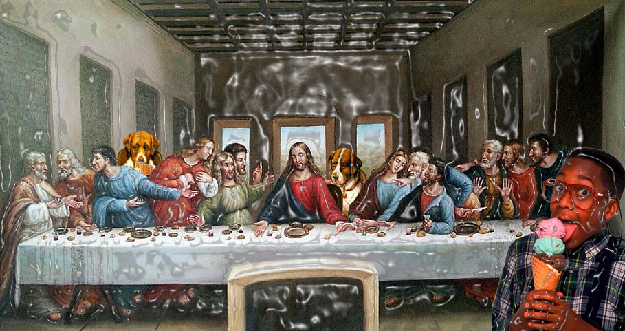
I decided to show it terms of what it would be like if Leonardo da Vinci decided to mess with “The Last Supper” after it had been critically acclaimed and beloved for years.

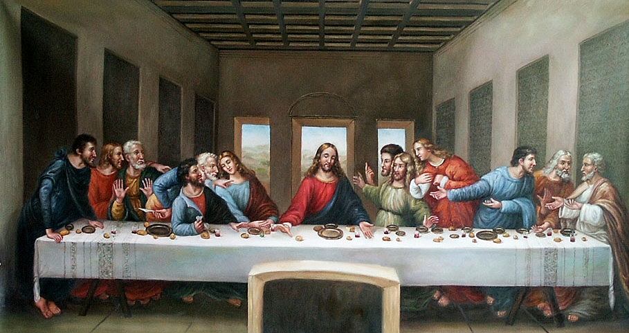
Here we have the original version of “The Last Supper” by Leonardo da Vinci. In our example, this functions as the stand-in for the original “Star Wars” trilogy. In a word, a masterpiece.

If da Vinci did to 'The Last Supper' what George Lucas has done to 'Star Wars'

————

In 1997, George Lucas re-released the trilogy with changes. Some of them were CGI changes to certain scenes. They were changes that were so nuanced that you’d have to look at the original and new version side by side to notice the differences. But there were two main changes:

1. In “Star Wars,” when Han Solo encounters Greedo and shoots him, the scene was changed to have Greedo shoot first and have Han fire a defense shot. Before, Han shot and killed him just because he was done with Greedo’s nonsense. But in the new version, it was an act of self defense. This angers the geeks to no end.

2. In “Return of The Jedi,” Lucas added a musical number to the scene in Jabba’s palace. It involves monsters singing and dancing as if it’s a Muppet show. That is what irks me.

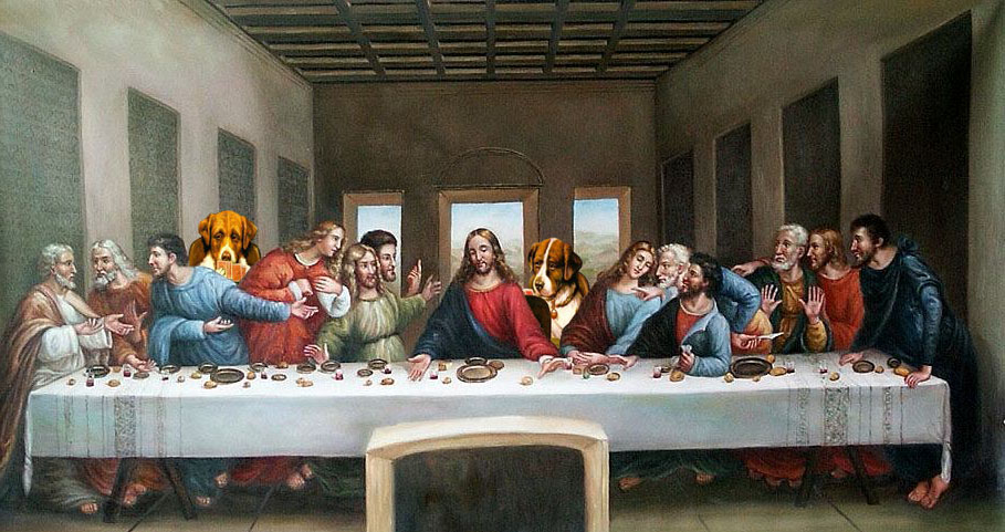
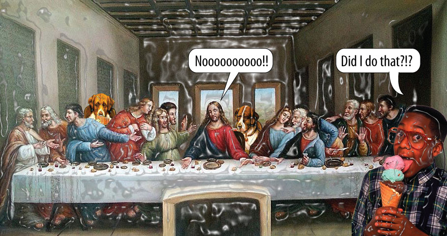
So, these changes are akin what it would be like if da Vinci decided he wanted to horizontally flip “The Last Supper” and add in some of the canines from the “Dogs Playing Poker” painting.

If da Vinci did to 'The Last Supper' what George Lucas has done to 'Star Wars'

————

Around the time “Stars Wars: Episode III —- Revenge of The Sith” was released, Lucas tweaked with the original trilogy again. This time, he changed the end of “Return of The Jedi” to use imagery of the new Anakin Skywalker, replacing the original footage.

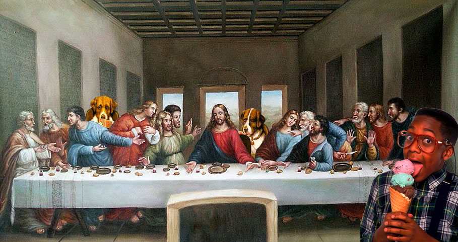
To me, this akin to da Vinci saying, “OK, now I’m going to add Urkel from ‘Family Matters.'”

If da Vinci did to 'The Last Supper' what George Lucas has done to 'Star Wars'


————

Then we found out that the Blu-ray versions would have even more changes, which was like adding a PhotoShop filter to something he’d already tinkered with a bunch of times.

If da Vinci did to 'The Last Supper' what George Lucas has done to 'Star Wars'

————

And when we learned what those changes would be, it was even worse.

If da Vinci did to 'The Last Supper' what George Lucas has done to 'Star Wars'

————

It would be like your mom deciding that your favorite meal she prepared was still not good enough, so he had to change it. She’d add thumbtacks, staples and manure until it was “just right.”

That’s what you’ve done to us, George Lucas. You’ve added manure to our favorite dish.

Harry Potter, Star Wars, Joseph Campbell and the hero myth

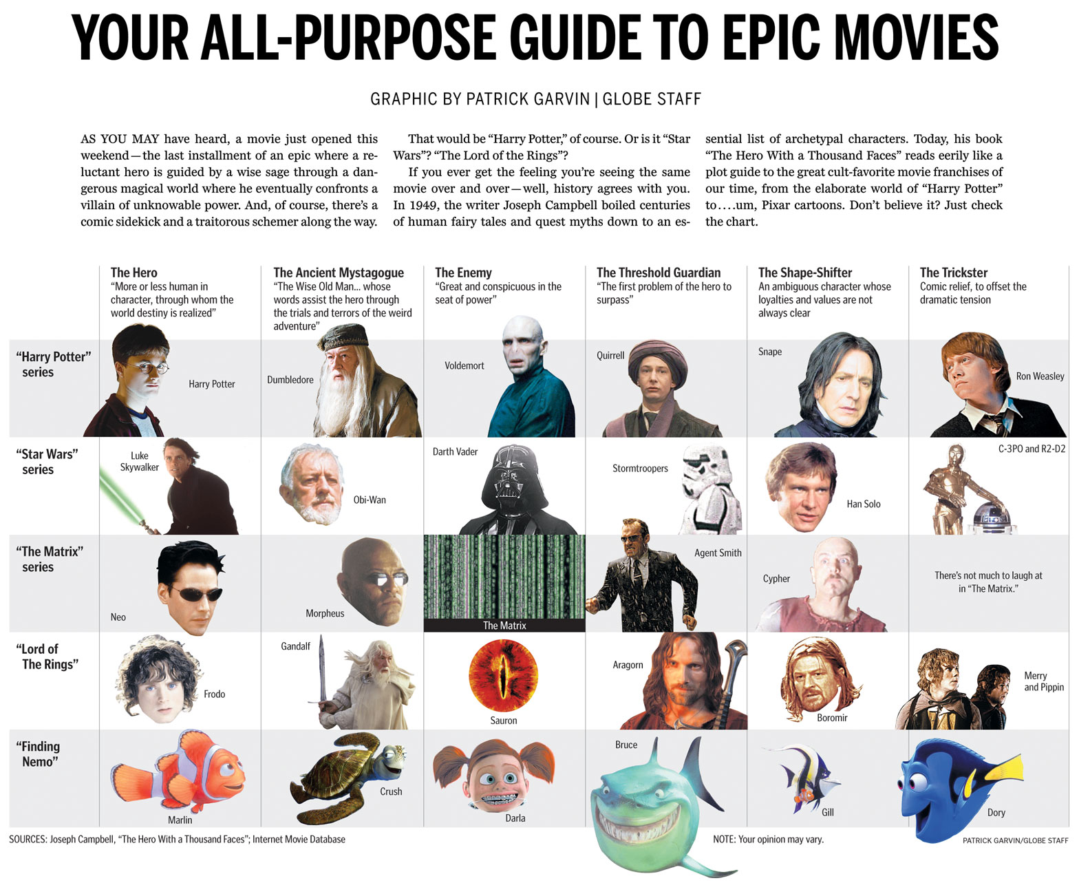
I wanted to share with you a chart from the Ideas section of this Sunday’s Boston Globe. Using the archetypes described in Joseph Campbell’s “The Hero With a Thousand Faces,” the chart compares characters from the Harry Potter series, “Star Wars,” “The Matrix,” “Lord Of The Rings” and… “Finding Nemo.”

Click for a larger view.

Boston Globe chart comparing Harry Potter, Star Wars, The Matrix, Lord of the Rings and Finding Nemo using Joseph Campbell hero archetypes

HOW IT CAME TOGETHER

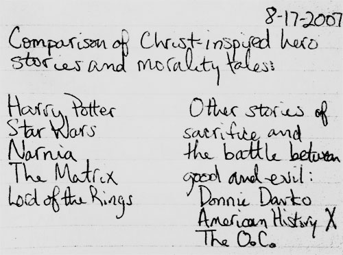
I’ve long kept a graphics notebook in which I jot down and scribble ideas as they occur to me. I’m currently on the fifth notebook.

In the summer of 2007, I caught up with the world and finally began reading the Harry Potter books. I started a month or so before the final book was released. Thus, I got to start with the first book and read the entire series without pausing in between books. The day I finished the seventh book, my mind was racing with ideas. Once such idea:

I jotted whatever came to my mind, knowing I could edit it later. I had long seen the similarities in other sci-fi and fantasy movies, as I had some teachers in high school who riffed on those concepts in class. The idea sat in the notebook for almost four years. (Note to those who know me: check the date on the top of the notebook entry.)

Flash forward to this current summer, four years and one newspaper after I first read the Harry Potter books and had the idea. Colleague Ryan Huddle was working on his great Harry Potter treatment, which you can read about on Charles Apple’s blog. Dan Zedek, AME for Design, asked if I might have any ideas for “The Deathly Hallows,” as he had seen what I had done for the last Indiana Jones movie. I told him about the aforementioned notebook submission, and added that we didn’t have to focus solely on Biblical characters. We could open it up to the hero archetypes explored by Joseph Campbell, who literally wrote the book on the topic.

The next day, Dan told me he had run the idea by Steve Heuser of the Ideas section. Steve had thought the idea had potential and wanted me to rough up some notes to use as a jumping-off point. I consulted assistant graphics editor Javier Zarracina, who was a wealth of ideas. We looked up the hero myth structure, which can be very simple or complicated, depending on who’s dissecting Joseph Campbell’s books and lectures. Additionally, I am especially indebted to Mike O’Brien and Rob Bergman from DeSmet Jesuit High School in St. Louis, as they gave me tons of ideas and sites to consult.

Working with Steve and Javier, I tightened the focus to the archetypes and left out the comparisons of plot. I used Harry Potter, “Star Wars,” “Lord of the Rings” and “The Matrix,” but decided to leave off the Narnia movies. For one, I had only seen the first movie, which hadn’t had the same mass appeal as the others on the list. Steve suggested we try to find a movie that used the same archetypes but that deviated from the serious sci-fi/fantasy realm. I suggested “Finding Nemo,” and he laughed so hard that I knew we had a winner.

I originally structured the chart in a rather traditional, straightforward way. Steve suggested I use the whole width of the page, and Javier suggested I cut out some of the photos using silhouettes. Lisa Tuite and Wanda Joseph-Rollins of The Boston Globe library both helped pull photos to use. Dan helped me vary the cutouts so that they seemed more dynamic. We tweaked and tweaked, and I liked each version more than the previous versions. The graphic ended up on Boston.com by Friday afternoon.

ABOUT THE MOVIES WE DIDN’T USE

There were a ton of movies we could have used, because there are a ton of movies that use these archetypes. Besides the Narnia films, both the “Batman” series and “The Princess Bride” were suggested, as were several westerns and Akira Kurosawa films. Many non-fantasy films were suggested, too. These were all great suggestions, and I thank all of you whom I e-mailed for advice.

Ultimately, Steve, Javier, Dan and I kept the list limited to big movies and series from the past 10 years or so. We could have easily done a full-page chart with more than a dozen films and still not even scratch the surface of the films who’ve used these archetypes. The whole point of this chart is that these tropes are ubiquitous.

In addition to the films we chose (or didn’t choose), readers might take issue with the specific characters we chose for the categories. Within the newsroom, we had lots of differing opinions. Ultimately, I think this shows we came up with a great idea that will have people talking. A “talker,” if you will. Or a “Hey, Martha.”

Working on this chart appealed to several of my geek loves: “Star Wars,” philosophy, Harry Potter and infographics. Dan frequently likes to tease me for my references to “Star Wars” and “Harry Potter.” If only I could have referenced Scrabble, “The X-Files,” “Battlestar Galactica” and “Melrose Place,” the Pat Garvin interests could have all been referenced.

Next time.

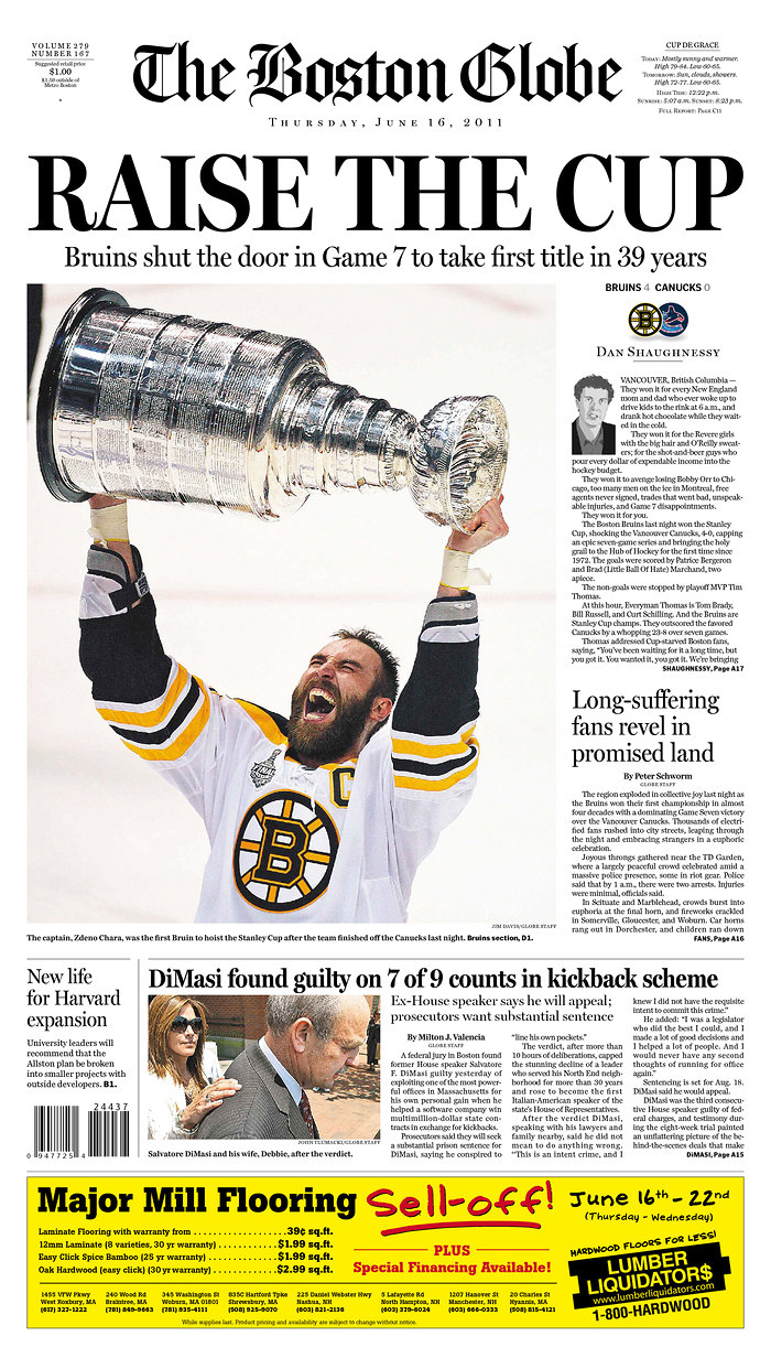
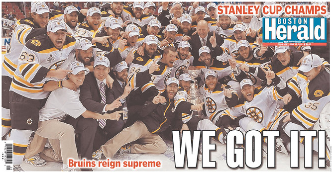
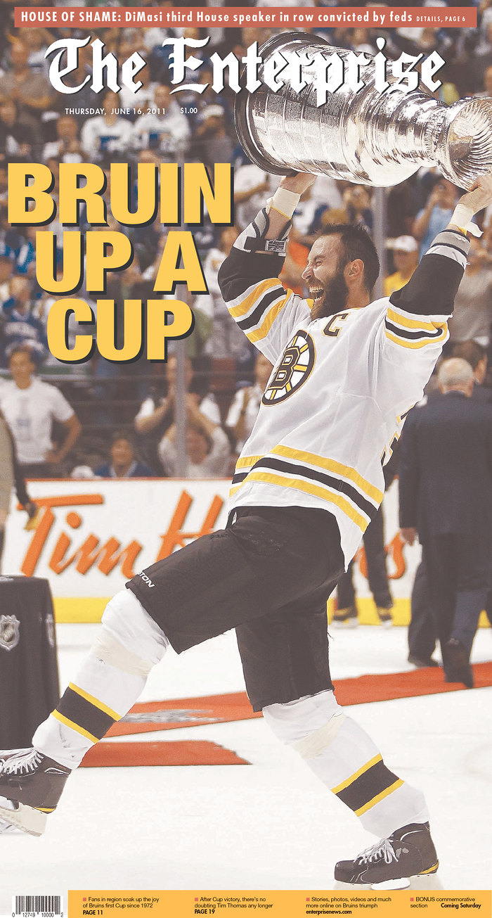
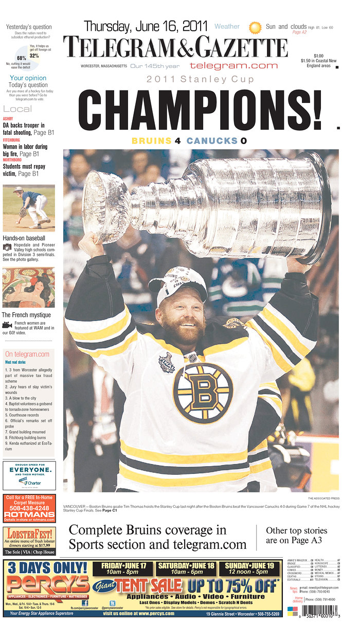
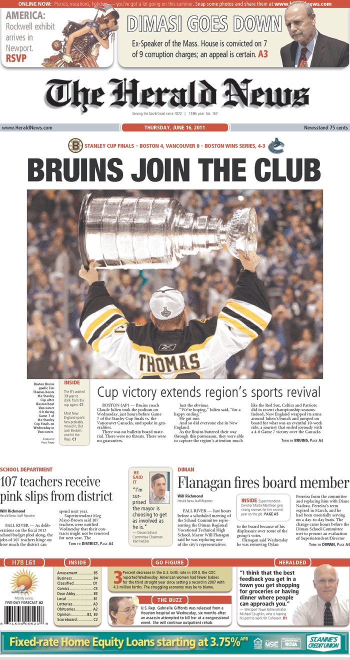
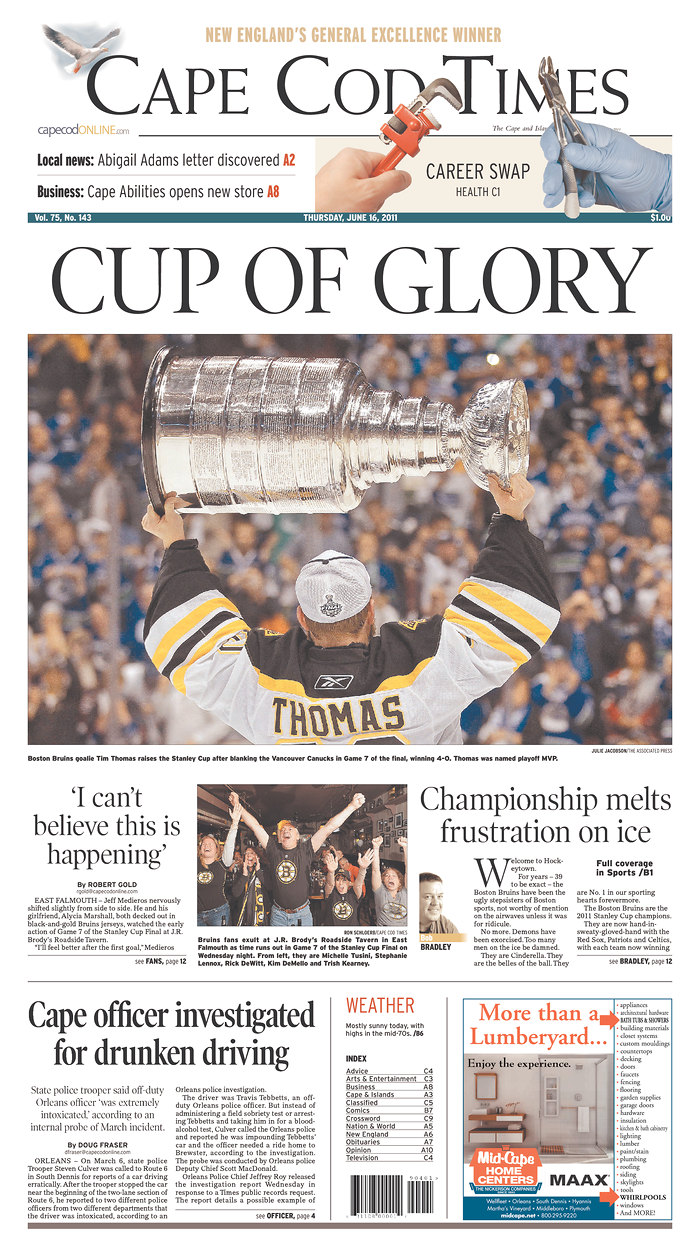
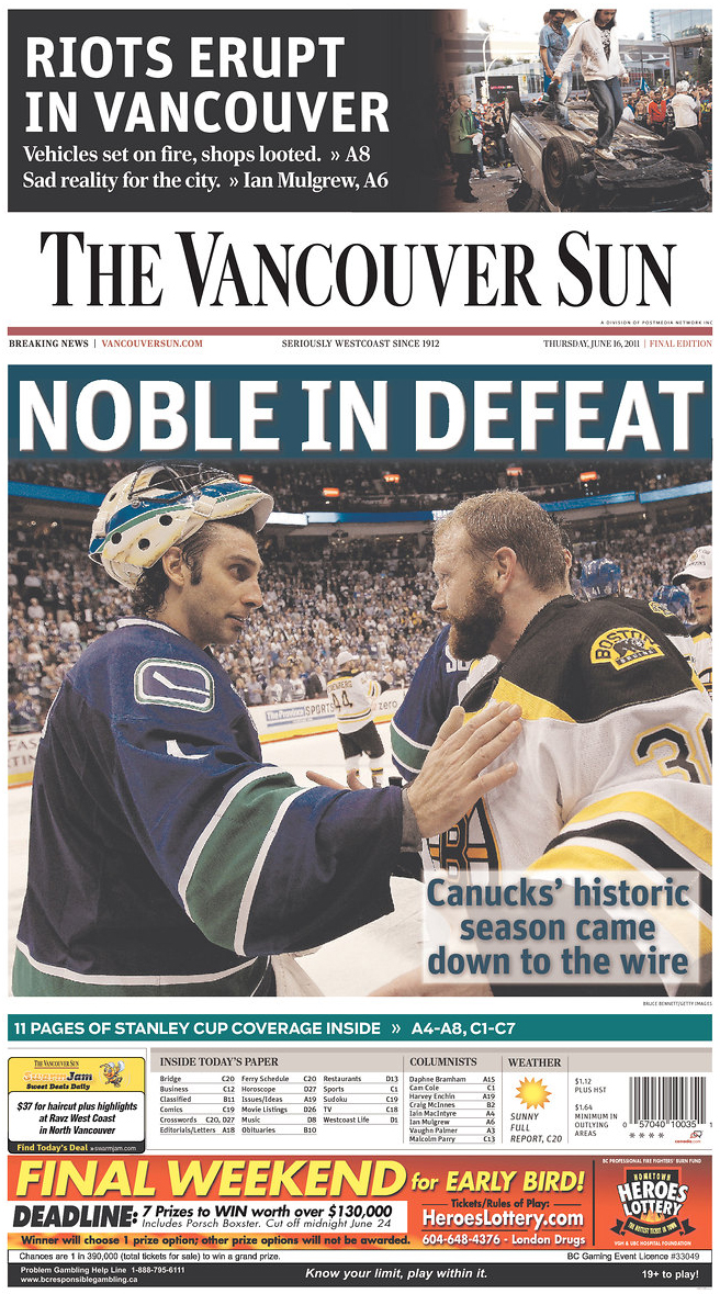
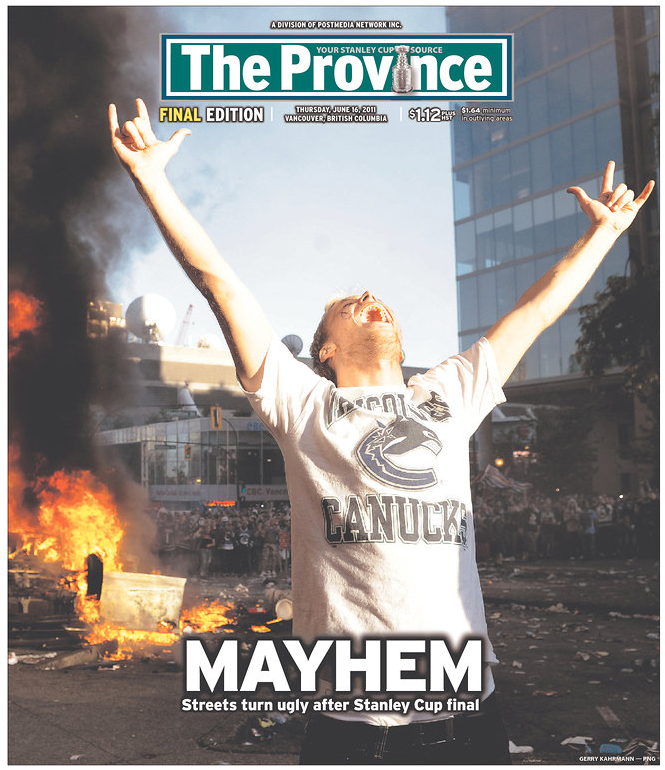
How Massachusetts, Canadian papers played Stanley Cup win

Last night’s Stanley Cup game was big news for a few reasons. It was the first time the Boston Bruins had won in 39 years. And on top of that, there were riots. In Vancouver.

So, take a look at how papers in Massachusetts and Canada played the game and the riots. Click any of the pages for a larger view. In a few days or so, I’ll have a look at how The Globe has played the Bruins in the playoffs and finals.

All images come from Newseum.

———
The Boston Globe
Boston, Mass.

Stanley Cup newspaper fronts

———
The Boston Herald
Boston, Mass.

Stanley Cup newspaper fronts

———
The Enterprise
Brockton, Mass.

Stanley Cup newspaper fronts

———
Telegram & Gazette
Worcester, Mass.

Stanley Cup newspaper fronts

———
The Herald News
Fall River, Mass.

Stanley Cup newspaper fronts

———
Cape Cod Times
Hyannis, Mass.

Stanley Cup newspaper fronts

———
The Vancouver Sun
Vancouver, Canada

Stanley Cup newspaper fronts

———
The Province
Vancouver, Canada

Stanley Cup newspaper fronts

———
The Globe and Mail
Toronto, Canada

Stanley Cup newspaper fronts

———
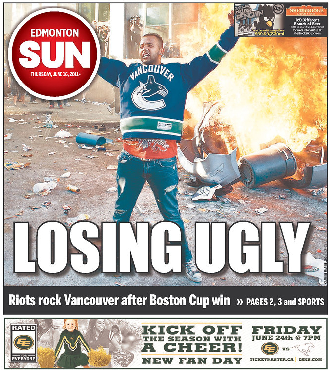
Edmonton Sun
Edmonton, Canada

Stanley Cup newspaper fronts

———
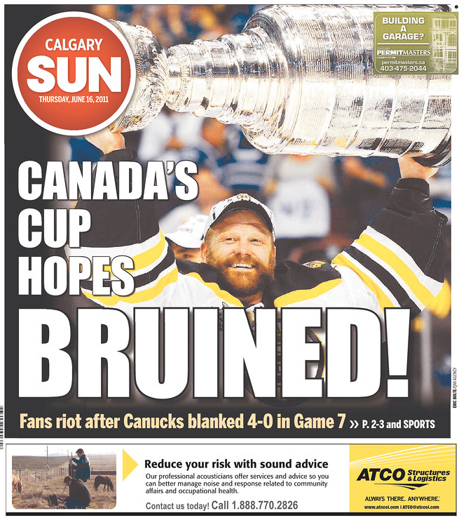
Calgary Sun
Calgary, Canada

Stanley Cup newspaper fronts

———
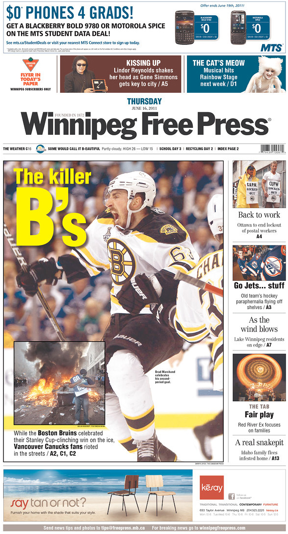
Winnipeg Free Press
Winnipeg, Canada

Stanley Cup newspaper fronts

———

Celebrities might not remember each other’s bigoted rants, but we do

Tracy Morgan’s recent comedy routine about a hypothetically gay son has drawn critics to say he should be fired from “30 Rock.” Joakim Noah of the Chicago Bulls was fined $50,000 for calling a fan “Fa****” during a game. Both have since apologized.

At least once a year, some celebrity has to issue an apology for offending some group. I don’t care if these people think what they said was offensive, but how did they not think anyone else could be offended? Or that it wouldn’t get noticed? Do these people never see any news or gossip sites?
Let’s just run down a few of the big things in the last few years. Just a few:

And these are just some of the recent occurrences in which celebrities caused outcries with slurs. The point is, there have been enough of them that other celebrities could look at them and say, “Gee, if I say this, people might get upset and I could be fired or at the very least, ostracized.”

But they don’t get it. And I’m not sure Joakim Noah or Tracy Morgan get why this was wrong. After Noah was fined $50,000, he said, “I made a mistake, learn from it and move on. That’s about it.”

But that’s not “about it,” Joakim. Think about Tyler Clementi, who was outed as gay on the Internet and subsequently jumped off the George Washington Bridge to his death. Or the other LGBT youth who were bullied and died by suicide. Or Matthew Shepard, who was beaten and left on a fence to die. Many of these celebrities will attribute their slip-ups to the “heat of the moment” or a “moment of frustration,” but for the rest of us, we don’t get to live in that vacuum. We have the context of knowing how deep and hurtful “fa****” can be, whether it’s heard at a club in Myrtle Beach or from a car in Jacksonville’s Riverside neighborhood. You get to apologize, pay and “move on,” but for the actual “faggots,” Joakim, we have to live with the reality of that word every day.

It would be a great tragedy if Joakim Noah and Tracy Morgan would just “move on” and try to forget these incidents. Apologies and fines are one thing, but I think both could benefit from spending time with groups that serve the LGBT community. There drop-in centers for LGBT youth with nowhere else to go. Tracy Morgan joked about the abuse he would dish out if his son were gay. To many kids at these centers, that joke is a harsh reality. When Morgan’s tirade is forgotten about and there’s a new controversy, these kids can’t forget it. If Morgan were to visit these places, he might not forget it, either. We’re telling a whole generation of gay youth that “it gets better,” but we need to hold ourselves and our celebrities accountable to make sure that it does get better.

A tale of two visits: Obama and the Queen in Ireland

Yesterday, President Obama and his wife Michelle visited Ireland. Last week, Queen Elizabeth II was in Ireland. All in all, a pretty big week for the country.

Obama was there pay tribute to his lineage in Moneygall, which Mark Landler of The New York Times described as “a postage-stamp Irish hamlet of 300.” Obama hugged people, shook hands and — most importantly — had a Guinness.

The Queen’s visit was more somber, as she addressed — but came short of apologizing for — the history of violence between England and Ireland. There were several protestors, and the pictures of them are more striking than the photos of the Queen’s visit. To see photos from The Big Picture, click here.

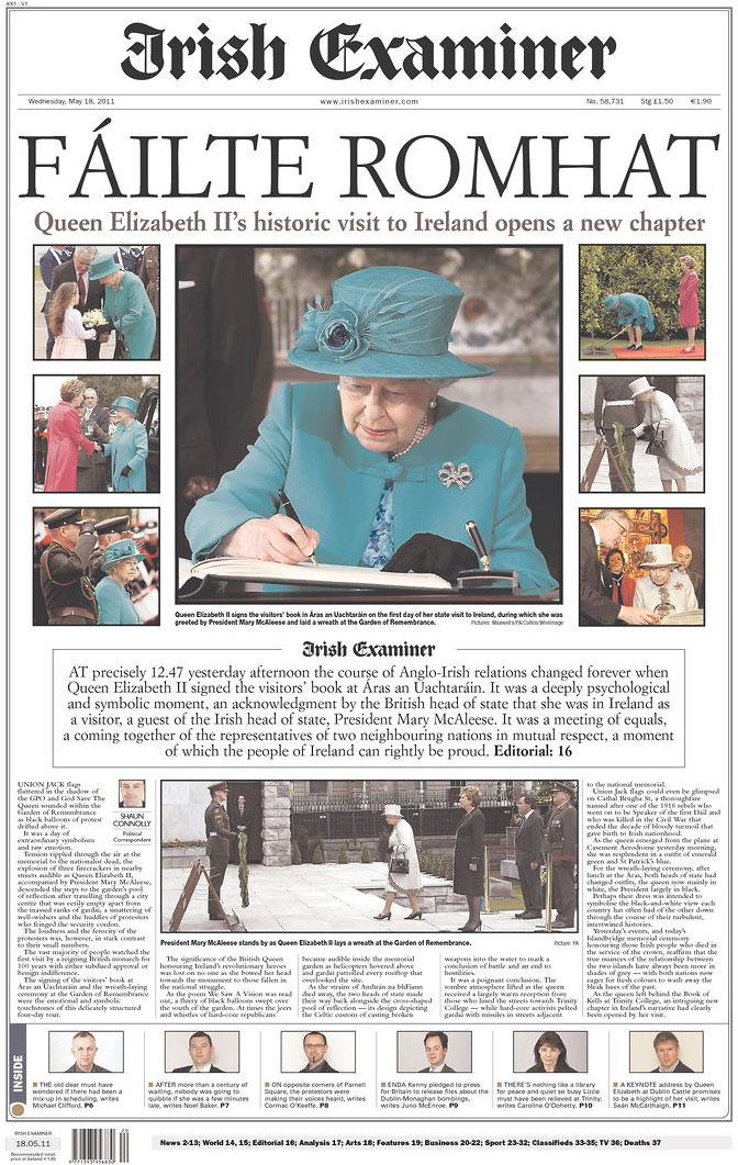
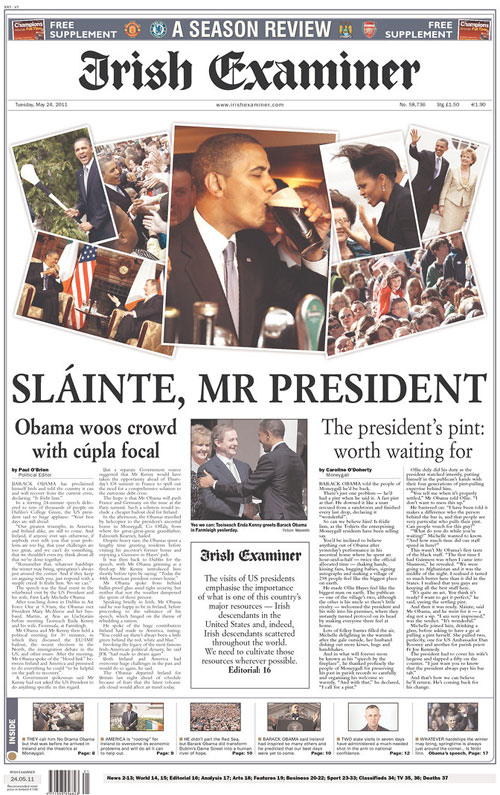
The way the two visits were played in the press highlight the differences of the trips. The usually playful Irish Examiner had a clean, serious front for Elizabeth’s visit, but returned to its normal relaxed form with a scrapbook-y collage of Obama’s visit.

———

THE QUEEN’S VISIT TO IRELAND

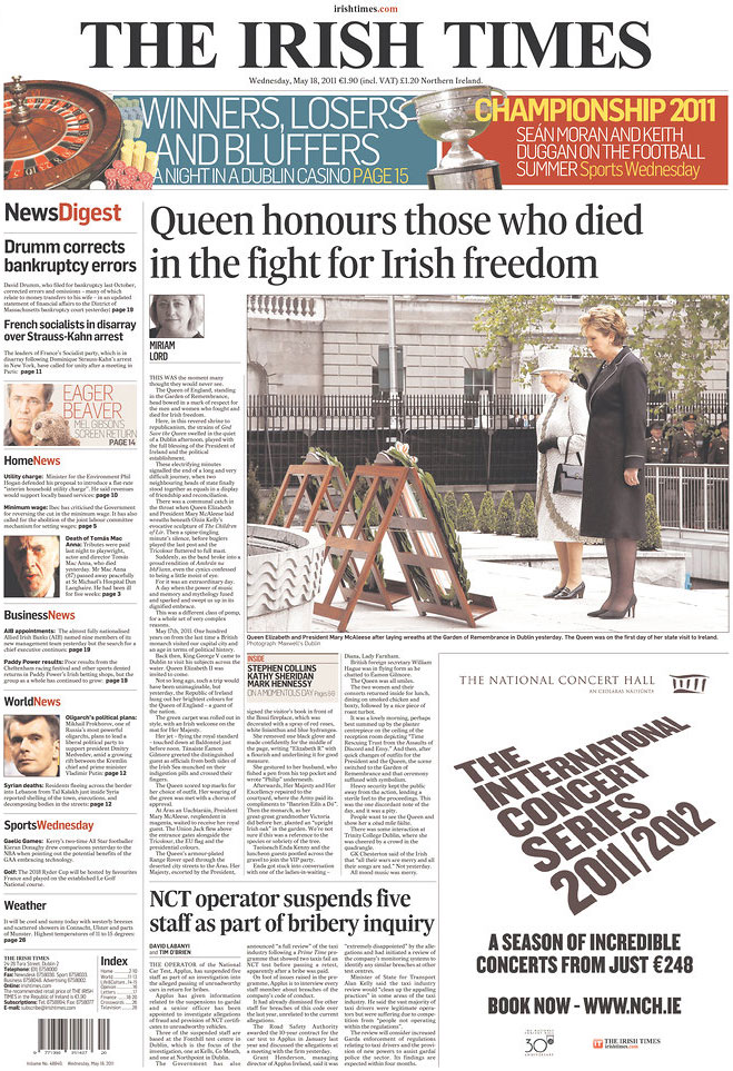
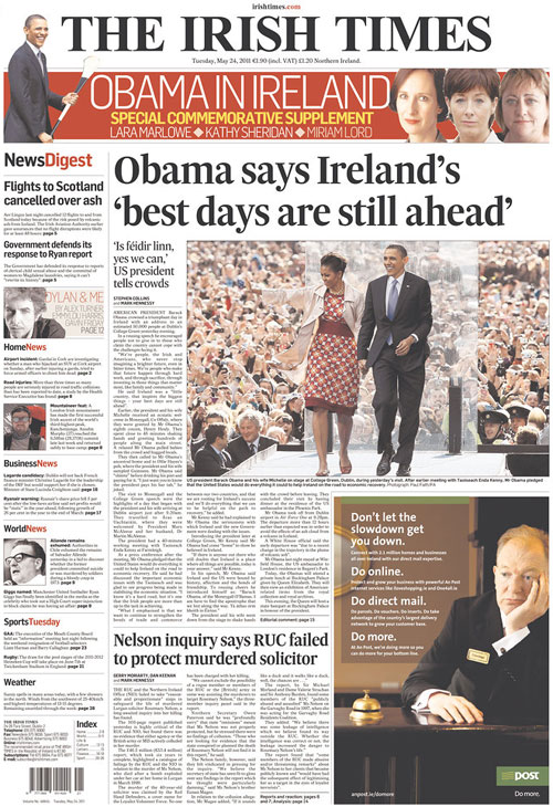
The Irish Times focused on the conciliatory nature of the Queen’s visit, showing her with Irish president Mary McAleese laying wreaths in honor of the dead Irish at the Garden of Remembrance in Dublin.

Miriam Lord writes:

This was the moment many thought they would never see.

The Queen of England, standing in the Garden of Remembrance, head bowed in a mark of respect for the men and women who fought and died for Irish freedom.

Here, in this revered shrine to republicanism, the strains of God Save the Queen swelled in the quiet of a Dublin afternoon, played with the full blessing of the President of Ireland and the political establishment.

These electrifying minutes signalled the end of a long and very difficult journey, when two neighbouring heads of state finally stood together as equals in a display of friendship and reconciliation.

To read the rest of Lord’s story, go here.

The Irish Examiner showed several photos of the Queen’s visit, but the largest play went to the photo of Queen Elizabeth II signing the guestbook at Áras an Uachtaráin, the official residence of the president of Ireland.

The importance of this was summed up in the main copy block under the photos:

At precisely 12:47 yesterday afternoon the course of Anglo-Irish relations changed forever when Queen Elizabeth II signed the visitors’ book at Aras an Uachtarain. It was a deeply psychological and symbolic moment, an acknowledgement by the British head of state that she was in Ireland as a visitor, a guest of the Irish head of state, President Mary McAleese. It was a meeting of equals, a coming together of the representatives of two neighboring nations in mutual respect, a moment of which the people of Ireland can rightly be proud.

To read Shaun Connolly’s story, go here.

———

OBAMA’S VISIT TO IRELAND

The Irish Times played the story the way it plays many of its centerpiece stories: with one main photo, one headline and one deckhead. The photos fascinated me, because I was trying to wrap my mind around the glass-looking partition thing from which Obama delivered his speech.

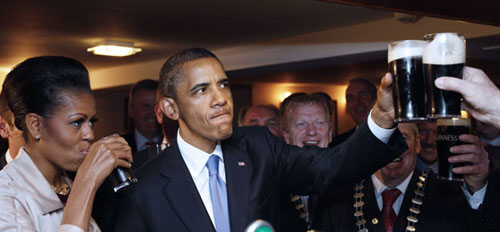
What the Irish Times front didn’t show, though, but did show on its website:

That photo was uncredited on the site. To see that photo (and to read the story by Stephen Collins and Mark Hennessy), go here.

That Guinness moment did make it on the Irish Examiner front, though:

Similarly to the front featuring Queen Elizabeth II, the importance of this event was summed up in the main copy block under the photos:

The visits of US presidents emphasise the importance of what is one of this country’s major resources — Irish descendants in the United States and, indeed, Irish descendants scattered throughout the world. We need to cultivate those resources wherever possible.

To read Paul O’Brien’s story, go here.

———

UPDATE

The Queen did NOT have a Guinness. Read about it here.

How the Florida Times-Union covered historic victory

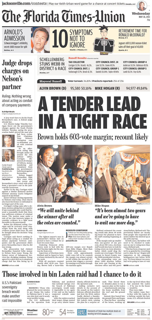
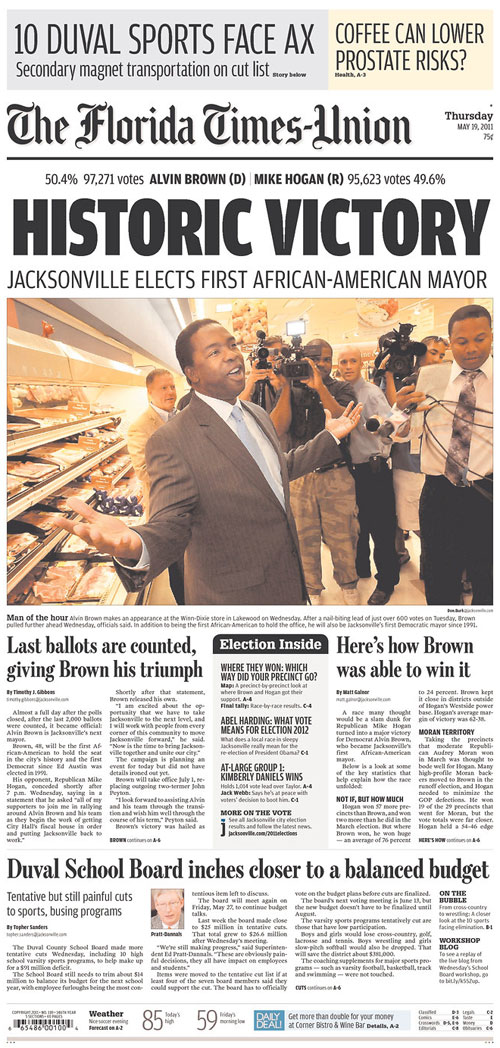
This past week, the people of Jacksonville, Fla., elected its first black mayor in the history of the city. Democrat Alvin Brown beat Republican Mike Hogan in a runoff on May 17. The runoff followed the March election in which the two garnered the most votes.

Many of my former colleagues at The Florida Times-Union did great work this week. Here’s some — but not all — of that work.

By the time Wednesday’s paper went to bed, the two were 603 votes apart. Brown photo shot by Bruce Lipsky, Hogan shot by Bob Self. But by Wednesday afternoon…

…Alvin Brown was declared the victor. The victory shot from Thursday’s paper by Don Burk.

Reporter Matt Galnor explained the historic win’s statistics and graphic artist Annie Liao made this graphic showing the precinct-by-precinct results. Click for a larger view.

Annie Liao infographic Jacksonville mayor's race precincts

And Sunday, Tim Gibbons wrote a piece analyzing Alvin Brown’s campaign and how he won.

Jacksonville was my home for four and a half years, and because of the time I spent there with such great friends and colleagues, I will always think of Jacksonville as one of my homes. Thus, even though I no longer live there, this mayoral race was pretty interesting to me. And it reminded me of a few graphics I did that can now be updated.

In January 2009, I researched and put together this graphic in time for Obama’s inauguration. This timeline-chart hybrid shows which party was in control of the presidency, U.S. Senate and House, Florida Governorship, Senate and House, and the Jacksonville mayor’s office and city council from 1960 to 2009.

A month later, I researched and put together this graphic showing how long it took for black men and women to be elected into various political offices, from the White House down to Jacksonville positions. Jacksonville’s first black city council members post-Reconstruction were Sallye Mathis, Mary Singleton and Earl Johnson. Nat Glover became the first black sheriff in 1995. He ran for mayor in 2003, but lost to John Peyton. Jackie Brown, a black woman, ran for mayor in 2007, but also lost to Peyton. She died shortly after the election.

I’m looking forward to the possible graphics that can come from this election. Between Brown’s victory, Peyton’s administration coming to an end and the shift of influence in the city, there will be no shortage of graphics.

———

UPDATE

Denise M. Reagan, AME for Visuals at The Florida Times-Union, writes:

The blogs on election night and all the next day during the count of provisional and absentee ballots were well done and featured a lot of participation from the community.

Additionally, on Monday, #AlvinBrownVictorySongs was a hashtag on Twitter for — you guessed it — potential victory songs for Alvin Brown.

INFOGRAPHIC: Rebecca Black’s “Friday” vs. The Cure’s “Friday, I’m In Love”

So, in the last few weeks, 13-year-old Rebecca Black’s song “Friday” has gone viral. It’s a song about an eighth-grader getting ready for school on a Friday and getting excited for the weekend.

Did I mention it’s by a 13-year-old?

In case you missed it:

For what it is, it’s catchy. But it’s catching lots of nasty comments for Black. Last week, she appeared on “Good Morning America” for a segment in which the reporter read some of the comments people have anonymously posted online about this video. Watch the interview, and you’ll totally feel for this kid. But for all the hate, she’s doing alright for herself. She’s passed Justin Bieber for iTunes downloads, or so say the talking heads on that ABC clip.

The last pop song about Friday I remember getting any attention was The Cure’s “Friday, I’m In Love” from the band’s 1992 album, “Wish.”

The Cure video’s embed feature has been disabled, or else I would have linked to it. But check it out, and then take a look at how each of these songs compare as odes to the last day of the work week:

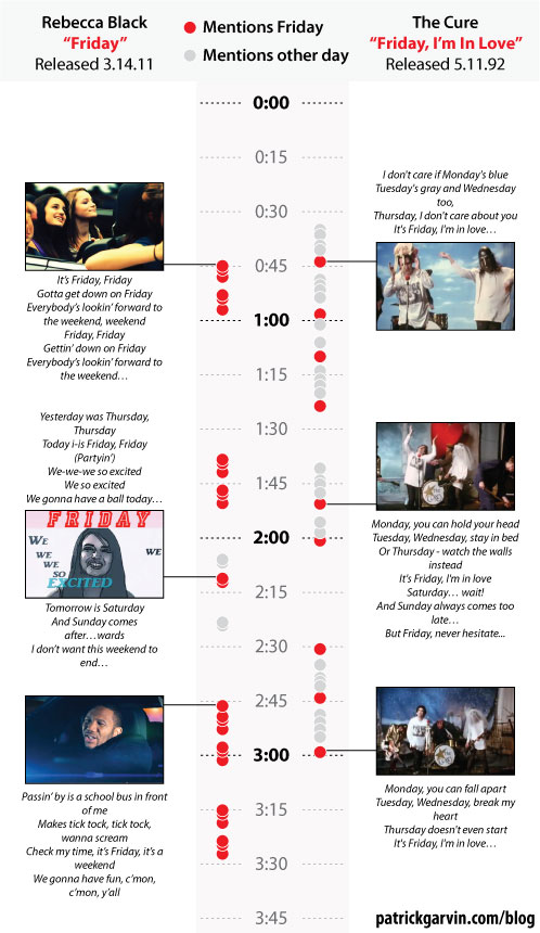
So, from my estimations, here’s a breakdown of each song and its video:

Total mentions of “Friday”
Rebecca Black, “Friday”: 27
The Cure, “Friday, I’m In Love”: 9

Total mentions of any other day of the week
Rebecca Black, “Friday”: 4
The Cure, “Friday, I’m In Love”: 28

Verses sung by a rapper
Rebecca Black, “Friday”: 1
The Cure, “Friday, I’m In Love”: 0

Tween girl wearing braces
Rebecca Black, “Friday”: 1+
The Cure, “Friday, I’m In Love”: 0

Pasty white man wearing a wedding veil
Rebecca Black, “Friday”: 0
The Cure, “Friday, I’m In Love”: 2

So, Rebecca Black gets down on Friday, whereas Robert Smith gets down MOST on Friday. Of course, he also has been known to get down at “10:15 On A Saturday Night.” Rebecca Black, though, would not be getting down at that time, as she’d be in bed. Or at a sleepover, playing MASH.

My favorite videos of 2011 so far

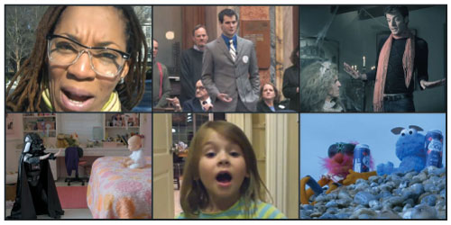
In conjunction with my musings on the “Jen Aniston sex tape” and seven traits of viral videos, I present my favorite videos to surface in 2011. Four of them have gotten at least a million page views apiece, and the fifth could eventually get that many views. The sixth one, though, will probably remain a cult favorite.

——

1. ATLANTA WEATHER REPORT

Megan McGlover is not a weather lady or even a reporter, per se. She’s a woman with her blog and videos — and she’s hilarious.

——

2. VOLKSWAGON COMMERCIAL: THE FORCE

This Super Bowl commercial actually appeared online a few days before the game. It was a wise move, because it generated a lot of hype. Thus, I think this is the most memorable commercial from this year’s Super Bowl.

——

3. 5-YEAR-OLD NEEDS JOB BEFORE GETTING MARRIED

There’s another video where this girl explains why Seinfeld is a better comedian than she is. She laments that he can write great jokes, and she can’t. In this video, though, she explains that she’s going to be independent before getting married.

——

4. ZACH WAHLS SPEAKS ABOUT FAMILY

In an address before Iowa legislators, 19-year-old Zach Wahls describes his life growing up raised by gay parents. His candor and passion make you want to give him a hug.

——

5. SASSY GAY FRIEND: GREAT EXPECTATIONS

The Second City Network has produced a handful videos showing how women from literature would have fared had they had a sassy gay friend. This newest one is one of the best. It’s already had more than 100,000 views in its first week.

——

6. LCD SOUNDSYSTEM, “DANCE YRSELF CLEAN”

The video is nine minutes long, keeps the same pace throughout and is for a band that has cult status but not mainstream recognition, per se. Thus, this video won’t be viral in the way that these other videos have been and will continue to be. But it features Muppets rocking out and getting drunk on the beaches of Brighton in England, so it’s got that going for it.

Ya Know It Gets Even Colder, Right?

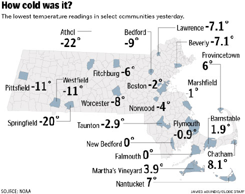
It’s been a cold few months in Massachusetts, the first New England winter for this Midwestern transplant by way of Florida. Just how cold has it been? Here’s what Monday looked like:

Graphic by James Abundis for The Boston Globe.

——————-

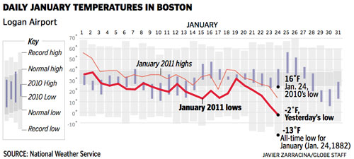
And here’s what Monday looked like in context:

Graphic by Javier Zarracina for The Boston Globe.

——————-

And here’s what Monday felt like:

Photo from Cambridge. I saw this handiwork on Saturday and had to take a picture for posterity.

If you missed it, here’s how much snow we’ve been getting. And here’s David Filipov’s science experiments in Athol, where it was 23 degrees below zero.