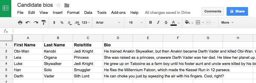
Under a new State Department policy that went into effect October 1, the United States will issue a G-4 visa to a partner of a staff member of US-based international organizations only if the couple is legally married. Among other organizations, this includes the United Nations, the World Bank, and the International Monetary Fund.
Per the State Department’s website: “Effective immediately, U.S. Embassies and Consulates will adjudicate visa applications that are based on a same-sex marriage in the same way that we adjudicate applications for opposite gender spouses.”
This has ramifications for anyone who worked for a US-based international organization and wanted to obtain a G-4 vis for a partner. But this has noticeable consequences for same-sex couples. In many countries, same-sex marriage is not permitted. Furthermore, there are some countries where same-sex relations are still illegal, and in some countries, punishable by death.
From an NBC News article:
For all new G-4 applications filed at the State Department after Monday, the same-sex partner must be a legally married spouse. For U.N. workers who are in relationships currently recognized by a G-4 visa but are not legally marriage, their partners will have 30 days after the new year to either get married or exit the United States.
David Pressman, who was the U.S. ambassador to the U.N. Security Council for special political affairs in the Obama administration, said the G-4 action is harmful in part because the United Nations is “composed of probably one of the most diverse workforces of any organization in the world.”
“If that’s how you advance equality between same-sex and opposite sex partners, then we have an enormous problem on our hands,” Pressman said. He described the policy as a “creative and cynical way to use the expansion of equality at home to vindictively target same-sex couples abroad.”
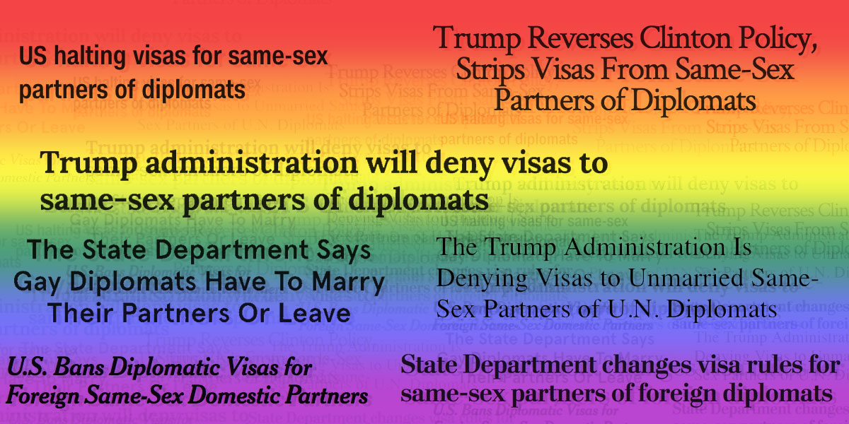
Here’s a look at how a handful of news outlets framed the issue. I’ve included screenshots of the headlines, as well as links to the articles.
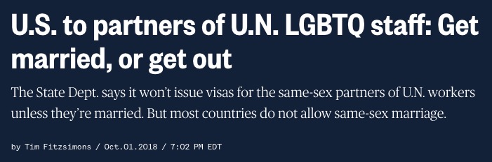
First, the aforementioned piece from NBC News: U.S. to partners of U.N. LGBTQ staff: Get married, or get out
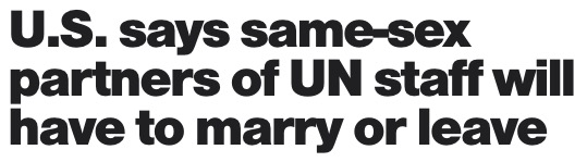
CBS News: U.S. says same-sex partners of UN staff will have to marry or leave
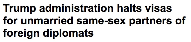
ABC News: Trump administration halts visas for unmarried same-sex partners of foreign diplomats
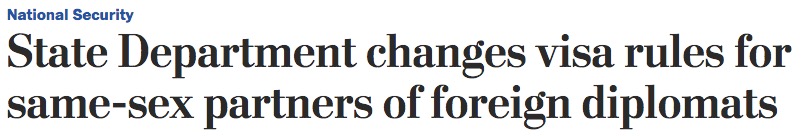
Washington Post: State Department changes visa rules for same-sex partners of foreign diplomats
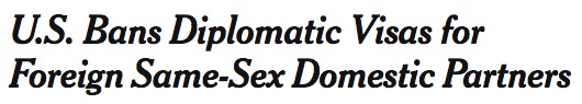
New York Times: U.S. Bans Diplomatic Visas for Foreign Same-Sex Domestic Partners
Wall Street Journal: Trump Administration Halts Some Same-Sex Visas for Foreign Officials in U.S.
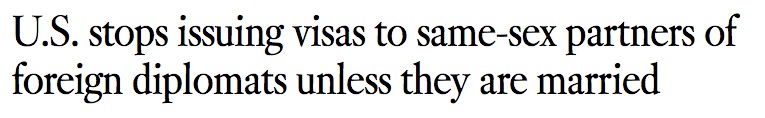
Los Angeles Times: U.S. stops issuing visas to same-sex partners of foreign diplomats unless they are married
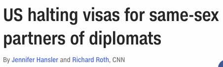
CNN: US halting visas for same-sex partners of diplomats
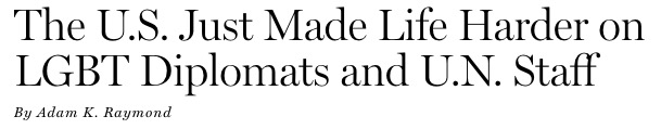
New York Magazine: The U.S. Just Made Life Harder on LGBT Diplomats and U.N. Staff
And here are some headlines from LGBTQ-themed publications:
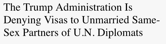
INTO: The Trump Administration Is Denying Visas to Unmarried Same-Sex Partners of U.N. Diplomats
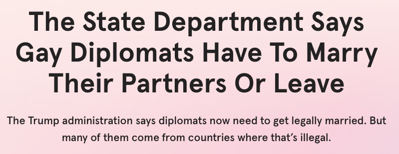
them: The State Department Says Gay Diplomats Have To Marry Their Partners Or Leave
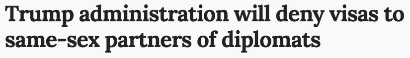
LGBTQ Nation: Trump administration will deny visas to same-sex partners of diplomats
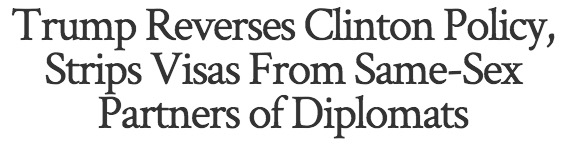
The Advocate: Trump Reverses Clinton Policy, Strips Visas From Same-Sex Partners of Diplomats
Headlines have the challenge of distilling the essence of a story down to a few words while not giving away too much of the story. This story is a hard story to sum up in a short headline, because there are so many ways to frame the situation:
- The State Department has a new policy affecting people who want G-4 visas
- People who work for US-based international organizations who want visas for their partners will have to get married to get those visas
- People who work for US-based international organizations who want visas for their partners will have to get married to get those visas, but there will be complications for some people
- People who work for US-based international organizations who want visas for their partners will have to get married to get those visas, but same-sex couples face potential dilemmas that opposite-sex couples won’t face
- UN workers who want to get G-4 visas for their partners will now have to marry their partners to get the visa
- UN workers who want to get G-4 visas for their partners will now have to marry their partners to get the visa, even if they are in a same-sex couple and they live in a country where same-sex marriage is not legally allowed
- UN workers who want to get G-4 visas for their partners will now have to marry their partners to get the visa, even if they are in a same-sex couple and they live in a country where same-sex relations are agains the law
Each of those statements is true, though some of them are descriptive and precise, and some are broader. Ultimately, the least clunky of them is that first one: “The State Department has a new policy affecting people who want G-4 visas.” But that fails to capture the totality of what’s happening, and what’s at stake.
Part of what makes it difficult to convey the news in brief, compelling and accurate language is that it’s difficult to refer to the people affected without being at least somewhat clunky. News organizations and the journalist who write for them have struggled on how to refer to couples in same-sex relationships. For years, “gay marriage” has been treated as interchangeable with “same-sex marriage,” and “gay couples” has been seen as acceptable to mean “same-sex couples.” This colloquial way of referring to same-sex couples is limited, though, as it implies something that we can’t know for certain: the orientations of the people in same-sex couples. In the US and other countries that permit same-sex couples to marry, the orientation of the couple is not a factor. The couples can comprise gay people, bisexual people, pansexual people, queer people, and so on. Even straight people.
Similarly, this policy change affects anyone in a same-sex couple wanting a G-4 visa, whether they are gay, bisexual, pansexual, queer, etc. This might seem like hairsplitting and nitpicking, but there’s a good reason to pay attention to the language. From a traditional copy editor’s perspective, it’s more precise and accurate to say “same-sex couple” and “opposite-sex couple” than to say “gay couple” or “straight couple.” I can’t imagine too many people have written corrections for incorrectly identifying the sexual orientation of a couple who got married, but anyone who aims to be accurate — and correction-free! — should keep this in mind.
But beyond that, it’s more inclusive to say “same-sex couple,” because “gay couple” only speaks to gay couples. “Same-sex couples” includes so many more people. Bisexual people and others who identify as neither straight nor gay can feel erased or ignored if the default blanket description of “not straight” is just “gay.”
For similar reasons, the term “straight marriage” is also limited and inaccurate. There can be — and are — opposite-sex couples comprising people who don’t consider themselves straight.
Sign up for the LGBTQ+ Experiment newsletter here.