Last week, I discovered Rob Levin‘s podcast, “SVG Immersion: The Anything and Everything SVG Podcast.” On one of the episodes, Rob talked to front-end developer Petr Tichy about SVG animation, as Petr had created this really cool animated Christmas card using SVG. Just click on it and it watch it.
Cool, eh?
Inspired by Rob and Petr, I Googled how to create SVG animations myself. After looking at some examples and a few tutorials, I decided to attempt my own. This SVG animation was the result of my efforts. It was easier than I expected, and I think SVG animation is a tool my colleagues and I will be able to use for many interactive projects.
Below, I’ve written a tutorial of how I put the animation together. It’s a rather long explanation, but I wanted to document it in depth. I used the starter files from Mr. Map Generator to help build this animation and thus the tutorial will read similarly to the one I wrote for that.
To create this responsive SVG animation, I used Adobe Illustrator and a text editor. If you’re following along, I’m going to assume you are familiar with Illustrator and only a little familiarity with basic HTML. For the most part, this requires a lot of copying and pasting. You need not have any SVG experience, and I’ve written this as if the reader has never used SVG.
This was my first time using SVG animation, so I am not an expert by any means. Rather, I am writing this from a perspective to say, “Hey, look how easy this was for a newbie!”
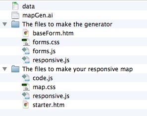
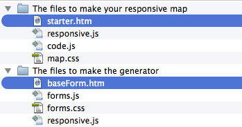
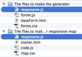
Let’s get started. Here is a zip file of four files:
- ocean.ai
- starter.htm
- svg.css
- responsive.js
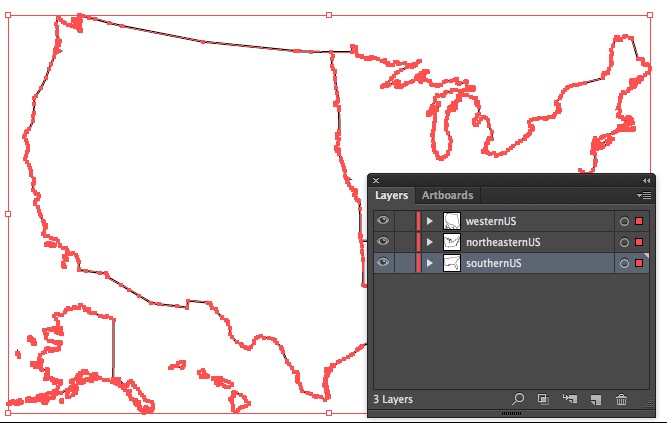
When you’ve downloaded the zip, open up the Illustrator file called ocean.ai.
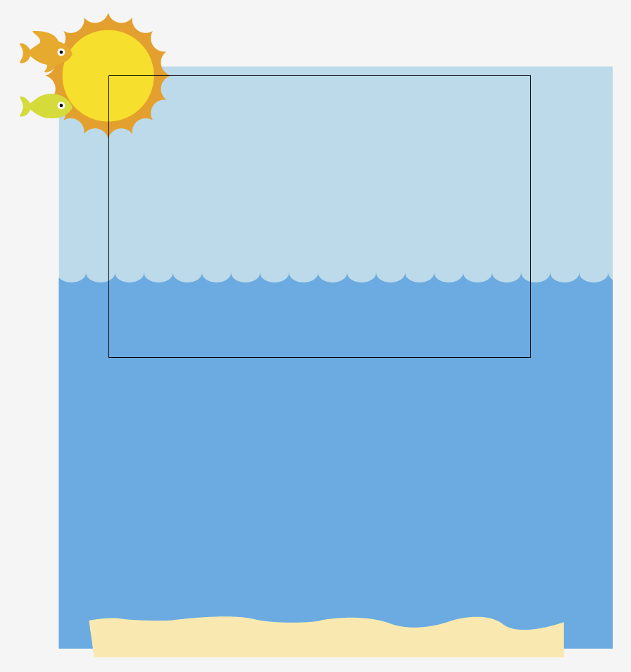
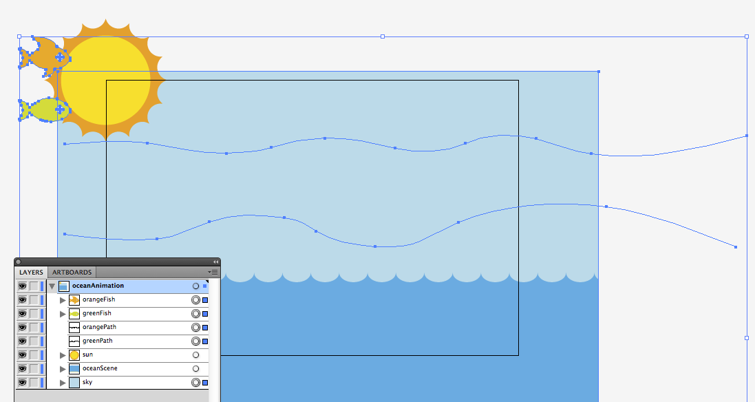
You’ll see that there are elements hanging off the artboard. Our artboard is 600px wide and 400px tall. But when animating SVG, you can make your artboard whatever width or height you want.
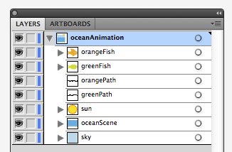
Each section of the ocean scene has its own layer in the Illustrator file. Furthermore, each layer has a name describing the content of said layer: greenFish, orangeFish, etc. These names are one word, with no spaces or breaks. This is important.
Our layers are:
- orangeFish, the orange fish
- greenFish, the green fish
- orangePath, the path the orange path will swim along
- greenPath, the path the green path will swim along
- sun
- oceanScene, which is the water and the sand
- sky
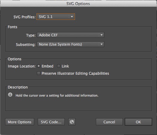
Save the Illustrator file as an SVG. It’s easy to do in the “Save As” settings.
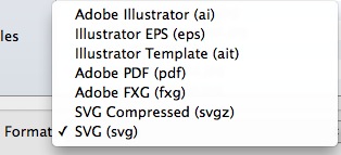
Illustrator will give a pop-up and you can leave it be.
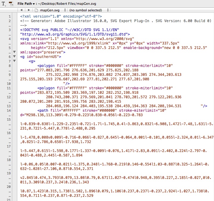
Once you’ve saved the file as an SVG in Illustrator, open the SVG in a text editor. Programs like Notepad or TextEdit are free with your computer. They are perfectly functional, but I use TextWrangler, which you can download for free. It color-codes tags in HTML and makes it easier to organize what you’re writing. Sublime and other editors are fine, too.
When you open the file in a text editor, it could look rather daunting if you’ve never looked at SVGs in text editors. Looks like a lot of gibberish, right?
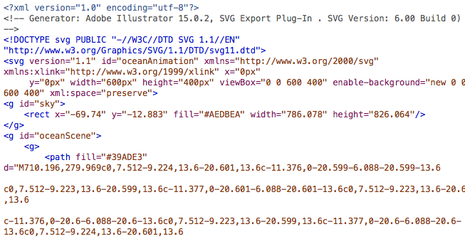
And yet while it looks foreign at first, certain things will look familiar. Just as p tags and div tags need opening tags and closing tags, so do g tags. In SVGs, g tags are group tags. Another way to think of g tags is to think of them like div tags for SVGs. Like div tags, g tags can have classes and IDs.
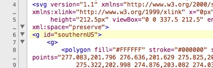
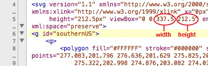
Look at the line that says “viewbox.”
Look at the part that says viewbox=”0 0 600 400.” That 600 means the box for your SVG is 600 pixels wide and 400 means it is 400 pixels tall. We’re going to eventually delete that part, but before we do, write down those two numbers somewhere or copy them into another file.
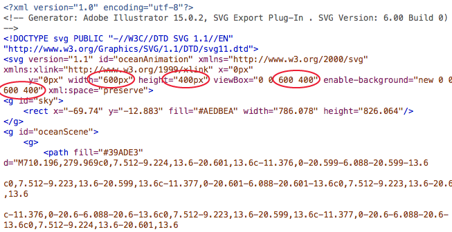
Write them down yet? Ya sure? OK, good.
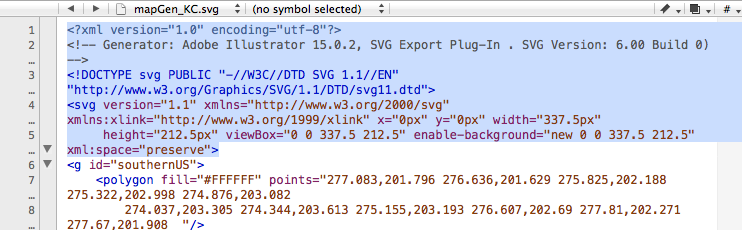
In your text editor, highlight everything from the first line until the space just before the first g tag.
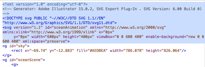
Got it highlighted? Good. Now delete that.
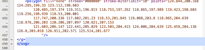
At the bottom of the document, highlight everything after the last closing g tag. And then hit delete.
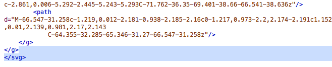
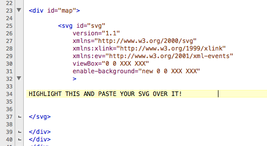
Now select all that’s in the document and copy it. We’re ready to add it to our HTML file: starter.htm.
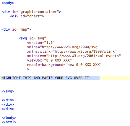
Look for the part that says, “HIGHLIGHT THIS AND PASTE YOUR SVG OVER IT!” Highlight that part, and well, do what it says: Delete it, and paste your SVG that you’ve cut and pasted.
In starter.htm, that is going to be on line 30.
OK, now that you’ve pasted that, look for the areas that say “viewBox” and “enable-background.” Particularly, notice that they each include a line that says “0 0 XXX XXX.”
This is why I told you to write your width and height down. Or paste it somewhere. Because now you need it.
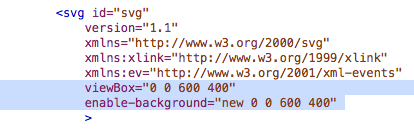
Paste over “XXX XXX” with your actual width and height. In our case with our file, we had a width of 600 and a height of 400, so we changed “0 0 XXX XXX” to “0 0 600 400″ in our file.
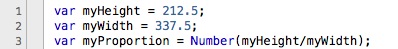
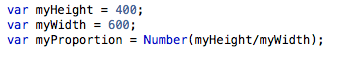
Open up responsive.js. The top three lines of the file will look like this:
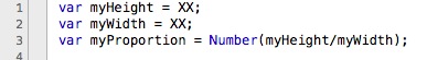
Change the XX to reflect the appropriate value. Our exercise had a width of 600 and a height of 400.
Save the JS file and close it. You’re done with it.
At this point of the process, if you were to open up starter.htm in a browser, you’d get a static, non-moving image.

Now we are ready to start animating!
In your text editor, in starter.htm, find the g tag for sun.
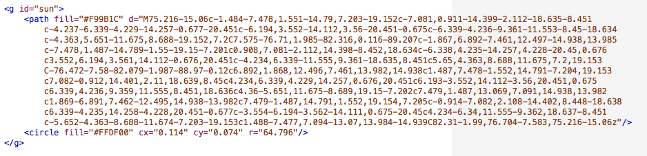
Most of that code is for the orange part on the outside. The circle tag is for the middle circle of the sun.
The code that will do the animating will look like this:
<animateTransform attributeType=”xml”
attributeName=”transform”
type=”rotate”
from=”0″ to=”360″
begin=”0″ dur=”10s”
repeatCount=”indefinite” />
What that does is rotate the sun from 0 degrees to 360 degrees, beginning 0 seconds into the animation. The “dur” refers to the duration, which we have as 10 seconds. Where it says, “repeatCount,” we’ve left a value of “indefinite,” meaning we want it to repeat indefinitely. We will paste that just before the closing g tag. That will make our sun rotate.
Test it in the browser, and it should work!
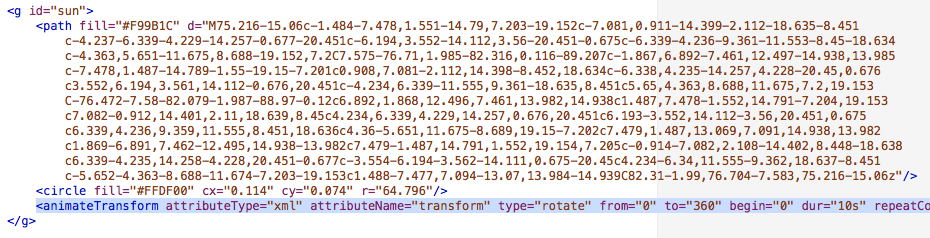
Now we want to add code that will have the sun float up after 2 seconds. That could will look like this:
<animateTransform
attributeType=”XML”
attributeName=”transform”
type=”translate”
from=”0,0″ to=”0,-400″
begin=”2s” dur=”2″
fill=”freeze”/>
This will move the sun from an X,Y coordinate of 0,0 to 0,-400, 2 seconds in and over a period of 2 seconds. In other words, want it to move up 400 pixels over 2 seconds. We will paste that in the sun group, just after where we posted the rotating code: before the closing g tag.
Test it in the browser, and it should work. Except now we see that when the sun starts moving up, it has stopped rotating. We want it to keep rotating, though, as it moves up.
What we need to do is to add <g> tag between <g id=”sun”> and the first <path> tag. Then we add </g> tag before the second <animateTransform> tag.
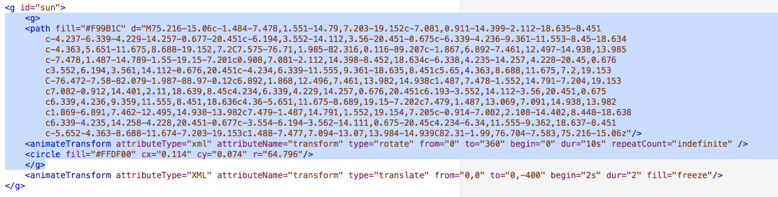
That keeps the rotating animation going while moving the whole sun upward.
Now we want to add code that will have the water and sand float up after 2 seconds. That could will look exactly the same as the code we just added to the sun:
<animateTransform
attributeType=”XML”
attributeName=”transform”
type=”translate”
from=”0,0″ to=”0,-400″
begin=”2s” dur=”2″
fill=”freeze”/>
We add it to the code for “oceanScene,” which contains both the water and the sand. We add just before the final g tag:
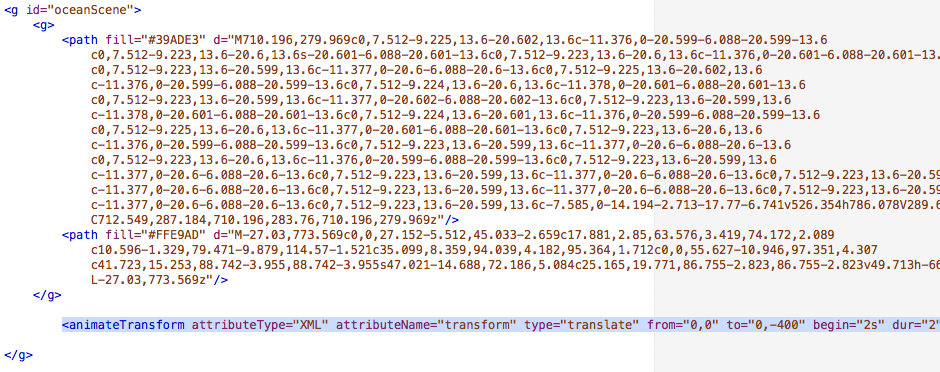
This will move “oceanScene” from an X,Y coordinate of 0,0 to 0,-400, 2 seconds in and over a period of 2 seconds.
Test it in the browser, and it should work!
Now when we look at the page in the browser, we should see the sun rotate, and then after two seconds, the sun, water and sand move up. That gives the appearance that we’ve panned down to the bottom of the sea.

Now, all we need to do is add the animation that makes our fish swim!
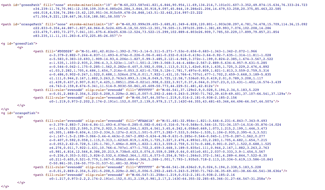
So, in the Illustrator file are two paths that we’ve put on layers: orangePath and greenPath. They both have no fill and no stroke.
Here’s how they look in code:
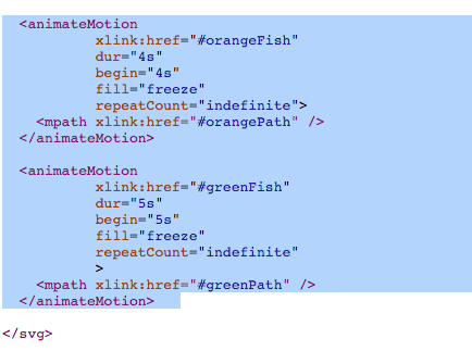
We want the orange fish to move along orangePath. We want it to begin at 4 seconds, and take 4 seconds to complete. We want that to repeat indefinitely. Here’s the code that would do that:
<animateMotion
xlink:href=”#orangeFish”
dur=”4s”
begin=”4s”
fill=”freeze”
repeatCount=”indefinite”>
<mpath xlink:href=”#orangePath” />
</animateMotion>
We want almost identical code for the green fish. We want the green fish to move along greenPath. But we want it to start a second after the orange fish, and have the green fish swim a little slower. So with this tag, we want it to begin at 5 seconds, and take 5 seconds to complete. We want that to repeat indefinitely. Here’s the code that would do that:
<animateMotion
xlink:href=”#greenFish”
dur=”5s”
begin=”5s”
fill=”freeze”
repeatCount=”indefinite”>
<mpath xlink:href=”#greenPath” />
</animateMotion>
Now we just need to add that code to our file, starter.htm. In the past examples, we have been adding tags inside g tags. These animateMotion tags, though, will be placed outside of any g tags. These will be pasted before the closing svg tag.
And that, friends, is how to animate an SVG.
I found that I had to adjust my Illustrator file and resave it to SVG a few times to get the positions just right. The first few times, I had my fish too low, then too high, just a hair too right, etc. Having to toggle between Illustrator and a text editor was cumbersome, and that’s a complaint I’ve heard on a few different SVG podcasts.
When I made this, I got a lot of the code from examples I Googled. This example from CSS-Tricks was especially helpful, as it was where I got the code for how to animate something on a specific path.
There’s a lot more, of course, but that page has a great overview to get started.