
In the last week, all hands have been on deck in the Boston Globe infographics department for our coverage of the nuclear crisis in Japan and what it means for nuclear plants in the U.S., particularly in New England. We’ve had great work from David Schutz, Javier Zarracina, David Butler, James Abundis, Daigo Fujiwara and Monica Ulmanu.
Below is just some of the stuff we had from March 14 to March 18. We used a variety of approaches for the variety of stories and angles, and I think we’ve been doing a great job. Needless to say, I love working with these people.
———
MONDAY, MARCH 14, 2011
On the Sunday after the earthquake, the focus of the story had shifted to the Japanese reactor and the crisis at the nuclear plant there.
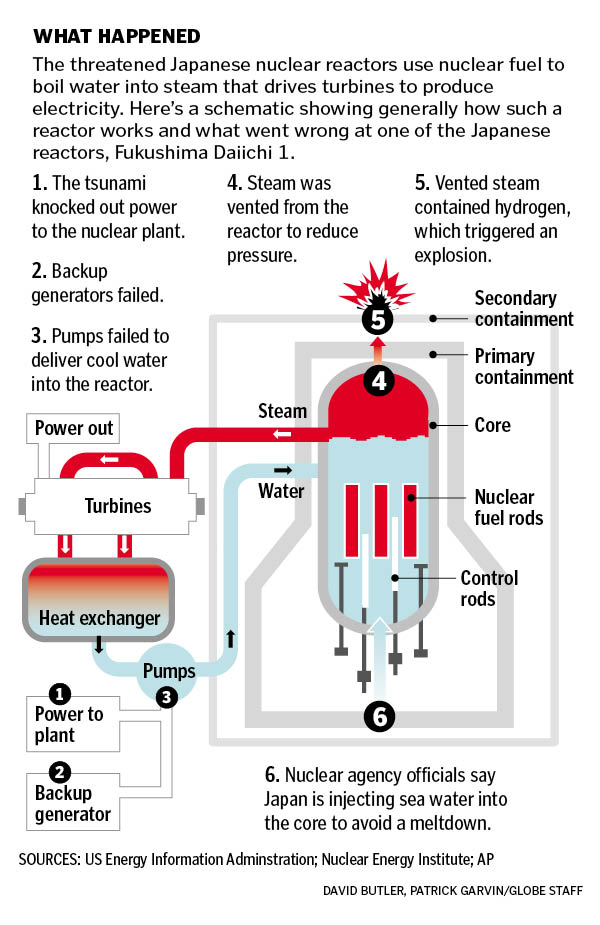
David Butler and I worked on the graphics for that Monday’s paper, including this one here. Butler found an earlier Associated Press graphic, but then simplified some of the steps and colors. Additionally, he added some details not in the original graphic, using information we got from reporter Carolyn Johnson and David Schutz, Deputy Design Director/News & Graphics.
Here’s a look at that graphic. Click on it for a larger view:
———
TUESDAY, MARCH 15, 2011
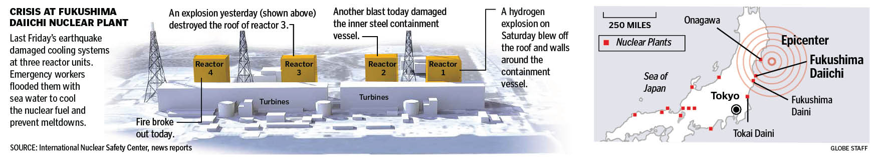
The next day focused more on the plant at Fukushima. Here’s a front page graphic. Click for a larger view.
———
WEDNESDAY, MARCH 16, 2011
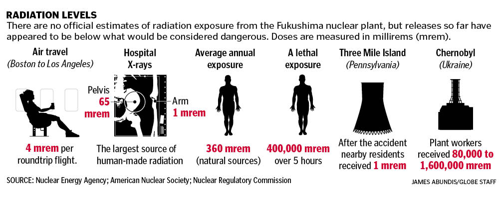
James Abundis put this graphic together explaining radiation levels. The questions many people had were, “How much radiation has been released by the Fukushima plant?” and “How does that compare to other radiation levels?” This infographic answers those questions simply but thoroughly. Click for a larger view.
Inside the A section, we had this infographic explaining the risks of nuclear meltdown and the potential worst-case scenarios.

———
FRIDAY, MARCH 18, 2011
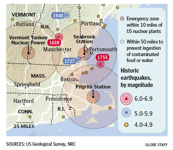
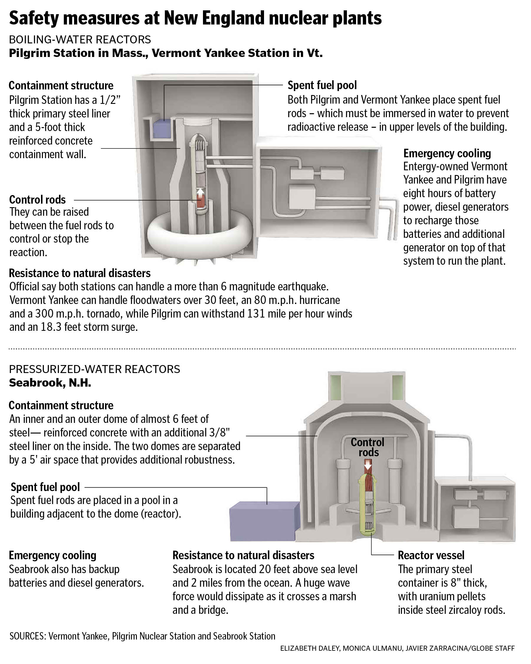
The problems with the boiling water reactor in Japan shed light on the BWRs and PWRs here in the states, particularly three in New England: Vermont Yankee Nuclear Power in Vernon, Vermont; Seabrook Station in Seabrook, New Hampshire and Pilgrim Station in Plymouth, Mass. David Schutz had put together a map of historic earthquakes last year, so I updated that to show these three reactors. Click for a larger view.
Inside, we had a graphic by Monica Ulmanu and Javier Zarracina explaining the safety measures in place at those New England nuclear plants, with an assist by Boston Globe reporter Beth Daley. Click for a larger view.
———
These are just some of the graphics we did this past week. It’s been a team effort, with work by everyone in the department.
RELATED
How The Boston Globe covered the tsunami on Saturday, March 12, 2011
How other newspapers covered the tsunami on Saturday, March 12, 2011