
Every once in a while, I get to do a book cover for a friend who has a fun book project. Last year, my friend and former colleague Topher Sanders approached me about a women’s literature project he was working on with his friend Elizabeth Román. “Aysel’s Arrow,” which was released today, focuses on a Latina whose new relationship forces her to deal with issues with her family and her past. Get it on Amazon here. To read a Q-and-A with Topher and Elizabeth, go here.
When Topher and I began discussing the project, he had some ideas based on themes in the novel:
- Aysel is a Latina, so picking imagery familiar to her culture might tie the cover to the story. Mexican Lotería cards have a specific style to them: colorful and yet simple.
- Anime also plays a huge role in the novel, as it is at an anime event that Aysel meets Courtney, her main love interest. Topher and I mused as if there was a way to involve anime in the cover.
- But it was this Flickr photo that informed my earliest drafts. Simply called “milk,” this image shows a woman. Is she emerging? Is she drowning? Is she simply just there, neither drowning nor emerging? Elizabth, Topher and I each had our own takes on this woman. “That’s the beauty of art,” Topher said. “Everybody can see their own thing.”
So, with “milk” and anime on my mind, here were my first two versions:
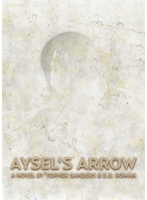
I was just sort of experimenting, with some ideas as jumping-off points. I kinda wanted to just throw a bunch of ideas out there, and then see how they land. These seemed like they matched the themes somewhat: the Lotería typefaces, the hint of an Anime character emerging (or hiding?) in the smokey, foggy texture.
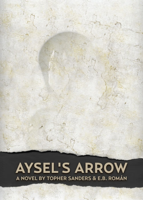
But it didn’t really feel complete, so the second version included the ripped texture. This was where I got a little artsy-fartsy: Those ripped edges don’t match up if you try to line them up. There’s a missing piece needed to make them one whole piece. It reflects the literal losses she’s experienced, but also the abstract losses she might not be able to identify.
Or so I thought. Still, I wasn’t sold.
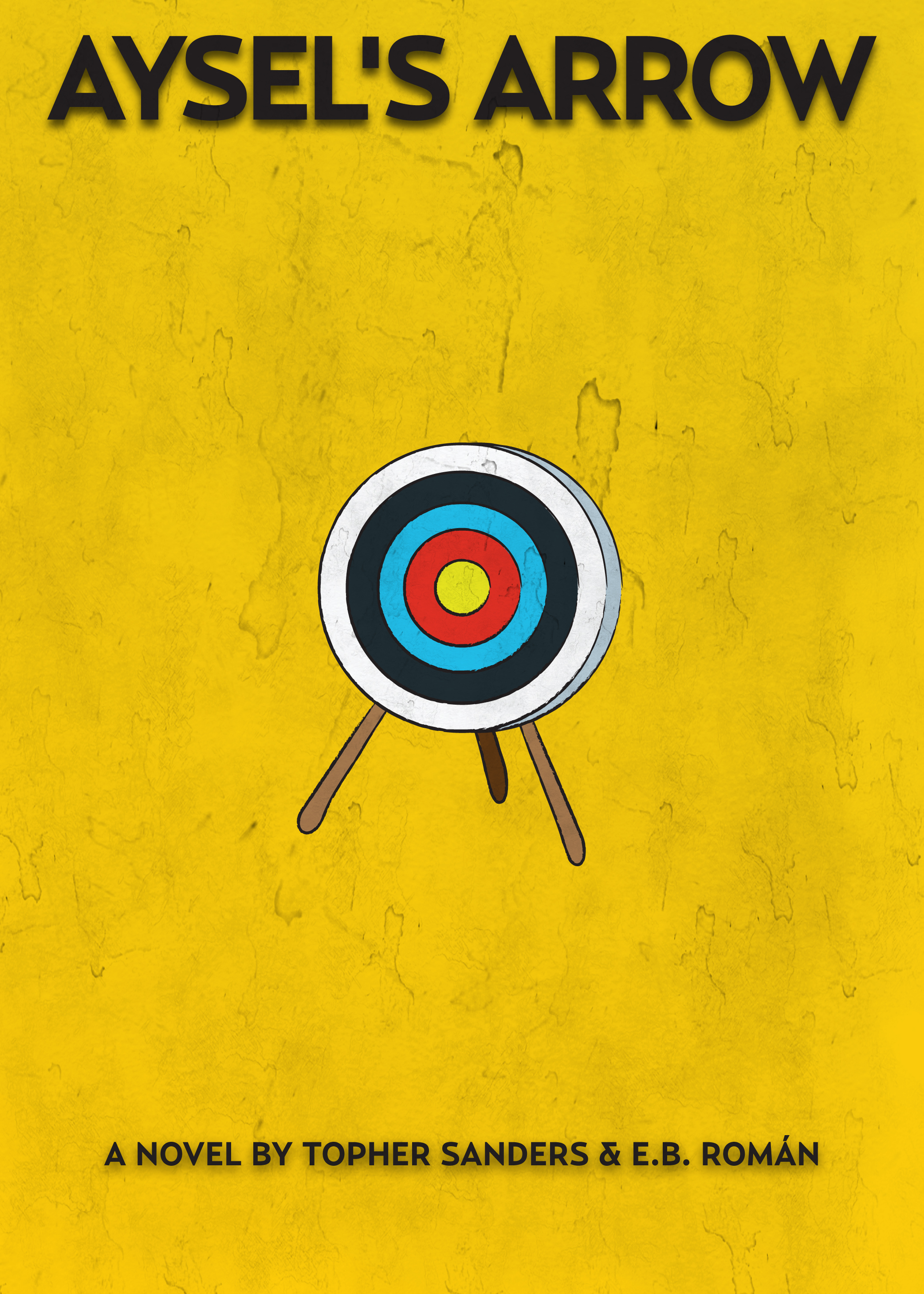
I started thinking of some of my favorite book covers. I thought of Chip Kidd and some other well known book designers, but my mind kept going back to the simple covers for Carl Hiaasen’s novels. With that in mind, I went more toward the Lotería theme, focusing on archery, an important hobby for Aysel.
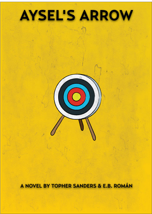
This was pretty simple, and much more straightforward. The texture adds some grittiness, but it’s still pretty plain. You don’t see whether she’s aimed, whether she misses or whether she hits the bull’s eye. You don’t see the arrows, either. You just see the target, sitting there.
It had some influence from the Lotería cards, but the simple, singular illustration in the middle with bright colors was my way of emulating the covers for Carl Hiaasen’s novels.
Additionally, the colors seemed to work well with Aysel’s story. She’s tough, so primary colors seemed more appropriate than pastels or the muted browns I used in the earlier cover. The blurry fog of the earlier cover worked well to show what was beneath the surface, but this straight cover introduces you to the feel of the novel a lot faster, I felt.
I sent Topher and Elizabeth the four versions, and they were receptive to them all. But it was the simple archery-themed one that won them over. We tweaked the text and made some elements a little bigger.
Here’s how the final version turned out:
One of the things I had begun to miss about illustrating for newspapers was the challenge of finding concepts that match abstract topics. When designing a cover for the weekend arts and entertainment tab, you have to illustrate a variety of things in one defined space. This project scratched that itch, but also gave me a new challenge: matching an emotional tone of a character and writing style.
Additionally, it was fun to collaborate with Topher again, especially on a project so different for both of us.
To read a Q-and-A with Topher and Elizabeth, go here.
To get the book on Amazon, go here.
To check out the Facebook page, go here.
Pingback: Patrick Garvin: Blog» Blog Archive » Topher Sanders and Elizabeth Román on “Aysel’s Arrow”