20 years after “black album,” Metallica’s platinum records compared

It was 20 years ago this week, on Aug. 12, 1991, that Metallica’s self-titled fifth studio album was released. In the two decades since its release, the “black album” has become Metallica’s defining album. It is certified 15X platinum, far above any other studio album by the band.

Five years later, the band teamed up once again with Bob Rock, the producer of the “black album” (so named for its black cover). “Load,” Metallica’s sixth studio album, was released in the summer of 1996. Hardcore fans said that the band had “sold out.” Some said it was because the band members had cut their hair. My friend Ned felt conflicted buying “Load,” but I told him that his long hair made up for their sins of cutting their glorious manes.

Anywho, for the 20th anniversary of the album that spawned “Enter Sandman” and “Sad But True,” I thought I’d look up the band’s platinum certifications on Recording Industry Association of America’s website. Using the RIAA’s listings, I created the following chart of when the band’s nine studio albums were certified platinum, double platinum, triple platinum, and so on.

Of course, another way to compare how many times each album went platinum would be to use bars. Here is each album and its number of platinum certifications, by order of release:

What can these charts tell us?

  • The “black album” is definitely the Metallica’s biggest commercial success. Add up the number of platinum certifications for all the studio albums they’ve done since and you won’t still won’t match it.
  • The band’s platinum certifications increase with each album through the “black album” and then decrease with each album after that. Of course, all of this is with the hindsight of 20 years. The newer albums might eventually be certified platinum again after they’ve been “out long enough” to catch up with the others. I’m not sure that will happen, though.
  • In the 2000s (whatever that decade is to be called), the Metallica albums that continued to get certified had been released between 1984 and 1991.
  • The post-“black album” records see an initial jump but don’t continue getting certified the way that the other non-“black album” discs do. Again, those older albums have been out a lot longer, so they have had the time to climb steadily.

Another thought

Bob Rock produced that record and every studio album through “St. Anger” in 2003. They used a different producer for “Death Magnetic,” which a lot of die-hard fans think is the best in 20 years. My theory? Fans who gravitated toward the unpolished sounds of the first four albums liked that familiar style in “Death Magnetic.” “Metallica” had a lot more polished sound and each album sounded cleaner and cleaner. “Death Magnetic,” though, sounds like it’s going to rob you, knife you and then eat you.

Of course, maybe it’s simpler than that. Maybe it’s not Bob Rock, the band members’ hair or any of that. Many bands or artists have that classic album to which fans will compare every other album that band or artist will release. For Metallica, it’s the “black album.” Those guys could cure cancer and some headbanger would say, “That’s good and all, but it’s no ‘black album.'”

What did your headline say? Same-sex marriage? Or gay?

The New York State Senate passing a bill allowing same-sex marriage was huge news, as was Governor Andrew Cuomo’s signing that bill into law later that night. Most New York papers gave that story big play on A1 on Saturday. Depending on which paper you saw, you either read that the bill allowed “same-sex marriage,” or that it allowed “gay marriage.”

I used to be a hardliner about using those terms in newspapers. I argued that “same-sex marriage” not presumptuous the way “gay marriage” was, and that it was more accurate. Here were my reasonings:

  • “Same-sex” refers to the genders of the couples, rather than the orientations of the people in the couple. If a man marries a man, we know they’re a same-sex marriage. But we don’t know that they identify as gay. They might identify as bisexual. Or, they could identify as straight. Or one could be gay and one could be bi, or one could be straight and the other gay. That seems like a stretch, but it could legally happen. As far as I know, the states that allow same-sex marriage don’t use gay tests. In all of the U.S., a lesbian could marry a gay man, but many wouldn’t think that makes it a “straight” marriage.
  • If a lesbian did marry a gay man, and thus both people were gay, could that be a “gay marriage”? Don’t say it can’t happen, because I know of at least two cases where it has happened.
  • There’s no law against the marriage between two gay people. As stated above, a gay man could marry a lesbian. The law is that two people of the same sex can’t get married, but as far as I know, the law doesn’t say that two gay people of the same sex couldn’t get married. I think two straight men would find it just as hard to get married in Missouri as two gay men.

Now, it might seem I’m being pedantic and splitting hairs. I totally understand that, which is why I don’t really make a deal about it anymore when talking to people in casual conversation. In general, I think we’re lax in conversation in way that we probably shouldn’t be in print. In conversation, I can ask for a “Kleenex,” even if you don’t have Kleenex brand tissues, because it’s become acceptable in conversation to refer to all tissues as “Kleenex.” “Dumpster” is no longer specific to the company, but can mean any large metal trash receptacle. We know what we mean.

But in print, we still hold to those rules. Every copy editing professor I had in college made it a point that if you don’t know it’s a Kleenex, call it a tissue. If you don’t know it’s a Frisbee, it’s a flying disc. I had one professor tell me of a correction a paper had to write when a reporter referred to a man as “African-American” when the man was not American at all. “We don’t make assumptions,” another professor told me.

I would mention all of these points to copy editor friends, many of whom agreed with me. But one smart copy editor friend of mine said, “Yeah, but ‘gay marriage’ sometimes fits in a head spec better than ‘same-sex marriage.'”

Thus, her paper’s policy was to use “same-sex marriage” in all copy, but give latitude in case “gay marriage” fit better in the headline. I’ve not explored too many other papers’ policies, but I would not be surprised if other papers have that policy, too.

And for the publications that use both “same-sex marriage” and “gay marriage” in copy, is there a policy for when to use one and not the other? Or is it OK to just switch them so as to not repeat the same term? I’d be interested to hear what discussions have gone on in other newsrooms.

I won’t deny that this dissection of language might seem anal-retentive. But I was a copy editor. It was my job to think this way.

More of The Boston Globe’s Bruins pages, infographics

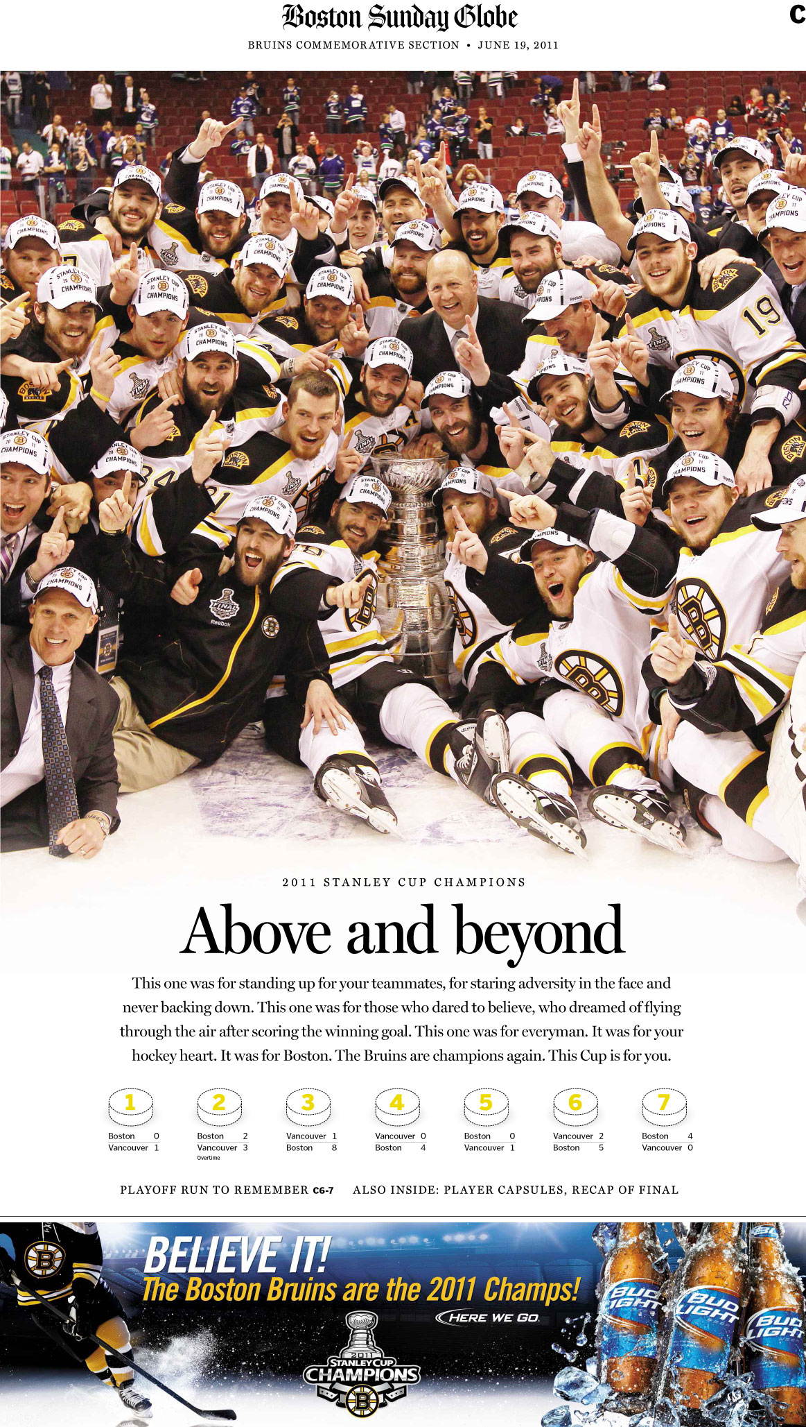
Last weekend, The Boston Globe published a special section commemorating the Boston Bruins’ season and Stanley Cup victory. The section was emblematic of all the good coverage that the paper had published all season, both in the sports section and throughout the paper.

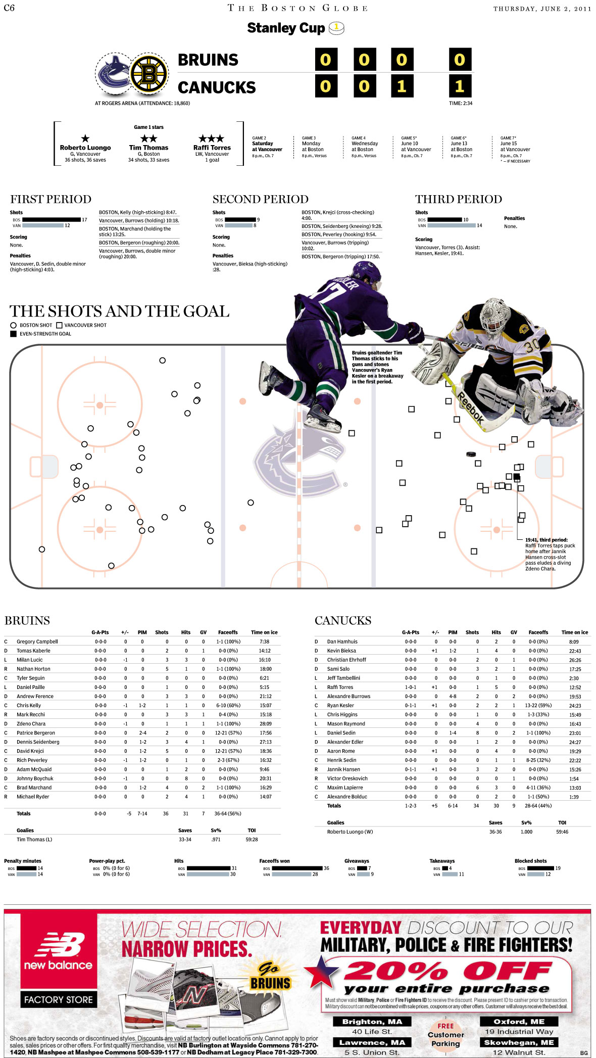
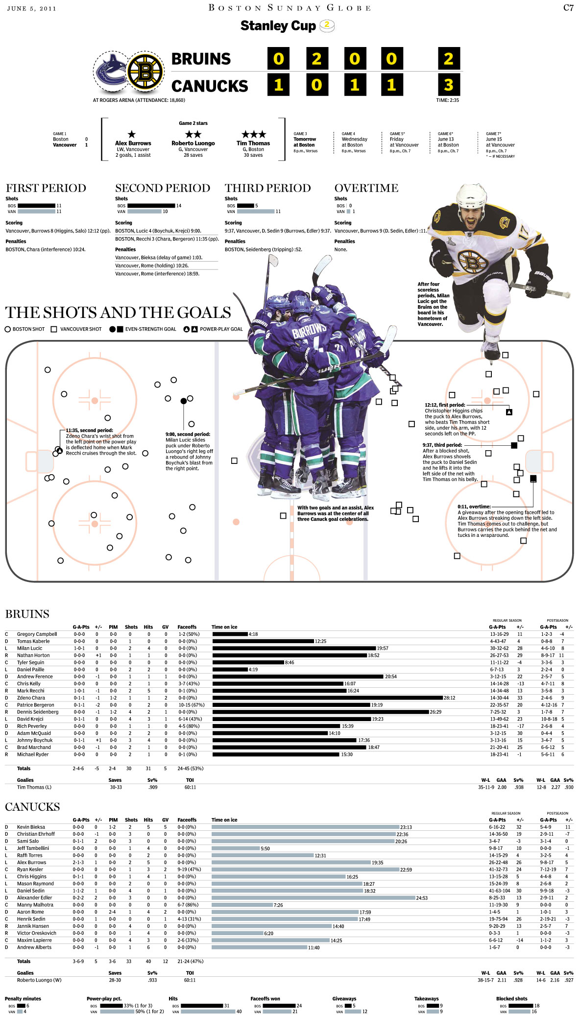
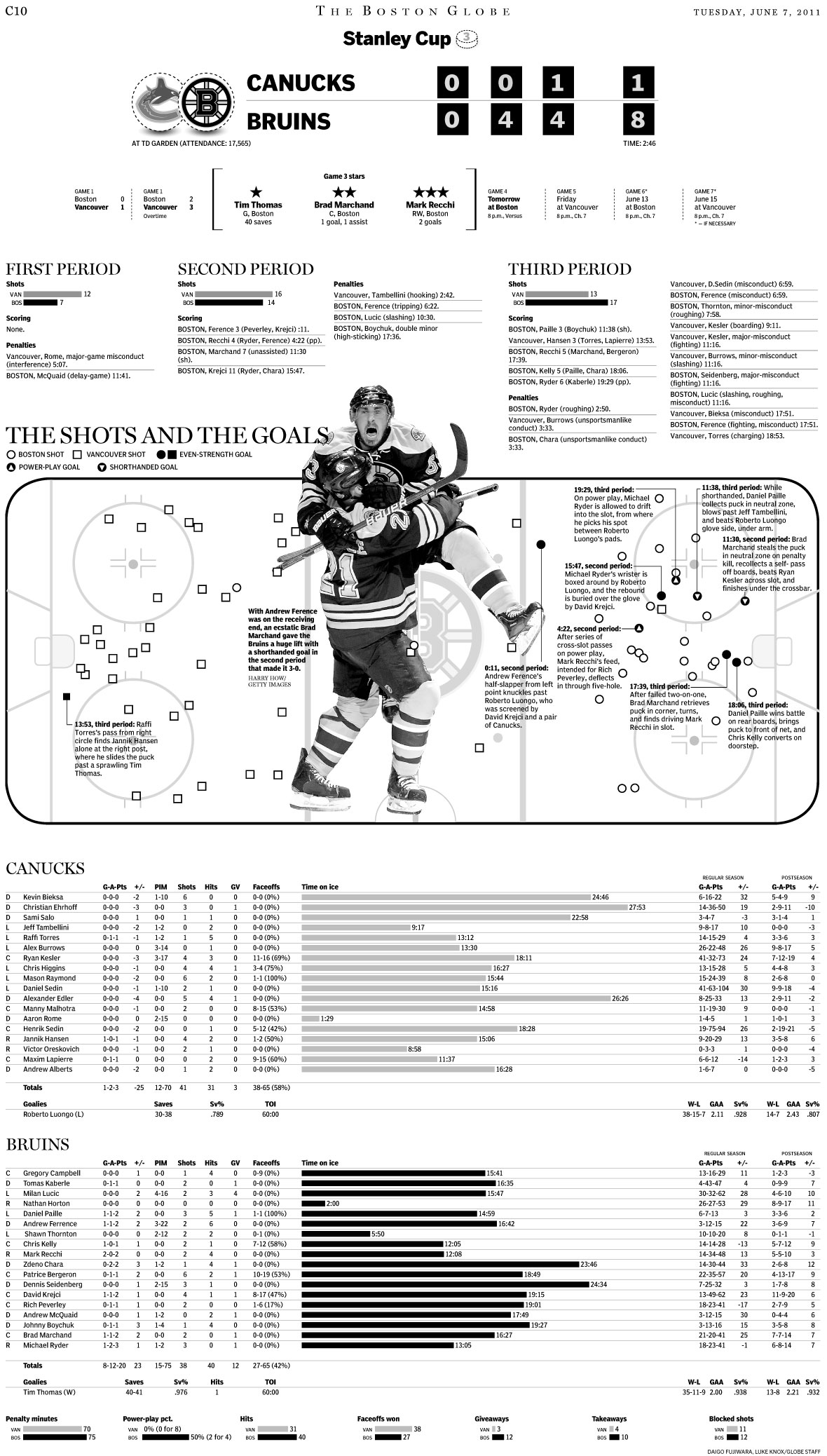
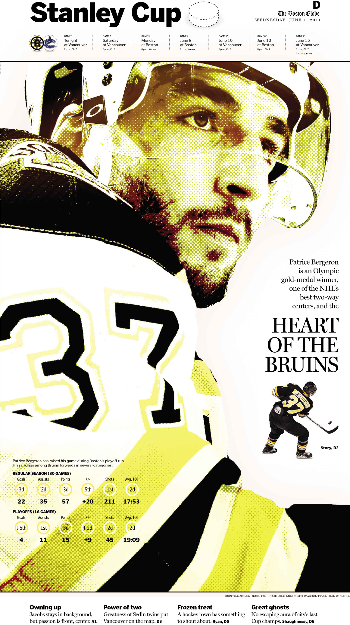
Here are some of my favorite pages The Boston Globe produced for the Bruins’ appearance in the series with the Canucks. Click on any of them for a larger view.

————
The preview section
June 1, 2011

Boston Globe coverage of the Boston Bruins

Boston Globe coverage of the Boston Bruins

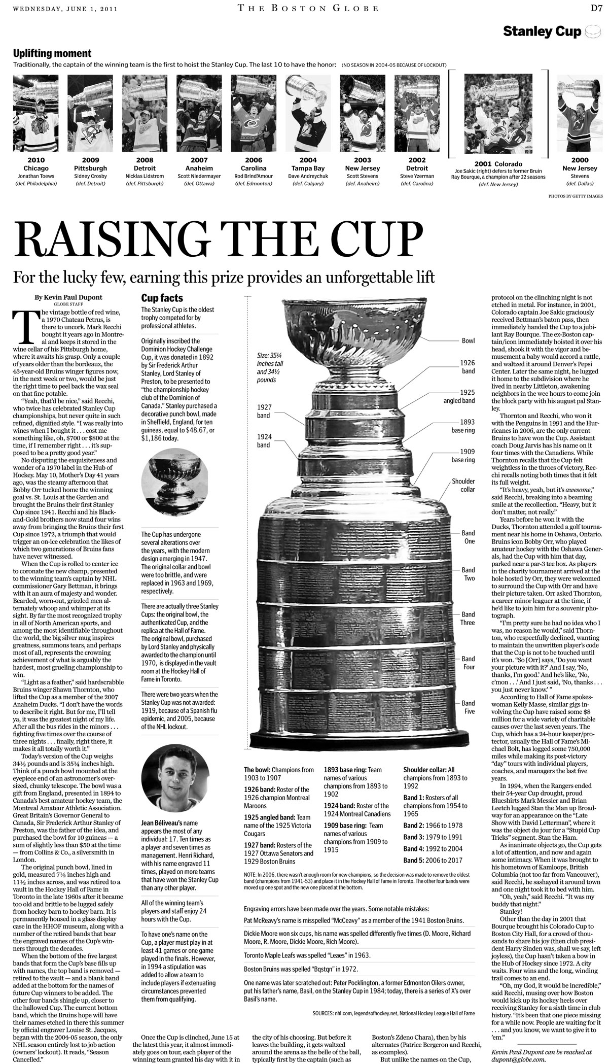
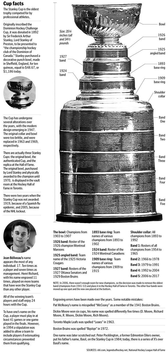
Here’s a closer look at that “Raising the cup” package:
Boston Globe coverage of the Boston Bruins

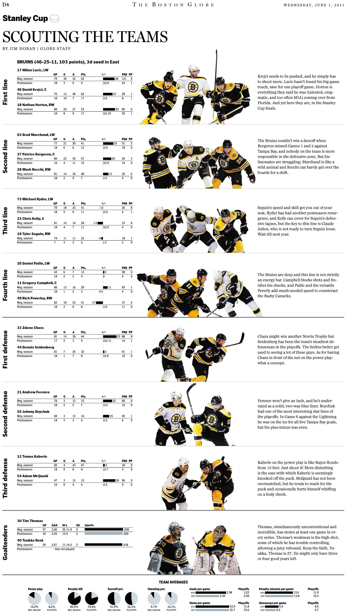
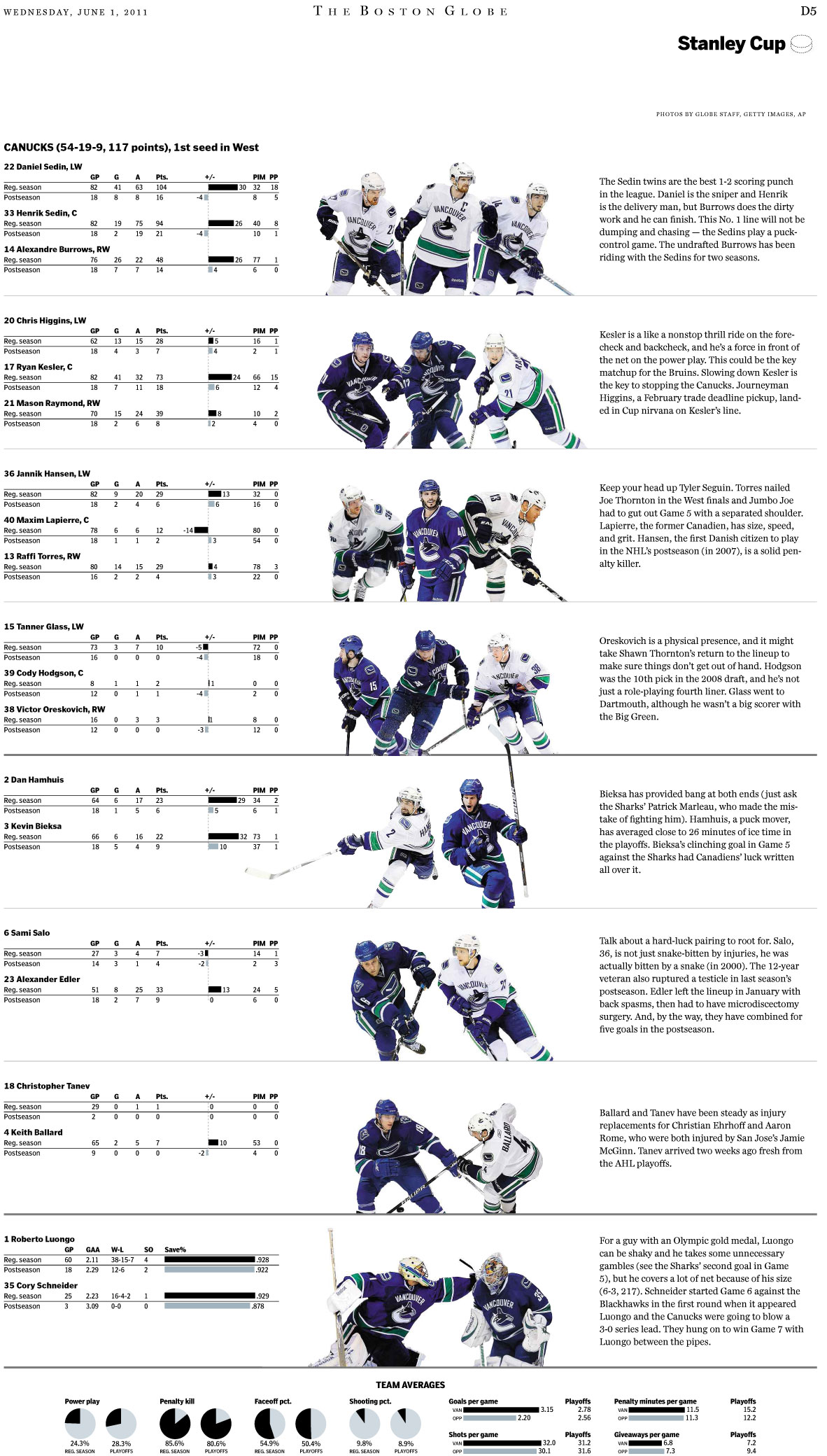
Here’s a nice comparison of the two teams:
Boston Globe coverage of the Boston Bruins

Boston Globe coverage of the Boston Bruins

————
Game graphics

Both Daigo Fujiwara and Luke Knox worked hard at putting together full pages breaking down the shots, the goals and the performances of each player for each game. Each of these ran the day after the game.

Boston Globe coverage of the Boston Bruins

Boston Globe coverage of the Boston Bruins

Boston Globe coverage of the Boston Bruins

In total, there were seven of these pages, one after each game. Daigo had quite the task: plot each point on the ice, and then find a full-body photo that wouldn’t cover the points, and then cut it out and put it in the graphic. And do it all on deadline.

You’ll recall game 3 when Aaron Rome of the Canucks hit Bruin Nathan Horton on the chin, knocking Horton down. The instant replays tried to show what happened, but it wasn’t until I saw this graphic by Dave Butler that I fully understood what had happened.

Boston Globe coverage of the Boston Bruins

————
The special section
June 19, 2011

Boston Globe coverage of the Boston Bruins

Boston Globe coverage of the Boston Bruins

This page features another great graphic by Daigo. I helped plug in some of the initial numbers, but he did much of the heavy lifting.

————
Other

Daigo and Tom Giratikanon put together this cool online graphic showing how far into the playoffs each of Boston’s four main teams have gotten, going all the way back to the Boston Americans (now the Red Sox).

I got to put together the print version:

Boston Globe coverage of the Boston Bruins

These pages are only some of the great pages that the Globe produced this past season. I hope we’ll get to do it all again next year.

How Massachusetts, Canadian papers played Stanley Cup win

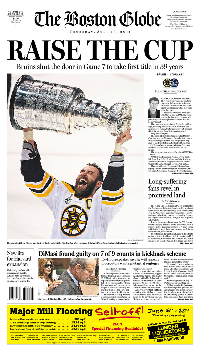
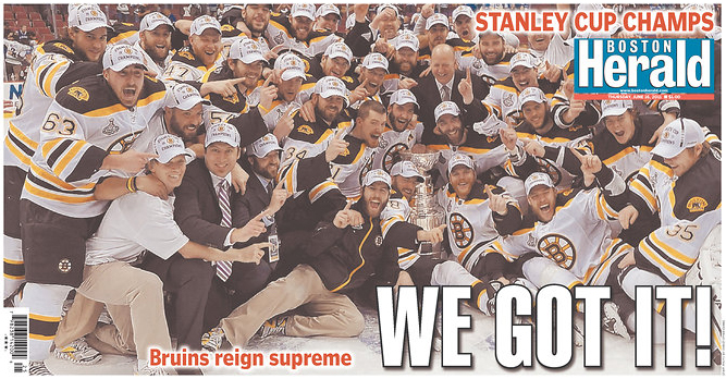
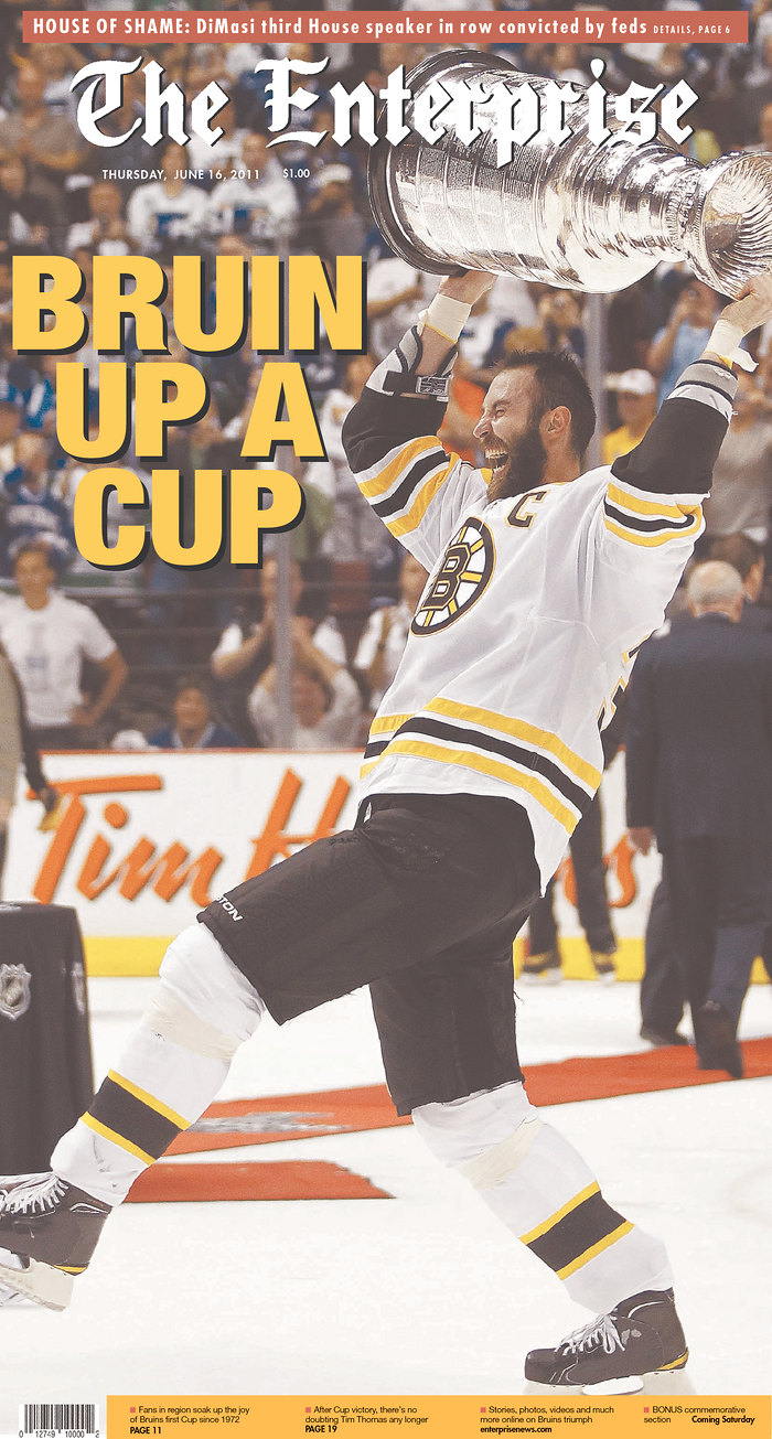
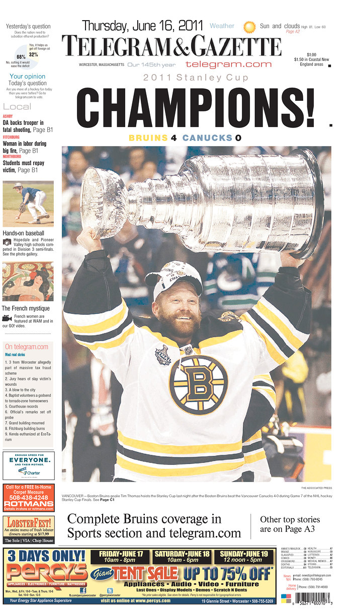
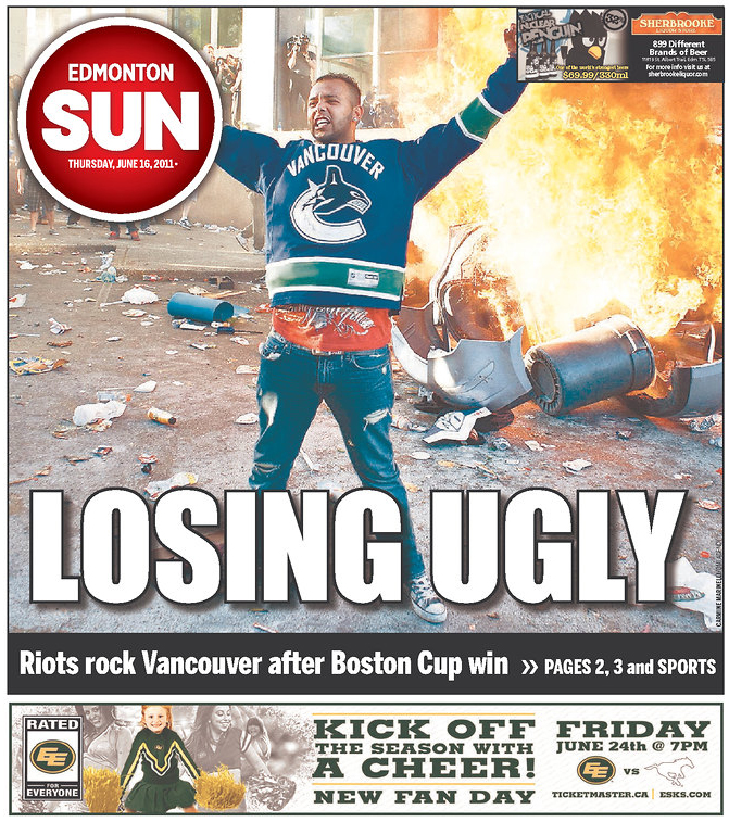
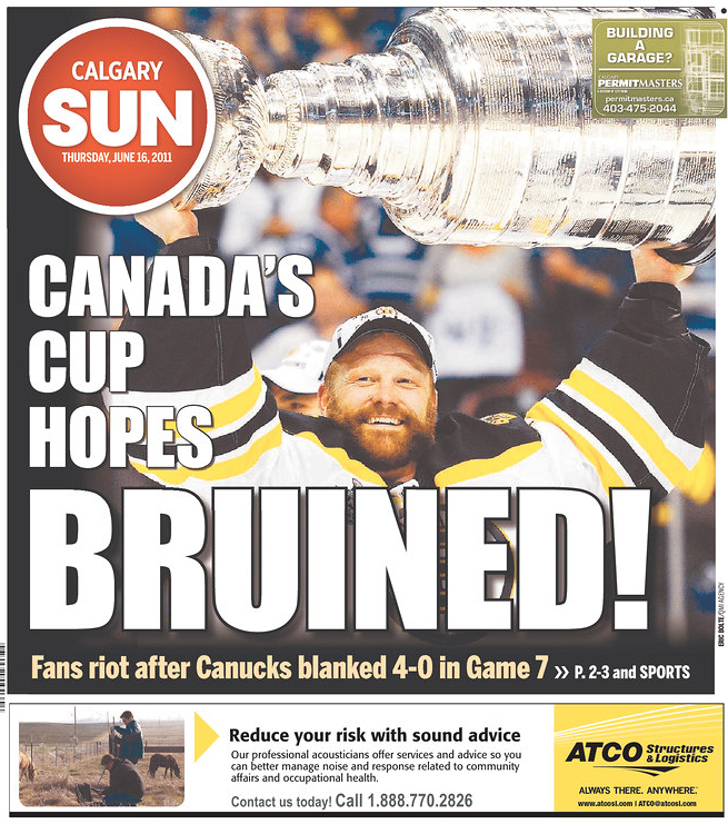
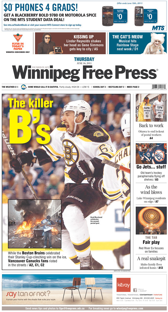
Last night’s Stanley Cup game was big news for a few reasons. It was the first time the Boston Bruins had won in 39 years. And on top of that, there were riots. In Vancouver.

So, take a look at how papers in Massachusetts and Canada played the game and the riots. Click any of the pages for a larger view. In a few days or so, I’ll have a look at how The Globe has played the Bruins in the playoffs and finals.

All images come from Newseum.

———
The Boston Globe
Boston, Mass.

Stanley Cup newspaper fronts

———
The Boston Herald
Boston, Mass.

Stanley Cup newspaper fronts

———
The Enterprise
Brockton, Mass.

Stanley Cup newspaper fronts

———
Telegram & Gazette
Worcester, Mass.

Stanley Cup newspaper fronts

———
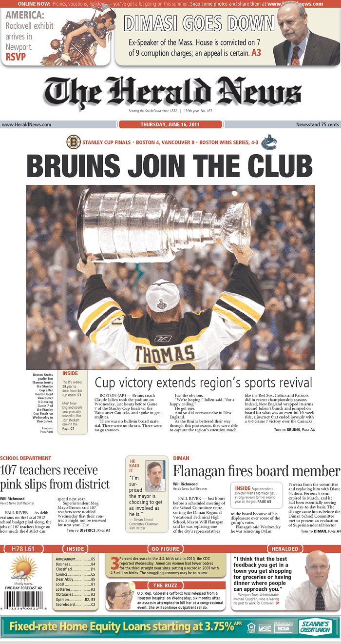
The Herald News
Fall River, Mass.

Stanley Cup newspaper fronts

———
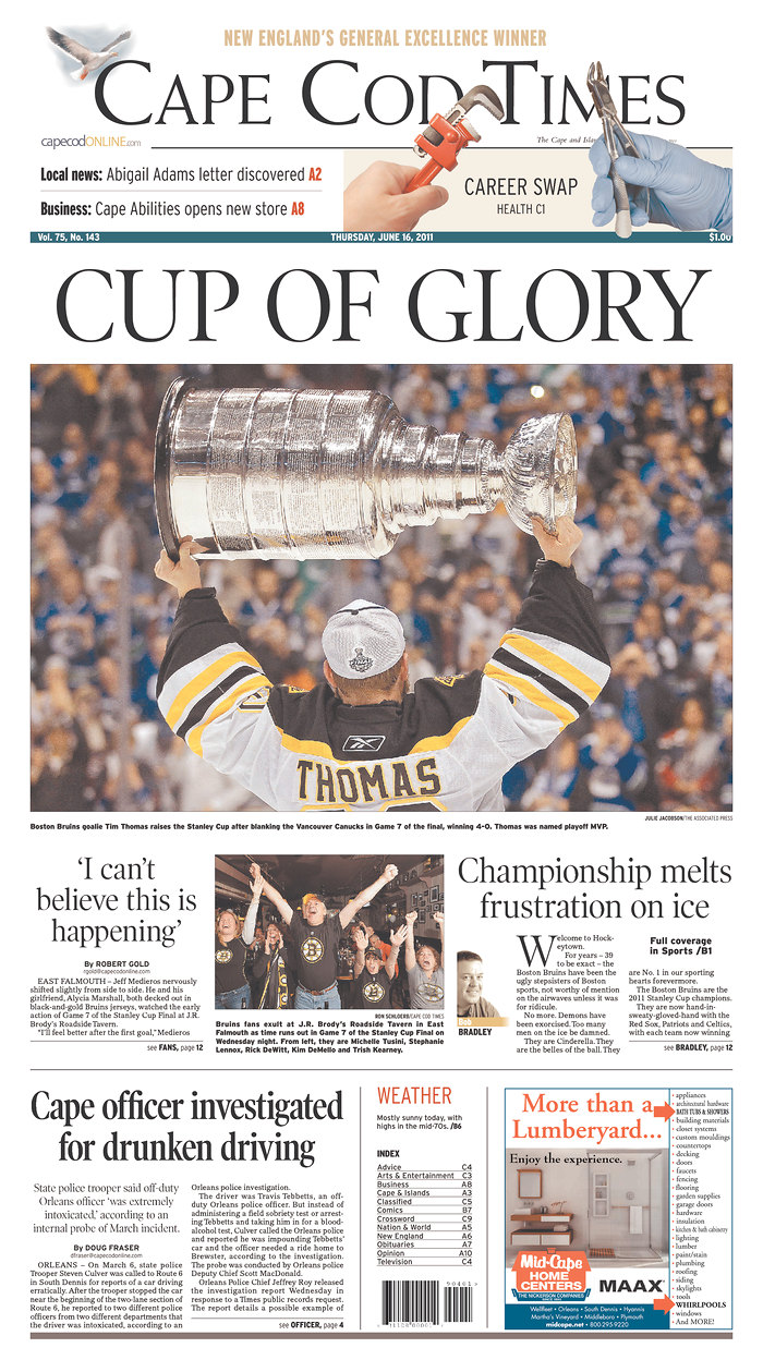
Cape Cod Times
Hyannis, Mass.

Stanley Cup newspaper fronts

———
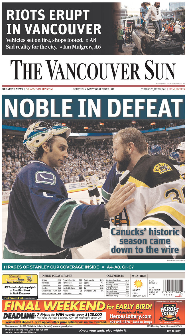
The Vancouver Sun
Vancouver, Canada

Stanley Cup newspaper fronts

———
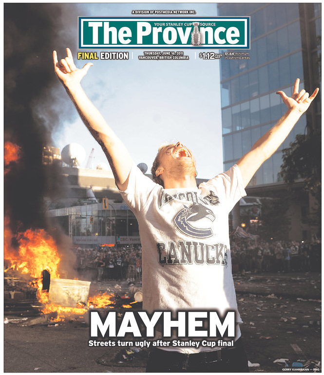
The Province
Vancouver, Canada

Stanley Cup newspaper fronts

———
The Globe and Mail
Toronto, Canada

Stanley Cup newspaper fronts

———
Edmonton Sun
Edmonton, Canada

Stanley Cup newspaper fronts

———
Calgary Sun
Calgary, Canada

Stanley Cup newspaper fronts

———
Winnipeg Free Press
Winnipeg, Canada

Stanley Cup newspaper fronts

———

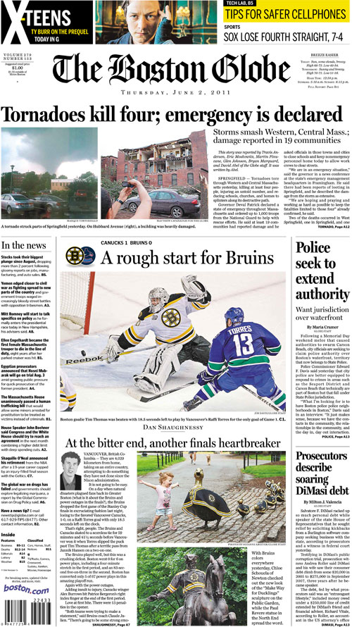
How The Boston Globe/Boston.com covered the tornadoes

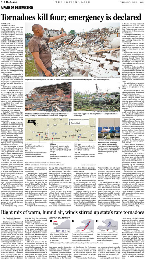
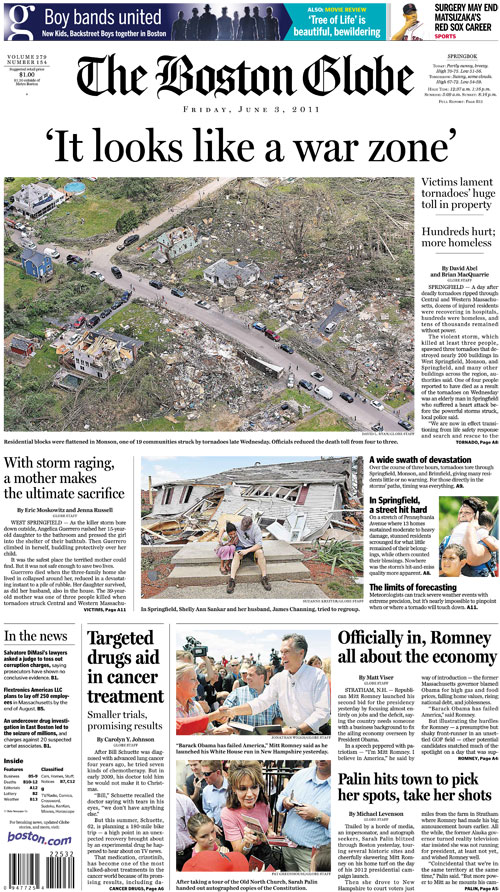
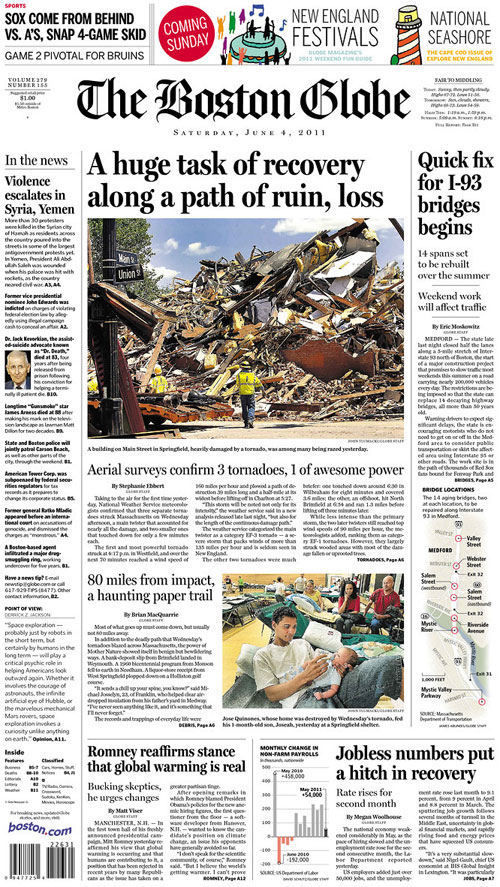
The Boston Globe and Boston.com have done a great job covering Wednesday night’s tornadoes in Western and Central Massachusetts. I’ve included the last three days’ front pages, as well as some inside pages, photos and graphics. To see all of the Boston Globe/Boston.com coverage, go here.

———

THURSDAY, JUNE 2

The inside page:

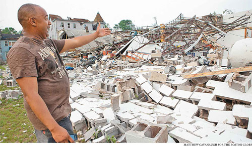
The top photo is by Matthew Cavanaugh, for the Boston Globe:

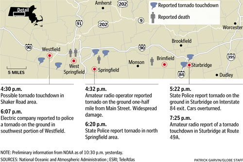
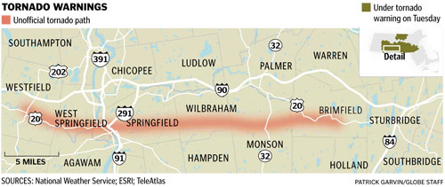
We used NOAA’s updates to put together this map of reported touchdowns and deaths:

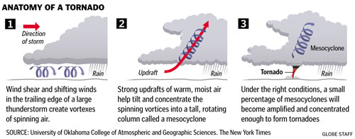
Javier Zarracina quickly put together this explainer on the anatomy of a tornado:

To read the main bar (gang byline of Travis Andersen, Eric Moskowitz, Martin Finucane, Glen Johnson, Bryan Marquard, and David Abel), go here.

To read Carolyn Y. Johnson’s story on how tornadoes form, go here.

To see Tom Giratikanon’s map of the history of tornadoes in Massachusetts, go here.

———

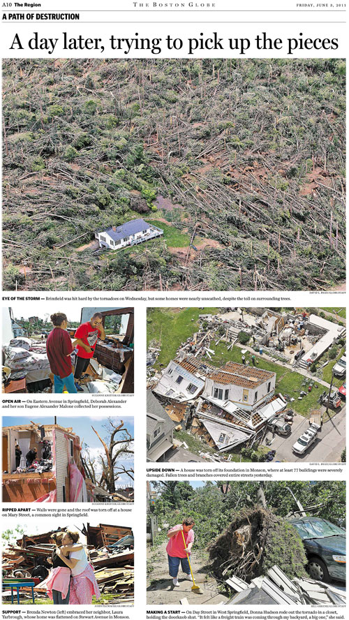
FRIDAY, JUNE 3

We had several inside pages, including this color photo page:

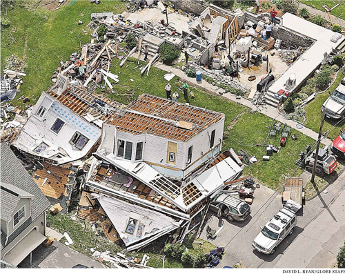
Which included this great photo by David L. Ryan:

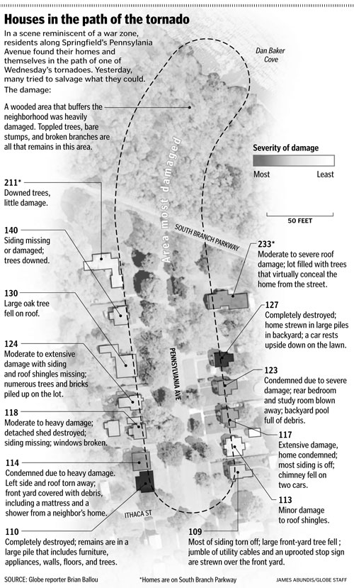
Elsewhere inside was this great map by James Abundis with reporter Brian Ballou. It shows the varying damage of houses on Pennsylvania Avenue in Springfield.

To read Ballou’s story, go here.

With updates from the National Weather Service, we were able to show which cities had warnings, and more reported touchdowns:

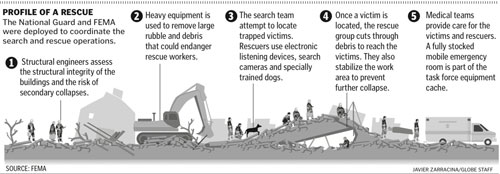
Javier Zarracina put together an explainer showing how the National Guard and FEMA were deployed to coordinate the search and rescue operations:

To read Brian MacQuarrie’s story, go here.

———

SATURDAY, JUNE 4

The photo up top is by John Tlumacki:

To read Stephanie Ebbert’s story, go here.

To read Brian MacQuarrie’s story, go here.

To see all of the Boston Globe/Boston.com coverage, go here.

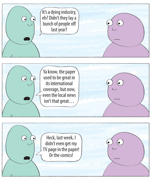
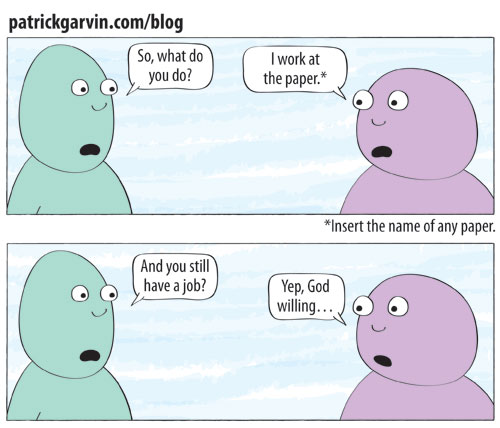
WEB COMIC: The conversation many journalists hate, pt. 1

I sometimes wonder what it would be like if we were all so cavalier to introduce our grievances about topic X as soon as we learn about someone’s allegiance to said topic. Or how inappropriate it would be if we talked about a stranger’s recently deceased relatives the way we talk about their recently laid-off colleagues.

———

RELATED:

Web Comic: 10 Reasons You Should Hire A Journalist

A tale of two visits: Obama and the Queen in Ireland

Yesterday, President Obama and his wife Michelle visited Ireland. Last week, Queen Elizabeth II was in Ireland. All in all, a pretty big week for the country.

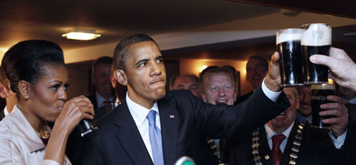
Obama was there pay tribute to his lineage in Moneygall, which Mark Landler of The New York Times described as “a postage-stamp Irish hamlet of 300.” Obama hugged people, shook hands and — most importantly — had a Guinness.

The Queen’s visit was more somber, as she addressed — but came short of apologizing for — the history of violence between England and Ireland. There were several protestors, and the pictures of them are more striking than the photos of the Queen’s visit. To see photos from The Big Picture, click here.

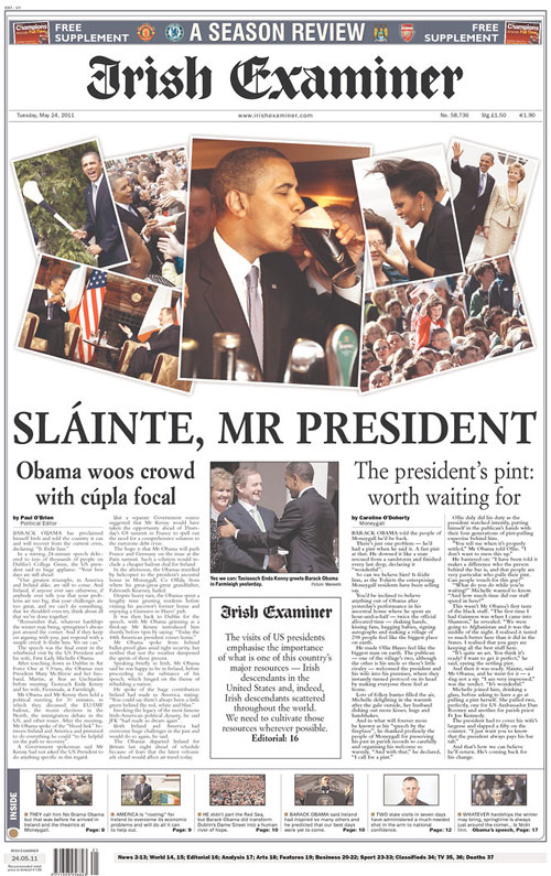
The way the two visits were played in the press highlight the differences of the trips. The usually playful Irish Examiner had a clean, serious front for Elizabeth’s visit, but returned to its normal relaxed form with a scrapbook-y collage of Obama’s visit.

———

THE QUEEN’S VISIT TO IRELAND

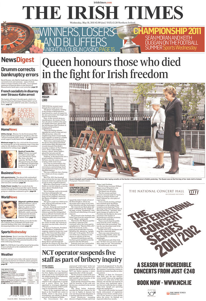
The Irish Times focused on the conciliatory nature of the Queen’s visit, showing her with Irish president Mary McAleese laying wreaths in honor of the dead Irish at the Garden of Remembrance in Dublin.

Miriam Lord writes:

This was the moment many thought they would never see.

The Queen of England, standing in the Garden of Remembrance, head bowed in a mark of respect for the men and women who fought and died for Irish freedom.

Here, in this revered shrine to republicanism, the strains of God Save the Queen swelled in the quiet of a Dublin afternoon, played with the full blessing of the President of Ireland and the political establishment.

These electrifying minutes signalled the end of a long and very difficult journey, when two neighbouring heads of state finally stood together as equals in a display of friendship and reconciliation.

To read the rest of Lord’s story, go here.

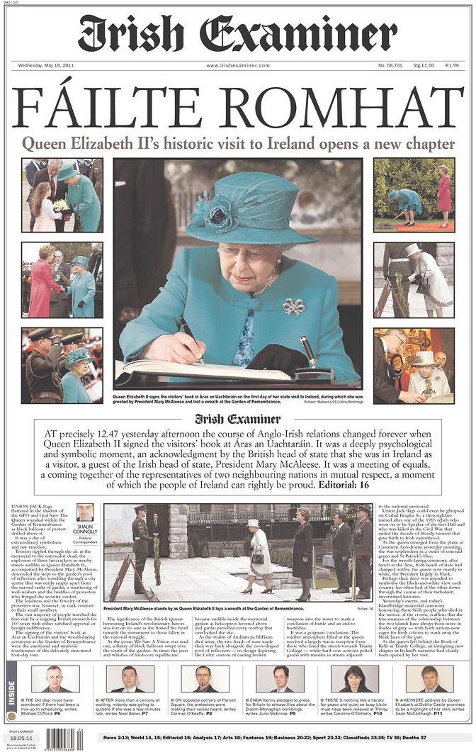
The Irish Examiner showed several photos of the Queen’s visit, but the largest play went to the photo of Queen Elizabeth II signing the guestbook at Áras an Uachtaráin, the official residence of the president of Ireland.

The importance of this was summed up in the main copy block under the photos:

At precisely 12:47 yesterday afternoon the course of Anglo-Irish relations changed forever when Queen Elizabeth II signed the visitors’ book at Aras an Uachtarain. It was a deeply psychological and symbolic moment, an acknowledgement by the British head of state that she was in Ireland as a visitor, a guest of the Irish head of state, President Mary McAleese. It was a meeting of equals, a coming together of the representatives of two neighboring nations in mutual respect, a moment of which the people of Ireland can rightly be proud.

To read Shaun Connolly’s story, go here.

———

OBAMA’S VISIT TO IRELAND

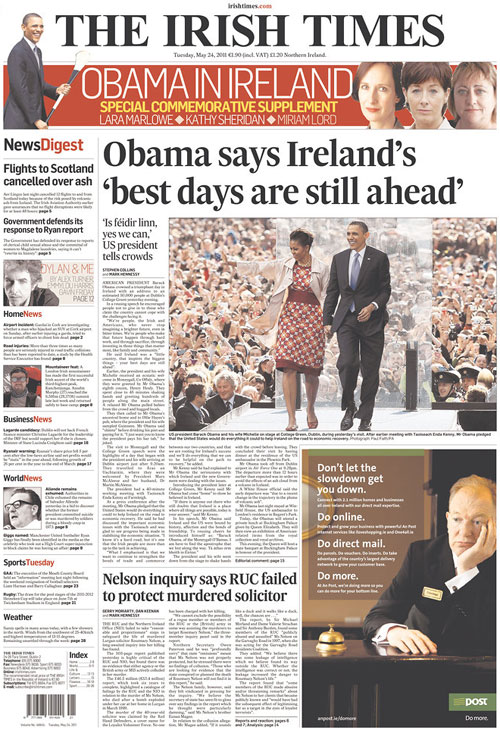
The Irish Times played the story the way it plays many of its centerpiece stories: with one main photo, one headline and one deckhead. The photos fascinated me, because I was trying to wrap my mind around the glass-looking partition thing from which Obama delivered his speech.

What the Irish Times front didn’t show, though, but did show on its website:

That photo was uncredited on the site. To see that photo (and to read the story by Stephen Collins and Mark Hennessy), go here.

That Guinness moment did make it on the Irish Examiner front, though:

Similarly to the front featuring Queen Elizabeth II, the importance of this event was summed up in the main copy block under the photos:

The visits of US presidents emphasise the importance of what is one of this country’s major resources — Irish descendants in the United States and, indeed, Irish descendants scattered throughout the world. We need to cultivate those resources wherever possible.

To read Paul O’Brien’s story, go here.

———

UPDATE

The Queen did NOT have a Guinness. Read about it here.

How the Florida Times-Union covered historic victory

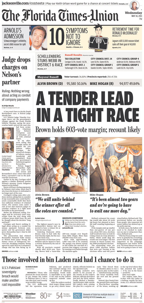
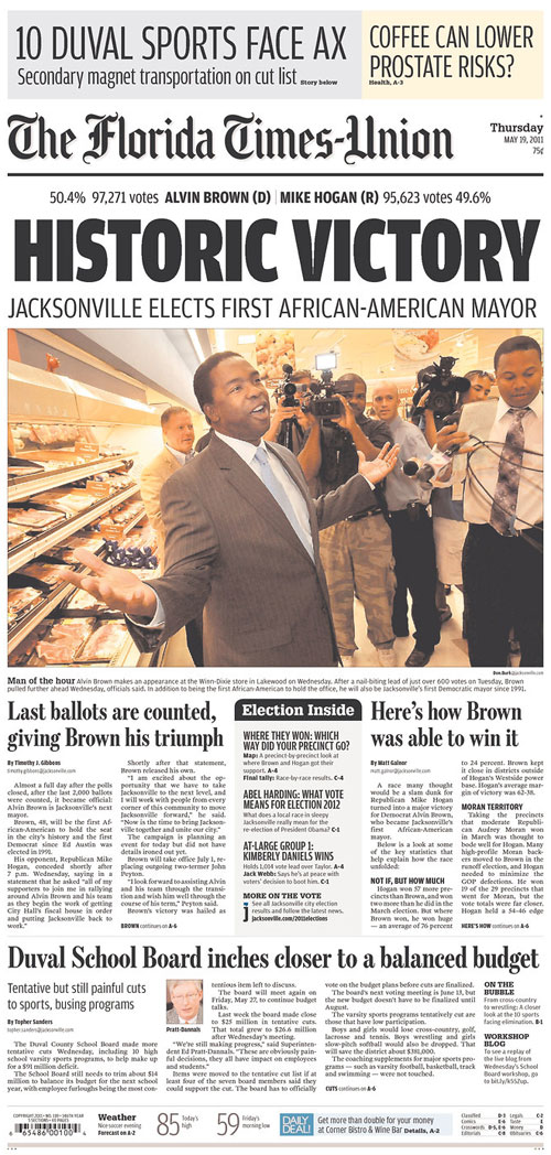
This past week, the people of Jacksonville, Fla., elected its first black mayor in the history of the city. Democrat Alvin Brown beat Republican Mike Hogan in a runoff on May 17. The runoff followed the March election in which the two garnered the most votes.

Many of my former colleagues at The Florida Times-Union did great work this week. Here’s some — but not all — of that work.

By the time Wednesday’s paper went to bed, the two were 603 votes apart. Brown photo shot by Bruce Lipsky, Hogan shot by Bob Self. But by Wednesday afternoon…

…Alvin Brown was declared the victor. The victory shot from Thursday’s paper by Don Burk.

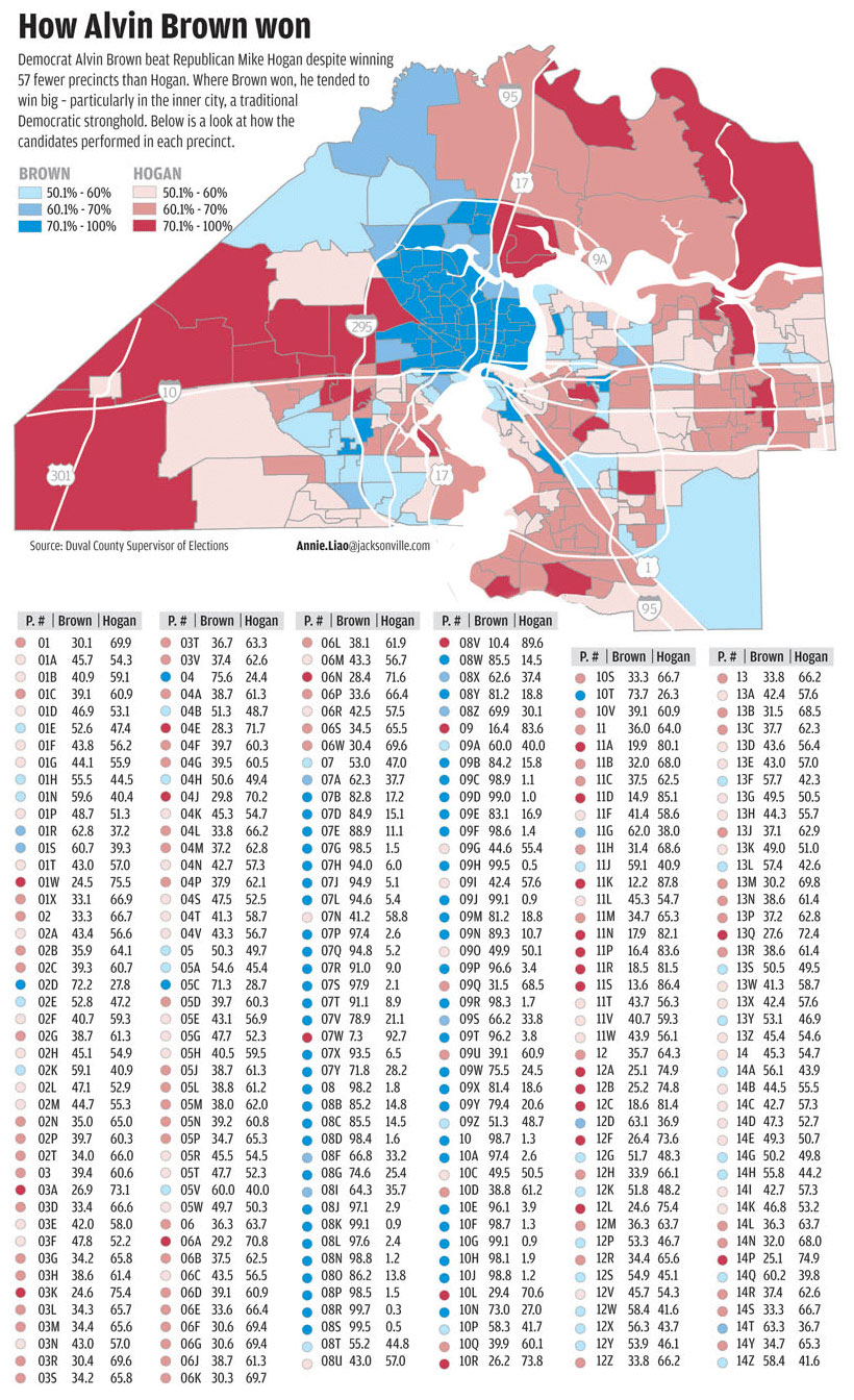
Reporter Matt Galnor explained the historic win’s statistics and graphic artist Annie Liao made this graphic showing the precinct-by-precinct results. Click for a larger view.

Annie Liao infographic Jacksonville mayor's race precincts

And Sunday, Tim Gibbons wrote a piece analyzing Alvin Brown’s campaign and how he won.

Jacksonville was my home for four and a half years, and because of the time I spent there with such great friends and colleagues, I will always think of Jacksonville as one of my homes. Thus, even though I no longer live there, this mayoral race was pretty interesting to me. And it reminded me of a few graphics I did that can now be updated.

In January 2009, I researched and put together this graphic in time for Obama’s inauguration. This timeline-chart hybrid shows which party was in control of the presidency, U.S. Senate and House, Florida Governorship, Senate and House, and the Jacksonville mayor’s office and city council from 1960 to 2009.

A month later, I researched and put together this graphic showing how long it took for black men and women to be elected into various political offices, from the White House down to Jacksonville positions. Jacksonville’s first black city council members post-Reconstruction were Sallye Mathis, Mary Singleton and Earl Johnson. Nat Glover became the first black sheriff in 1995. He ran for mayor in 2003, but lost to John Peyton. Jackie Brown, a black woman, ran for mayor in 2007, but also lost to Peyton. She died shortly after the election.

I’m looking forward to the possible graphics that can come from this election. Between Brown’s victory, Peyton’s administration coming to an end and the shift of influence in the city, there will be no shortage of graphics.

———

UPDATE

Denise M. Reagan, AME for Visuals at The Florida Times-Union, writes:

The blogs on election night and all the next day during the count of provisional and absentee ballots were well done and featured a lot of participation from the community.

Additionally, on Monday, #AlvinBrownVictorySongs was a hashtag on Twitter for — you guessed it — potential victory songs for Alvin Brown.

More Boston Globe infographics about Japan, nuclear plants

In the last week, all hands have been on deck in the Boston Globe infographics department for our coverage of the nuclear crisis in Japan and what it means for nuclear plants in the U.S., particularly in New England. We’ve had great work from David Schutz, Javier Zarracina, David Butler, James Abundis, Daigo Fujiwara and Monica Ulmanu.

Below is just some of the stuff we had from March 14 to March 18. We used a variety of approaches for the variety of stories and angles, and I think we’ve been doing a great job. Needless to say, I love working with these people.

———
MONDAY, MARCH 14, 2011

On the Sunday after the earthquake, the focus of the story had shifted to the Japanese reactor and the crisis at the nuclear plant there.

David Butler and I worked on the graphics for that Monday’s paper, including this one here. Butler found an earlier Associated Press graphic, but then simplified some of the steps and colors. Additionally, he added some details not in the original graphic, using information we got from reporter Carolyn Johnson and David Schutz, Deputy Design Director/News & Graphics.

Here’s a look at that graphic. Click on it for a larger view:

Boston Globe Fukushima infographic by David Butler and Patrick Garvin

———
TUESDAY, MARCH 15, 2011

The next day focused more on the plant at Fukushima. Here’s a front page graphic. Click for a larger view.

Boston Globe Fukushima infographic

———
WEDNESDAY, MARCH 16, 2011

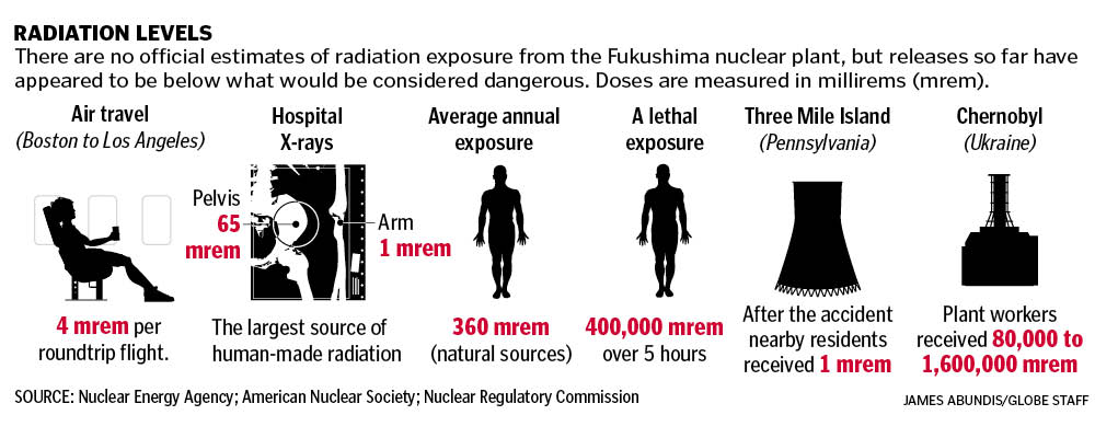
James Abundis put this graphic together explaining radiation levels. The questions many people had were, “How much radiation has been released by the Fukushima plant?” and “How does that compare to other radiation levels?” This infographic answers those questions simply but thoroughly. Click for a larger view.

Boston Globe infographic

Inside the A section, we had this infographic explaining the risks of nuclear meltdown and the potential worst-case scenarios.

Boston Globe  infographic

———
FRIDAY, MARCH 18, 2011

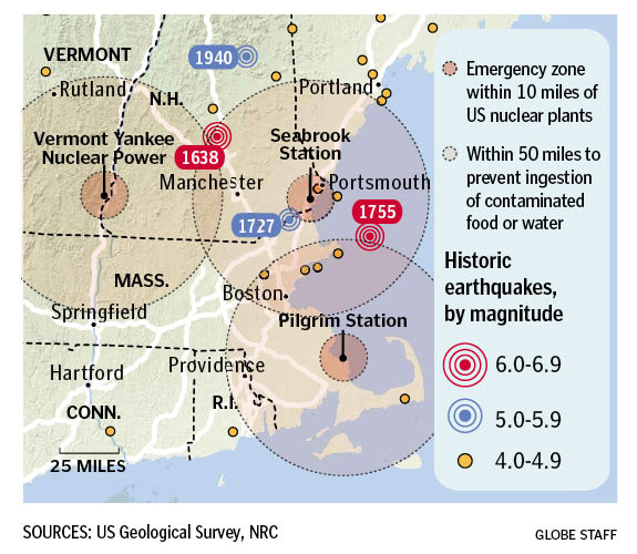
The problems with the boiling water reactor in Japan shed light on the BWRs and PWRs here in the states, particularly three in New England: Vermont Yankee Nuclear Power in Vernon, Vermont; Seabrook Station in Seabrook, New Hampshire and Pilgrim Station in Plymouth, Mass. David Schutz had put together a map of historic earthquakes last year, so I updated that to show these three reactors. Click for a larger view.

Boston Globe  infographic

Inside, we had a graphic by Monica Ulmanu and Javier Zarracina explaining the safety measures in place at those New England nuclear plants, with an assist by Boston Globe reporter Beth Daley. Click for a larger view.

Boston Globe  infographic

———

These are just some of the graphics we did this past week. It’s been a team effort, with work by everyone in the department.

RELATED
How The Boston Globe covered the tsunami on Saturday, March 12, 2011
How other newspapers covered the tsunami on Saturday, March 12, 2011

Behind the Missouri School of Journalism’s Project 573

This week, the Missouri School of Journalism launched Project 573, a multi-disciplined, multimedia reporting project put together by 12 seniors representing the School of Journalism’s six sequences: broadcast, convergence, magazine, photojournalism, print and strategic communication.

They decided to report on the recession of the last few years and how it’s affected American life. The result is “The American Response,” which will be updated throughout the next few months. When it launched Monday, it already had photo galleries, videos, narratives and infographics. There’s even an interactive game.

Project 573 (so named for the area code) was put together by 12 seniors, overseen by two faculty advisers, Reuben Stern and Jacqui Banaszynski. I had both Reuben and Jacqui when I attended Mizzou’s J-school. It’s because of Reuben that I took my first infographics class and chose this path.

The project was conceived by Evan Bush and Adam Falk. I was impressed by the project, especially when you realize that the Kirk and Spock of the project were seniors who had all sorts of other things going on. I remember my capstone semester in college, and I barely could function well enough to remember to eat or get gas in the car, let alone run a project like this one. So, I wanted to get their perspectives. Evan took some time to answer my questions, the answers to which are below.

—————

How did you guys come up with Project 573?

The project was kind of a weird moment of serendipity. Adam [Falk] and I are roommates and we spend a lot of time on “shop talk” around the house. But the project was actually fleshed out in an excited text message/ Gchat conversation. Adam was at a journalism conference, and I texted him something like, “We need to make a documentary.” Just an off-the-cuff idea I’d had. Adam quickly reminded me that the J-school probably wouldn’t let us take a year off to shoot a documentary and that a collaboration with students of other interest areas would be much more interesting.

In New York, the conference Adam attended was about the future of journalism education. I think the wheels started turning for him there; he came back jazzed on journalism and couldn’t shut up about the conference.

So we took a step back, and the day he came back, hashed out the guts of our plan in a G-Chat conversation while Adam was at work and I was in class.

I had a lunch date with a couple of other students and Dean Mills. I just jumped in and said I’d been kicking around a crazy idea–that we could bring all the sequences at the J-school together for a big happy journalism mess. Dean had been at the New York conference with Adam, so they were sort of familiar with each other.

I told him we would like to meet with him. He agreed for the next week, and then the planning began.

—————

How did you pitch this? How was it received?

Adam and I went to Dean’s office just bubbling with excitement and energy. We took about an hour to get ready for school that day–like we were going to a senior prom or something. We practiced a basic elevator speech at home and tried not to get too excited.

When we walked in, we made small talk for a few minutes and we didn’t get halfway through the pitch before he jumped in with basic questions. We’d expected this thing to be a fight and we’d have to have a lot of ammo.

After a couple of easy questions, he said something to the effect of, “Sounds great, let’s take the next step.”

We kind of looked at each other like, “Uh…is that a yes…and if so…let’s figure out a couple of next steps.”

It kind of felt like he’d already made up his mind before we’d even stepped foot in his office.

We’ve had a lot of feelings like that in Dean’s office. We’ll get geared up for a big pitch to him and then walk into his office and he’s already excited and ready to support us however he can.

—————

How did the other 10 seniors get involved with Project 573?

The hardest pitches we’ve made were to students, although pretty much everyone we talked to was interested right away. We contacted students individually based on our experiences with them in classes and seeing people’s work out there. We asked professors for recommendations. We came up a one-sheet pitch to give people.

Adam and I met with them individually, gave them a basic elevator speech, answered questions and let them take a few days to decide. Pretty much everyone we contacted was interested right away and it usually became a logistics question–how the heck are we going to get everybody Capstone credit in an established system.

It took a lot of work to make sure everyone could fit into a schedule and graduate on time.

—————

How did you divvy up the workload among the group?

It was a process. We didn’t know what we were doing as managers right away and weren’t comfortable taking complete ownership over a group project. We thought it was going to be really important to get everyone on board with the idea and then go from there. For the first few weeks, we had really vague discussions about what we as a group wanted the project to be.

Everyone was really interested in a truly collaborative process, but it became clear that at some level they needed someone to drive the boat. Adam and I decided to be co-editors with the group’s support and take that role so people would feel comfortable with a structure.

After that, things became more collaborative and everyone started to feel more comfortable. We all brainstormed an organizational structure where we divvied out administrative workload. We decided that everyone would be reporting, editing and either designing or helping conceptualize design.

I’d read a bit about Google’s 20% model. Basically, Googlers get to use 20% of their time however they choose as long as it fits within the mission of Google. We put that in place right before winter break and people have taken ownership of some supplementary things we call “pet projects.” For example, all of our bio videos were produced by Alex Rozier, who chose working on them as his pet project.

—————

How long had you been working on this before you went live?

We spent one semester in a one-hour class conceptualizing, planning, pre-reporting and designing a website. But any true reporting and web development began the last week of January when we put our noses to the grindstone and began going out into the community and working on stories.

—————

What kind of hurdles did you experience when working on this?

Woof. What a question.

First off, Adam and I had little to no experience in management. But we were confident (read: stupid) enough to give it a shot. Learning on the fly when 10 people are expecting results from you has its ups and downs. We have learned more about group dynamics, how to get people excited, how to lead meetings, and how to execute an idea more than any Business 4000 class could ever teach you. We were fortunate enough to recruit patient and forgiving people that liked us (or pretended to at least) enough to stick it out when we didn’t know what the heck we were doing.

Kind of along those lines, getting people on board with this thing was tough. Our class in the Fall met for one hour each week at 8 a.m. No amount of coffee was going to get everybody pumped about Project 573 consistently each class session at that time. We worked really hard at making sure everyone was involved in all the big decisions and that they began to feel ownership of this project. We had to transfer ownership from the two of us, to everyone else. By the end of the Fall semester, we’d begun to feel really confident about the way the group was starting to gel and take initiative. At the end of the semester, we had a 4-hour meeting outside of class on a Saturday. Best decision we made. Everything kind of culminated and we came together as a group. That was the moment we knew everyone was on board and ready to get out there and report.

Settling on a topic took about 8 weeks. To get everyone on board, we needed something universal, and something every reporter could get behind. So we spent a lot of time talking about what we valued in journalism. In the end, our group decided that we wanted to focus our reporting on people and universal themes.

We wanted to report on something that we would have an advantage covering in Missouri, but that would resonate on a national level. So we settled on telling the story of the economy in the heartland.

Equipment was a challenge. We wanted to shoot video on DSLRs–Nikon D7000s–because we felt like we could get more camera for the J-school’s buck. And we definitely did, but we didn’t know the equipment.

Adam, myself, Andrew Feiler and Dan Brenner came up with an equipment list that basically amounted to endless Googling of photography and videography blogs. The equipment we’re using took a lot of time to put together and is unlike anything the J-school currently has. It’s amazing stuff, but it has quirks no one at Mizzou really knows how to fix.

—————

What was easier than you expected?

Convincing the dean. Finding a developer. We found a guy to develop our site for free because he needed a portfolio piece. He is an absolute animal and stayed up for about 3 days finishing our site recently. He gets the web, understands journalism, and has been a pleasure to work with. All for free. Could we have stumbled into a better deal? Public Service Announcement: Josh Smith. Hire him yesterday.

—————

What surprises came up that you weren’t expecting?

We asked Jacqui Banaszynski to guest lecture for our class. She’s a Pullitzer-prize winning journalist who coaches writing at Mizzou. She came into Project 573 and gave a quick chat that had everyone’s jaws touching their desks. A month and a half later, she agreed to help with story coaching. Basically, she helps our reporters conceptualize stories and brainstorm how to tell them. And she suggests ways to improve stories as they come along.

—————

You blogged and Tweeted with this project way before Project 573’s March 14 launch date. How did this help you lay the groundwork and get interest in the community?

Community engagement is something we thought was incredibly important to start with. It’s something we didn’t know enough about and kind of did a lot of trial and error to get figured out. We have an amazing strategic communications student, Campbell Massie, working on the project. The three of us have talked a lot about improving engagement. It’s a new area for all of us, and we’ve been experimenting with it. Having an online presence was very important to us, but it was hard to justify that without content. We started a blog and started pushing that out as a way to engage with people, find an audience and get connected with social media.

—————

When putting this project together, from whom, where or what did you draw inspiration?

First, we looked at top student multimedia projects that we thought had similar ideas to us. We wanted a mark set that we could shoot for. Not to pigeonhole us as student journalists, but with full class schedules and the limitations of a college life, we wanted to set expectations that were attainable, yet of the highest quality. We drew inspiration from University of North Carolina’s Powering a Nation and the Soul of Athens project at the University of Ohio. We sought out some of the students who had worked on those projects and had gone onto professional careers in multimedia and chatted with them about what to expect.

After that, it’s a mixed bag of things we thought were awesome journalism. NPR’s Planet Money helped us understand broad economic concepts. The New York Times has some fantastic multimedia work in One in 8 Million and a variety of other projects. Little video blogs like Californiaisaplace were great examples of storytelling and compelling shooting.

Inspiration came from anywhere and everywhere. It just had to have a core that focused on dynamic, well-reported storytelling.

—————

What plans are there for this project to continue after you all graduate and move on with your careers?

We don’t have anything hard and fast lined up, but a big part of this project has been trying to find juniors to take the mantle over. One of our group member’s pet projects is to recruit new, talented students to take ownership of Project 573 and take it from here. We have a handful of people that have shown interest and expect to have more interested following the launch.

A lot of the professors in the J-school think this project is important and some have expressed interest in helping that continue. Entrepreneurship and innovation are becoming hot words at Mizzou right now, and we hope this will open the floodgates for plenty more projects with bold goals and students at the helm.

—————

If you’re hiring this spring, consider these students. Seriously. Be sure to check out the “Meet The Team” bios on each person. Their candid videos about the future of journalism shows their excitement for trial and error. These students have some interesting ideas and don’t seem to be afraid of the possibilities. That’s pretty refreshing, and inspiring.