My moot point against Rick Springfield and “Jessie’s Girl”

Happy Birthday to Rick Springfield, who turns 62 on Tuesday. He is best remembered for his 1981 song, “Jessie’s Girl.” And best known to my friends as the guy who spawned my now defunct war on the word “moot.”

When I was a copy editing intern, my friend and I bonded over stories of our favorite pet peeves and word misuses. I had the pedestrian ones everyone has: “their/there/they’re” and “you’re/your.” But my friend one-upped me with her distaste for Rick Springfield and his use of the word moot.

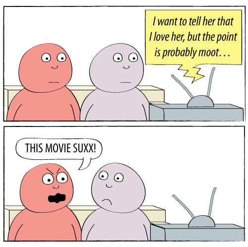
I was intrigued. Why would this bug a copy editor? In the song, Rick declares his love for his friend’s girlfriend. He says, “I want to tell her that I love her, but the point is probably moot.”

That use of the word is acceptable in the vernacular, but according to Merriam-Webster, the word has two meanings:

  1. open to question : debatable : subjected to discussion : disputed
  2. deprived of practical significance : made abstract or purely academic

Similarly, the definitions from the OED:

  1. Originally in Law, of a case, issue, etc.: proposed for discussion at a moot (MOOT n.1 4). Later also gen.: open to argument, debatable; uncertain, doubtful; unable to be firmly resolved. Freq. in moot case, [moot] point.
  2. N. Amer. (orig. Law). Of a case, issue, etc.: having no practical significance or relevance; abstract, academic. Now the usual sense in North America.

“Jessie’s Girl” used the word in its second meaning: not worth debating, already decided, irrelevant, etc. But that wasn’t the FIRST definition given in the dictionaries, and upon later, research, it wasn’t necessarily the original definition of the word.

According to TheFreeDictionary.com:

The adjective moot is originally a legal term going back to the mid-16th century. It derives from the noun moot, in its sense of a hypothetical case argued as an exercise by law students. Consequently, a moot question is one that is arguable or open to debate. But in the mid-19th century people also began to look at the hypothetical side of moot as its essential meaning, and they started to use the word to mean “of no significance or relevance.” Thus, a moot point, however debatable, is one that has no practical value. A number of critics have objected to this use, but 59 percent of the Usage Panel accepts it in the sentence The nominee himself chastised the White House for failing to do more to support him, but his concerns became moot when a number of Republicans announced that they, too, would oppose the nomination. When using moot one should be sure that the context makes clear which sense is meant.

Back then, we zealous 22-year-old copy editors thought that the first definition should be the primary definition and that it must be Rick Springfield’s fault for the opposite definition. In our minds, the word had meant  “disputed, debatable and open to discussion” until the very moment he released “Jessie’s Girl” as a single.

From that moment on, I adopted my friend’s dislike for Rick Springfield. I disparaged him whenever I heard him.

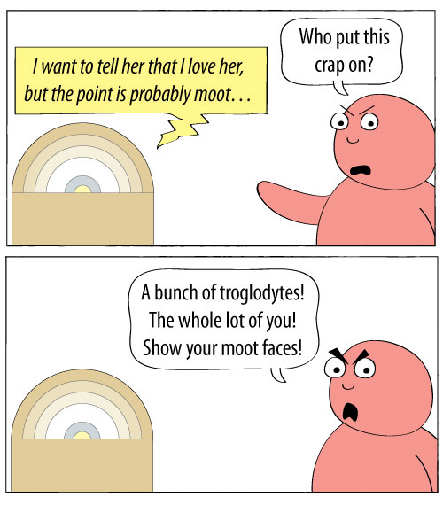
On a movie soundtrack…


On a jukebox…

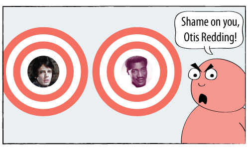
This went on for about four years. Then, I became more accepting of the changing nature of words. Many people will say “podium” when they mean “lectern.” “Presently,” which meant “in the immediate future,” became an acceptable substitute for “currently.” If we were really sticklers for word use, Otis Redding’s “(Sittin’ On) The Dock Of The Bay” would really be “(Sittin’ On) The Pier Of The Bay.” The dock, which can mean “landing pier,” also means the water right around the pier.

But we’ve forgiven those deviations and have even incorporated them into our language. And, as language evolves, it’s important to recognize what people will understand and won’t understand. If most people know “moot” to mean “irrelevant” and “not debatable,” then I’m fighting a losing battle if I try to use the original meaning. Language evolves, and so I had to evolve as well.

So I had to find another reason to mock Rick Springfield.
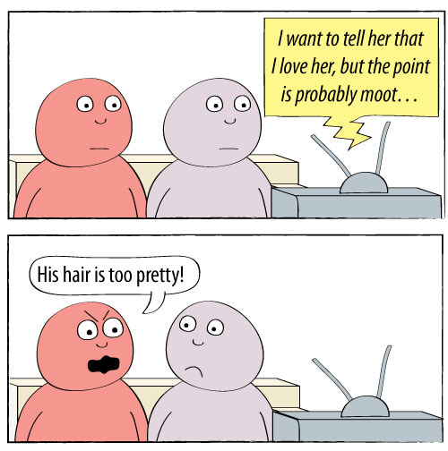
For more on the word “moot,” check out this blog post on Talk Wordy To Me.

20 years after “black album,” Metallica’s platinum records compared

It was 20 years ago this week, on Aug. 12, 1991, that Metallica’s self-titled fifth studio album was released. In the two decades since its release, the “black album” has become Metallica’s defining album. It is certified 15X platinum, far above any other studio album by the band.

Five years later, the band teamed up once again with Bob Rock, the producer of the “black album” (so named for its black cover). “Load,” Metallica’s sixth studio album, was released in the summer of 1996. Hardcore fans said that the band had “sold out.” Some said it was because the band members had cut their hair. My friend Ned felt conflicted buying “Load,” but I told him that his long hair made up for their sins of cutting their glorious manes.

Anywho, for the 20th anniversary of the album that spawned “Enter Sandman” and “Sad But True,” I thought I’d look up the band’s platinum certifications on Recording Industry Association of America’s website. Using the RIAA’s listings, I created the following chart of when the band’s nine studio albums were certified platinum, double platinum, triple platinum, and so on.
Of course, another way to compare how many times each album went platinum would be to use bars. Here is each album and its number of platinum certifications, by order of release:

What can these charts tell us?

  • The “black album” is definitely the Metallica’s biggest commercial success. Add up the number of platinum certifications for all the studio albums they’ve done since and you won’t still won’t match it.
  • The band’s platinum certifications increase with each album through the “black album” and then decrease with each album after that. Of course, all of this is with the hindsight of 20 years. The newer albums might eventually be certified platinum again after they’ve been “out long enough” to catch up with the others. I’m not sure that will happen, though.
  • In the 2000s (whatever that decade is to be called), the Metallica albums that continued to get certified had been released between 1984 and 1991.
  • The post-“black album” records see an initial jump but don’t continue getting certified the way that the other non-“black album” discs do. Again, those older albums have been out a lot longer, so they have had the time to climb steadily.

Another thought

Bob Rock produced that record and every studio album through “St. Anger” in 2003. They used a different producer for “Death Magnetic,” which a lot of die-hard fans think is the best in 20 years. My theory? Fans who gravitated toward the unpolished sounds of the first four albums liked that familiar style in “Death Magnetic.” “Metallica” had a lot more polished sound and each album sounded cleaner and cleaner. “Death Magnetic,” though, sounds like it’s going to rob you, knife you and then eat you.

Of course, maybe it’s simpler than that. Maybe it’s not Bob Rock, the band members’ hair or any of that. Many bands or artists have that classic album to which fans will compare every other album that band or artist will release. For Metallica, it’s the “black album.” Those guys could cure cancer and some headbanger would say, “That’s good and all, but it’s no ‘black album.'”

Hot enough to fry an egg? Bake cookies? News outlets try

The heat wave of the past few days has led many in news organizations to ponder just how hot it has been. Hot enough to fry an egg? Hot enough to bake cookies?

They’ve tried these experiments, with varying results.

———

STLtoday.com/St. Louis Post-Dispatch

Erica Smith shared a video by Huy Mach in which they tried to bake cookies in Erica’s car.

To watch the fun video and learn whether they were edible, go here. Music by Kevin McLeod.

———

indystar.com/Indianapolis Star

Online Editor Amy Bartner and Columnist Erika Smith went outside to fry an egg. The first surface they tried?

The hood of a car. They ended up testing other surfaces, too. To see their video, go here.

———

lancasteronline.com/Intelligencer Journal/Lancaster New Era

In Lancaster, Pa., the experiments were carried out by the staff at Lancaster Science Factory. In one experiment, they used a frying pan covered in Saran Wrap to keep the egg white from evaporating.

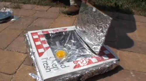
A second experiment used a pizza box lined with foil.

To see how these worked, go here.

———

EastBayRI.com/East Bay Newspapers

East Bay Newspapers in Rhode Island tried with a skillet and again with foil.

To see how those experiments turned out, go here.

———

I ate my fair share of eggs this weekend, but I cooked them inside. And they were delicious.

Any other examples I missed? Send ’em my way.

Harry Potter, Star Wars, Joseph Campbell and the hero myth

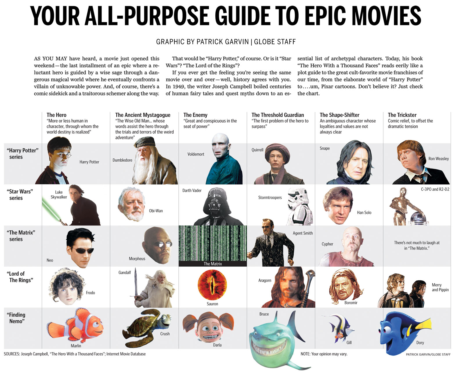
I wanted to share with you a chart from the Ideas section of this Sunday’s Boston Globe. Using the archetypes described in Joseph Campbell’s “The Hero With a Thousand Faces,” the chart compares characters from the Harry Potter series, “Star Wars,” “The Matrix,” “Lord Of The Rings” and… “Finding Nemo.”

Click for a larger view.

Boston Globe chart comparing Harry Potter, Star Wars, The Matrix, Lord of the Rings and Finding Nemo using Joseph Campbell hero archetypes

HOW IT CAME TOGETHER

I’ve long kept a graphics notebook in which I jot down and scribble ideas as they occur to me. I’m currently on the fifth notebook.

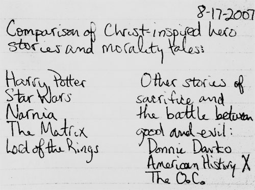
In the summer of 2007, I caught up with the world and finally began reading the Harry Potter books. I started a month or so before the final book was released. Thus, I got to start with the first book and read the entire series without pausing in between books. The day I finished the seventh book, my mind was racing with ideas. Once such idea:

I jotted whatever came to my mind, knowing I could edit it later. I had long seen the similarities in other sci-fi and fantasy movies, as I had some teachers in high school who riffed on those concepts in class. The idea sat in the notebook for almost four years. (Note to those who know me: check the date on the top of the notebook entry.)

Flash forward to this current summer, four years and one newspaper after I first read the Harry Potter books and had the idea. Colleague Ryan Huddle was working on his great Harry Potter treatment, which you can read about on Charles Apple’s blog. Dan Zedek, AME for Design, asked if I might have any ideas for “The Deathly Hallows,” as he had seen what I had done for the last Indiana Jones movie. I told him about the aforementioned notebook submission, and added that we didn’t have to focus solely on Biblical characters. We could open it up to the hero archetypes explored by Joseph Campbell, who literally wrote the book on the topic.

The next day, Dan told me he had run the idea by Steve Heuser of the Ideas section. Steve had thought the idea had potential and wanted me to rough up some notes to use as a jumping-off point. I consulted assistant graphics editor Javier Zarracina, who was a wealth of ideas. We looked up the hero myth structure, which can be very simple or complicated, depending on who’s dissecting Joseph Campbell’s books and lectures. Additionally, I am especially indebted to Mike O’Brien and Rob Bergman from DeSmet Jesuit High School in St. Louis, as they gave me tons of ideas and sites to consult.

Working with Steve and Javier, I tightened the focus to the archetypes and left out the comparisons of plot. I used Harry Potter, “Star Wars,” “Lord of the Rings” and “The Matrix,” but decided to leave off the Narnia movies. For one, I had only seen the first movie, which hadn’t had the same mass appeal as the others on the list. Steve suggested we try to find a movie that used the same archetypes but that deviated from the serious sci-fi/fantasy realm. I suggested “Finding Nemo,” and he laughed so hard that I knew we had a winner.

I originally structured the chart in a rather traditional, straightforward way. Steve suggested I use the whole width of the page, and Javier suggested I cut out some of the photos using silhouettes. Lisa Tuite and Wanda Joseph-Rollins of The Boston Globe library both helped pull photos to use. Dan helped me vary the cutouts so that they seemed more dynamic. We tweaked and tweaked, and I liked each version more than the previous versions. The graphic ended up on Boston.com by Friday afternoon.

ABOUT THE MOVIES WE DIDN’T USE

There were a ton of movies we could have used, because there are a ton of movies that use these archetypes. Besides the Narnia films, both the “Batman” series and “The Princess Bride” were suggested, as were several westerns and Akira Kurosawa films. Many non-fantasy films were suggested, too. These were all great suggestions, and I thank all of you whom I e-mailed for advice.

Ultimately, Steve, Javier, Dan and I kept the list limited to big movies and series from the past 10 years or so. We could have easily done a full-page chart with more than a dozen films and still not even scratch the surface of the films who’ve used these archetypes. The whole point of this chart is that these tropes are ubiquitous.

In addition to the films we chose (or didn’t choose), readers might take issue with the specific characters we chose for the categories. Within the newsroom, we had lots of differing opinions. Ultimately, I think this shows we came up with a great idea that will have people talking. A “talker,” if you will. Or a “Hey, Martha.”

Working on this chart appealed to several of my geek loves: “Star Wars,” philosophy, Harry Potter and infographics. Dan frequently likes to tease me for my references to “Star Wars” and “Harry Potter.” If only I could have referenced Scrabble, “The X-Files,” “Battlestar Galactica” and “Melrose Place,” the Pat Garvin interests could have all been referenced.

Next time.

Del Taco, a flying saucer and a nostalgia for a past St. Louis

There’s a big kerfluffle in my hometown of St. Louis this week. A UFO-looking building, which until midnight was home to a Del Taco franchise, was presumably going to be demolished. The property’s owner didn’t think anyone would take the property and keep the building intact. The Board of Aldermen voted Wednesday on a bill that would provide tax abatement for whomever developed the property, and on Thursday, the bill’s sponsor added a provision to the bill that would force the demolition to go before the city’s Preservation Board. Still, the preservationists are skeptical that the building will be preserved.

It might be hard to understand the fervor for the building. Certainly there’s no fervor for the business within the building. The Del Taco franchise didn’t make much money. In December 2009, the independent operator who had been subleasing the building filed for bankruptcy. I would think that the people who cared about the Del Taco would have shown up by now. But in the weeks since the building’s possible demolition was announced, there have been Facebook pages, a petition and blogging campaigns to save the late-’60s era building.

Why? What’s so special about this building? I’ve had to ask myself that question a few times this week.

When I first heard that the flying saucer building on South Grand could be torn down, I felt a pang of nostalgia. It reminded me of when I was a kid, and I felt that was reason enough to save it. After some thought, I realized I had never even gone through the drive-thru there, let alone inside. I had been to the other Del Taco, but not the one in the flying saucer building. Thus, my only memories of it were seeing it as I drove into the cities from the suburbs.

But I had this righteousness that they shouldn’t tear down such a historic building. Of course, until I started reading about the building, I had no idea it had been built in the 1960s as a gas station. I had attached a sense of nostalgia to a place I only saw from a car. Why was this place so important? I didn’t even grow up in the city. I grew up in the county. And I haven’t lived there since 2000.

So, why am I and other kids from the suburbs suddenly following this on Facebook, with a sense of nostalgia for a building we hadn’t thought of in years? There are a few reasons at play, and only a few have to do with the building itself.

Photo by Laura Miller/Riverfront Times

Photo by Laura Miller/Riverfront Times

For starters, it is a cool building. It looks like a flying saucer, and is a testament to some of the interesting architecture that’s harder to find in St. Louis these days. Past has shown that interesting buildings don’t get replaced with interesting buildings. The Parkmoor was torn down for a Walgreen’s, the Arena was torn down for an office park. Historic architecture has been replaced with things that no longer distinguish the neighborhoods. You could have a Walgreen’s in Wentzville or an office park in Chesterfield, but you won’t find a flying saucer there.

St. Louis is a city with a fragile ego. The city as a whole is still smarting over the fact that InBev bought Anheuser Busch, which is one of several big companies that are no longer headquartered in St. Louis. There are people there who remember the days when St. Louis thought of itself in the same leagues as New York and Chicago. St. Louis had several major companies. St. Louis had four sports teams. St. Louis had a thriving downtown. That’s in the past, but it hurts, even for people who were born long after the city’s heyday. The inferiority complex has been passed down to generations. Quite simply, St. Louis is a Jan Brady — the overlooked middle sister — smarting over how it used to be Marcia, the pretty older sister who commanded attention.

In a column from July 2009 about “Meet Me In St. Louis,” St. Louis Post-Dispatch columnist Bill McClellan captured some of this feeling pretty well:

Back when the country was founded, the successful people had no reason to leave the East Coast. The less successful pushed west. This clump of unsuccessful people reached St. Louis. The adventurous ones pushed on. The slackers stayed here. Much later, we built the Gateway Arch to honor the people who had the gumption to keep going. We are the only city in the world that has a memorial to honor those who left.

So this whole thing about leaving and not leaving is in our DNA.

This underlying zeitgeist is important in understanding things in St. Louis. Nothing exists in a vacuum, and these old wounds surface at the oddest times. The guilt over not doing enough to improve the city. The guilt over leaving the city altogether. The guilt of riding someone else’s nostalgia for a building I never even entered.

So, this isn’t really about a Del Taco. Or a flying saucer. It’s about a symbol.

More of The Boston Globe’s Bruins pages, infographics

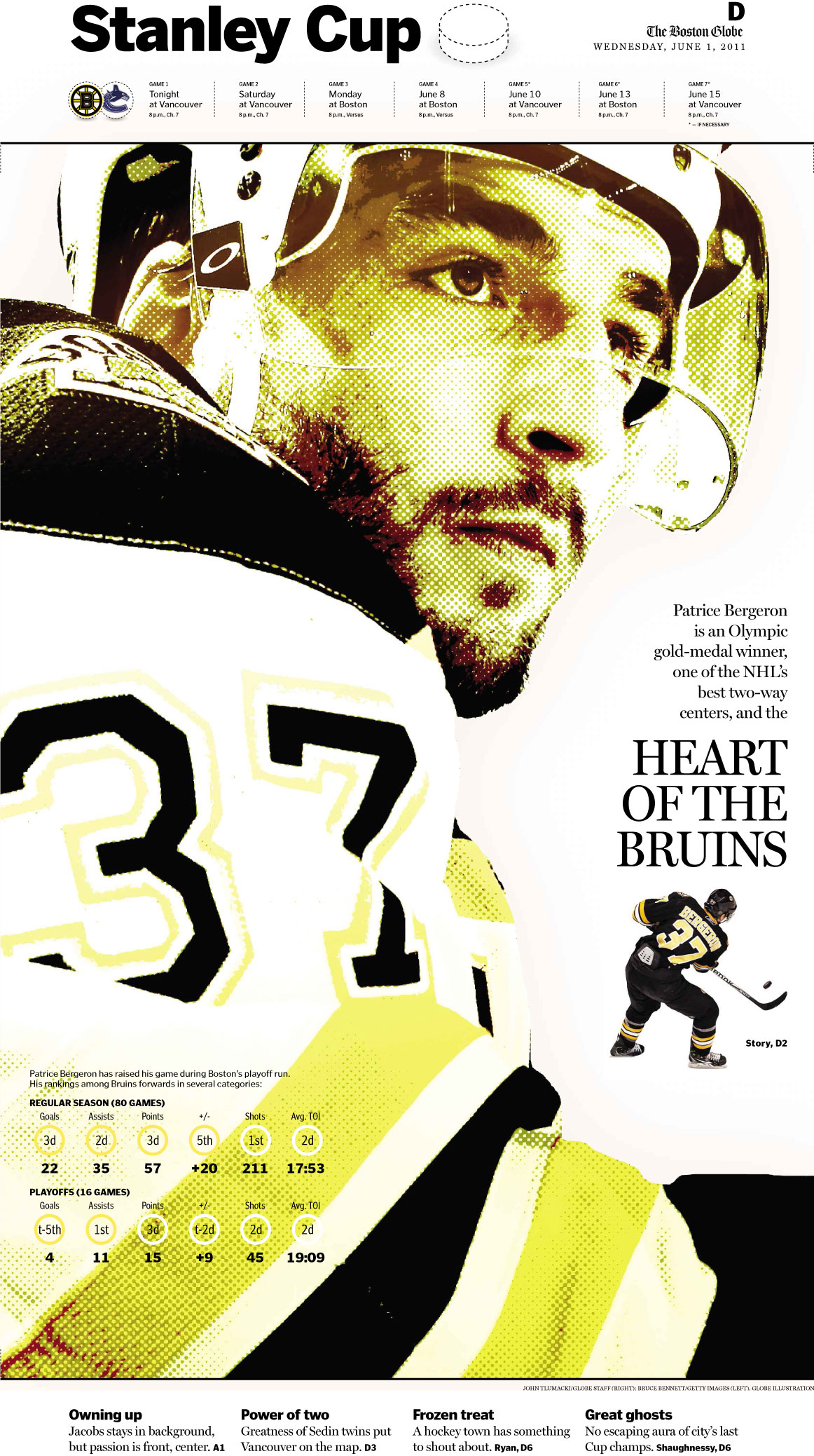
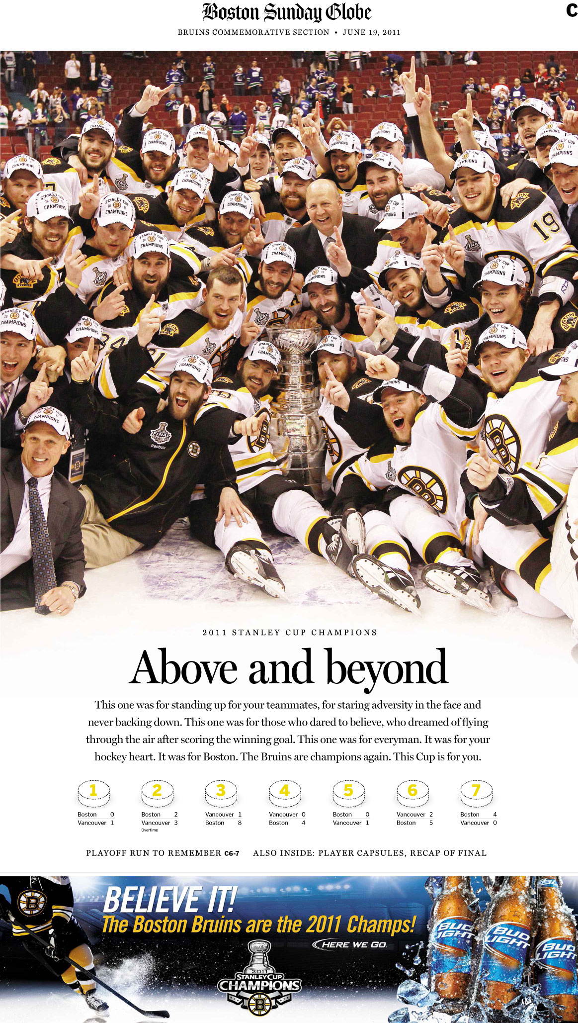
Last weekend, The Boston Globe published a special section commemorating the Boston Bruins’ season and Stanley Cup victory. The section was emblematic of all the good coverage that the paper had published all season, both in the sports section and throughout the paper.

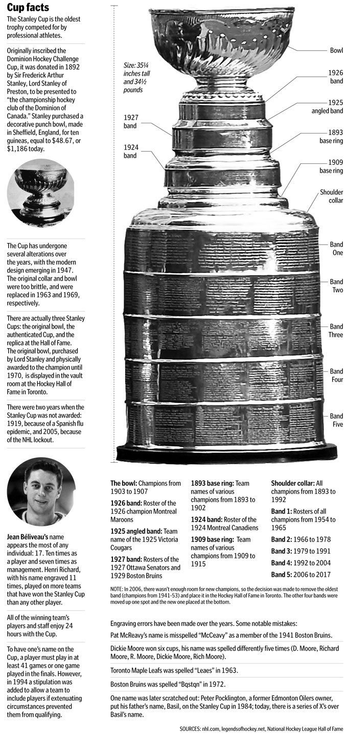
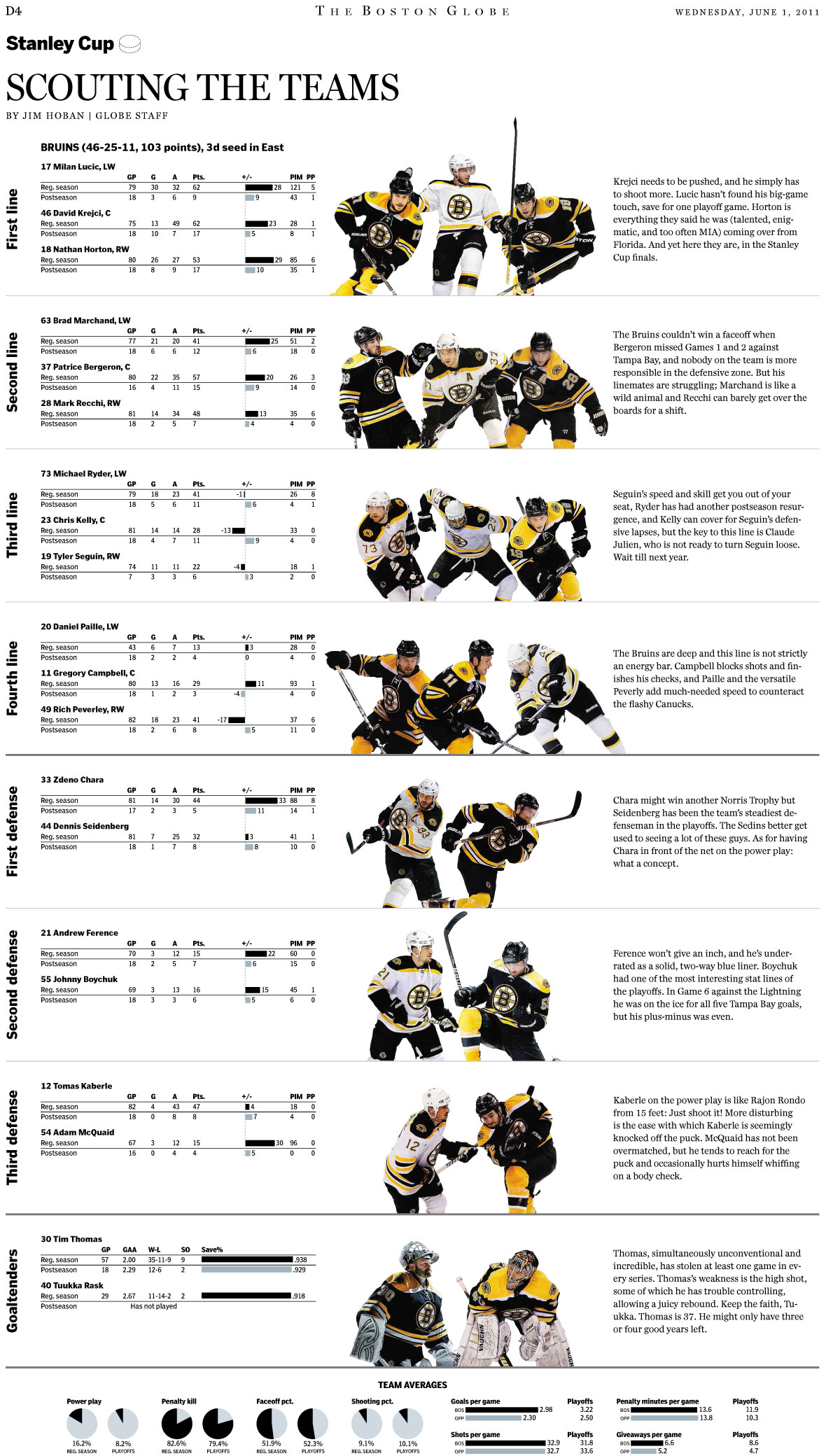
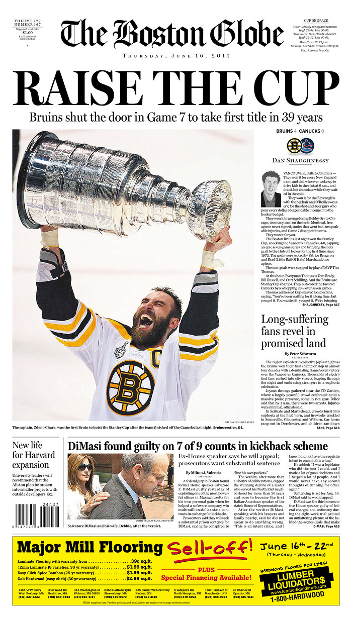
Here are some of my favorite pages The Boston Globe produced for the Bruins’ appearance in the series with the Canucks. Click on any of them for a larger view.

————
The preview section
June 1, 2011

Boston Globe coverage of the Boston Bruins

Boston Globe coverage of the Boston Bruins

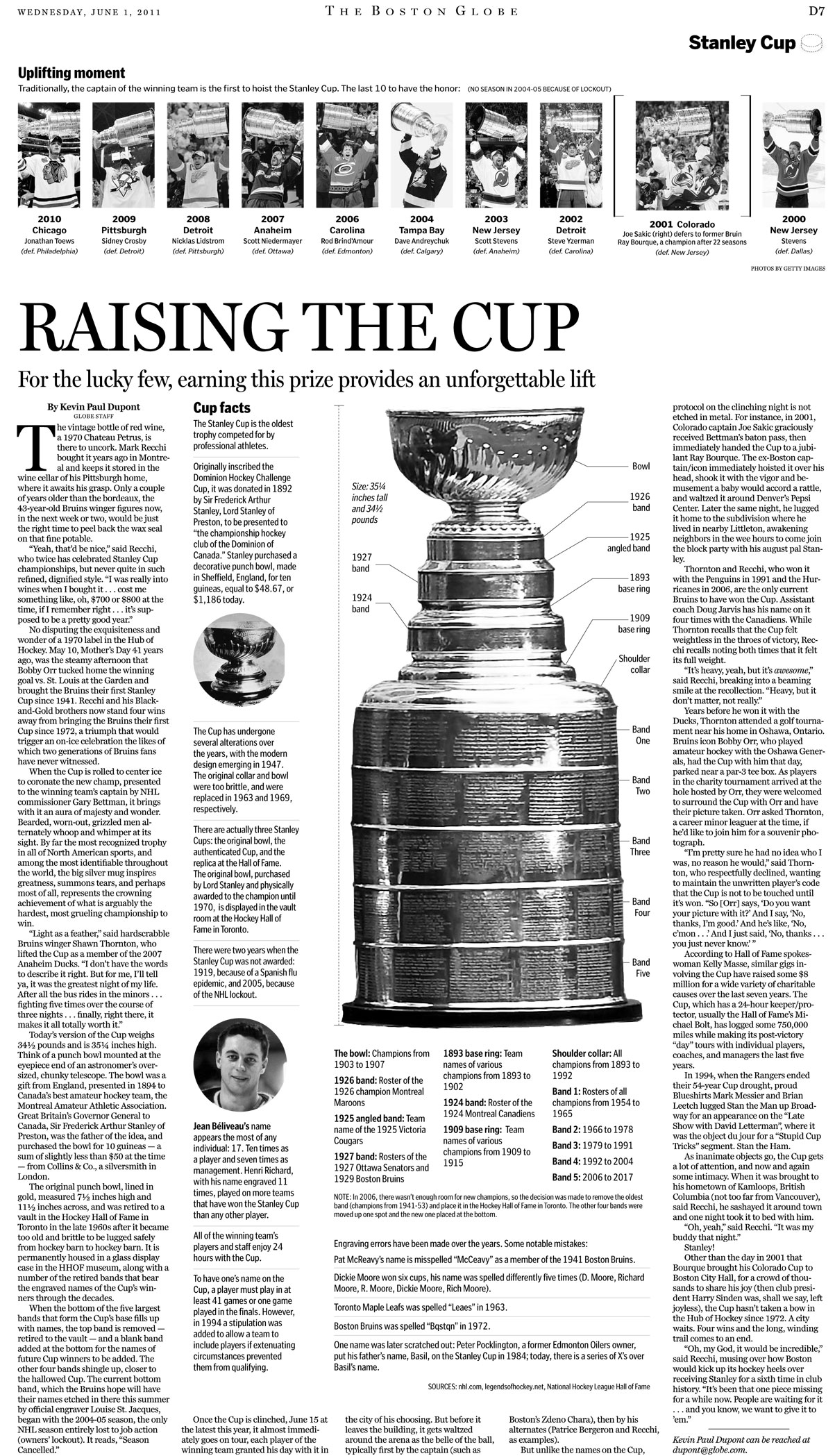
Here’s a closer look at that “Raising the cup” package:

Boston Globe coverage of the Boston Bruins

Here’s a nice comparison of the two teams:

Boston Globe coverage of the Boston Bruins

Boston Globe coverage of the Boston Bruins

————
Game graphics

Both Daigo Fujiwara and Luke Knox worked hard at putting together full pages breaking down the shots, the goals and the performances of each player for each game. Each of these ran the day after the game.

Boston Globe coverage of the Boston Bruins

Boston Globe coverage of the Boston Bruins

Boston Globe coverage of the Boston Bruins

In total, there were seven of these pages, one after each game. Daigo had quite the task: plot each point on the ice, and then find a full-body photo that wouldn’t cover the points, and then cut it out and put it in the graphic. And do it all on deadline.

You’ll recall game 3 when Aaron Rome of the Canucks hit Bruin Nathan Horton on the chin, knocking Horton down. The instant replays tried to show what happened, but it wasn’t until I saw this graphic by Dave Butler that I fully understood what had happened.

Boston Globe coverage of the Boston Bruins

————
The special section
June 19, 2011

Boston Globe coverage of the Boston Bruins

Boston Globe coverage of the Boston Bruins

This page features another great graphic by Daigo. I helped plug in some of the initial numbers, but he did much of the heavy lifting.

————
Other

Daigo and Tom Giratikanon put together this cool online graphic showing how far into the playoffs each of Boston’s four main teams have gotten, going all the way back to the Boston Americans (now the Red Sox).

I got to put together the print version:

Boston Globe coverage of the Boston Bruins

These pages are only some of the great pages that the Globe produced this past season. I hope we’ll get to do it all again next year.

How Massachusetts, Canadian papers played Stanley Cup win

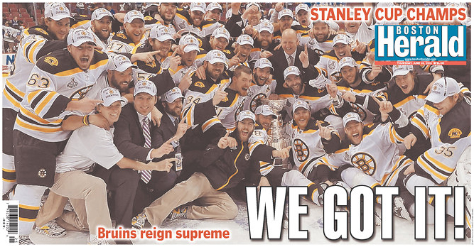
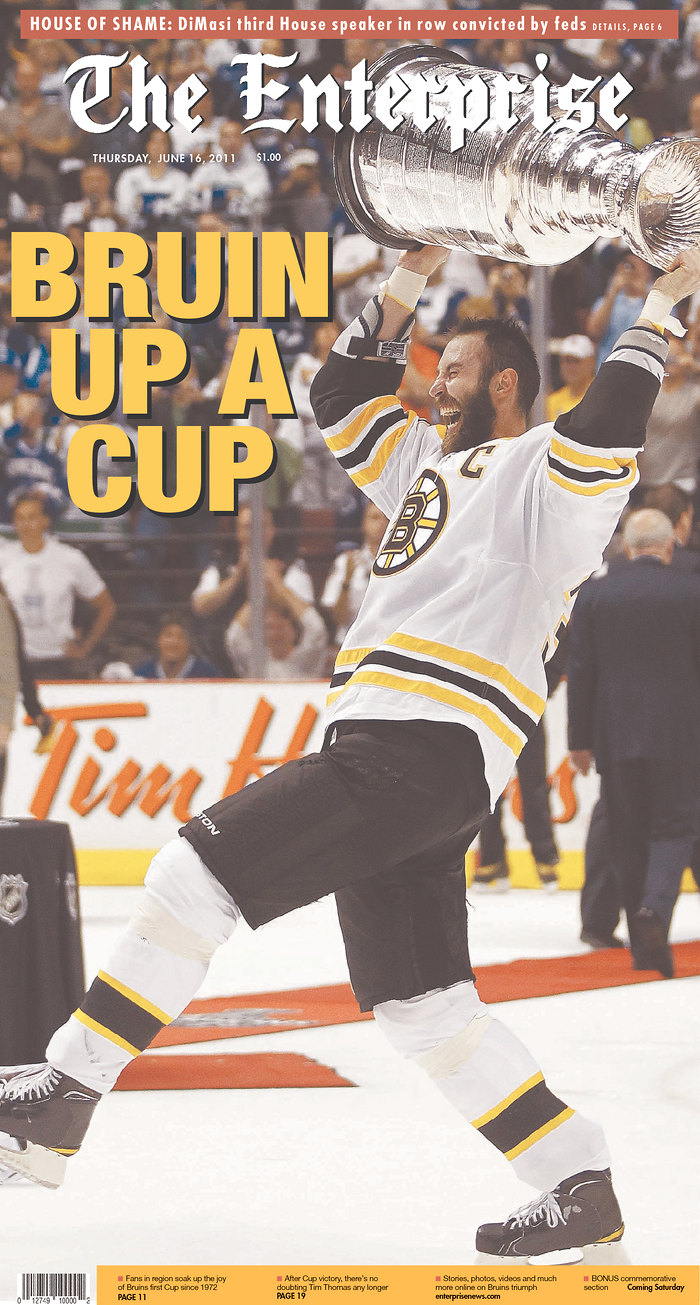
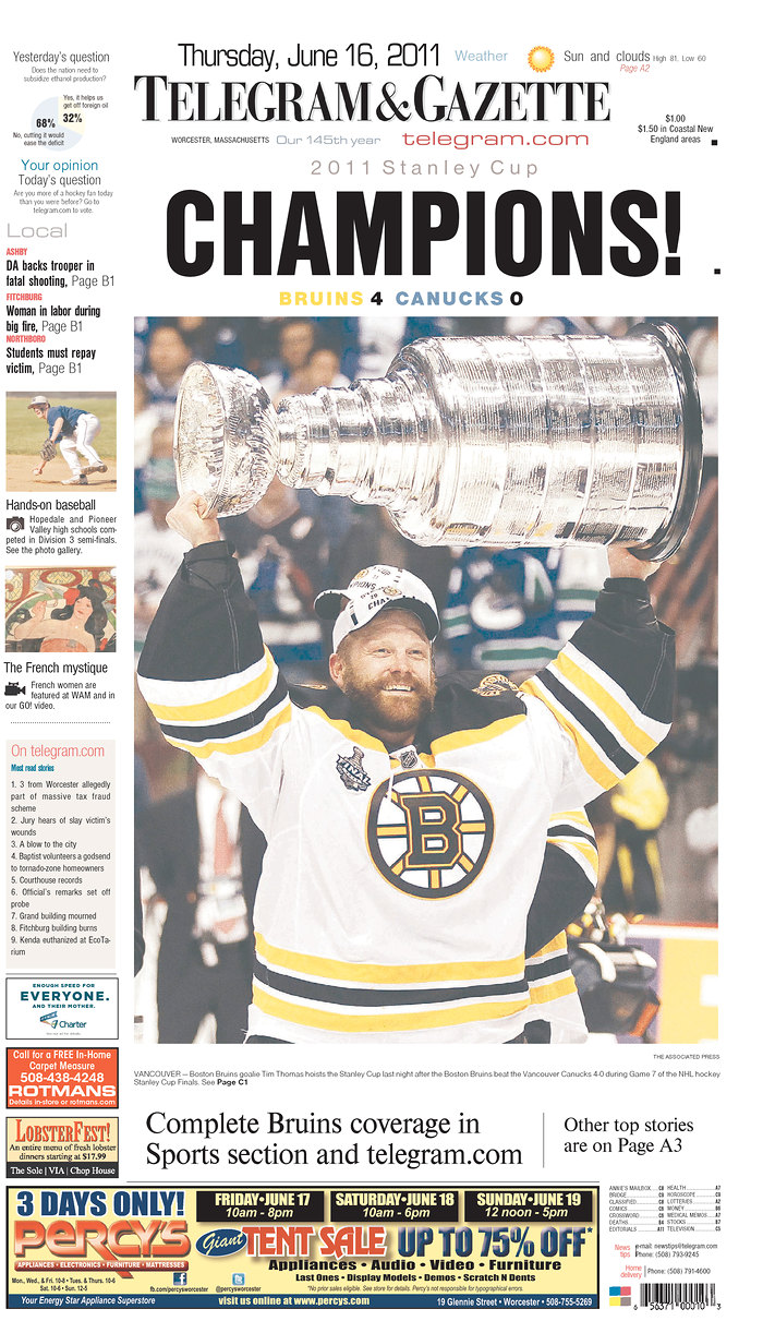
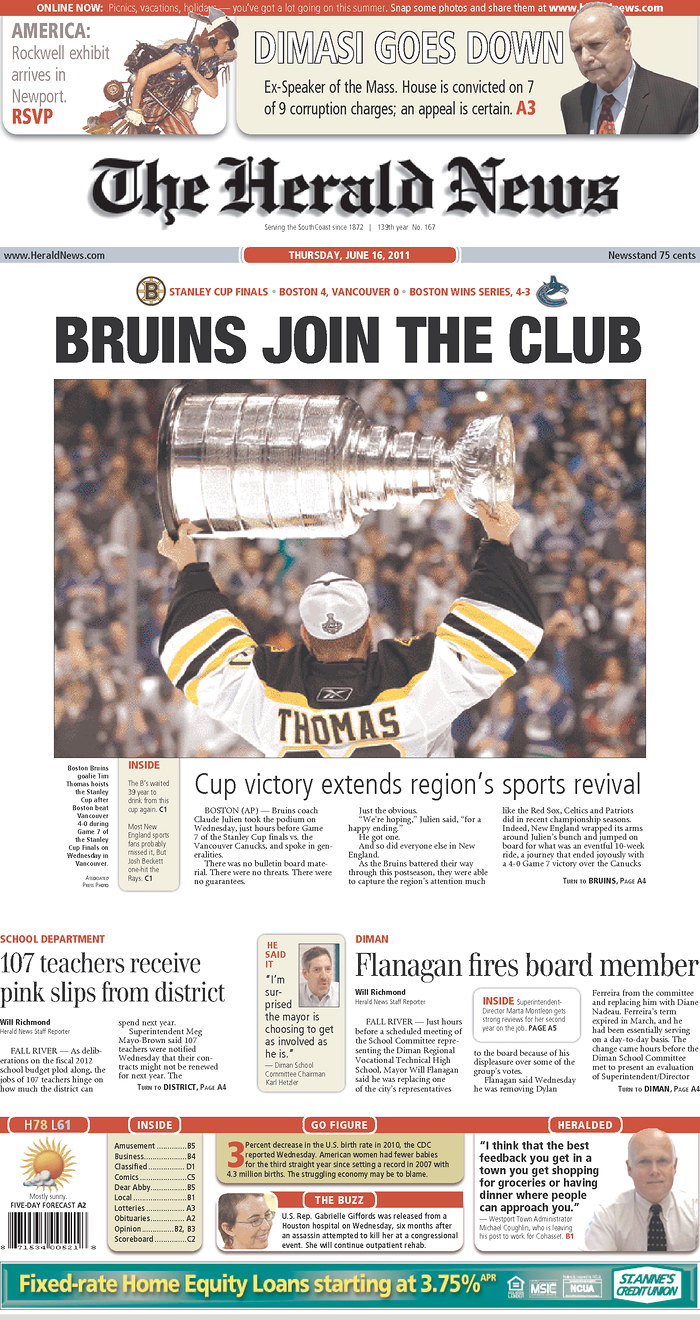
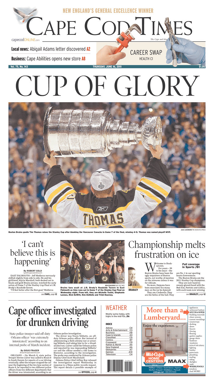
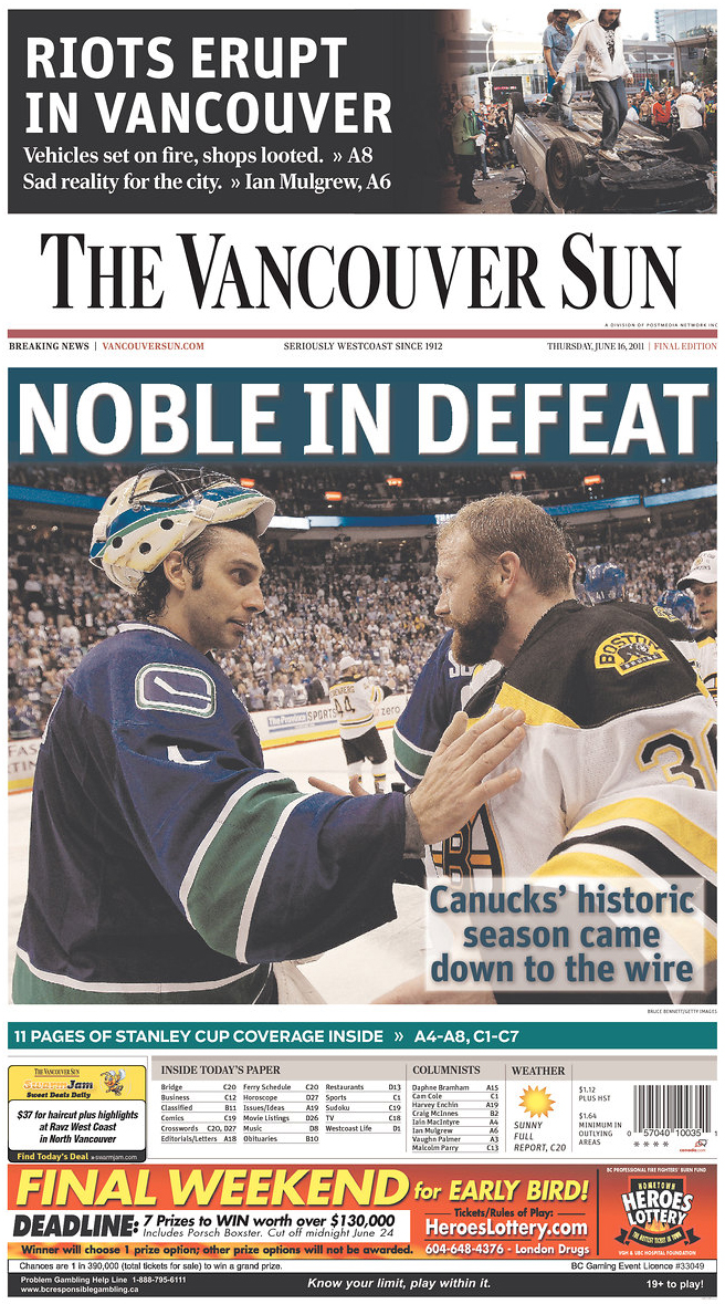
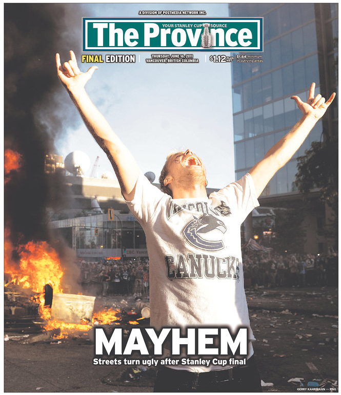
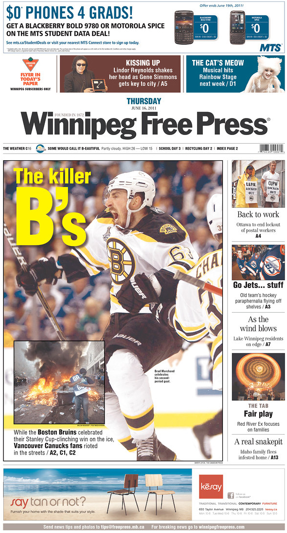
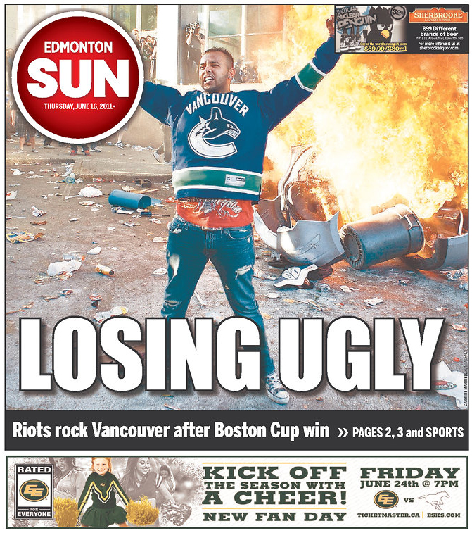
Last night’s Stanley Cup game was big news for a few reasons. It was the first time the Boston Bruins had won in 39 years. And on top of that, there were riots. In Vancouver.

So, take a look at how papers in Massachusetts and Canada played the game and the riots. Click any of the pages for a larger view. In a few days or so, I’ll have a look at how The Globe has played the Bruins in the playoffs and finals.

All images come from Newseum.

———
The Boston Globe
Boston, Mass.

Stanley Cup newspaper fronts

———
The Boston Herald
Boston, Mass.

Stanley Cup newspaper fronts

———
The Enterprise
Brockton, Mass.

Stanley Cup newspaper fronts

———
Telegram & Gazette
Worcester, Mass.

Stanley Cup newspaper fronts

———
The Herald News
Fall River, Mass.

Stanley Cup newspaper fronts

———
Cape Cod Times
Hyannis, Mass.

Stanley Cup newspaper fronts

———
The Vancouver Sun
Vancouver, Canada

Stanley Cup newspaper fronts

———
The Province
Vancouver, Canada

Stanley Cup newspaper fronts

———
The Globe and Mail
Toronto, Canada

Stanley Cup newspaper fronts

———
Edmonton Sun
Edmonton, Canada

Stanley Cup newspaper fronts

———
Calgary Sun
Calgary, Canada

Stanley Cup newspaper fronts

———
Winnipeg Free Press
Winnipeg, Canada

Stanley Cup newspaper fronts

———

Through GLAAD, Tracy Morgan could still redeem himself

Yesterday, I blogged that I wanted to see Tracy Morgan and Joakim Noah visit drop-in centers and halfway houses for LGBT youth. Both men have recently apologized for having offended the LGBT community. Noah called a fan “fa****” and Morgan described what he’d do if he had a gay son. Noah was fined $50,000 and Kobe Bryant was fined $100,000 for a similar offense.

After paying that fine, Noah said, “I made a mistake, learn from it and move on. That’s about it.”

I mused that I wondered how much he could learn from paying a fine that doesn’t go to helping gay youth. I said I’d rather see him use his time and effort to make a human connection with the kids who have to leave their homes because their families cannot accept that they’re gay.

It seems Tracy Morgan will indeed do just that. He will team with GLAAD and meet with residents of New York’s Ali Forney Center, which provides housing and support to homeless LGBT youth and families who have lost children to anti-gay violence. Additionally, Morgan will travel to Nashville, where Morgan will apologize to the audience he offended.

In a statement through GLAAD, Morgan said:

“I know how bad bullying can hurt. I was bullied when I was a kid. I’m sorry for what I said. I didn’t mean it. I never want to use my comedy to hurt anyone… My family knew what it was like to feel different. My brother was disabled, and I lost my father to AIDS in 1987. My dad wasn’t gay but I also learned about homophobia then because of how people treated people who were sick with that.”

To me, this is what “it gets better” could and should look like. I don’t want Joakim Noah’s $50,000 or Kobe’s $100,000 if those are just symbolic fines. I’d rather have them see the power of their words.

You might say, “Pat, why are you harping on this?” Because I’ve heard strangers call me “fa****.” Because I’ve heard people say gay slurs “in the heat of the moment” when they were looking for a synonym for “asshole” or “idiot.” I know what it’s like to know that there are some places that are safer for me than others. And until Noah makes an effort to show that he knows this is wrong and hurtful, I can’t help but think he’s ashamed he got caught and not feeling guilty because he did something wrong. I guess that shouldn’t matter, but as someone who has been called a fa**** by strangers, I think I still strive for a world where someone is not calling me that because they think it’s wrong, rather than a world where someone would want to call me that but won’t because they’d get called out for it.

Another way to look at it: When Joakim Noah got mad at that fan and called him a slur, he called him “fa****.” Why? Because the guy was doing something stereotypically gay? No, because the guy was doing something he didn’t like. That’s it. But why “fa****” and not the N word or a word for a religious group? Because he knows those words are offensive and he probably knows people who fit in those minority groups.

I think until more people know people who are gay, gay slurs will seem acceptable to them to use in “the heat of the moment” in ways that the N word or other words are not acceptable.

Joakim Noah said he paid his fine and “that’s about it, let’s move on.” Tracy Morgan, on the other hand, is allowing this to transform him and he’s reacting with humility and graciousness. He made a mistake, but he’s not being cavalier in his response. That these guys made a mistake didn’t bother me as much as the flippant “let’s move on” response. That goes for Tim Hardaway, too, whose remarks were way worse than Joakim Noah’s. Sometimes the way you handle your mistake can be more offensive than the initial mistake.

But in the case of Tracy Morgan, the steps he’s taking show that he seems to know the gravity of his words. I hope that Tracy Morgan can eventually be viewed as a champion of gay rights who came to the cause after realizing his mistakes. That would mean a lot more to me than Joakim Noah paying a fine and trying to forget it and “move on.”

Celebrities might not remember each other’s bigoted rants, but we do

Tracy Morgan’s recent comedy routine about a hypothetically gay son has drawn critics to say he should be fired from “30 Rock.” Joakim Noah of the Chicago Bulls was fined $50,000 for calling a fan “Fa****” during a game. Both have since apologized.

At least once a year, some celebrity has to issue an apology for offending some group. I don’t care if these people think what they said was offensive, but how did they not think anyone else could be offended? Or that it wouldn’t get noticed? Do these people never see any news or gossip sites?
Let’s just run down a few of the big things in the last few years. Just a few:

And these are just some of the recent occurrences in which celebrities caused outcries with slurs. The point is, there have been enough of them that other celebrities could look at them and say, “Gee, if I say this, people might get upset and I could be fired or at the very least, ostracized.”

But they don’t get it. And I’m not sure Joakim Noah or Tracy Morgan get why this was wrong. After Noah was fined $50,000, he said, “I made a mistake, learn from it and move on. That’s about it.”

But that’s not “about it,” Joakim. Think about Tyler Clementi, who was outed as gay on the Internet and subsequently jumped off the George Washington Bridge to his death. Or the other LGBT youth who were bullied and died by suicide. Or Matthew Shepard, who was beaten and left on a fence to die. Many of these celebrities will attribute their slip-ups to the “heat of the moment” or a “moment of frustration,” but for the rest of us, we don’t get to live in that vacuum. We have the context of knowing how deep and hurtful “fa****” can be, whether it’s heard at a club in Myrtle Beach or from a car in Jacksonville’s Riverside neighborhood. You get to apologize, pay and “move on,” but for the actual “faggots,” Joakim, we have to live with the reality of that word every day.

It would be a great tragedy if Joakim Noah and Tracy Morgan would just “move on” and try to forget these incidents. Apologies and fines are one thing, but I think both could benefit from spending time with groups that serve the LGBT community. There drop-in centers for LGBT youth with nowhere else to go. Tracy Morgan joked about the abuse he would dish out if his son were gay. To many kids at these centers, that joke is a harsh reality. When Morgan’s tirade is forgotten about and there’s a new controversy, these kids can’t forget it. If Morgan were to visit these places, he might not forget it, either. We’re telling a whole generation of gay youth that “it gets better,” but we need to hold ourselves and our celebrities accountable to make sure that it does get better.

How The Boston Globe/Boston.com covered the tornadoes

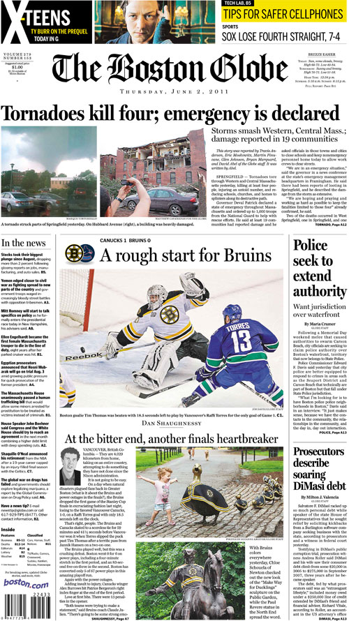
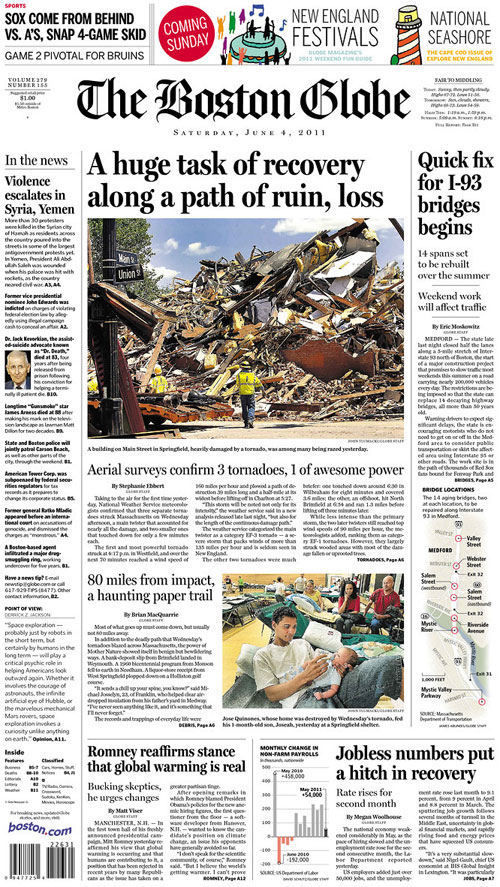
The Boston Globe and Boston.com have done a great job covering Wednesday night’s tornadoes in Western and Central Massachusetts. I’ve included the last three days’ front pages, as well as some inside pages, photos and graphics. To see all of the Boston Globe/Boston.com coverage, go here.

———

THURSDAY, JUNE 2

The inside page:

The top photo is by Matthew Cavanaugh, for the Boston Globe:

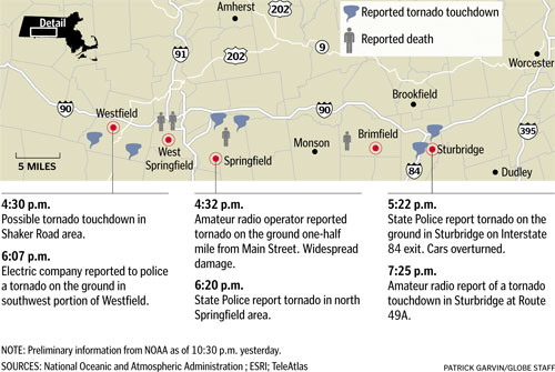
We used NOAA’s updates to put together this map of reported touchdowns and deaths:

Javier Zarracina quickly put together this explainer on the anatomy of a tornado:

To read the main bar (gang byline of Travis Andersen, Eric Moskowitz, Martin Finucane, Glen Johnson, Bryan Marquard, and David Abel), go here.

To read Carolyn Y. Johnson’s story on how tornadoes form, go here.

To see Tom Giratikanon’s map of the history of tornadoes in Massachusetts, go here.

———

FRIDAY, JUNE 3

We had several inside pages, including this color photo page:

Which included this great photo by David L. Ryan:

Elsewhere inside was this great map by James Abundis with reporter Brian Ballou. It shows the varying damage of houses on Pennsylvania Avenue in Springfield.

To read Ballou’s story, go here.

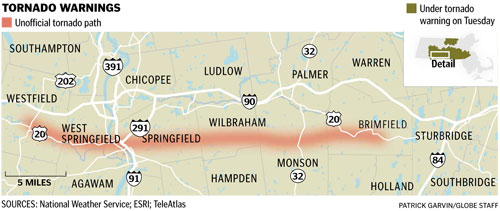
With updates from the National Weather Service, we were able to show which cities had warnings, and more reported touchdowns:

Javier Zarracina put together an explainer showing how the National Guard and FEMA were deployed to coordinate the search and rescue operations:

To read Brian MacQuarrie’s story, go here.

———

SATURDAY, JUNE 4

The photo up top is by John Tlumacki:

To read Stephanie Ebbert’s story, go here.

To read Brian MacQuarrie’s story, go here.

To see all of the Boston Globe/Boston.com coverage, go here.