More Boston Globe infographics about Japan, nuclear plants

In the last week, all hands have been on deck in the Boston Globe infographics department for our coverage of the nuclear crisis in Japan and what it means for nuclear plants in the U.S., particularly in New England. We’ve had great work from David Schutz, Javier Zarracina, David Butler, James Abundis, Daigo Fujiwara and Monica Ulmanu.

Below is just some of the stuff we had from March 14 to March 18. We used a variety of approaches for the variety of stories and angles, and I think we’ve been doing a great job. Needless to say, I love working with these people.

———
MONDAY, MARCH 14, 2011

On the Sunday after the earthquake, the focus of the story had shifted to the Japanese reactor and the crisis at the nuclear plant there.

David Butler and I worked on the graphics for that Monday’s paper, including this one here. Butler found an earlier Associated Press graphic, but then simplified some of the steps and colors. Additionally, he added some details not in the original graphic, using information we got from reporter Carolyn Johnson and David Schutz, Deputy Design Director/News & Graphics.

Here’s a look at that graphic. Click on it for a larger view:

Boston Globe Fukushima infographic by David Butler and Patrick Garvin

———
TUESDAY, MARCH 15, 2011

The next day focused more on the plant at Fukushima. Here’s a front page graphic. Click for a larger view.

Boston Globe Fukushima infographic

———
WEDNESDAY, MARCH 16, 2011

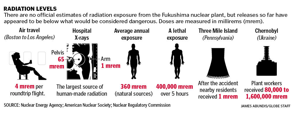
James Abundis put this graphic together explaining radiation levels. The questions many people had were, “How much radiation has been released by the Fukushima plant?” and “How does that compare to other radiation levels?” This infographic answers those questions simply but thoroughly. Click for a larger view.

Boston Globe infographic

Inside the A section, we had this infographic explaining the risks of nuclear meltdown and the potential worst-case scenarios.

Boston Globe  infographic

———
FRIDAY, MARCH 18, 2011

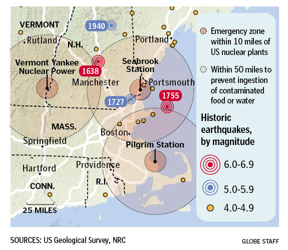
The problems with the boiling water reactor in Japan shed light on the BWRs and PWRs here in the states, particularly three in New England: Vermont Yankee Nuclear Power in Vernon, Vermont; Seabrook Station in Seabrook, New Hampshire and Pilgrim Station in Plymouth, Mass. David Schutz had put together a map of historic earthquakes last year, so I updated that to show these three reactors. Click for a larger view.

Boston Globe  infographic

Inside, we had a graphic by Monica Ulmanu and Javier Zarracina explaining the safety measures in place at those New England nuclear plants, with an assist by Boston Globe reporter Beth Daley. Click for a larger view.

Boston Globe  infographic

———

These are just some of the graphics we did this past week. It’s been a team effort, with work by everyone in the department.

RELATED
How The Boston Globe covered the tsunami on Saturday, March 12, 2011
How other newspapers covered the tsunami on Saturday, March 12, 2011

Remembering St. Louis Cardinal Marty Marion

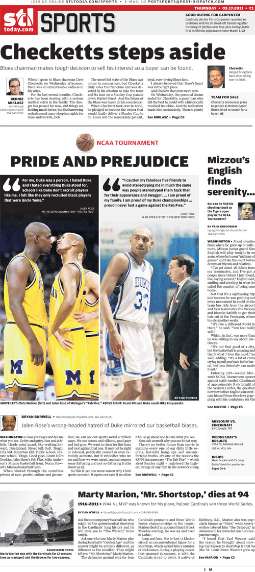
Former St. Louis Cardinals shortstop Marty Marion, who played on three World Series championship teams (1942, ’44 and ’46), died Tuesday night of an apparent heart attack. Read the St. Louis Post-Dispatch story here.

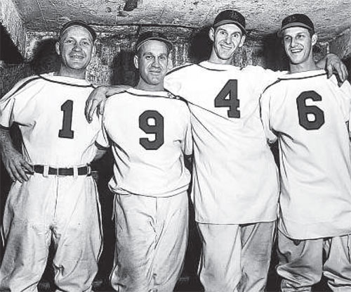
Marty Marion (No. 4) joined the celebration after the St. Louis Cardinals won the 1946 World Series. Others who turned around their jerseys to mark the occasion were Whitey Kurowski (1), Enos Slaughter (9) and Stan Musial (6). (Post-Dispatch photo)

I grew up in St. Louis, but most people my age wouldn’t have known his name. I’m fortunate that I got to know him as a person, as he was my neighbor. It wasn’t until I got older and started researching that I realized how legendary he was.

He had been known as the Cardinals’ greatest shortstop until Ozzie Smith played for the team in the 1980s. He was one of the best players on the team from the ’40s, an era when the Cardinals won the National League pennant four times and the World Series three times. He was a teammate and friend of Stan Musial, considered the greatest Cardinal to ever play and a larger-than-life hero in St. Louis.

According to the Post-Dispatch story, Marion indirectly influenced another great shortstop: Cal Ripken. According to Tony LaRussa:

“I heard that [former Baltimore Orioles manager] Earl Weaver said the reason he thought about moving Cal Ripken to shortstop is that [Weaver] grew up in St. Louis watching Marty Marion. That’s a helluva compliment.”

Marion’s Baseball-Reference.com statistics are interesting, specifically during the World War II years when some of the players were, ya know, fighting in the war. Marion’s stats look odd with modern stats in mind, but the game was different then. (For starters, no andro.)

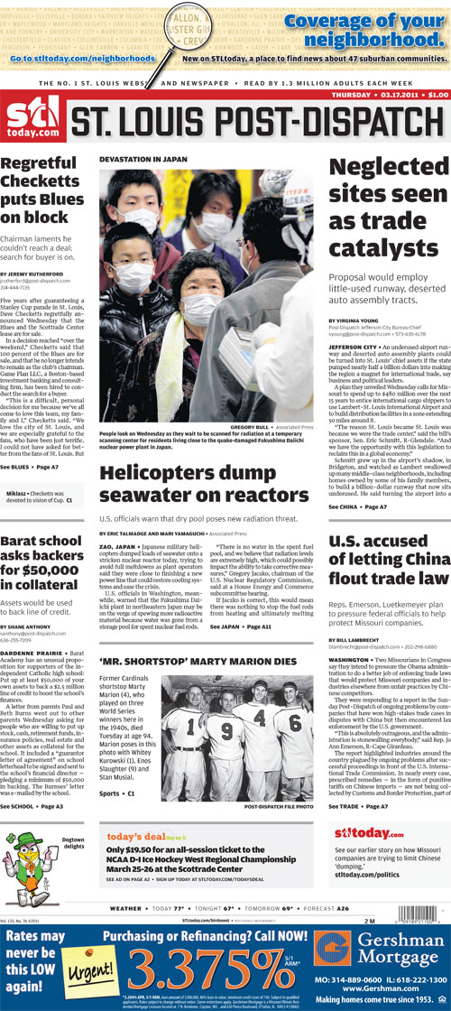
To see a Post-Dispatch/STLtoday.com gallery of Marty Marion photos, go here. Here’s how the Post-Dispatch played the story on A1 on Thursday:

And how it played on the front of sports:

How newspapers played the tsunami coverage

There were lots of great photos played on front pages today. Thus, I won’t be doing an exhaustive look at each newspaper’s front page coverage of the tsunami and earthquake, but rather an overview.

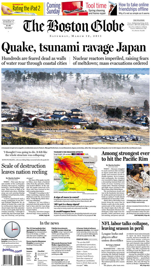
Many went with huge, dominant photos showing the destruction, which I think is a powerful way to show what an 8.9 quake looks like. The Boston Globe went with a large photo and with graphics. More on that here.

———————
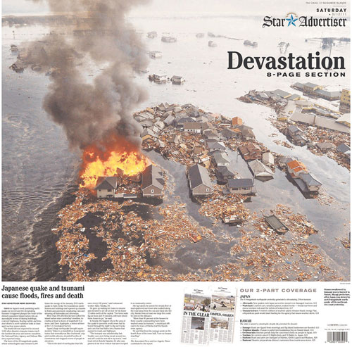
The Honolulu Star-Advertiser
Honolulu, Hawaii

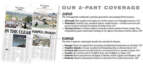
This appears to be a wrap. At the bottom is an explanation of their two-part coverage:

———————

West Hawaii Today
Kailua Kona, Hawaii

———————

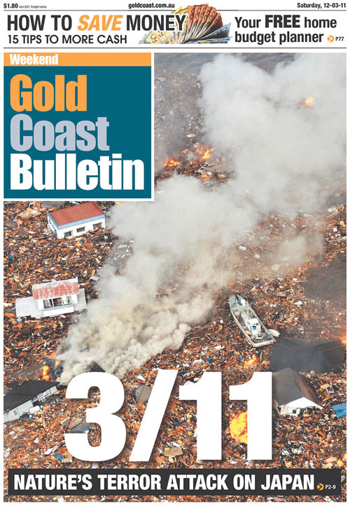
Gold Coast Bulletin
Gold Coast, Australia

This newspaper took a dramatic approach: a full-page photo with a headline invoking “9/11” and a deck calling this “nature’s terror attack.”

———————

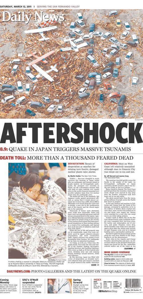
Daily News
Los Angeles, Calif.

The smaller nameplate over a hugely played photo reminded me of The Virginian-Pilot, which has consistently known when to scale back and let the photo tell the story.

———————

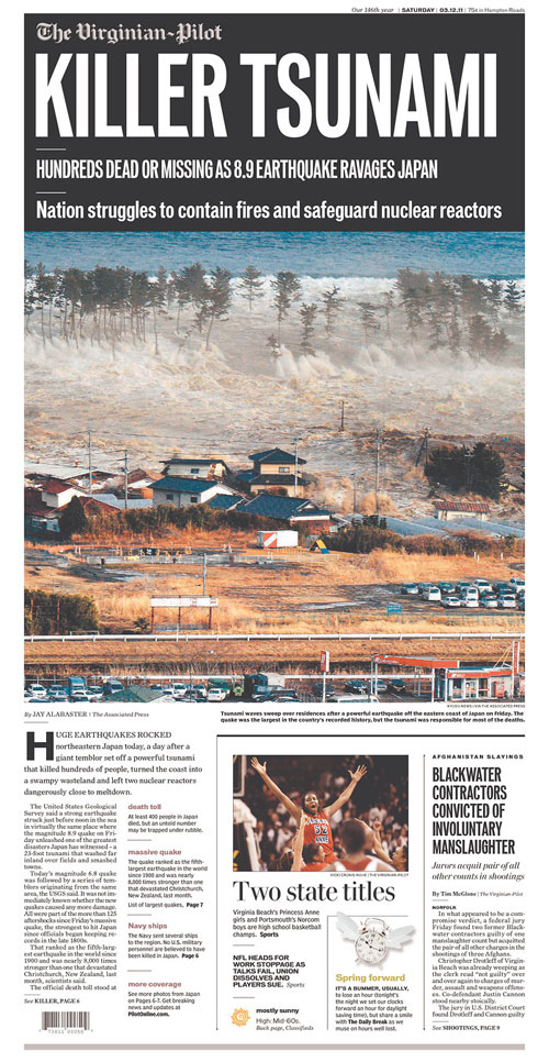
The Virginian-Pilot
Norfolk, Va.

———————

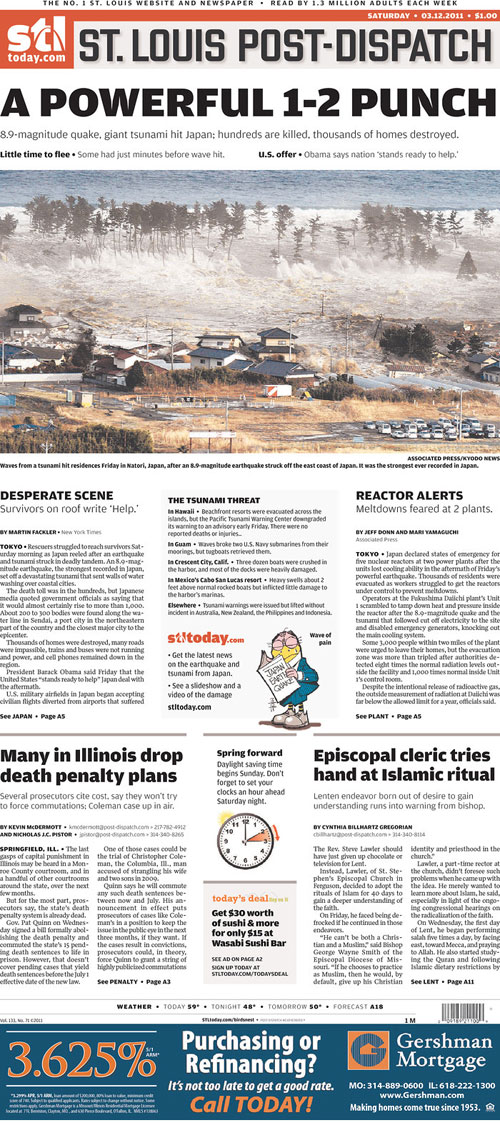
St. Louis Post-Dispatch
St. Louis, Mo.

The real centerpiece of this, though, was the Weatherbird:

The Weatherbird is an iconic piece of Post-Dispatch history. He appears on the front every day, reacting to whatever the main news of the day happens to be. I think he sums up how we all feel.

RELATED: The Boston Globe’s coverage of the tsunami

The Boston Globe’s coverage of the tsunami

The Boston Globe’s coverage of the earthquake and tsunami in Japan has been a team effort. Particularly the graphics coverage.

Here’s how Saturday’s front looked, designed by David Schutz, Deputy Design Director/News & Graphics:

Here’s a look at that graphic on the front. Click on it for a larger view:

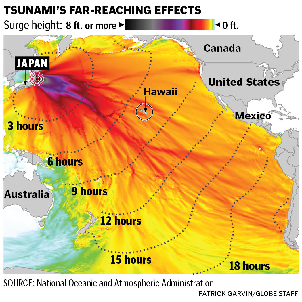
Boston Globe tsunami infographic by Patrick Garvin

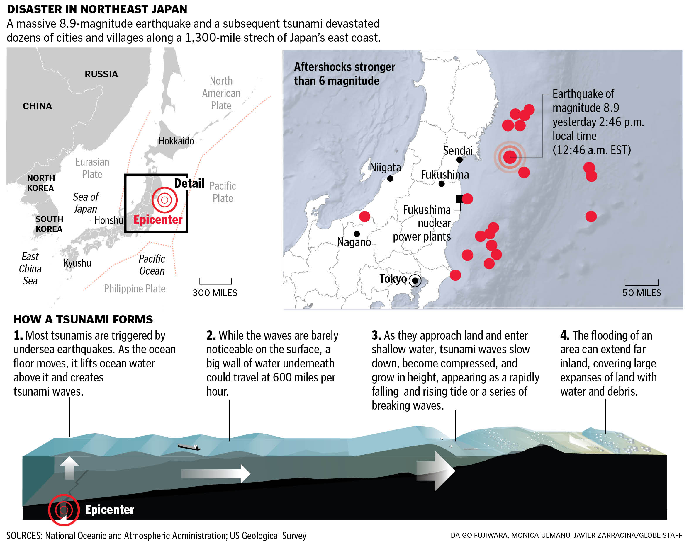
Inside, we had this larger graphic by Daigo Fujiwara, Monica Ulmanu and Javier Zarracina. Click on it for a larger view:

Great team effort by Daigo Fujiwara, Monica Ulmanu and Javier Zarracina on this tsunami infographic

Here’s how all of these graphics were played on Boston.com: as a package, with the front page graphic explaining the far-reaching effects as a slider and the how the “How a Tsunami Forms” graphic as an animated step-by-step graphic.

Indeed, this was very much a team effort.

RELATED: How other newspapers played the tsunami coverage

How The Boston Globe’s “g” covered the Oscars

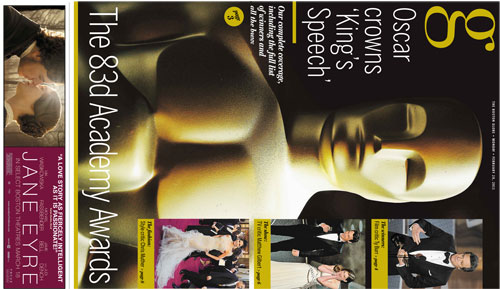
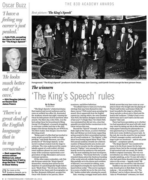
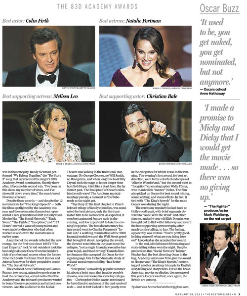
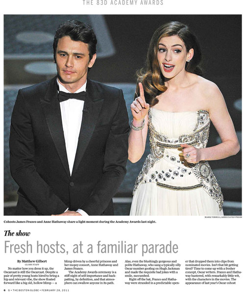
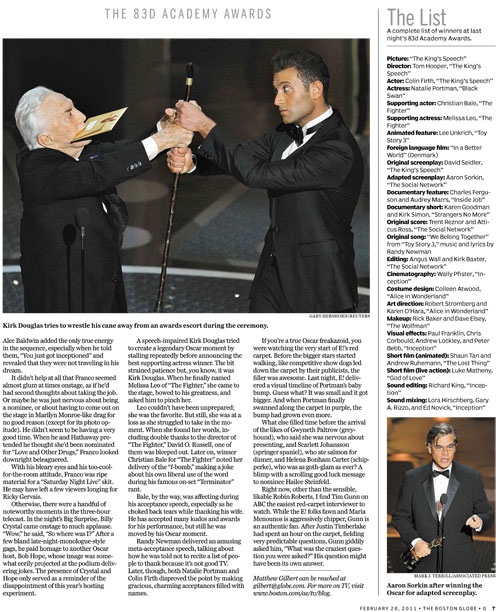
While we’re looking at how newspapers covered last night’s Oscars, let’s look at how The Boston Globe covered it. The Globe’s magazine-style features section — aptly called “g” — had some great coverage. Thanks to features design supervisor Martin Gee for sending these pages along.

The cover was done as a wrap:

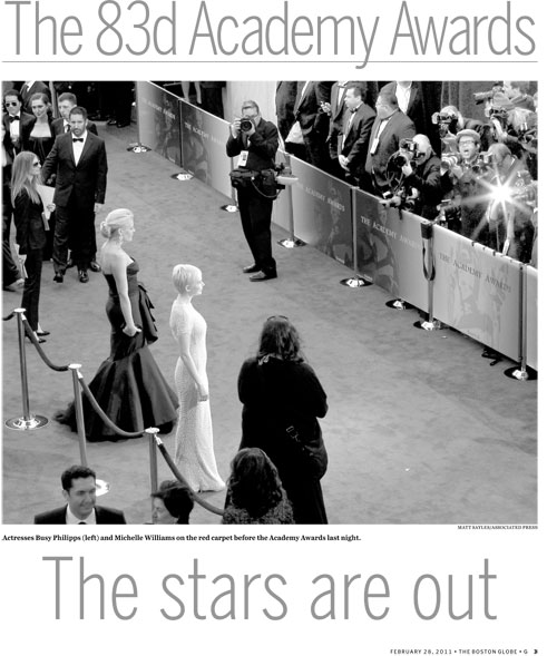
A larger, vertical view:

———————

The inside pages:

——

——

——

——

——

——

——

————

To see how other papers covered the Oscars, go here.

“Dewey Defeats Chicaco”: That Green Bay headline

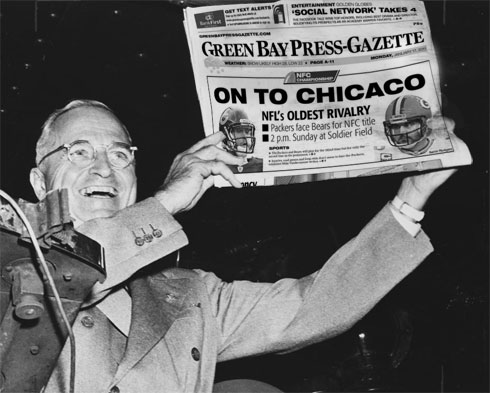
Monday’s front page of The Green Bay Press-Gazette has received a lot of attention. It’s been on blogs, news sites and all over Twitter. Keep in mind that many people on Twitter think nothing of using “u r” in place of “you are.” When these traitors to the English language point out a spelling error, you know your mistake has gone viral.

The error is a simple spelling error: Where there should have been a “G” was a third “C.” Many people wonder how anyone missed that, let alone several people.

When I first saw the page with the preface of “spot the error,” I glossed over the third “C.” The letters are in all caps, and the C looks so close to the G that my mind filled in the blanks. It took me a second before the “Oh, shit” moment.

And it indeed is an “Oh, shit” moment. No one wants this. A lot of us in the news industry will jump on this error, but what many of us won’t admit is that we’re glad it wasn’t us who made this mistake. Why could it have been us? Because we’ve worried about making mistakes like this, mistakes that other people could see and think of as inexcusable.

We’ve all obsessed over these things. I dare you to find a journalist who hasn’t done at least one or two of the following:

  • Called an editor to have him read back a paragraph, just to make sure a fix you made got in there.
  • Taken a story or graphic home with you so that you could double- or triple-check the facts.
  • Taken a calculator with you to double-check the numbers.
  • Have a friend or significant other read over something to check for errors. (I’ve made use of my friends who are math teachers.)
  • Called or e-mailed a source to have them verify a wording of something they verified in the last e-mail or call.
  • Woken up in the middle of the night and checked his or her story, graphic, cutline, whatever.

And yet there have been times when errors have crept in despite whatever mechanisms we have against these things. And if you’ve got OCD and Catholic guilt, then nothing a reader could say will be worse than what you’ll say to yourself.

Let’s be clear, though: This is no justification or excuse for the errors, or else they wouldn’t be called “errors.” Any error is regrettable, and when we let them in, we’re falling short of our job. And we’re damaging our reputations among the readers who’ve already got a golconda of reasons to distrust us. I know of one couple in the Midwest who makes a morning game of spotting errors in the local paper. Sadly, they’ve found more in the last few years. (And no, this couple is not my parents.)

In the blogs this week, I’ve seen this Green Bay headline compared to the infamous “Dewey Defeats Truman” headline. I’ll grant you a few things:

  • Both were bold, in all caps.
  • Both were prominent, above-the-fold headlines that caught the eye.
  • Both were regrettable.

But in the Green Bay headline, they at least got the right city. The factual error was a spelling error, not an error incorrectly calling a presidential election. If the Press-Gazette had published a headline that said, “Chicaco defeats Green Bay,” then the “Dewey Defeats Truman” comparison would be right on the money. But yes, they’re both egregious “Oh, shit” errors. [See UPDATE below.]

These errors raise our consciousness, though, and can restore our vigilance. Craig Silverman at Regret The Error has offered to send a free copy of his book to journalists who send him their personal accuracy checklists. I’ve enjoyed seeing the responses he’s gotten, and I think it will help all of us.

Here’s more or less what I’ve made my habit for my graphics:

  • Have I cut and pasted the numbers and names, or have I typed them myself?
  • Have I checked to make sure the numbers and names match up with the source material?
  • Do the numbers add up to what the graphic says they add up to?
  • Do the numbers, names and facts in my infographic match what’s in the reporter’s story?
  • Have the reporter and editors seen this graphic?
  • Have I had someone else double-check the graphic against the source info?
  • Have I done a follow-up accuracy check with all my sources to make sure I have the information correct?
  • If using color-coding, do the colors match the right values? And are the colors different enough to be distinguishable?
  • If I’ve had to rescale or move any of the elements on the page, did I move them all in the group?
  • Are all the labeled roads labeled correctly?
  • Are my numbered steps in order?
  • If I had any “head goes here” or “XX” text fields in the graphic, have I replaced those with the actual text?
  • Are my label lines pointing to the correct data points, locations, etc.?

These are second nature to many of us, as they seem like common sense. But it’s good to see it written down. What type of checklist do you have?

————-

UPDATE

I’ve since learned more about the Dewey headline, and can clarify more about the mistake. The Tribune was relying on polling data to call elections, and that night, the polling data suggested a huge Dewey win. As the deadline got closer, editors of the Tribune went with the data and put that headline in the first edition.

So, this error was a “source error.” The Chicago Tribune, of course, still published incorrect information, but it was a different kind of error. But it was one that has been talked about for several years, just as the Green Bay headline will be talked about for several years. The reasons behind the errors are different, but they’re doozies.

To newspaper people in my generation, we’ve almost always had a result for the next day, or we’ve at least run a generic “too close to call.” To us, “Dewey Defeats Truman” comes from a world we can’t comprehend: “You mean they couldn’t just plug it in Excel to see who won? Like who was their CAR/data guy? OMG!” So, younger journalists might forgive the typo sooner than the incorrect election result simply because they grasp it more easily. But again, understanding careless errors doesn’t justify them.

Martin Luther King Jr. Pages, part 2

Two more offerings…

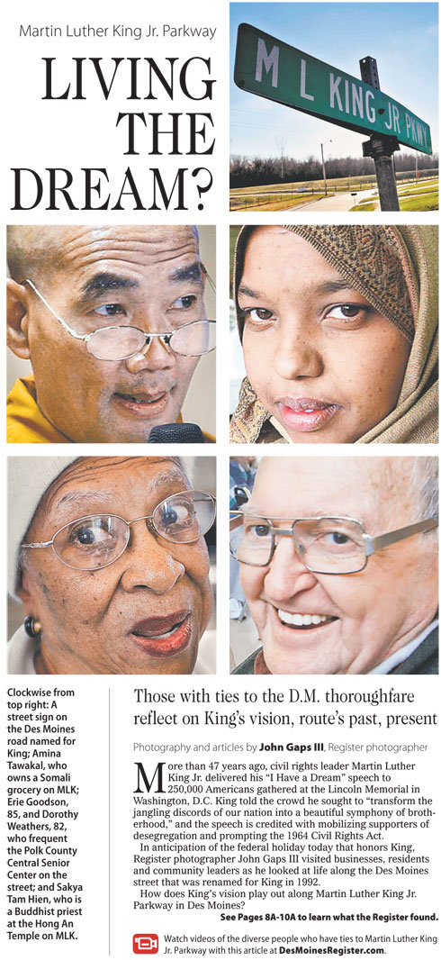
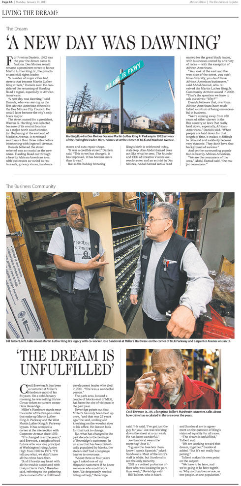
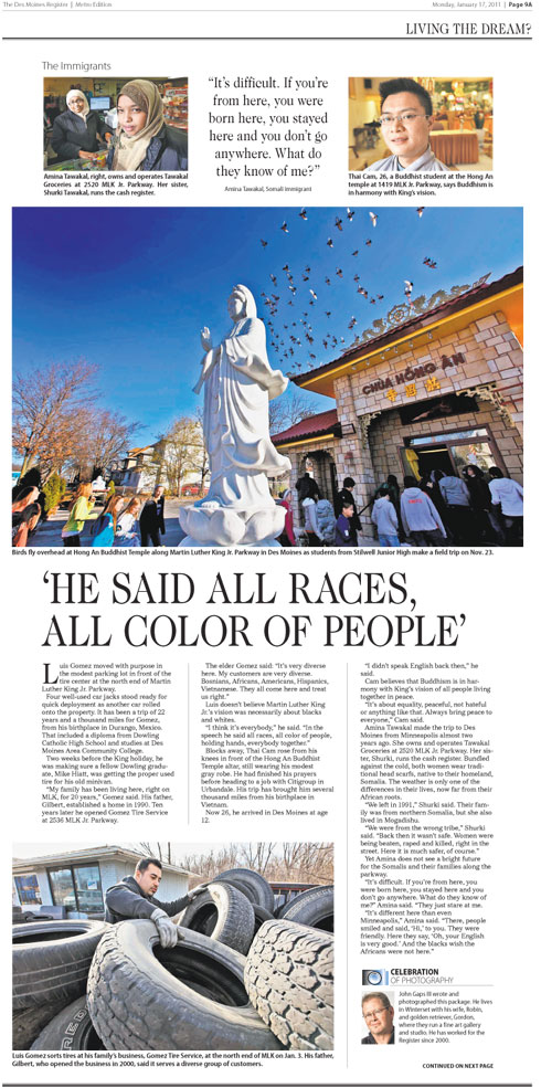
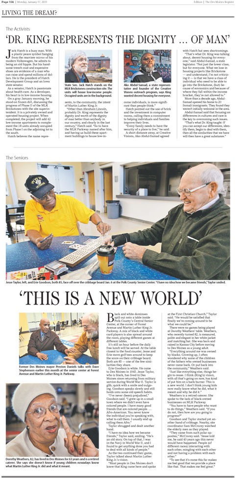
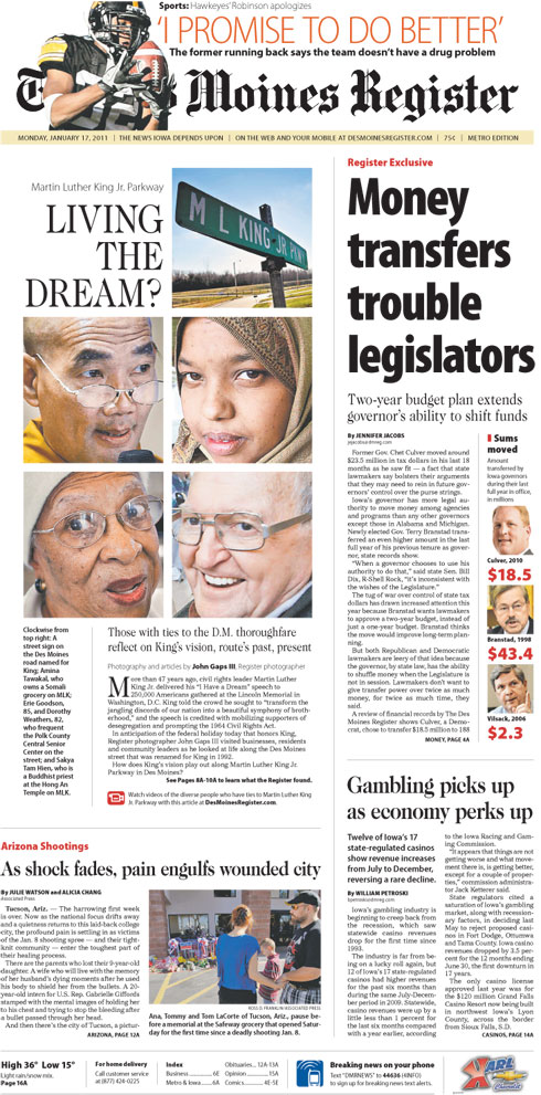
Nicole Bogdas of The Des Moines Register sent me some PDFs of how her paper covered Martin Luther King Jr.’s birthday, a federal holiday. Pages designed by Nicole, photos by John Gaps III.

Here’s the front page:

———————–

Here’s a closer look at that package:

Like many cities, Des Moines has a street named after King. Staff photographer John Gaps III went out and captured life along that street, talking with residents, community leaders and business owners. Among the people he talked to were a Somali grocery store owner and a Buddhist priest.

A look at the inside pages:

———————–

———————–

———————–

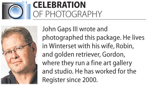
Great photos by John Gaps III. I appreciated this side box about him:

Thanks, Nicole, for sharing this work. To see how the Des Moines Register played this package online, go here.

———————–

The Orange County Register
Santa Ana, Calif.

This interactive timeline features audio of King’s famous “I have a dream” speech. To see the interactive, go here. The credit lists Lenin Aviles, Chantal Lamers, Michael Doss, Susan L. Jacobs and Pam Eisenberg. Good work by all of them.
Martin Luther King Jr. Pages, part 1
As I do more often these days, I perused Newseum’s front page offerings. Today, I wanted to see how newspapers played Martin Luther King Jr. Additionally, today was the day after the Golden Globes, which played a big part in today’s front pages.

———————–

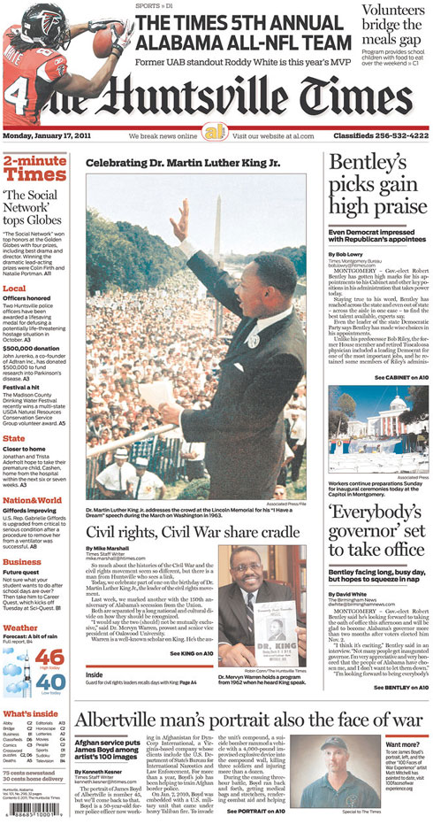
The Huntsville Times
Huntsville, Ala.

Reporter Mike Marshall talked with Mervyn Warren, provost and senior vice president of Oakwood University, about the common links between the histories of the Civil War and the civil rights movement. To read the full story, go here.

———————–

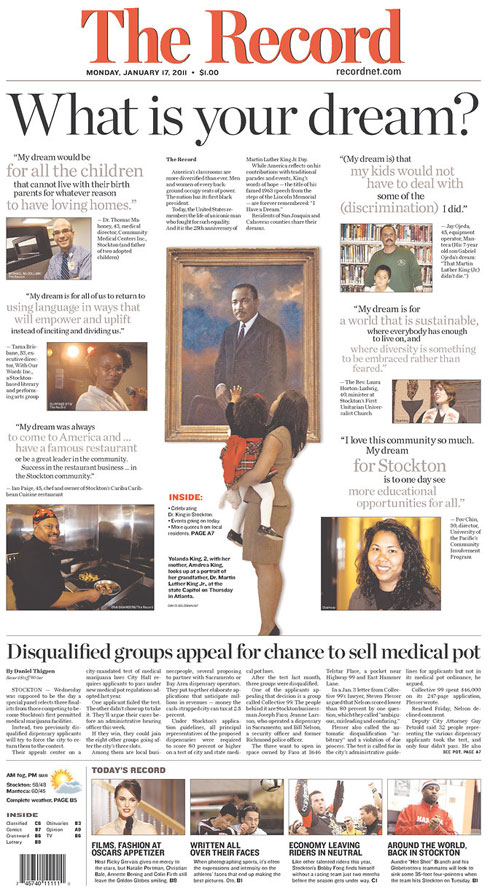
The Record
Stockton, Calif.

The (Stockton) Record talked with local people about their dreams. To read the vignettes, go here.

———————–

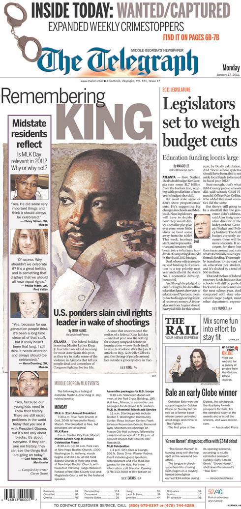
The Telegraph
Macon, Ga.

The Telegraph of Macon, Ga., asked readers, “Is Martin Luther King Day still relevant in 2011? Why or why not?” To see what they said, go here.

———————–

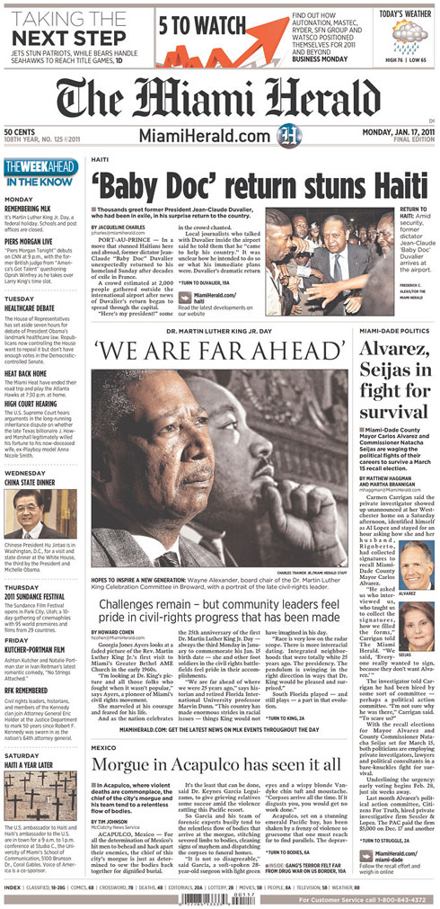
The Miami Herald
Miami, Fla.

Howard Cohen talked with community leaders about how South Florida figures in the evolution of race relations. To read that story, go here.

———————–

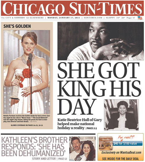
Chicago Sun-Times
Chicago, Ill.

The Sun-Times cover story explains how former Indiana congresswoman Katie Beatrice Hall worked to get Martin Luther King Jr.’s birthday recognized as a national holiday. To read that story, go here.

———————–

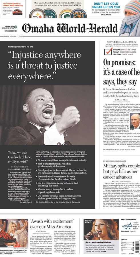
Omaha World-Herald
Omaha, Neb.

Jonathon Braden talked with scholars about King’s legacy, and what his words mean today, especially in the wake of events like the shooting of Rep. Gabrielle Giffords, D-Ariz. To read the story, go here.