How newspapers played the tsunami coverage

There were lots of great photos played on front pages today. Thus, I won’t be doing an exhaustive look at each newspaper’s front page coverage of the tsunami and earthquake, but rather an overview.

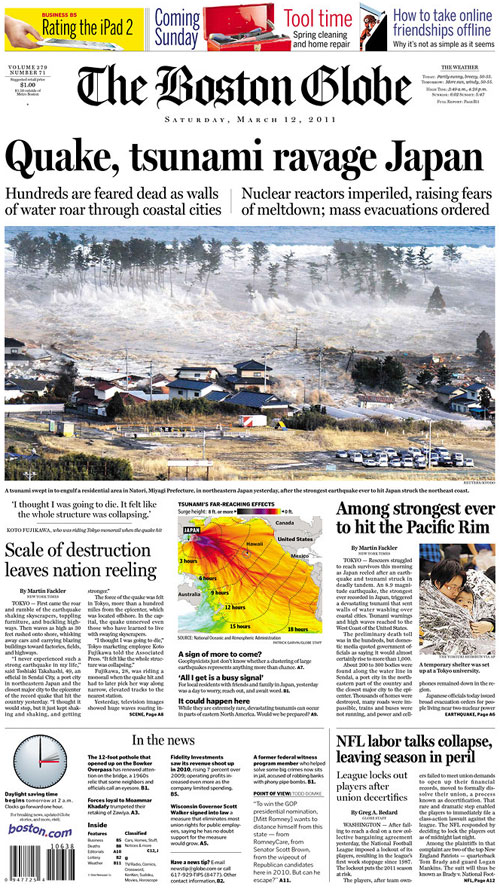
Many went with huge, dominant photos showing the destruction, which I think is a powerful way to show what an 8.9 quake looks like. The Boston Globe went with a large photo and with graphics. More on that here.

———————
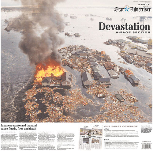
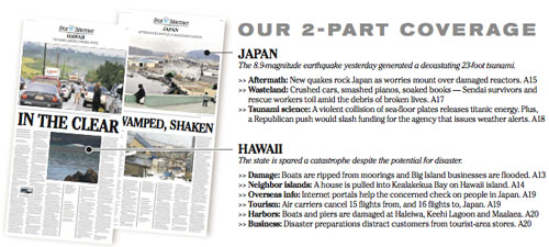
The Honolulu Star-Advertiser
Honolulu, Hawaii

This appears to be a wrap. At the bottom is an explanation of their two-part coverage:

———————

West Hawaii Today
Kailua Kona, Hawaii

———————

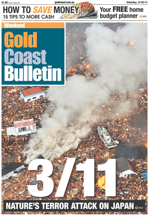
Gold Coast Bulletin
Gold Coast, Australia

This newspaper took a dramatic approach: a full-page photo with a headline invoking “9/11” and a deck calling this “nature’s terror attack.”

———————

Daily News
Los Angeles, Calif.

The smaller nameplate over a hugely played photo reminded me of The Virginian-Pilot, which has consistently known when to scale back and let the photo tell the story.

———————

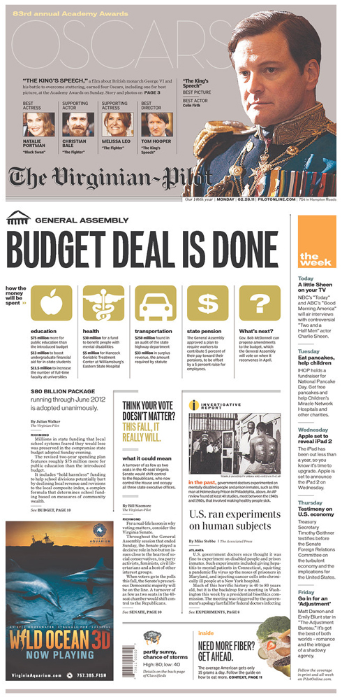
The Virginian-Pilot
Norfolk, Va.

———————

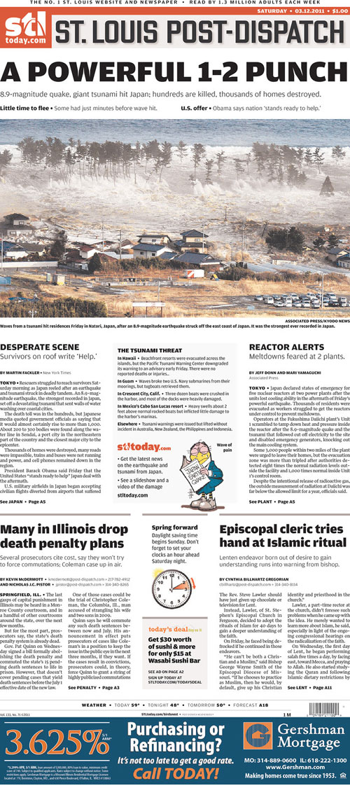
St. Louis Post-Dispatch
St. Louis, Mo.

The real centerpiece of this, though, was the Weatherbird:

The Weatherbird is an iconic piece of Post-Dispatch history. He appears on the front every day, reacting to whatever the main news of the day happens to be. I think he sums up how we all feel.

RELATED: The Boston Globe’s coverage of the tsunami

The Boston Globe’s coverage of the tsunami

The Boston Globe’s coverage of the earthquake and tsunami in Japan has been a team effort. Particularly the graphics coverage.

Here’s how Saturday’s front looked, designed by David Schutz, Deputy Design Director/News & Graphics:

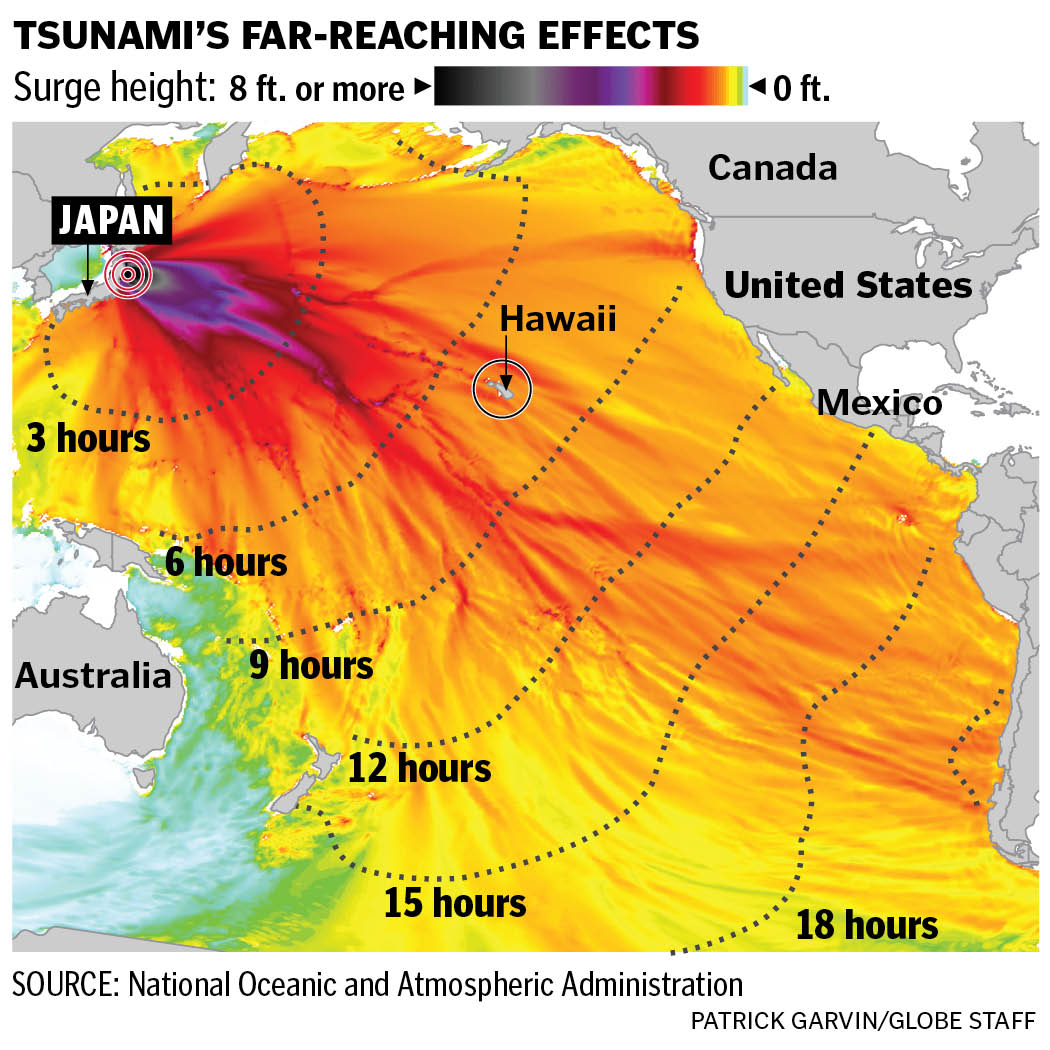
Here’s a look at that graphic on the front. Click on it for a larger view:

Boston Globe tsunami infographic by Patrick Garvin

Inside, we had this larger graphic by Daigo Fujiwara, Monica Ulmanu and Javier Zarracina. Click on it for a larger view:

Great team effort by Daigo Fujiwara, Monica Ulmanu and Javier Zarracina on this tsunami infographic

Here’s how all of these graphics were played on Boston.com: as a package, with the front page graphic explaining the far-reaching effects as a slider and the how the “How a Tsunami Forms” graphic as an animated step-by-step graphic.

Indeed, this was very much a team effort.

RELATED: How other newspapers played the tsunami coverage

“Jen Aniston sex tape” and 7 viral video traits

If you clicked on any of the “Jen Aniston sex tape” links hoping to see Aniston having sex, then you did exactly what they wanted you to do.

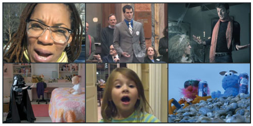
“They” being Smart Water, who hired Jennifer Aniston to make a commercial for the company’s bottled water. The video is not a sex tape at all, unless you’re Ozzie and Harriet and can be aroused by hair and lipstick. No, this video was a spoof on viral videos — and an attempt to create a viral video.

I spent last week looking up what makes a viral video, hoping to pin down what made these things work. The guys behind this ad seem to know how to make a viral video. What resulted was a video that included references to general trends and specific viral videos. Some of the references might have been too specific for casual web users, though meme-savvy people will get it.

So, I give you the breakdown of this viral video from the perspective of a guy who trolls the Internetz, but who has never made a viral video. My only research — besides looking up “how videos go viral” and “how to make a viral video” — has been tracking lots of videos and memes.

If I’ve learned anything, it’s this: The Internet is a scary place. So, let’s go.

——
1. REFERENCES TO OTHER VIRAL VIDEOS

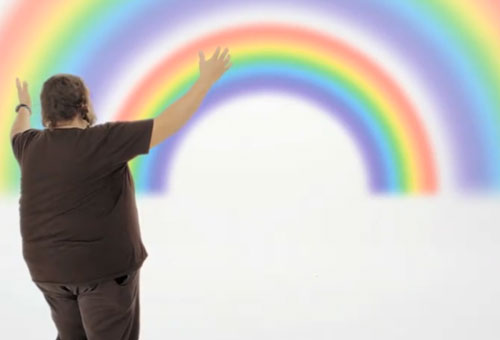
Of course this video references past viral videos; that’s what makes it a parody. The whole video references trends, but I could count three specific videos referenced:

The “Numa Numa” video has been referenced before in a Geico commercial in which the zealous lip-syncing guy with glasses was shown with the Geico gecko. Funny or Die parodied the “David After Dentist” video with “Bieber After the Dentist.” That “David After Dentist” video was mashed up with the Christian Bale tirade video, and it was hilarious.

——
2. CELEBRITIES

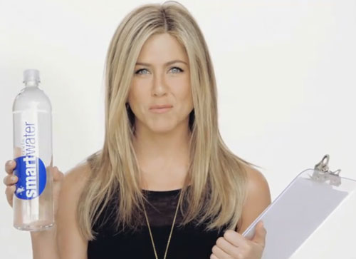
Would this Smart Water ad have been as funny without a celebrity? I don’t think so. The “David After Dentist” video inspired several parodies, but it was the Justin Bieber parody that went viral. The James Vandermemes video earlier this year worked because it featured a celebrity making fun of himself.

——
3. KIDS

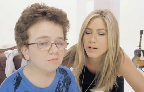
People love kids on the Internet. They don’t have to be cute or even well-behaved. Precocious kids, it seems, get lots of page views.

This kid in the Jennifer Aniston Smart Water video is especially precocious, lip-syncing to Far East Movement and responding with sass to Aniston’s questions. It was scripted, of course, but came off as real, which is another thing that can help videos go viral.

——

4. AUTHENTICITY

The little kid might have been one of the only authentic things in this commercial, but at least we knew it was scripted from the beginning. Some of my favorite viral videos have that “Holy shit, is this real?” quality to them. And they feature people who aren’t afraid to do something silly (hence, “Numa Numa.”)

Newscasts with weird characters or mistakes are especially good for authenticity. Antoine Dodson became a meme after he was featured in a newscast about his sister being assaulted. I don’t think they’ve caught the perp, but Antoine Dodson has inspired several parodies (many including Dodson himself). The subsequent Antoine Dodson videos have not been funny, in my opinion, because he’s too aware that he’s trying to get your attention and make you laugh.

Other newscast videos that went viral:

A low-quality video that looks like it was shot on a webcam or camcorder can still go viral if it’s authentic, funny and worth watching through the end. Tay Zonday’s video for “Chocolate Rain” went viral, and many didn’t know why. It was a repetitive song with no chorus and was not sophisticated in its production value. But the guy was earnest and you couldn’t help but like him. The “Numa Numa” guy was very authentic, which is why his original video was better than his Geico ad.

——
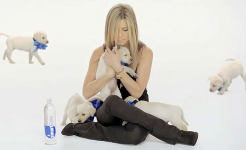
5. ANIMALS

If I’ve learned anything from I Can Has Cheezburger?, it’s that animals will get views. It doesn’t matter what kind of animal: it could be a cat, dog, bird, ferret or something else.

The only animal that wouldn’t go viral would probably be a dead animal. Fortunate for Jennifer Aniston, the folks at Smart Water went with live animals.

——
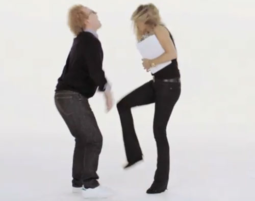
6. VIOLENCE

Search for “kick to the nuts” on YouTube and you’ll find a bunch of videos. Most notable is this one, if for no other reason than the quote at 1:12: “No cup, no nothin’, bro, just straight up nuts.”

——

7. SEX

This video takes advantage of several of Jennifer Aniston’s assets — her humor, her timing, her recognition — but also takes advantage of her good looks. There really is no sex in this video — the Herbal Essences commercials were steamier.

But if you add “sex tape” to anything, you’ll get views. Even if it’s on YouTube and people know they won’t get to see nudity. Even if it’s on my blog and they know it won’t be an actual “sex tape,” they’ll still click on it. You did, and so will others.

RELATED: My favorite videos of 2011 so far

My favorite videos of 2011 so far

In conjunction with my musings on the “Jen Aniston sex tape” and seven traits of viral videos, I present my favorite videos to surface in 2011. Four of them have gotten at least a million page views apiece, and the fifth could eventually get that many views. The sixth one, though, will probably remain a cult favorite.

——

1. ATLANTA WEATHER REPORT

Megan McGlover is not a weather lady or even a reporter, per se. She’s a woman with her blog and videos — and she’s hilarious.

——

2. VOLKSWAGON COMMERCIAL: THE FORCE

This Super Bowl commercial actually appeared online a few days before the game. It was a wise move, because it generated a lot of hype. Thus, I think this is the most memorable commercial from this year’s Super Bowl.

——

3. 5-YEAR-OLD NEEDS JOB BEFORE GETTING MARRIED

There’s another video where this girl explains why Seinfeld is a better comedian than she is. She laments that he can write great jokes, and she can’t. In this video, though, she explains that she’s going to be independent before getting married.

——

4. ZACH WAHLS SPEAKS ABOUT FAMILY

In an address before Iowa legislators, 19-year-old Zach Wahls describes his life growing up raised by gay parents. His candor and passion make you want to give him a hug.

——

5. SASSY GAY FRIEND: GREAT EXPECTATIONS

The Second City Network has produced a handful videos showing how women from literature would have fared had they had a sassy gay friend. This newest one is one of the best. It’s already had more than 100,000 views in its first week.

——

6. LCD SOUNDSYSTEM, “DANCE YRSELF CLEAN”

The video is nine minutes long, keeps the same pace throughout and is for a band that has cult status but not mainstream recognition, per se. Thus, this video won’t be viral in the way that these other videos have been and will continue to be. But it features Muppets rocking out and getting drunk on the beaches of Brighton in England, so it’s got that going for it.

@MayorEmanuel and a DIY punk ethos

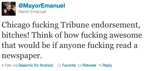
Now that former White House Chief of Staff Rahm Emanuel was recently elected mayor, the man behind the @MayorEmanuel Twitter feed has been revealed in a piece in The Atlantic.

The man is Dan Sinker, journalism professor at Columbia College in Chicago and founder of the now defunct zine, Punk Planet.

In Alexis Madrigal’s piece for The Atlantic, Sinker’s @MayorEmanuel is portrayed as an evolution in Sinker’s approach to journalism and story-telling:

After Punk Planet’s sad demise — mostly due to distribution problems, Sinker says — Sinker received a Knight Fellowship in Journalism at Stanford. He used the time to study how to deliver journalism in a world of mobile device ubiquity. In 2009, he launched CellStories.net, which puts out one story per day exclusively for mobile devices. And he landed a gig teaching journalism at Columbia College in downtown Chicago.

As a professor, Sinker focuses on entrepreneurial journalism and independent media. A student in one of his classes described him as down-to-earth, knowledgeable, and interesting. She said he encouraged his students to build businesses around their work, helping underserved groups find places to congregate online. “He’s DIY,” she said and “big on building communities.” Most importantly, in a journalism world drenched in negativity, she said Sinker inspired students because he’s actually positive about the future of media.

I think it was evident early on that whomever was behind this Twitter feed was no idiot. The constant cussing, the rants and the side stories didn’t bely his brilliance, but rather highlighted it. It was obvious that this person knew a lot about Rahm Emanuel, Chicago, politics and how social media works. The @FakeSarahPalin account that emerged in the 2008 election lacked the depth that @MayorEmanuel possessed. It was snarky, and sometimes witty, but didn’t have a cohesive feel. It didn’t feel like an epic, which is how Madrigal describes Sinker’s feed.
Are you catching that? This Twitter feed — delivered in 140-character installments — is being gushed about and being described with words like “epic” and “poem.” This Twitter feed that you can get on your cellphone and that has more “fucks” you can count is — rightfully so — being lauded as a masterpiece.

So, how can we learn from Dan Sinker?

I think we need to be as tapped into our topics as he was tapped into Rahm Emanuel, both as a person and politician. Sinker’s understanding of Chicago was key; who else but a die-hard Chicagoan would know celery salt? (Note: Celery salt is popular with Chicago hot dogs, though I’ve always thought it was gross).

So, knowing your topic thoroughly is a start. But you also need to know your audience. Dan Sinker knew his audience, which was probably a cross-section of Chicagoans, social media enthusiasts and people who appreciate satire. In those three designations, we probably cover young people who laugh at the word “fuck.” Key to knowing the audience is knowing how they use Twitter. Having several posts over the period of a day allowed him to start episodic storylines and introduce characters like Quaxelrod.

Which is I think the third important lesson of this whole thing: have fun with it. Sinker certainly did.

Fundamentally, though, he had an underlying nut graf that can be traced to his punk sensibilities. In Alexis Madrigal’s piece for The Atlantic, Sinker’s view of punk is summed up pretty aptly:

Sinker described the punk rock mindset in his introduction to a 2001 book that collected interviews from the zine. “[Punk] is about looking at the world around you and asking, ‘Why are things as fucked up as they are?'” he wrote. “And then it’s about looking inwards at yourself and asking, “Why aren’t I doing anything about this?”

Joshua Benton at The Nieman Journalism Lab writes that Sinker’s application of the punk ethos in modern times is noteworthy because of the tools he’s using:

But punk is also about the tools you end up doing that “anything” with. The promise of punk is that you don’t need anything fancy to do something great. You don’t need to be Jimmy Page or Steve F’in Howe to play guitar; you just need three chords. You don’t need fancy technique to be an artist; stencils and spray paint will work. And you don’t need a desk in a newsroom to be a journalist; the Xerox machines at your copy shop will do.

Benton points to a video of Dan Sinker shot by Ted Delaney in 2009, in which he says…

Sinker almost gives a two-year-ahead preview of what would become @MayorEmanuel, not to mention a great piece of advice for the future of journalism: Use simple tools and platforms, then breathe life into them. Don’t accept that something basic can’t be used to create something beautiful and creative.

Even something as basic as a box that only takes 140 characters…

…It sums up just about everything good about the DIY web, and it’s a spirit — innovation with simple tools and a little human creativity — that can lead a simple Twitter account to become something beautiful.
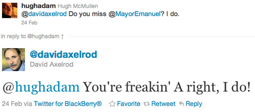
Simple can indeed be creative and catch on. It’s worked for The Oatmeal, Hyperbole and a Half and Megan McGlover. Hell, @MayorEmanuel was so popular, even Axelrod misses him.
So do I. Freakin’ right, so do I.

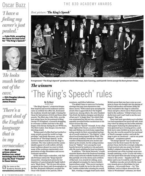
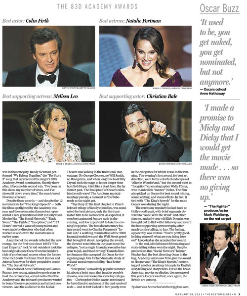
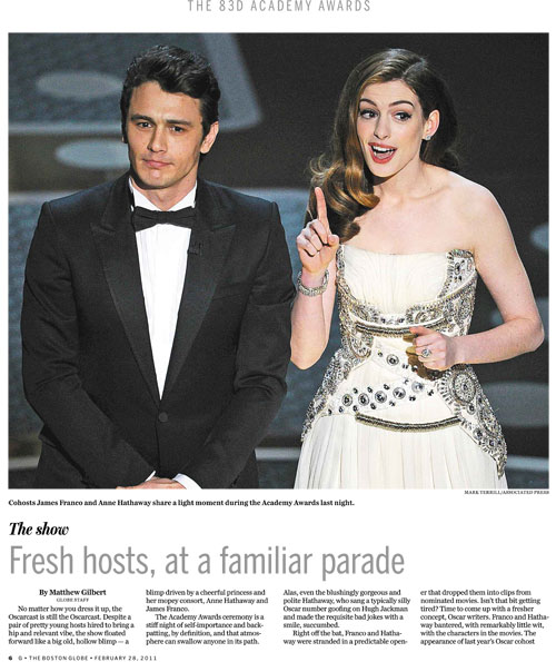
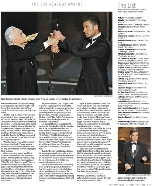
How The Boston Globe’s “g” covered the Oscars

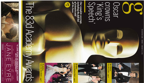
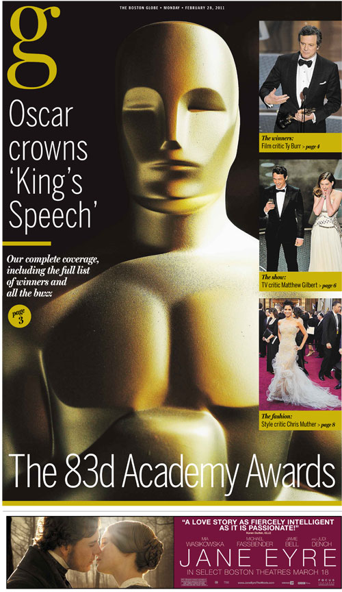
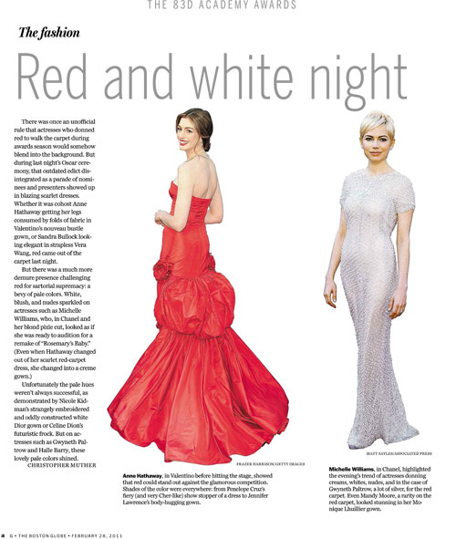
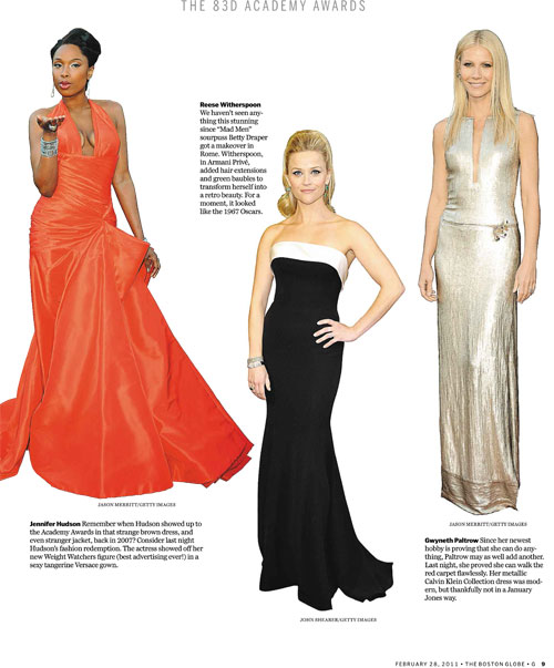
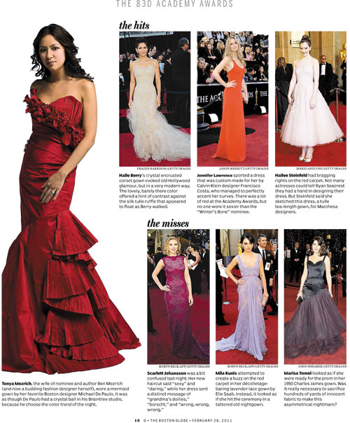
While we’re looking at how newspapers covered last night’s Oscars, let’s look at how The Boston Globe covered it. The Globe’s magazine-style features section — aptly called “g” — had some great coverage. Thanks to features design supervisor Martin Gee for sending these pages along.

The cover was done as a wrap:

A larger, vertical view:

———————

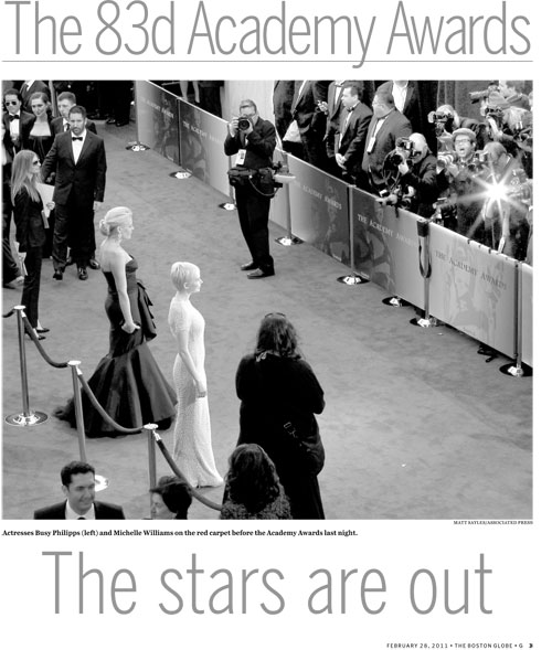
The inside pages:

——

——

——

——

——

——

——

————

To see how other papers covered the Oscars, go here.

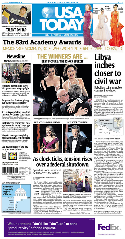
How newspapers covered The Oscars

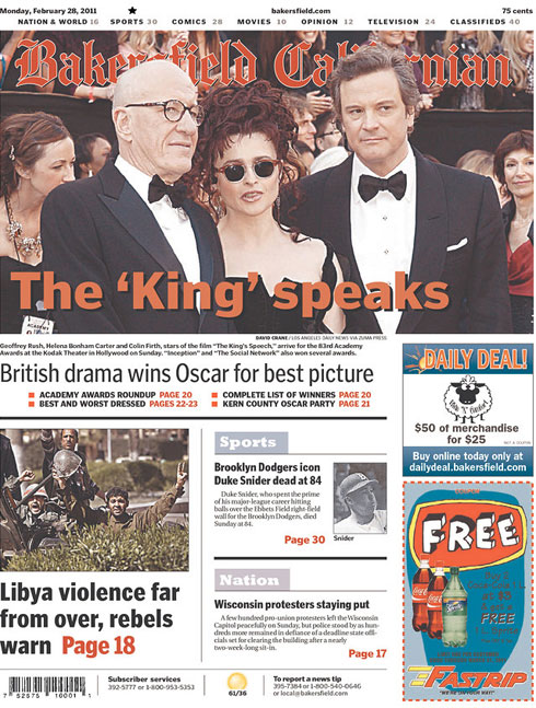
The Oscars provide a prime opportunity to check in on Newseum and see how various papers covered last night’s awards show. So, I present a cursory look at how some newspapers covered the big night.

———————–

The Bakersfield Californian
Bakersfield, Calif.

———————–

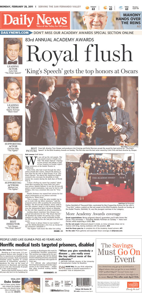
Daily News
Los Angeles, Calif.

———————–

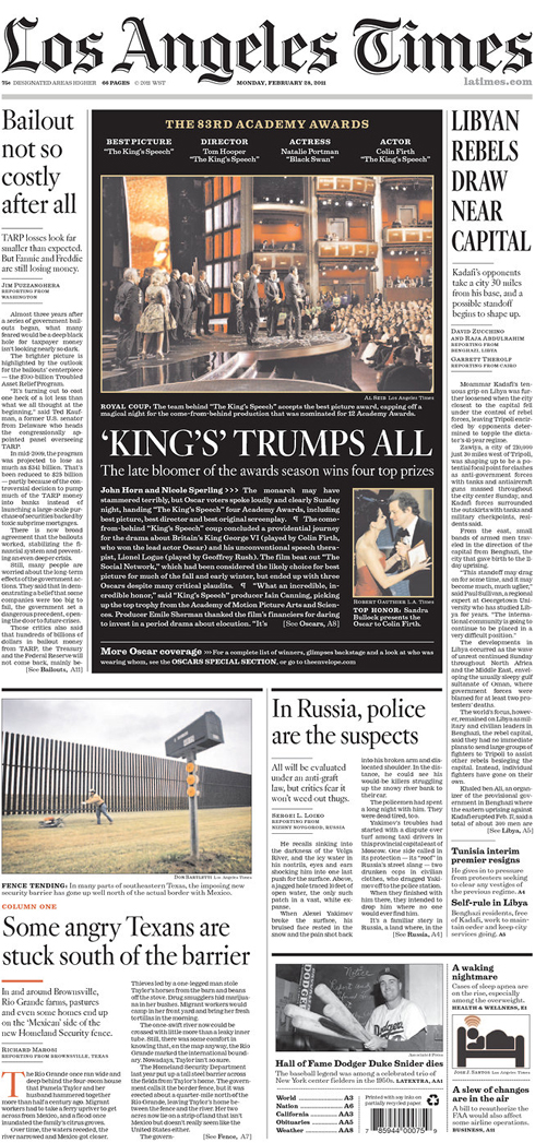
Los Angeles Times
Los Angeles, Calif.

———————–

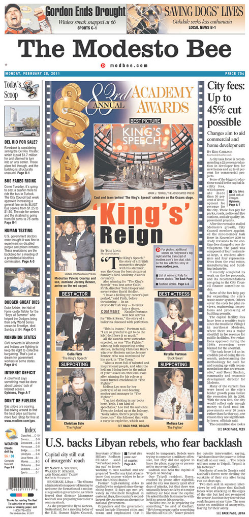
The Modesto Bee
Modesto, Calif.

———————–

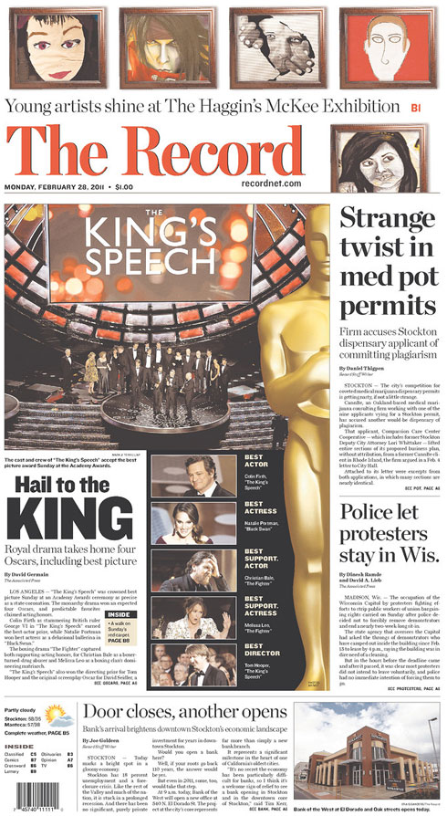
The Record
Stockton, Calif.

———————–

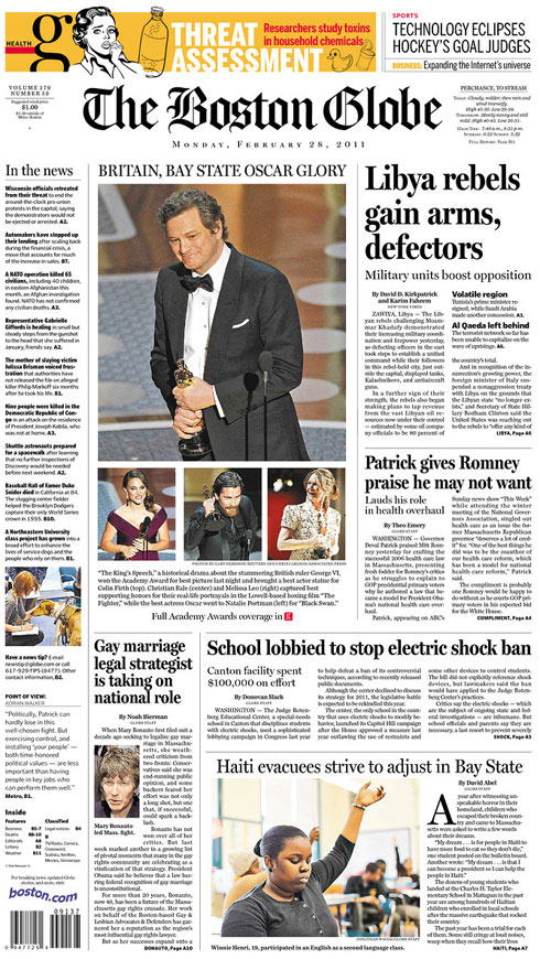
The Boston Globe
Boston, Mass.

———————–

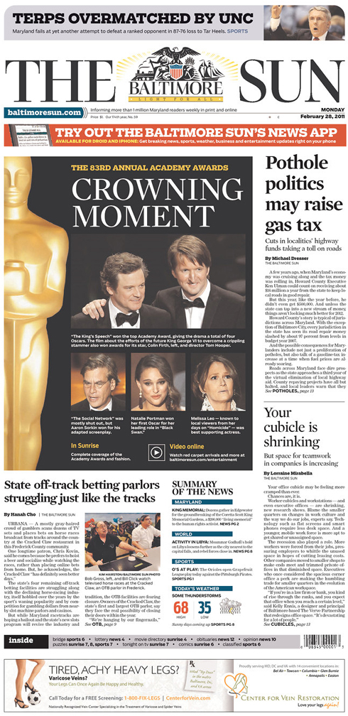
The Baltimore Sun
Baltimore, Md.

———————–

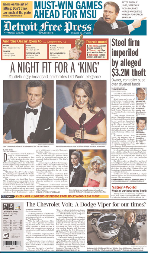
Detroit Free Press
Detroit, Mich.

———————–

USA TODAY
McLean, Va.

———————–

The Virginian-Pilot
Norfolk, Va.

———————–

HOW NEWSPAPERS USED TWITTER

Many newspapers have used awards shows to interact with readers. My former paper, The Florida Times-Union, used the hashtag #jaxoscars for its Oscar-related tweets. The St. Louis Post-Dispatch used #stlfilm. Following the snark on Twitter was more fun than the actual awards. Much more fun.

Ya Know It Gets Even Colder, Right?

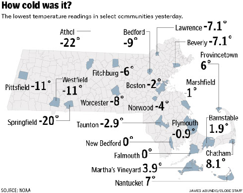
It’s been a cold few months in Massachusetts, the first New England winter for this Midwestern transplant by way of Florida. Just how cold has it been? Here’s what Monday looked like:

Graphic by James Abundis for The Boston Globe.

——————-

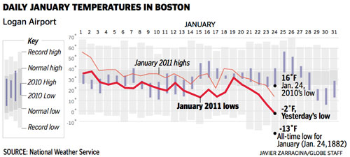
And here’s what Monday looked like in context:

Graphic by Javier Zarracina for The Boston Globe.

——————-

And here’s what Monday felt like:

Photo from Cambridge. I saw this handiwork on Saturday and had to take a picture for posterity.

If you missed it, here’s how much snow we’ve been getting. And here’s David Filipov’s science experiments in Athol, where it was 23 degrees below zero.

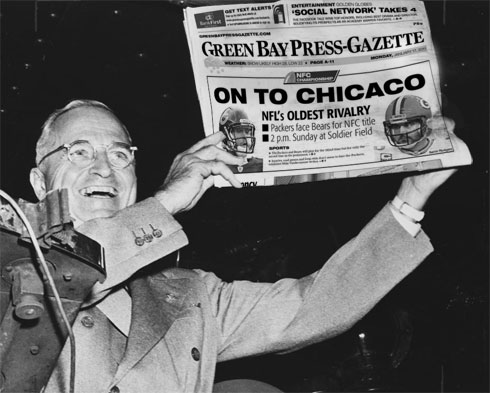
“Dewey Defeats Chicaco”: That Green Bay headline

Monday’s front page of The Green Bay Press-Gazette has received a lot of attention. It’s been on blogs, news sites and all over Twitter. Keep in mind that many people on Twitter think nothing of using “u r” in place of “you are.” When these traitors to the English language point out a spelling error, you know your mistake has gone viral.

The error is a simple spelling error: Where there should have been a “G” was a third “C.” Many people wonder how anyone missed that, let alone several people.

When I first saw the page with the preface of “spot the error,” I glossed over the third “C.” The letters are in all caps, and the C looks so close to the G that my mind filled in the blanks. It took me a second before the “Oh, shit” moment.

And it indeed is an “Oh, shit” moment. No one wants this. A lot of us in the news industry will jump on this error, but what many of us won’t admit is that we’re glad it wasn’t us who made this mistake. Why could it have been us? Because we’ve worried about making mistakes like this, mistakes that other people could see and think of as inexcusable.

We’ve all obsessed over these things. I dare you to find a journalist who hasn’t done at least one or two of the following:

  • Called an editor to have him read back a paragraph, just to make sure a fix you made got in there.
  • Taken a story or graphic home with you so that you could double- or triple-check the facts.
  • Taken a calculator with you to double-check the numbers.
  • Have a friend or significant other read over something to check for errors. (I’ve made use of my friends who are math teachers.)
  • Called or e-mailed a source to have them verify a wording of something they verified in the last e-mail or call.
  • Woken up in the middle of the night and checked his or her story, graphic, cutline, whatever.

And yet there have been times when errors have crept in despite whatever mechanisms we have against these things. And if you’ve got OCD and Catholic guilt, then nothing a reader could say will be worse than what you’ll say to yourself.

Let’s be clear, though: This is no justification or excuse for the errors, or else they wouldn’t be called “errors.” Any error is regrettable, and when we let them in, we’re falling short of our job. And we’re damaging our reputations among the readers who’ve already got a golconda of reasons to distrust us. I know of one couple in the Midwest who makes a morning game of spotting errors in the local paper. Sadly, they’ve found more in the last few years. (And no, this couple is not my parents.)

In the blogs this week, I’ve seen this Green Bay headline compared to the infamous “Dewey Defeats Truman” headline. I’ll grant you a few things:

  • Both were bold, in all caps.
  • Both were prominent, above-the-fold headlines that caught the eye.
  • Both were regrettable.

But in the Green Bay headline, they at least got the right city. The factual error was a spelling error, not an error incorrectly calling a presidential election. If the Press-Gazette had published a headline that said, “Chicaco defeats Green Bay,” then the “Dewey Defeats Truman” comparison would be right on the money. But yes, they’re both egregious “Oh, shit” errors. [See UPDATE below.]

These errors raise our consciousness, though, and can restore our vigilance. Craig Silverman at Regret The Error has offered to send a free copy of his book to journalists who send him their personal accuracy checklists. I’ve enjoyed seeing the responses he’s gotten, and I think it will help all of us.

Here’s more or less what I’ve made my habit for my graphics:

  • Have I cut and pasted the numbers and names, or have I typed them myself?
  • Have I checked to make sure the numbers and names match up with the source material?
  • Do the numbers add up to what the graphic says they add up to?
  • Do the numbers, names and facts in my infographic match what’s in the reporter’s story?
  • Have the reporter and editors seen this graphic?
  • Have I had someone else double-check the graphic against the source info?
  • Have I done a follow-up accuracy check with all my sources to make sure I have the information correct?
  • If using color-coding, do the colors match the right values? And are the colors different enough to be distinguishable?
  • If I’ve had to rescale or move any of the elements on the page, did I move them all in the group?
  • Are all the labeled roads labeled correctly?
  • Are my numbered steps in order?
  • If I had any “head goes here” or “XX” text fields in the graphic, have I replaced those with the actual text?
  • Are my label lines pointing to the correct data points, locations, etc.?

These are second nature to many of us, as they seem like common sense. But it’s good to see it written down. What type of checklist do you have?

————-

UPDATE

I’ve since learned more about the Dewey headline, and can clarify more about the mistake. The Tribune was relying on polling data to call elections, and that night, the polling data suggested a huge Dewey win. As the deadline got closer, editors of the Tribune went with the data and put that headline in the first edition.

So, this error was a “source error.” The Chicago Tribune, of course, still published incorrect information, but it was a different kind of error. But it was one that has been talked about for several years, just as the Green Bay headline will be talked about for several years. The reasons behind the errors are different, but they’re doozies.

To newspaper people in my generation, we’ve almost always had a result for the next day, or we’ve at least run a generic “too close to call.” To us, “Dewey Defeats Truman” comes from a world we can’t comprehend: “You mean they couldn’t just plug it in Excel to see who won? Like who was their CAR/data guy? OMG!” So, younger journalists might forgive the typo sooner than the incorrect election result simply because they grasp it more easily. But again, understanding careless errors doesn’t justify them.

In Case You Missed It: Xtranormal

I’ve recently become obsessed with Xtranormal, a website that takes your text and turns it into a movie, usually with 3D-rendered characters speaking like voicemail messages. There are  tons of videos that have taken advantage of this “text-to-movie” site, and I’m loving them.

Particularly, I’m loving some of the journalism-themed videos.

Adventures in Freelancing, Part I: The Trend Story

————————————-

So You Want To Be A Journalist

“If I do not get a job at The New York Times right after graduation, I will go to Columbia Journalism School. Then I will get a job at The New York Times.”

And…

“Do you even read the newspaper?”
“Of course I read the newspaper. I love the New York Times.”
“Do you have a subscription?”
“No. Why would I pay money for a subscription? I read it for free online.”

————————————-

Snake on an MBTA train

Joel Abrams of Boston.com put together a dramatization of the snake on the red line using direct quotes from Eric Moskowitz’s story, my account or the Craigslist ad.

To read more about Xtranormal, go here.