Twitter’s acting the fool; use TweetDeck

So, after writing that post about “gay,” “homosexual” and the like, I thought, “I’ll tweet the link.”

Oy.

Apparently, there’s some sort of security flaw redirecting people to third-party sites. I can’t even put into words what happened to my screen without sounding like a grandma who doesn’t understand that she has to turn the computer on if she wants it to work. So I defer to Mashable:

The bug is particularly nasty because it works on mouseover only, meaning pop-ups and third-party websites can open even if you just move your mouse over the offending link.

The flaw uses a JavaScript function called onMouseOver which creates an event when the mouse is passed over a chunk of text. We’ve seen the flaw being abused to launch simple pop-up windows, redirect users elsewhere (including porn sites), and we’ve also seen it used in combination with blocks of color, covering the true “intention” of the tweet.

OMG! What to do? How do we go thiiiiiiiiis looooooooong without LOLZ, kittehs, JKs and LMFAOZ? IDK!

For now, the best course of action is using only third-party apps such as TweetDeck  to access Twitter, as the bug only seems to affect Twitter’s web interface. Also, if your Twitter account contains a message abusing the flaw, you can delete it using a third-party app.

Oh, Thank God.

Don’t Ask, Don’t Tell: “Gay” vs. “homosexual”

Between “Don’t Ask, Don’t Tell” and Prop 8, there are lots of gay issues (and terms) in the news. These issues tend to be difficult for many media outlets to cover, as no one wants to offend anyone. Not the same-sex couple who traveled to Canada to get married. Not the fire-and-brimstone pastor who thinks all “homosexuals and sodomites are going to hell.” Not the average guy who might not “understand the lifestyle” but nevertheless says, “I love my dead gay son.”

In some cases, pastors and randoms are interviewed for stories in which they have no real stake. There could be a series of vignettes about same-sex couples who’ve been together 17 years and fought for benefits and survived illness after illness. And then, an awkward transition…. “While these couples want to get married, not everyone agrees. Just ask Joad Cressbeckler….” To be sure, not all of these are tacked on, but it makes me wonder: How did the media cover Loving vs. Virginia back in the 1960s? How cringe-worthy would that coverage appear if we looked at it now? How similar or different is it from how the media is covering these current civil rights issues concerning gays and lesbians?

Not only are the topics controversial, even the terms are hotly debated. A 2005 Gallup poll surveying moral attitudes placed onto the lives gay and lesbian Americans showed that “homosexual” has negative connotation to it compared to “gay”:

Proving the power of language in the debate, survey responses were nine to 10 percentage points higher when the term “gay and lesbian” was used instead of “homosexual.”

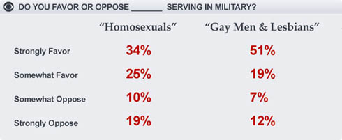
Earlier this year, a CBS News/ New York Times poll found that wording was key when asking whether Americans support allowing gays to serve in the military.

In its analysis of the 2005 poll, Daniel Gonzales Ex-Gay Watch pointed out the “right of any minority group to self-determine their own descriptive terminology.” It’s no longer acceptable for black people to be referred to as “negros,” Gonzales pointed out, so gays and lesbians should not be referred to as “homosexuals,” he argued.

For what it’s worth, here’s what’s in the GLAAD Media Reference Guide:

OFFENSIVE: “homosexual” (as a n. or adj.)
PREFERRED: “gay” (adj.); “gay man” or “lesbian” (n.)

Please use “lesbian” or “gay man” to describe people attracted to members of the same sex. Because of the clinical history of the word “homosexual,” it has been adopted by anti-gay extremists to suggest that lesbians and gay men are somehow diseased or psychologically/emotionally disordered – notions discredited by both the American Psychological Association and the American Psychiatric Association in the 1970s.

And from the National Lesbian & Gay Journalists Association stylebook:

homosexual: As a noun, a person who is attracted to members of the same sex. As an adjective, of or relating to sexual and affectional attraction to a member of the same sex. Use only if “heterosexual” would be used in parallel constructions, such as in medical contexts. For other usages, see gay and lesbian.

How the 8 million Terry Jones stories became stories

When I listened to the national weekly round-up shows the last few days, there were lots of cries that the media had been played by Terry Jones. Many of these journalists said that the media elevated the story to something it wasn’t, and that they were effectively encouraging him.

In hindsight, there were some things about this story that were most definitely newsworthy and needed to be covered. There were great features pieces that explained Muslim culture in ways that the culture hadn’t been explained before. And, most of all, this story and its myriad stories/non-stories demonstrated that through social media, comment boards and the viral nature of the Internet, many “non-events” are going to get attention.

Look at all the stories that came out of this:

Before this week, how many people had him on the radar? How did this guy get to enjoy press conference after press conference?

According to The Washington Post, Jones first tweeted his plan for “International Burn a Koran Day” on July 12. The Council on American-Islamic Relations got wind of that, The New York Times published something and by September 6, protesters in Kabul were burning an effigy of Jones, chanting “Death to America.”

The news here was not that this guy was going to burn a Koran or even that he’d do it on 9/11. Fred Phelps’ Westboro Baptist Church takes part in all sorts of stunts and those events have become non-events. The news angle, in my opinion, was that Gen. Petraeus intervened in a domestic matter with the warning that this could have severe international consequences. American troops would be threatened in areas where extremists have been known to carry out attacks. In other words, Jones was doing the international equivalent of yelling “Fire!” in a crowded theatre: his free speech could endanger others, and people cried shenanigans.

Note that in the Washington Post timeline of events, it took more than a month and a half for a news outlet to acknowledge this event. The tweets and Facebook page communicated this, and through the viral nature of the Internet, people in the Middle East were long aware of this before the The Times posted something. If not for Twitter or Facebook, would these people have even known? Hard to say, but the fact that Jones could broadcast these plans on his own is a key factor in how this became the story that it did.

The guy’s striking look and odd conversational style probably didn’t hurt his chances of getting on TV. The speculation of “will he, won’t he?” got lots of TV play. And then the readers, callers and viewers who chimed in helped continue the story. Many people were talking about it, even if they weren’t saying anything of substance. On the radio this week, I heard one guy who said he wanted to rip page after page out of the Koran and feed it to his goat. The more that these people got to comment on air and online, the more they became part of the story. The story was no longer just that some guy was going to burn the Koran, or that Petraeus was intervening. The story became, “Holy shit, this guy is not alone in his beliefs about Islam and he’s become a poster boy for these people.”

As for the story about Jones being from the same Missouri town as Rush Limbaugh, that story was inevitable. I think it has less to do with a “liberal agenda” or more to do with the practice of localizing. Like it or not, many news outlets localize stories. So, the “could this happen here” and “what our local imams are saying” stories were inevitable, and in many instances, justified stories. That he’s from Missouri doesn’t mean anything to me (though it is my home state), but I’m sure there are people who feel a certain connection to stories knowing one of the key players is from there. It’s the same reason papers write multiple stories about local kids who make it onto “American Idol.” And the coverage could have been worse. I was really expecting every town where Jones had stopped to fill up his tank and grab some food to run some interview with the gas station attendant, asking her to speculate on what Jones’ gas choice said about his character.

Thus, I’m proud of how Times-Union colleague Jeff Brumley approached this story. So many people had asked, “What’s the big deal? It’s just a Koran. People burn the Bible and the American flag all the time and no one cares.” Jeff explained that while it’s commonplace for people to use markers to highlight their favorite Biblical texts, many Muslims would be horrified to do that to their Koran. Jeff explained the differing cultural attitudes, and I hope that people would say, “Shit, we don’t want to piss off anyone, especially extremists who’ve been willing to blow people up over less.”

Arcade Fire teams with Google Chrome to make video about your childhood home (yes, YOUR home)

You probably saw this last week, but its implications are far-reaching enough that it bears bringing up again.

Indie rock band The Arcade Fire released an interactive music video for their song “We Used To Wait,” from their album, “Suburbs.” At the beginning of the video, you’re asked to enter the address for the home where you were raised. Once you type that in, it processes for a few seconds and then tells you you’re ready to start.

And then your mind is blown.

The video begins with a guy running down the street, and other windows pop up showing the street and the sky. Those windows collapse as new ones appear, all as this guy keeps running down the street. As he progresses, the bird’s eye view of the town in which he’s running becomes clearer, and you start to see familiar settings…

He’s running to your childhood home, or what Google Street View has on file of your home. Or, in the screen grab above, my childhood home. And then you’re given the chance to write or draw a postcard to your childhood self.

You’re hooked now, and totally want to do this for every home you’ve ever lived, right? You should know: This video requires a browser that reads HTML5. It was designed in partnership with Google Chrome, which you can download for free, but can also run on Safari.

Journalists of all crafts, take note:

  • This is truly interactive. Sometimes we’ll call things “interactive” when the interaction is rolling over or clicking. Those types of interactives have their place, but this is an interactive that requires a few levels of input from the user. First, the user needs to type in the address. Later in the video, the user moves the video along by writing or drawing a postcard to his or her younger self. Thus…
  • You can do this over and over before getting bored. You will never have the same experience with this video. Even if you type the same address, you’re still going to be asked to write or draw a postcard to yourself. And even if you write the same text, the experience won’t be the same. (I won’t tell you much more, except that your text begins to move.)
  • This shows some cool things HTML5 can do. Sure, you’re not going to make videos like this, per se, but if you’ve been trying to convince people in your department why you should be paying attention to HTML5, this will help your argument.
  • This works because it’s so personal. People love to look for themselves and loved ones in things. It’s the reason why people spend time with county-by-county maps, whether they’re for election results or home prices. It’s why searchable databases get so much attention. This video’s use of technology and interactivity really work because of the connection to the user. I typed in the house where we lived when I was born, the house where I spent most of my childhood, my friends’ houses, etc. This will entertain me (and you) for hours.

The nebulous intersection of media and Foursquare

The news that Foursquare is partnering with MTV in September to give virtual badges to Foursquare users who get tested for sexually transmitted infections is news for many reasons, one of which being that it reminds us that many media companies are still trying to wrap their minds around Foursquare (and all social media).

If you’re a newbie to this whole social media universe…

Foursquare and similar services use smart phones’ GPS capabilities to locate where users are and what’s around them. Users can then “check in” to a venue by tapping it on a list — or typing in their own.

Foursquare users already receive scout-inspired merit badges for a range of check-in accomplishments. These include “Gym Rat” for hitting the gym 10 times in a month or “Crunked” for checking in to four or more places in a single night.

Why would you want to advertise where you were? Some businesses are offering specials to people who check in, and others offer discounts to “mayors,” the Foursquare user who has more checkins at a given location than any other user who has checked in there within the last two months. And, the game mentality of the app drives users’ desires to earn as many points and badges as possible. I know a couple here who would check into funerals if they could.

The businesses who do offer incentives for people to check in there seem few and far between. Some of the businesses of which I’ve become mayor have said, “Foursquare? Like whatchoo’d play in grade school?” It’s nowhere on the radar for them, and when I explained the potential rewards, they’d say, “Wow, the things you can do these days.” But, as the Wall Street Journal has pointed out, there are businesses trying to embrace it.

When The Wall Street Journal unveiled its metro section for Greater New York, it included some Journal-specific Foursquare badges. When the Journal “checked in” near Times Square in May when the area was evacuated for a bomb threat, it was the first time the Journal had used Foursquare to break news. In the months since then, there have been musings as to how reporters can use Foursquare to find sources. In places like New York, you might find enough people on Foursquare at a given moment who will see your alerts and find you. But in smaller places, it could be hit or miss.

I’m curious as to how media companies will gauge success with Foursquare. Until there’s a model for how to integrate it into a media company’s mission, I think the best way to judge it will be reminiscent of the Supreme Court’s obscenity statement in the ’60s: “I know it when I see it.”

I Can Haz Page Views? You Want A Blog

Social Media Guide posted an interesting link this morning: “34 Reasons To Start A Blog.” It’s a pretty good list, and many of those reasons factored in my decision to start this very blog.

When I created my online portfolio, I asked an SEO-minded friend how to get page views for my site. (“SEO,” for the n00bs and unititiated, being “search engine optimization”). I could pay Google oodles to be one of the sponsored results at the top of the page, but that would not be fun, he warned.

“The owners of those sites paid Google directly for you to see those listings. They maybe didn’t pay too much to get that link high on the page, but if you click on that link, Google may […] them over for more than a dollar just for that click. And if you don’t buy anything on their site or click on one of their sponsor ads or something, you and Google make them look and feel like real assholes… Based on the type of website this is, the types of visitors you’re trying to attract and my assumption that you don’t want to pay through the ass to get your numbers to creep up, free SEO tactics are probably what you’re most interested in.”

And? Those free SEO tactics?

  1. Start a blog. “It doesn’t have to be a strictly graphics blog, but it should mostly be about you and your career and design and whathaveyou. Also things that you think are interesting and cool. You want to do this because search engines reward sites that are updated more frequently, so just a couple short blog posts per week will help. A post could be just a heading, a couple sentences, a link and a picture, and that will go toward boosting SEO. Putting links in blog posts, and really anywhere else on your site, will also help. Search engines like sites with lots of external links.”
  2. Get people to link their site to yours. “It’s up to you how you want to arrange for this to happen and whose sites you’d like to have linked back to yours. Search engines also like sites that have lots of links going TO them, so this gives everyone an incentive to ‘link swap,’ or agree to link to one another’s site in an even exchange.”
  3. Optimize your copy. “The basic principle is super straightforward: if you have a specific phrase that appears prominently and multiple times in the copy on a page of your site, your site is more likely to come up in the search results for that specific phrase. For instance, ‘info graphics artist,’ ‘info graphics designer,’ ‘Jacksonville illustrator’ and ‘news graphic design’ may all be appropriate for your list. More generic phrases like ‘info graphics artist’ will put you up against more competition, and while they may improve your ranking for those phrases, they may never get you close to the top of the list. As you get more specific, ‘Jacksonville illustrator,’ for example, you’ll be up against fewer sites and can make it closer to the top of the list. If you need help coming up with search term ideas based on your basic keywords, use the free Google Adwords Keyword Suggestion Tool.”
  4. Work those phrases into copy on your site in a way that comes across as natural. “It matters where they appear; search engines can tell heading text apart from body text, and they weigh it more heavily. All text that is emphasized in terms of font size and placement on the page is weighted to some degree. For each given page, I would recommend choosing just one or two selected search terms. Try to find a way to work one or both phrases into the title bar at the top of the browser window, and pick one phrase to put in the heading over the body text on that page. Then use one or both phrases about two times each per 300 words of body text, as a general rule of thumb. Be sure to list both terms in the meta tags and site description. Capitalization and punctuation won’t affect the phrases in terms of their effectiveness in optimization, but any other editing will, like inserting additional words within a phrase, changing spelling, etc.”

Another friend who’s much more web savvy than me offers this morsel for journalists wanting to blog:

“It’s one thing to have a nicely designed portfolio site that features your work, but a competitive job a recruiter also wants to see that you are involved in the cutting edge issues of your industry and demonstrating that you have ideas, and that other people care what you think and are commenting on it. In other words, I don’t just want to see your clips. I want to see you thinking critically about other people’s work and leading a conversation with other key players in your industry.”

From that Social Media Guide link, I found another blog-related read: Why Start a Blog and 25 Tips to Make it Work.

Enjoy, and get to blogging.

When two of my nerd loves collide

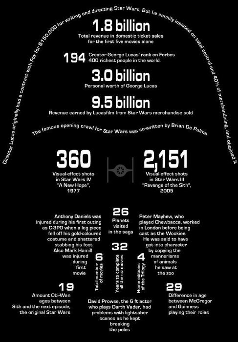
GraphJam has been one of my favorite sites for a while, posting simple charts based on pop culture. And I’m a huge “Star Wars” nerd. Thus, this piece I found today was really cool.

via GraphJam

When I first looked at it, though, I was expecting it to be all about Darth Vader. Instead, it’s a potpourri of information about all the movies and various characters. That doesn’t bother me; of all the images from “Star Wars,” I’m not sure you can find one more iconic and ubiquitous than the Darth Vader mask.

What I appreciate about this is what doesn’t have to be shown. The type sets the boundaries for you and then your mind fills in the rest. You look at this and know it’s the Darth Vader mask. I’m sure others in the graphic design field would have a few changes they’d make if they were doing it themselves, but I think they’d mainly look like this one.

When I’ve made images using typography, I’ve felt challenged with making it look exactly like the individual. I’ve filled every spot and don’t want any white space. In this case, though, I like the white space. (Even though it’s “black space.”)

Got any cool typography pieces? Send ’em my way. Got any cool “Star Wars” examples? Send ’em my way.

In case you missed it…

In case you missed these stories and interactives in the last few days:

  • Bedrooms of the dead: Preserving the memories of slain loved ones [Florida Times-Union/jacksonville.com]
    Reporter Jim Schoettler and photographer Jon M. Fletcher tell the stories of families of four Jacksonville murder victims who have chosen to remember their children by maintaining their bedrooms. Jon’s portraits of the rooms uses a technique I’m not sure I’ve seen in a newspaper before: the pictures from various perspectives have been pieced together to form a panoramic view.
  • To be continued: Real stories with StoryCorps [Florida Times-Union/jacksonville.com]
    Columnist Mark Woods reflects on StoryCorps, a project which archives personal stories told by the interviewee not to a journalist but to a loved one such a spouse, a child, a friend.
  • Video of suspended Nassau County administrators now public, in sheriff’s hands [Florida Times-Union/jacksonville.com]
    A video showing a Nassau County administrator stumbling naked on a balcony and some poolside partying at a South Florida hotel has thrust Sheriff Tommy Seagraves to the epicenter of the county’s notoriously contentious politics. Roughly 90 minutes of surveillance footage is now in the sheriff’s hands as he contemplates whether criminal charges are warranted against four top administrators. The county is investigating whether the four cheated taxpayers by skipping sessions they’d signed up for at a hurricane preparedness conference in May and billing the county $3,850 for lodging, food and vehicle mileage.
  • Homecoming for Herzog [St. Louis Post-Dispatch/stltoday.com]
    Hall of Famer and former Cardinals manager Whitey Herzog had his number 24 retired at Busch Stadium Saturday before the Pirates game. Players from the 1985 season were there, including one of my favorite all-time players: Ozzie Smith.
  • Celebrity Mug Shots Trivia Quiz [stltoday.com]
    This quiz shows blurry mug shots and asks you to guess who they are. If you follow Perez Hilton, Gawker, Huffington Post or The Smoking Gun, then you should be fine. I got 10 out of 10.
  • How long will the Blagojevich jury deliberate? [stltoday.com]
    What a cool interactive graphic. This compares the length of the Blagojevich trial to other well-known jury trials. The chart allows you to compare how many days these trials lasted to how long (or short) the deliberation process was. There are so many layers to this graphic. Another home run by the stltoday.com staff.

Exile in Phairville

I have finally listened to the new Liz Phair album, which she released herself over Fourth of July weekend via her website.

Don’t know who Liz Phair is? What you might recognize will be two singles from her 2003 album, “Liz Phair”:

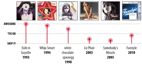
Essential Liz Phair:

At her peak, her music was brash, unfiltered, gritty, angsty and totally stream-of-conscious. She was Joan Jett, Rickie Lee Jones, Tori Amos, Ani DiFranco and Kim Gordon.

But then she did what so many musicians (and other humans) do: get married, have kids, settle down and become less angsty. By the time 2003’s poppy “Liz Phair” was released, she was more a contemporary of Sheryl Crow than Ani or Tori. Purists cringe at that album the way that “Star Wars” nerds lament the release of “The Phantom Menace” or the way Metallica fans lament when the band cut its mullets.

And now that she’s no longer signed to a label, she has carte blanche to do whatever she wants. On her new album, “Funstyle,” she raps, she mixes in loops of phones and other noises and gives voice to record executives talking about horrible the album is. It’s as if she’s had her Margot Kidder breakdown and is embracing it. You go, girl. Be as nuts as you want to be, I’ll still listen to you.

If possible, 19-year-old Pat would marry his mind’s version of 25-year-old Liz Phair. Hell, 28-year-old Pat might marry that version of Phair. She was the epitome of every cool girl you hear about in a Smithereens song. I don’t know if I’d marry the 2010 version of her, but I’d totally grab coffee and a beer with her and be her friend. We could go to cute little coffee houses and discuss music, then go to a  movie, and maybe then discuss it after with a beer. We’d say “totes,” “obvee” and “unfortch,” even though she’s 43 and I’m almost 29 and probably shouldn’t talk like that.

So, my past adoration of her won’t let me write her off. Sure, I won’t listen to this album every day, nor will I re-listen to every track, but her change over time hasn’t bothered me they way has others. I think she’s growing up. Not every album is going to be pissy, existentialist angst anthems about sex and youth and all the stuff that defined her. If Kurt Cobain were still alive, do you think he’d still be putting out “Smells Like Teen Spirit”? Probably not. He might sing anthems about parenthood, the family mini-van and the mortgage crisis and how it’s tough to grow old. He would not be too different from Liz Phair. And we’d listen to it at least a few times before setting it aside, because, well, he’s Kurt Cobain and we liked him when we were younger. It’s the same reason why I won’t outright dismiss a new album by Madonna or New Order or The Magnetic Fields, and it’s the same reason why I won’t dismiss “Funstyle.” Just yet, anyway.

Some tracks from the new album:

We’ve Got a Situation

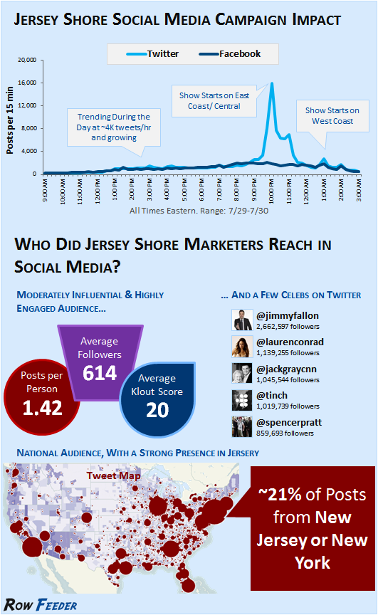
I made it through 17 minutes of the first episode of “Jersey Shore” before deciding to go do dishes and never watch it again, but this infographic via Mashable on “The Social Media Impact of ‘Jersey Shore'” was interesting.

I can’t judge. When I went through my “X-Files” marathon a few years ago, I tweeted almost every episode. “Cancer Man” became a trending topic. (Not really).

The Mashable graphic: