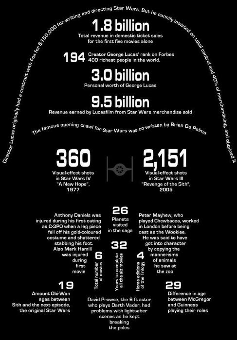
GraphJam has been one of my favorite sites for a while, posting simple charts based on pop culture. And I’m a huge “Star Wars” nerd. Thus, this piece I found today was really cool.
 via GraphJam
When I first looked at it, though, I was expecting it to be all about Darth Vader. Instead, it’s a potpourri of information about all the movies and various characters. That doesn’t bother me; of all the images from “Star Wars,” I’m not sure you can find one more iconic and ubiquitous than the Darth Vader mask.
What I appreciate about this is what doesn’t have to be shown. The type sets the boundaries for you and then your mind fills in the rest. You look at this and know it’s the Darth Vader mask. I’m sure others in the graphic design field would have a few changes they’d make if they were doing it themselves, but I think they’d mainly look like this one.
When I’ve made images using typography, I’ve felt challenged with making it look exactly like the individual. I’ve filled every spot and don’t want any white space. In this case, though, I like the white space. (Even though it’s “black space.”)
Got any cool typography pieces? Send ’em my way. Got any cool “Star Wars” examples? Send ’em my way.

I don’t know jack about graphics, but this rules. Both as a graphic and as a collection of information, it’s pretty awesome from my layman’s perspective. I really like how there are tons of little tidbits working together to make the overall Darth Vader, but nothing is squished too close together to make it difficult to sort through it all.
Cool!