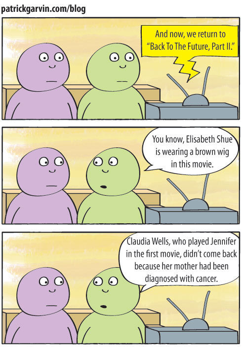
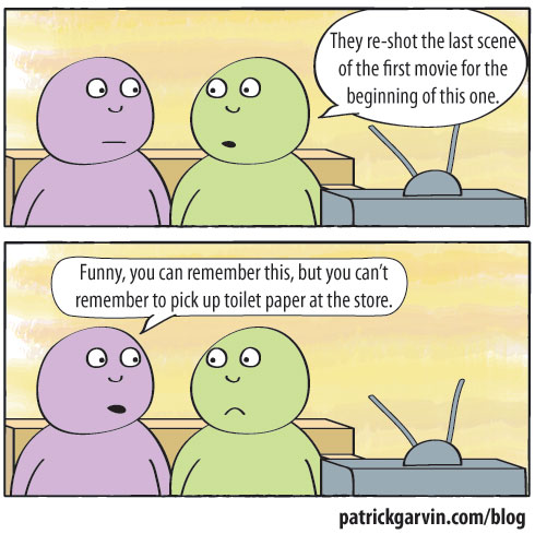
This web comic, like many, finds its inspiration in actual events. Special thanks to Times-Union reporters Larry Hannan and Jeremy Cox for this idea. Enjoy!
Tag Archives: pop culture
August 30: In case you missed it…
In case you missed these graphics, interactives and overall awesome goodies in the last few week:
“Star Wars Uncut”
Andrew DeVigal posted something awesome on Twitter this weekend: A scene from “Star Wars” reshot by fans, in which every 15 seconds is shot by a different group of fans. The scene is part of Star Wars Uncut, which includes just about every scene from “A New Hope” shot in segments lasting 15 segments. Some people used toys, others used dogs and others used their kids. And even others used stranger things. Quite enjoyable.
—-
Albert Pujols’ road to 400 home runs [stltoday.com]
Albert Pujols, in his 10th season, has reached the 400 home run milestone by age 30. Only Stan Musial has more as a Cardinal. In this look at Albert’s regular-season career home runs, you can sort the home runs by season, stadium, team and batting conditions. By Erica Smith and Brian Williamson.
—-
Muppets Name Etymology [College Humor]
Not sure if it’s because of GraphJam or I Love Charts, but I’m seeing all sorts of Venn diagrams lately. And this one is one of the best.
August 8: In case you missed it…
In case you missed these graphics and interactives in the last few days:
States that allow same-sex marriage vs. States that allow marriage between first cousins [I Love Charts]
Charles Blow tweeted this yesterday. It is, as you might guess from the title, a look at the states allowing same-sex marriage compared to the states allowing marriage between first cousins.
—-
Back to the Future timelines [Sean Mort, via FlowingData]
This chart breaks down the timelines from the “Back To The Future” trilogy. Compared to this, the various “Lost” timelines were totally followable.
—-
The Brett Favre Retirement Curve [Slate]
Dubbed “an interactive visualization of the quarterback’s annual off-season waffling,” this chart is a fever chart of sorts showing his waffling between “comeback,” “not sure” and “retirement.” And, the colors match those of the teams for which he’s played.
—-
Missouri’s sexually transmitted disease rates [stltoday.com]
The topic might not be pretty, but that’s why this chart is all the more important. It allows you to search by county, zip code, year and STD. My home county, St. Louis, has consistently ranked among the nation’s worst for at least two of the diseases, chlamydia and gonorrhea. This was put together by Brian Williamson, who consistently does great graphics databases. See this, like, now.
—-
Got some stuff we missed? Send ’em our way.
When two of my nerd loves collide
GraphJam has been one of my favorite sites for a while, posting simple charts based on pop culture. And I’m a huge “Star Wars” nerd. Thus, this piece I found today was really cool.
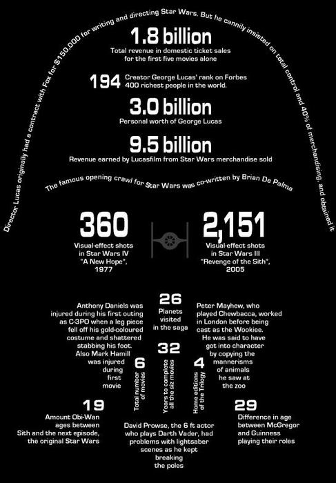 via GraphJam
When I first looked at it, though, I was expecting it to be all about Darth Vader. Instead, it’s a potpourri of information about all the movies and various characters. That doesn’t bother me; of all the images from “Star Wars,” I’m not sure you can find one more iconic and ubiquitous than the Darth Vader mask.
What I appreciate about this is what doesn’t have to be shown. The type sets the boundaries for you and then your mind fills in the rest. You look at this and know it’s the Darth Vader mask. I’m sure others in the graphic design field would have a few changes they’d make if they were doing it themselves, but I think they’d mainly look like this one.
When I’ve made images using typography, I’ve felt challenged with making it look exactly like the individual. I’ve filled every spot and don’t want any white space. In this case, though, I like the white space. (Even though it’s “black space.”)
Got any cool typography pieces? Send ’em my way. Got any cool “Star Wars” examples? Send ’em my way.
Exile in Phairville
I have finally listened to the new Liz Phair album, which she released herself over Fourth of July weekend via her website.
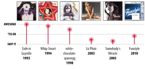
Don’t know who Liz Phair is? What you might recognize will be two singles from her 2003 album, “Liz Phair”:
Essential Liz Phair:
At her peak, her music was brash, unfiltered, gritty, angsty and totally stream-of-conscious. She was Joan Jett, Rickie Lee Jones, Tori Amos, Ani DiFranco and Kim Gordon.
But then she did what so many musicians (and other humans) do: get married, have kids, settle down and become less angsty. By the time 2003’s poppy “Liz Phair” was released, she was more a contemporary of Sheryl Crow than Ani or Tori. Purists cringe at that album the way that “Star Wars” nerds lament the release of “The Phantom Menace” or the way Metallica fans lament when the band cut its mullets.
And now that she’s no longer signed to a label, she has carte blanche to do whatever she wants. On her new album, “Funstyle,” she raps, she mixes in loops of phones and other noises and gives voice to record executives talking about horrible the album is. It’s as if she’s had her Margot Kidder breakdown and is embracing it. You go, girl. Be as nuts as you want to be, I’ll still listen to you.
If possible, 19-year-old Pat would marry his mind’s version of 25-year-old Liz Phair. Hell, 28-year-old Pat might marry that version of Phair. She was the epitome of every cool girl you hear about in a Smithereens song. I don’t know if I’d marry the 2010 version of her, but I’d totally grab coffee and a beer with her and be her friend. We could go to cute little coffee houses and discuss music, then go to a movie, and maybe then discuss it after with a beer. We’d say “totes,” “obvee” and “unfortch,” even though she’s 43 and I’m almost 29 and probably shouldn’t talk like that.
So, my past adoration of her won’t let me write her off. Sure, I won’t listen to this album every day, nor will I re-listen to every track, but her change over time hasn’t bothered me they way has others. I think she’s growing up. Not every album is going to be pissy, existentialist angst anthems about sex and youth and all the stuff that defined her. If Kurt Cobain were still alive, do you think he’d still be putting out “Smells Like Teen Spirit”? Probably not. He might sing anthems about parenthood, the family mini-van and the mortgage crisis and how it’s tough to grow old. He would not be too different from Liz Phair. And we’d listen to it at least a few times before setting it aside, because, well, he’s Kurt Cobain and we liked him when we were younger. It’s the same reason why I won’t outright dismiss a new album by Madonna or New Order or The Magnetic Fields, and it’s the same reason why I won’t dismiss “Funstyle.” Just yet, anyway.
Some tracks from the new album:
We’ve Got a Situation
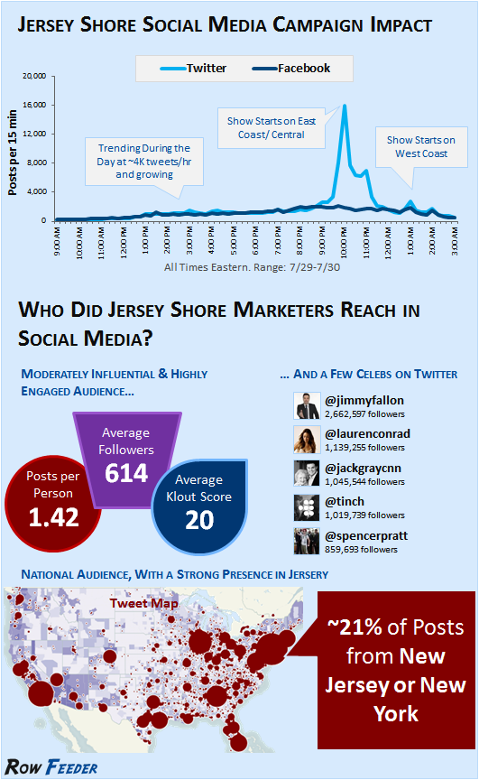
I made it through 17 minutes of the first episode of “Jersey Shore” before deciding to go do dishes and never watch it again, but this infographic via Mashable on “The Social Media Impact of ‘Jersey Shore'” was interesting.
I can’t judge. When I went through my “X-Files” marathon a few years ago, I tweeted almost every episode. “Cancer Man” became a trending topic. (Not really).
The Mashable graphic:

